Business Visualizations
This Chart Shows the Colors That Appear in the Most Fortune 500 Logos
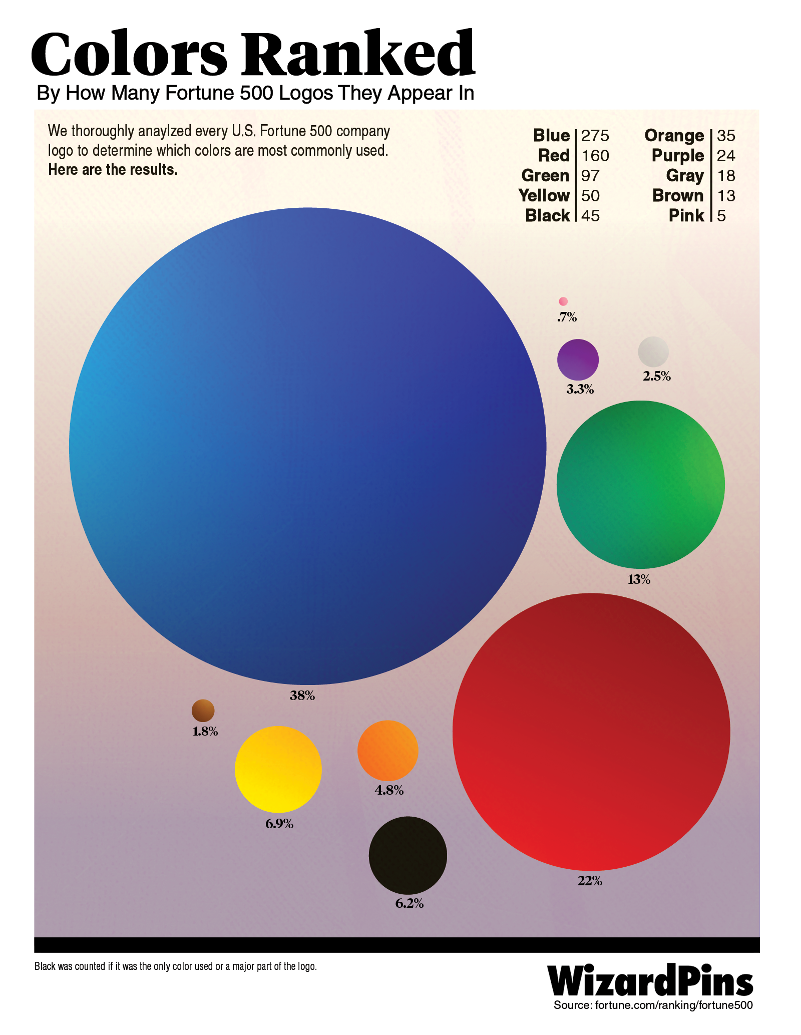
What color do you associate with success? While this answer may vary significantly depending on where you live (shout out to this fantastic and fascinating guide to colors in culture by David McCandless), it seems that many of the most successful companies in the world are linked with blue. Today we are admiring a bold and vibrant visualization by Wizard Pins! This chart shows colors ranked by how many Fortune 500 company logos they appear in. It is a visual feast that shines a light on color psychology in branding, marketing, and beyond!
Click below to zoom
I wonder how long it took the designer to count each color in all 500 logos! So why is blue the most common color for logos? Many brand giants are distinctively associated with blue, such as Walmart, Facebook (now Meta), GM, Ford, LinkedIn, Intel, United, and Pepsi! According to this article by Inc., the “answer is science, not fashion.” Not only is blue a beloved color for branding, it is also the world’s most beloved color of all. According to research by psychologists Stephen E. Palmer and Karen Schloss over the span of seven years, a person’s color preference can be “determined by averaging out how much that person likes all of the objects they associate with that color. Your inclination for orange, for example, depends on how you feel about pumpkins and traffic cones and Cheetos, among other things.” There are many universally cherished things that are blue, such as clear skies and crystalline seas. Most people love a warm, sunny day with sky blue above and sea blue all around. While Walmart’s blue logo might not evoke the bliss of a balmy beach outing, it may unconsciously stir a sense of goodness and stability.
