Charts
Which Country Produces the Most Oil?
Did you know that the United States is both the world’s largest oil producer and consumer? I learned that from this striking visualization from Visual Capital’s Elements page, which provides data-driven designs to reveal the state of our natural world and provoke discussion. Check it out:
Click below to zoom
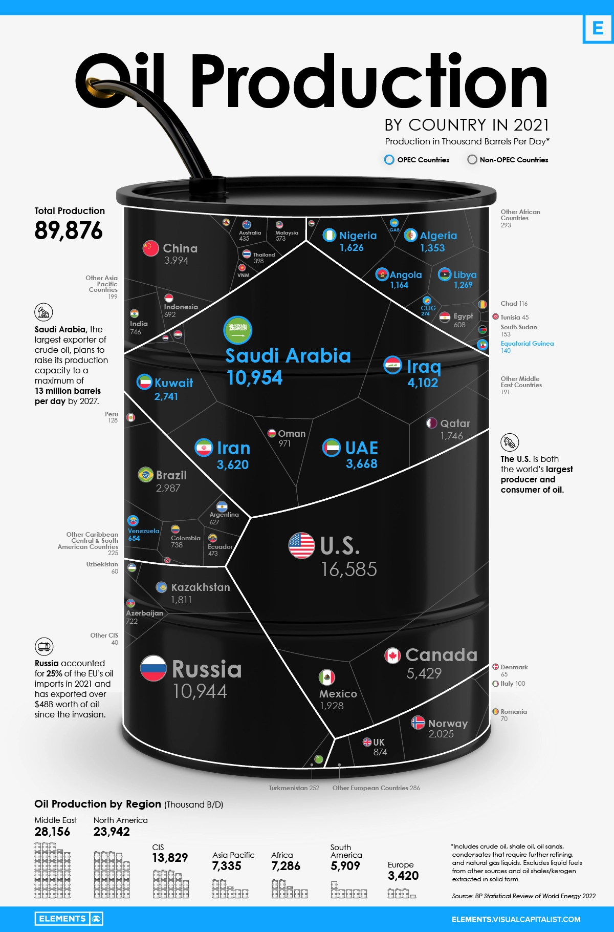
I really love how simple yet compelling this graphic is – it conveys information quickly while also providing engaging tidbits in the margins. The page also provides a search function so you can check how different countries compare in what percentage of the world’s oil they produce in a day. This got me curious – where does U.S. oil come from? According to the U.S. Energy Information Administration, 42.4% of American oil comes from Texas.
With all this in mind, it begs the question: when will the world’s oil run out? We rely on oil for so many facets of daily life, so facing the reality that oil can and will run out if we do not take action is daunting. As with all topics related to energy and the environment, there are conflicting answers. The Worldometer predicts that there are 47 years of oil left at current consumption levels, which is also confirmed by Discover Magazine’s analysis. However, scientists agree that there will theoretically always be a way to extract oil with the right technology. That does not necessarily mean it will be affordable – the harder a resource is to acquire, the more expensive it typically is. All in all, now is the time to pursue alternative, sustainable means of living and thriving on the only planet we have (currently)!