Finance Visualizations
150 Years of U.S. National Debt in One Chart
Today, the national debt of the United States of America stands at an eye-watering 28 trillion dollars and rising. The CARES Act of 2020 and other stimulus bills due to COVID have added massive increases in a short period of time. To see how we got to this place to being with Visual Capitalist has this great interactive timeline of US debt over the past 150 years.
Click below to use the interactive version
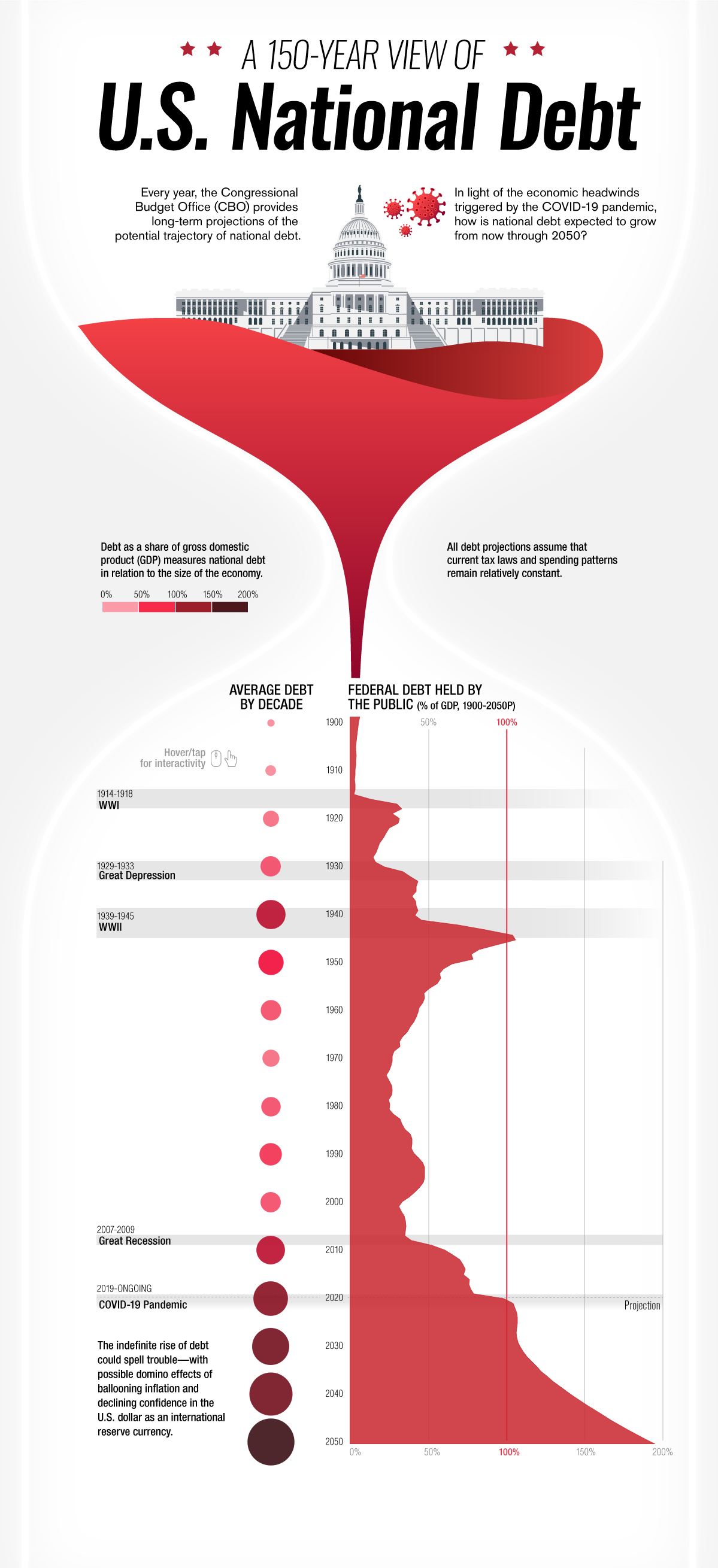
Starting in the year 1900 only 4.8% of the total national debt was held by the public. After World War I in 1910 that percentage jumped to 10. In 1920 following the Great Depression that number doubled to 22.9%. Ten years later that number would be in the billions, 16 billion to be exact with President Roosevelt’s New Deal in 1930. World War II would see this number jump to 40 billion or 75.1% of the GDP. The Korean War of 1950 would add hundreds of billions to the debt clock in only ten years bringing the total in 1950 to $257 billion but bringing the GDP down to 56.8%. The next big increase would come in 1980 when president Reagan introduced his tax cuts causing the gross debt to jump to over 900 billion. Ten years later it would see another massive jump to over $3,233 billion dollars with the Gulf War. Thirty years later the COVID-19 pandemic caused the average debt held by the public to sky rocket to 105.6 percent in 2020 , over $27,748 billion dollars. By 2050 it is estimated that the percentage of debt held by the public will be almost 200 percent.