Finance Visualizations
150 Years of U.S. National Debt in One Chart
Today, the national debt of the United States of America stands at an eye-watering 28 trillion dollars and rising. The CARES Act of 2020 and other stimulus bills due to COVID have added massive increases in a short period of time. To see how we got to this place to being with Visual Capitalist has this great interactive timeline of US debt over the past 150 years.
Click below to use the interactive version
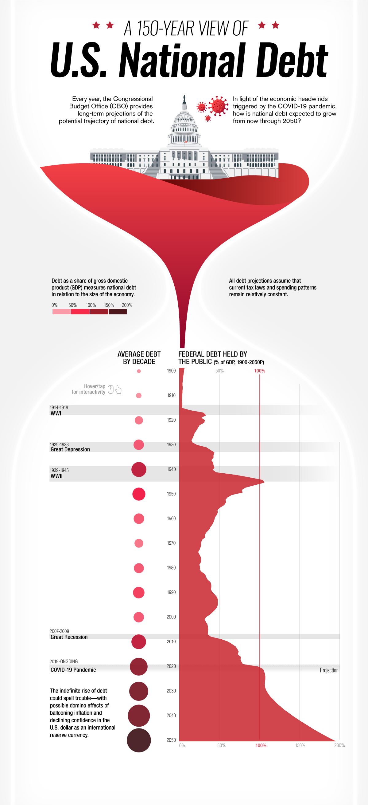
Starting in the year 1900 only 4.8% of the total national debt was held by the public. After World War I in 1910 that percentage jumped to 10. In 1920 following the Great Depression that number doubled to 22.9%. Ten years later that number would be in the billions, 16 billion to be exact with President Roosevelt’s New Deal in 1930. World War II would see this number jump to 40 billion or 75.1% of the GDP. The Korean War of 1950 would add hundreds of billions to the debt clock in only ten years bringing the total in 1950 to $257 billion but bringing the GDP down to 56.8%. The next big increase would come in 1980 when president Reagan introduced his tax cuts causing the gross debt to jump to over 900 billion. Ten years later it would see another massive jump to over $3,233 billion dollars with the Gulf War. Thirty years later the COVID-19 pandemic caused the average debt held by the public to sky rocket to 105.6 percent in 2020 , over $27,748 billion dollars. By 2050 it is estimated that the percentage of debt held by the public will be almost 200 percent.
Smartphones are a central part of modern life after a meteoric rise over the past decade. As technology advances, smartphones have developed more features, better cameras, larger screens, and greater connectivity. While many fans clamor for these upgrades, a growing countertrend calls for simpler options, more like phones from a decade ago. Enter the “dumb phone.” The team at Ooma created a timeline that tracks the rise of the dumb phone trend, helping us understand how it happened, what it entails, and why it’s even a thing.
Click below to zoom.
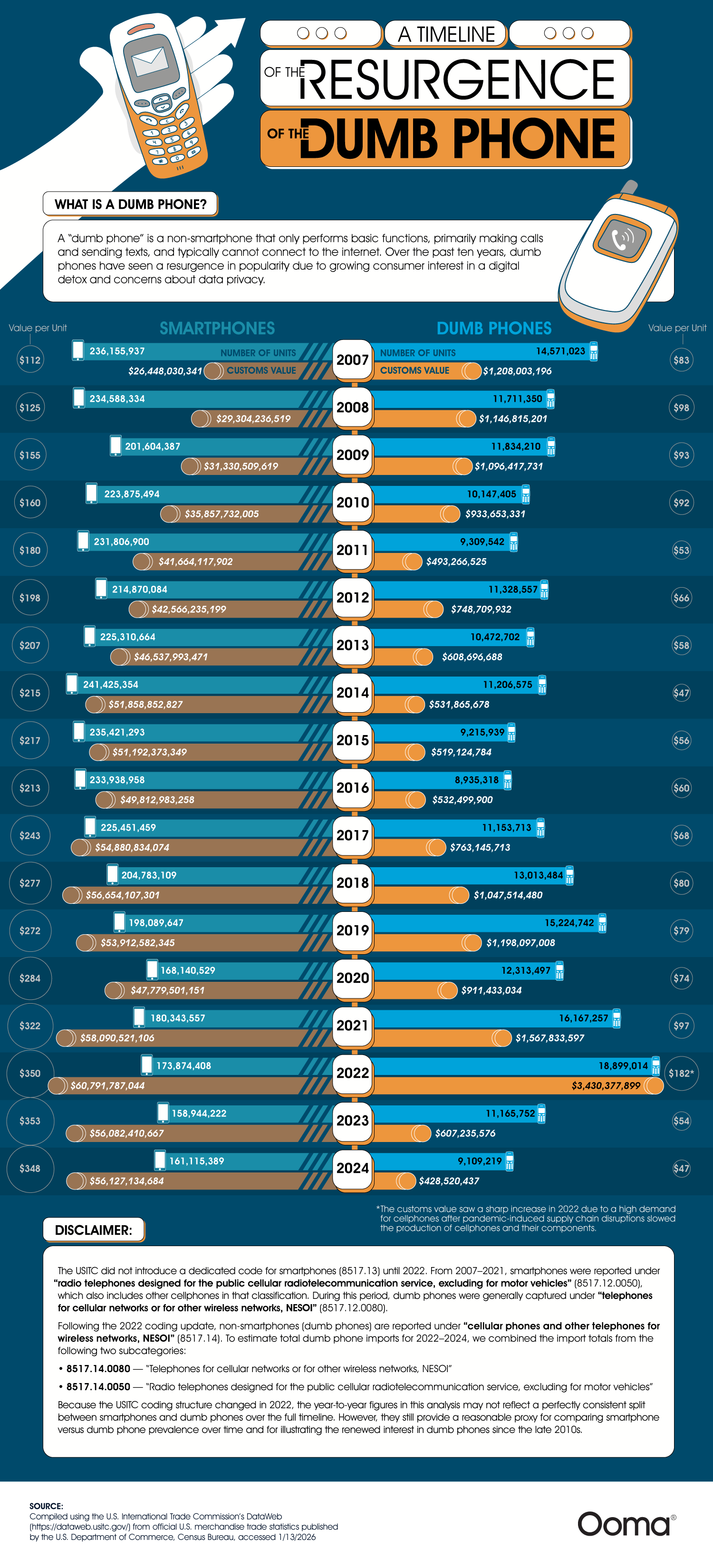
Their timeline compares the number of smartphones vs dumbphones each year from 2007 to 2024. Their data is sourced from the U.S. International Trade Commission, which logged units sold, customs values, and value per unit for both types of devices. Visualizing 17 years of this data helps highlight key inflection points. Over the course of the data, we can see the early dominance of the smartphone and the decline of the dumb phone through the mid-2010s. In the late 2010s, the dumb phone made a comeback, leading to a spike in popularity in 2022.
Before diving deeper into the data, it’s helpful to define the difference between smartphones and dumb phones. Smartphones are essentially pocket computers, mini versions of laptops or tablets. They have large touchscreens, advanced cameras, internet, and social media connectivity. Dumb phones are simple, focused solely on calls and texts. They have limited Internet connectivity and T9 keypads; that means no touch screens.
When 91% of Americans own a smartphone, a 35% increase since 2011, it’s hard to see how or why the dumb phone is gaining popularity, but the numbers tell the story. In 2022, more dumb phones were sold than smartphones. This could be because of growing research warning of the dangers of excessive screen time. Americans average five hours of phone use per day, but excessive screen time leads to sleep disruption, poor mental health, and reduced attention spans. Data privacy issues dominate the news cycle, too. Smartphones collect personal data, which is used for targeted advertising at best and for leaks and data compromise at worst. Dumb phones don’t have these vulnerabilities. A surprising advantage of dumb phones is the battery life. Many of them can go for days on a single charge, something smartphones can’t match.
Dumb phone sales peaked in 2022 and have since leveled off, but they remain well above their lowest point, when smartphones seemed poised to replace dumb phones forever. For now, the forecast seems to show dumb phones are here to stay. The resurgence of dumb phones highlights a shift toward simplicity and mindfulness in technology use. As concerns about screen time, privacy, and mental health grow, many Americans are opting for basic devices. This trend signals that, despite advancements, there’s value in taking a step back and prioritizing well-being over constant connectivity.
Online shopping, known as e-commerce, took the shopping world by storm. Today, one-fifth of all retail sales come from e-commerce. Economists predict e-commerce will only continue to grow in the coming years. This industry can be lucrative but not without risks. The competition is tight as the team at LLCAttorney proves with this chart tracking the e-commerce brands with the biggest gains and losses. The results show the shifting e-commerce landscape and just how much of a difference there is between leading retailers and struggling brands.
Click below to zoom.
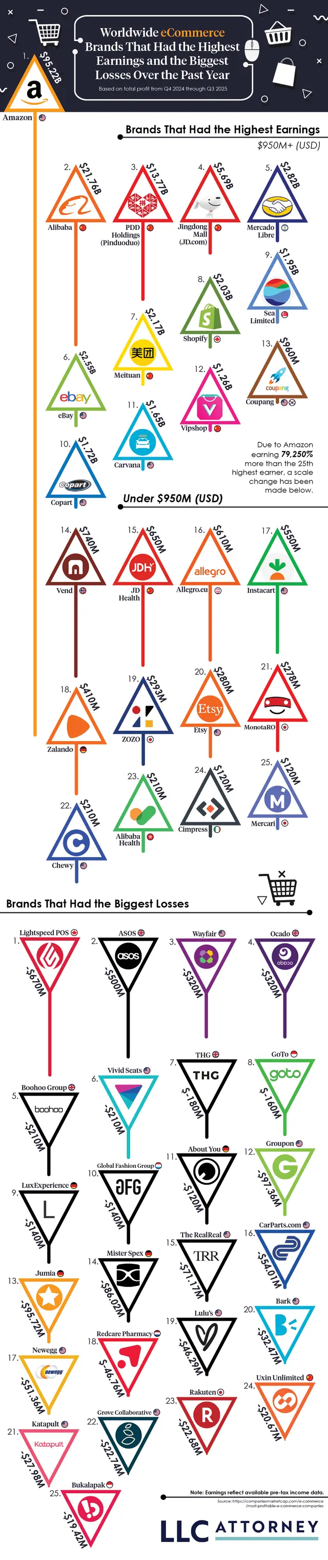
As we would expect from this global-dominant brand, Amazon leads the e-commerce industry with the biggest gains. In 2025, Amazon’s revenue amounted to a whopping $95.22 billion. Ever since Amazon debuted as a bookseller in 1994, it has had a meteoric rise, earning more each year. The biggest leap in the company’s earnings occurred between 2017 and 2018, with a 172.8% increase. Amazon only suffered one year in the red after it invested heavily in Rivian, a failed electric vehicle venture. Amazon’s massive catalog of over 12 million products, its entertainment subscription services, digital books, and convenient, fast delivery service make Amazon the powerhouse it is today.
Right behind Amazon, we find the Chinese brand, Alibaba, which earned $21.76 billion in 2025. Alibaba sells a wide range of products at wholesale prices. You’ll find electronics, home goods, beauty products, and even industrial supplies in their offerings. Alibaba’s business-to-business marketplace, which connects small and mid-size businesses directly to manufacturers, allows them to source bulk goods and makes this brand a popular choice. Other Chinese brands top the e-commerce earnings list too, like PDD Holdings (Pinduoduo) and Jingdong Mall (JD.com). Each of the top four e-commerce companies earned over 5 billion in revenue.
Turning to the other end of the chart, we find the brand with the most losses in 2025: Lightspeed POS. They reported a devastating $670 million loss. They earned $1.15 billion, but it wasn’t enough to cover their expenses. This Canadian e-commerce brand is a point-of-sale system for retailers and restaurants. It was once considered a promising company with rapid growth, but its revenue has shrunk significantly in the past few years as competitors have taken bites out of Lightspeed POS’s market. The British brand, ASOS, a clothing retailer, also suffered a massive $500 billlion loss in 2025. American brand Wayfair suffered losses, too, which is surprising considering its past popularity as an affordable home goods retailer with a big selection.
The figures we see here demonstrate that e-commerce is an industry with diverse companies and varying success rates. With tremendous gains and equally earth-shattering losses, we can see e-commerce is volatile, competitive, full of opportunities and challenges alike. The team’s data show that the industry’s biggest giants will be difficult to surpass. Companies like Amazon have set an astronomically high bar for success.
America’s infrastructure depends on vehicle use, making driving a necessary reality for many people. According to research, 78% of workers aged 16 and over use a car to get to work. Few Americans never or rarely drive. Car costs can be prohibitive, and more people struggle to afford vehicle ownership each year as car prices rise. Add other state-level fees to the mix, and vehicles can be a struggle to afford. The team at Grease Monkey helped determine the most affordable and expensive states to own a car in.
Click below to zoom.
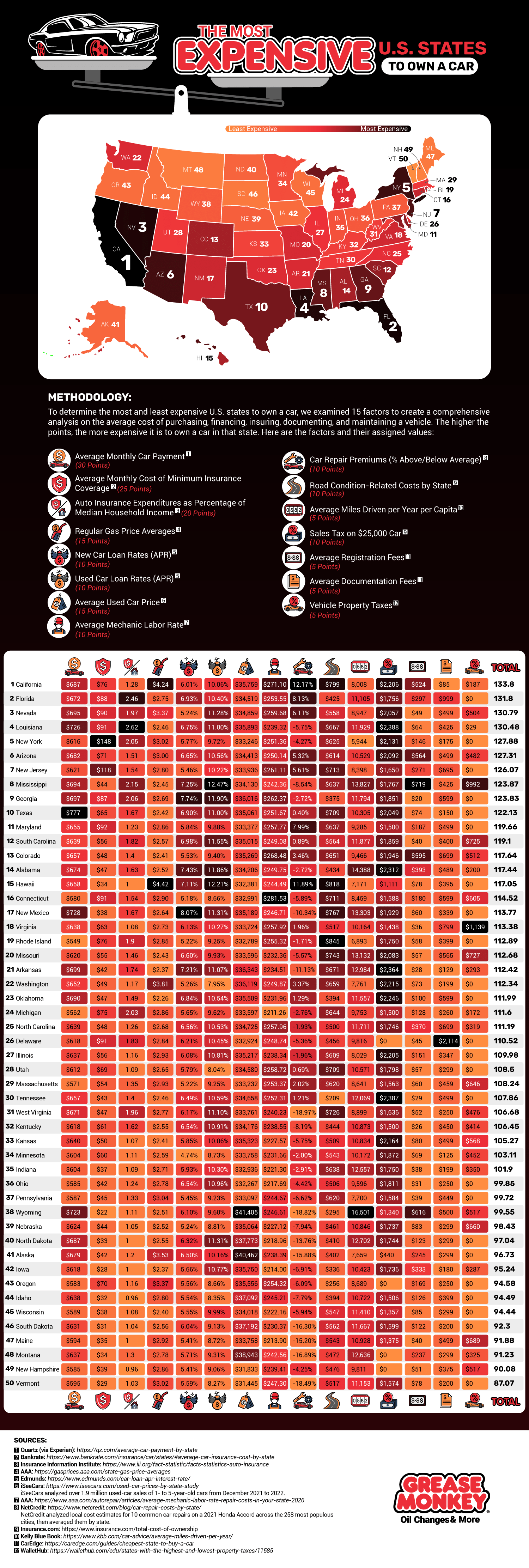
They found that California is the most expensive state for car ownership. The high costs in California are largely due to maintenance talks. There are higher car repair premiums, higher gas prices, higher registration fees, higher car insurance premiums, and above-average monthly car payments in California. All of these combine to make California a highly expensive state in which to own a car.
If you’re looking to save on vehicle expenses, look no further than Vermont. It scored nearly 50 points lower than California according to the team’s system. Vermont has the third-lowest car insurance rates, third-lowest repair premiums, and low registration fees and sales taxes. There are no vehicle property taxes in Vermont, another major source of savings.
To create such a comprehensive study, the team looked at 15 different data sets and awarded points based on these sets:
- Average monthly car payment
- Average monthly cost of minimum insurance coverage
- Auto insurance expenditures as a percentage of median household income
- Regular gas price averages
- New car loan rates
- Used car loan rates
- Average used car price
- Average Mechanic labor rate
- Care repair premiums
- Road condition-related costs by state
- Average miles driven per year per capita
- Sales tax on a $25,000 car
After California, the most expensive states to own a vehicle in were Florida, Nevada, Louisiana, New York, Arizona, New Jersey, Mississippi, Georgia, and Texas. If you’re looking for more affordable states other than Vermont, turn to New Hampshire, Montana, Maine, South Dakota, Wisconsin, Idaho, Oregon, Iowa, Alaska, and North Dakota. The team’s study is an exhaustive examination of all the costs that stack up to make driving prohibitive. Many of the more expensive states have a generally high cost of living, so this information could be useful to anyone looking to relocate to a more affordable state.
Although it might seem counterintuitive, thorough annual maintenance on your car can keep your costs down in the long term. Regular oil changes, brake service, and tire rotations can extend the life of your car, which has a big impact on your savings. For car insurance, investigate special programs you may qualify for, like being a safe driver or completing a defensive driving course. This map can help us reflect on the many expenses that come with car ownership and prompt us to think of ways we can save money and keep driving costs reasonable.
-

 Business Visualizations2 years ago
Everything Owned by Apple
-

 Business Visualizations2 years ago
America’s Most Valuable Companies Ranked by Profit per Employee
-

 Business Visualizations1 year ago
The Biggest Fortune 500 Company in Every State
-

 Business Visualizations1 year ago
The Biggest Employers by Industry
-

 Timelines2 years ago
Timeline Charts the Development of Communications Technology
-

 Business Visualizations8 months ago
The Largest Companies in America That Are Still Run by the Person Who Founded Them
-

 Charts2 years ago
Map Uncovers Countries with Most Powerful Passports
-
 Maps2 years ago
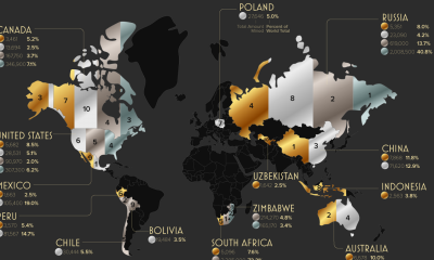
A Map to Gold and Silver
1 Comment