Timelines
New Timeline Shows Average Global Temperatures for Every Month From 1880 Through 2021
The subject of climate change is one that continues to be heavily debated, and with good reason. From the NASA Goddard Institute for Space Studies, here is a visual representation of the monthly global mean temperature, spanning from 1880 through 2021. The visual is laid out where the each year can be read as a clock, in terms of the months going clockwise, along with colors to indicate their average temperatures during those times of the year.
Click below to zoom
Did you know that since 1880, when modern record-keeping began, that the last eight years have been the warmest? Earth’s climate system is being altered by this consistent warming, and we’re seeing that the effects of Global Warming and becoming verse than ever before.
Climate change is will undoubtedly affect every country in the world, however it will hit some countries much harder than others. Six places from around the world that will prove to be especially vulnerable in regards to the impending impacts of climate change include Haiti, Nigeria, Yemen, Manila, Kiribati, and United Arab Emirates. They will all face changes for one reason or another, however all are scary.
In United Arab Emirates, for example, the sea levels have continued to race at an uncomfortable pace, and are at risk of facing water stress, which puts pressure on the UAE to spend much more energy and resources than they currently are on cooling.
According to the visual, and per NASA and the National Oceanic and Atmospheric Administration (NOAA), the global average surface temperature on Earth just last year in 2021 was tied with 2018 as being the sixth warmest year on record during that span. According to scientists around the globe today, the the climate change that we’re experiencing here on Earth is being referred to as “the biggest global threat of the 21st century.”
Smartphones are a central part of modern life after a meteoric rise over the past decade. As technology advances, smartphones have developed more features, better cameras, larger screens, and greater connectivity. While many fans clamor for these upgrades, a growing countertrend calls for simpler options, more like phones from a decade ago. Enter the “dumb phone.” The team at Ooma created a timeline that tracks the rise of the dumb phone trend, helping us understand how it happened, what it entails, and why it’s even a thing.
Click below to zoom.
Their timeline compares the number of smartphones vs dumbphones each year from 2007 to 2024. Their data is sourced from the U.S. International Trade Commission, which logged units sold, customs values, and value per unit for both types of devices. Visualizing 17 years of this data helps highlight key inflection points. Over the course of the data, we can see the early dominance of the smartphone and the decline of the dumb phone through the mid-2010s. In the late 2010s, the dumb phone made a comeback, leading to a spike in popularity in 2022.
Before diving deeper into the data, it’s helpful to define the difference between smartphones and dumb phones. Smartphones are essentially pocket computers, mini versions of laptops or tablets. They have large touchscreens, advanced cameras, internet, and social media connectivity. Dumb phones are simple, focused solely on calls and texts. They have limited Internet connectivity and T9 keypads; that means no touch screens.
When 91% of Americans own a smartphone, a 35% increase since 2011, it’s hard to see how or why the dumb phone is gaining popularity, but the numbers tell the story. In 2022, more dumb phones were sold than smartphones. This could be because of growing research warning of the dangers of excessive screen time. Americans average five hours of phone use per day, but excessive screen time leads to sleep disruption, poor mental health, and reduced attention spans. Data privacy issues dominate the news cycle, too. Smartphones collect personal data, which is used for targeted advertising at best and for leaks and data compromise at worst. Dumb phones don’t have these vulnerabilities. A surprising advantage of dumb phones is the battery life. Many of them can go for days on a single charge, something smartphones can’t match.
Dumb phone sales peaked in 2022 and have since leveled off, but they remain well above their lowest point, when smartphones seemed poised to replace dumb phones forever. For now, the forecast seems to show dumb phones are here to stay. The resurgence of dumb phones highlights a shift toward simplicity and mindfulness in technology use. As concerns about screen time, privacy, and mental health grow, many Americans are opting for basic devices. This trend signals that, despite advancements, there’s value in taking a step back and prioritizing well-being over constant connectivity.
Before we used banks, barcodes, or Bitcoin, humans still developed sophisticated point-of-sale systems to exchange something of value with a stranger. We’ve reinvented solutions time and again over human history, and the team at Qualtrics created a timeline that shows us the story of this history is a lot more dramatic than your tap-to-pay transaction suggests.
Trading between humans began with the exchange of goods rather than coins or paper. Livestock, pelts, and food were the stuff of life, the most valuable items we could possess. There was no central authority to set prices and values for these things, so trades were negotiated on a case-by-case basis. The first move toward abstraction came with the exchange of goods for cowry shells and tally sticks. An interesting fact: cowry shells have been found across continents, even among civilizations that never met each other.
A major currency turning point in the ancient world was Mesopotamia’s clay tokens, used to exchange for grain and to pay off debts. Ancient Egyptians expanded on this with labor tokens that existed in a tiered system as an early form of payroll. The Code of Hammurabi, from 1750 BC, established complex rules governing credit, debt, and contracts. Economic regulation is a lot older than many people may assume.
When the Silk Road opened in 138 BC, goods, currencies, and ideas traveled thousands of miles. Muslim merchants created sakk, a document that ordered banks to pay a third party, so they didn’t have to travel with heavy coins. The sakk is the direct ancestor of a check. The Song Dynasty of China created a system of paper receipts called jiaozi, which became the world’s first paper currency.
During the Industrial Revolution, James Ritty created the mechanical cash register to help secure coins and bills from untrustworthy cashiers pocketing spare change. He called the machine, “the Incorruptible Cashier.” The Diners Club card, introduced in 1950 by American Express, became the first plastic credit card. A pack of Wrigley’s Juicy Fruit gum became the first product with a barcode scanned at the checkout in 1974.
The digital age brought about the most dramatic and rapid development. In 2009, Square turned smartphones into point-of-sale registers. This dramatically lowered barriers to entry for small businesses everywhere that could process QR codes and contactless payment methods to sell goods and services. The newest advances are in the realm of biometrics. Michigan businesses started using payments triggered by eye recognition in 2023.
From clay tokens to retinal scans, we’ve come a long way in economic innovation. These advances and technologies tell the story of humans creating solutions to the problem of developing enough trust to trade with strangers. The timeline also shows us how commerce is so tightly woven into human history and development. Some may say it’s the keystone, the foundation of human civilization. This piece is an entertaining and informative visual tale of the development of money, sales, and trade.
Breakthroughs in technology can revolutionize industries and even give birth to new industries previously unimagined. The Qualtrics team explored the world’s most revolutionary products and services, arranged on a timeline that teaches us not only which tech has caused the biggest changes, but also how these developments interact with each other and advance technology and our lives as a whole. The timeline spans 1981 to 2022. It covers the realms of Computing and Internet, Entertainment and Media, and Mobile and Digital Services. Each item on the timeline has changed its industry and even changed the way humans live.
In the world of computing and Internet services, the timeline covers:
- IBM Personal Computer
- America Online
- Microsoft Windows 95
- Google Search Engine
- OpenAI ChatGPT
Click below to zoom.
The timeline covers the world of entertainment, featuring Sony PlayStation, Amazon, Craigslist, Netflix, Facebook, YouTube, and Nintendo Wii as the gamechangers. In the mobile and digital services realm, there’s a surprising diversity of products from smartphone models to apps like Uber to the Dyson DC01 Vacuum Cleaner, and even Red Bull energy.
It’s no secret that the personal computer revolutionized the business and computing industries. Before IBM’s PC, there was no market for personal computers; today, they’re a staple of modern life. Another 1980s brand, Red Bull, created a market where none previously existed. People traditionally get their caffeine fix from coffee, but energy drinks offer an easier-to-grab option on the go. Red Bull partnered with extreme-sports marketing to turn energy drinks into a lifestyle.
The timeline highlights AOL Instant Messenger as the Internet’s first big revolution. It’s a precursor to social media and helped make the World Wide Web a means of quick, easy communication. In 1998, Google Search Engines made the Internet an invaluable tool for knowledge. Google made it far easier to find websites of value on any topic under the sun (and even some beyond!)
From here on, the timeline is dominated by a range of innovative apps and Internet-based services. Amazon is the worldwide leader in e-commerce. It changed the way consumers shop forever, offering low prices, convenience, and fast delivery. Netflix changed the way people consume films and television by offering the first-ever streaming service. They offer an enormous library of new and old titles. No more waiting for a syndicated show to air. Netflix created a demand for “binge-worthy” content. The entertainment world touches every area of traditional arts and media. We see the Amazon Kindle changing how many book lovers read, offering a digital library that saves physical space and even money for some titles. Spotify became the leader of music streaming in 2008. Some think of it as the Netflix of music. Memberships offer unlimited streaming access to millions of songs and artists.
These are just a few of the industries that have been revolutionized by technology. We haven’t even touched on AI! Dive into the timeline to learn more about the most pivotal products and services of the modern era.
-

 Business Visualizations2 years ago
Everything Owned by Apple
-

 Business Visualizations2 years ago
America’s Most Valuable Companies Ranked by Profit per Employee
-

 Business Visualizations1 year ago
The Biggest Fortune 500 Company in Every State
-

 Business Visualizations1 year ago
The Biggest Employers by Industry
-

 Timelines2 years ago
Timeline Charts the Development of Communications Technology
-

 Business Visualizations9 months ago
The Largest Companies in America That Are Still Run by the Person Who Founded Them
-
 Charts2 years ago
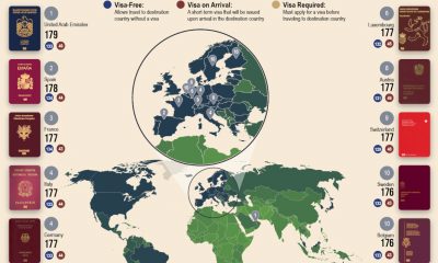
Map Uncovers Countries with Most Powerful Passports
-
 Maps2 years ago
A Map to Gold and Silver