
Charts
Study Examines What Americans Spend the Most Money On

As the economy shifts, we can see changes in consumer spending habits, as reflected in this Qualtrics study, which reveals what Americans spend the most money on. These insights show us what Americans prioritize and how much flexible spending money they have available for non-essentials. Using data from the U.S. Bureau of Labor Statistics, the team created a chart breaking down spending by category and then a further breakdown of spending categories by income bracket.
Click below to zoom.
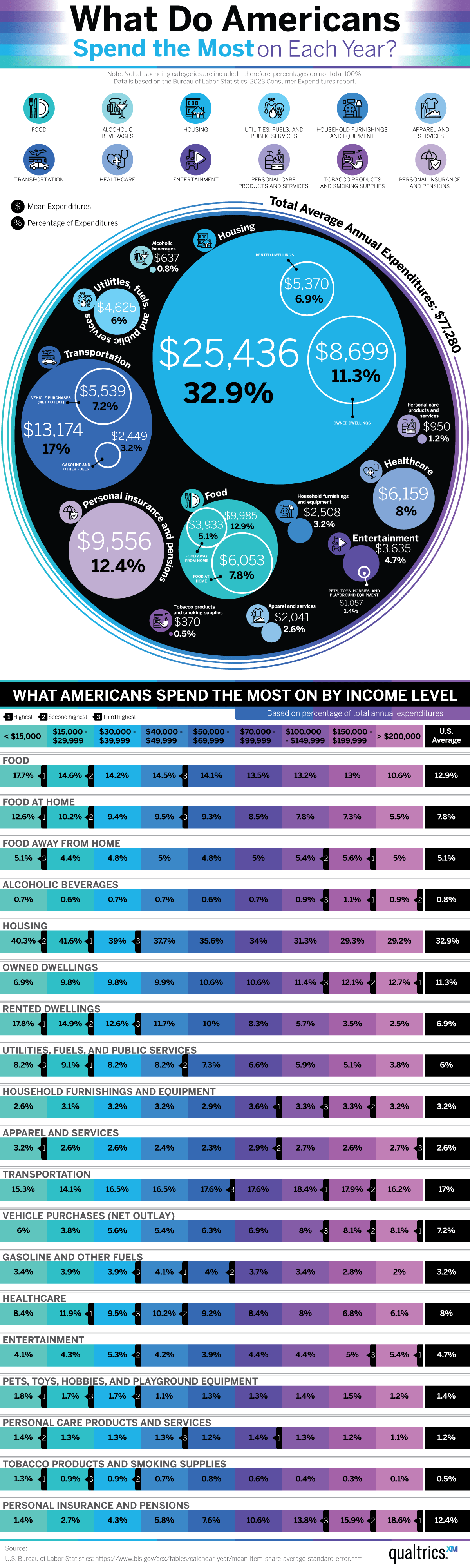
According to the data collected, Americans spend around $77,280 per year. This spending was divided into these categories, ranked by the amount spent on each.
- Housing – $25,436 (32.9% of total annual expenses)
- Transportation – $13,174 (17% of total annual expenses)
- Food – $9,985 (12.9% of total annual expenses)
- Personal insurance and pensions – $9,556 (12.4% of total annual expenses)
- Healthcare – $6,159 (8% of total annual expenses)
- Utilities, fuels, and public services – $4,625 (6% of total annual expenses)
- Entertainment – $3,635 (4.7% of total annual expenses)
- Household furnishings and equipment – $2,508 (3.2% of total annual expenses)
- Apparel and services – $2,041 (2.6% of total annual expenses)
- Personal care products and services – $950 (1.2% of total annual expenses)
- Alcoholic beverages – $637 (0.8% of total annual expenses)
- Tobacco products and smoking supplies – $370 (0.5% of total annual expenses)
Across income categories, Americans spent the most money on housing, which comes as no surprise. Housing costs and mortgage interest rates have been on the rise since 2020 in response to a shortage in housing stock. That means Americans must spend more if they dream of home ownership. The team’s data takes rent into account as well.
Many people also spent a lot on transportation. This is due to a combination of rising fuel costs leading to higher vehicle prices, as well as parts shortages that affected vehicle stock and prices. Another necessity takes number three on the list. According to the data, Americans are spending $1,174 a month on groceries. Grocery prices have dominated newsfeeds for the past few years. We all need food to survive, so seeing this item so far up the list is no surprise.
With so much uncertainty in the world, it seems Americans are investing heavily in insurance and pensions. The data shows that the more money someone makes, the more they spend on insurance, which makes sense as they need to protect expensive assets. Insurance can help offset unforeseen costs and protect investments. Unfortunately, this insurance spending is shared with high healthcare spending as well. Americans spend more than most citizens of other wealthy nations. As the cost of living has increased, so have health insurance premiums. Healthcare spending not only includes health insurance, but also co-pays, medical supplies, and surprise bills.
We live in an era full of strange relationships with money and wealth. Many Gen Z Americans state feeling “pressured” to show off wealth and luxury on social media, while 41% of Americans don’t feel they’re financially secure. Despite rising expenses, Americans still enjoy shopping, with many of them choosing to go shopping as a treat once a month. Gen Z cites boredom as their number one reason for spending money. Even so, 73% say they are willing to cut back on their daily spending to save for longer-term goals. It seems that although prices are rising, many Americans, particularly younger ones, are still willing to spend on a variety of areas.

Translation apps promise to dissolve language barriers with a tap, turning your phone into a pocket interpreter. A new study from Preply suggests that convenience comes at a cost. After surveying 1,200 Americans who have used these tools while traveling abroad, Preply found that 57% considered the apps robotic and unnatural, leaving travelers feeling that something essential was missing from their interactions with locals.
Click below to zoom.
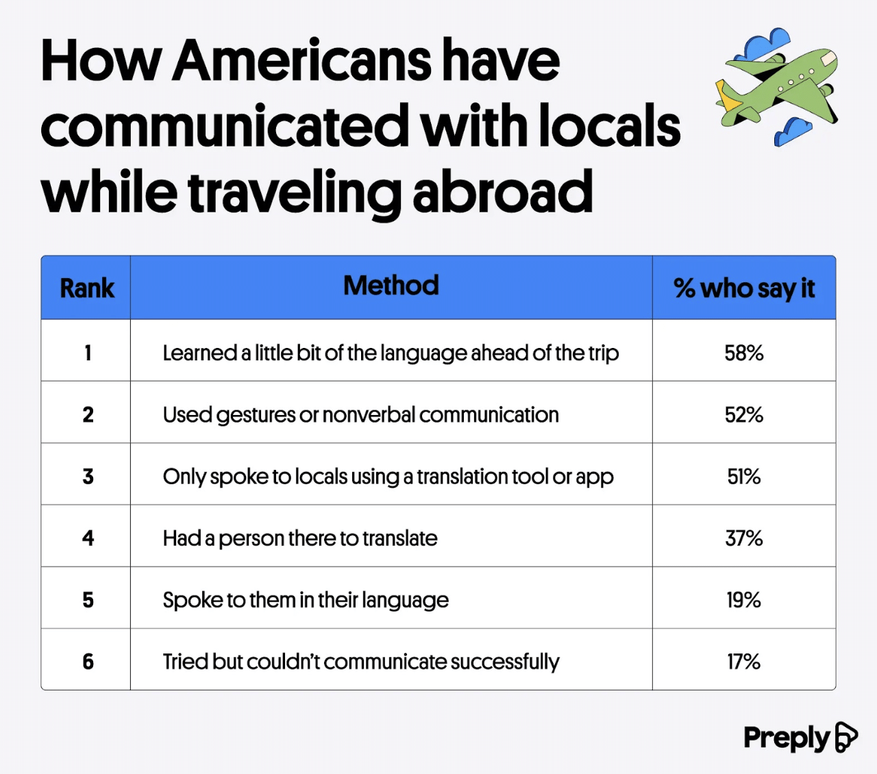 The study’s first graph breaks down how Americans usually communicate when they travel, and the most popular solution is low-tech. Nearly three in five respondents said they learned some of the local language before their trip so they could use it themselves. Gestures and pointing, along with facial expressions, were also popular when asking for food or directions. Half of respondents used a translation app or tool, while two in five used in-person translators. Almost one in five could speak the local language, either from prior knowledge or from efforts to study before the trip. 17% said they still struggled to communicate despite their best efforts.
Click below to zoom.
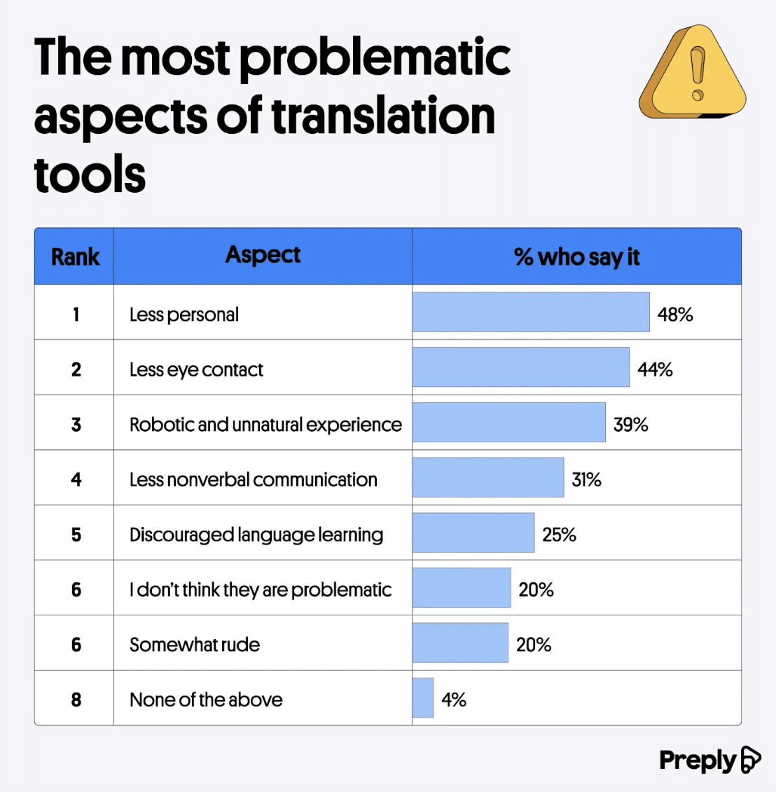 The second visual shows what travelers don’t like about translation apps. Most complaints center around human connection. Nearly half of travelers said technology made interactions less personal, and more than two in five were bothered by the lack of eye contact because the user must watch the screen. Body language and eye contact help people build rapport, but a device in the middle can disrupt this connection. One in five travelers described real-time technology as somewhat rude. A third of respondents reported an awkward moment while using the tool, and nearly one in three said the app made their trip feel less immersive.
The tools might also undercut long-term learning. More than a third of travelers felt translation technology discouraged them from learning more of the language, and 52% were frustrated that an app can’t communicate tone or cultural nuance.
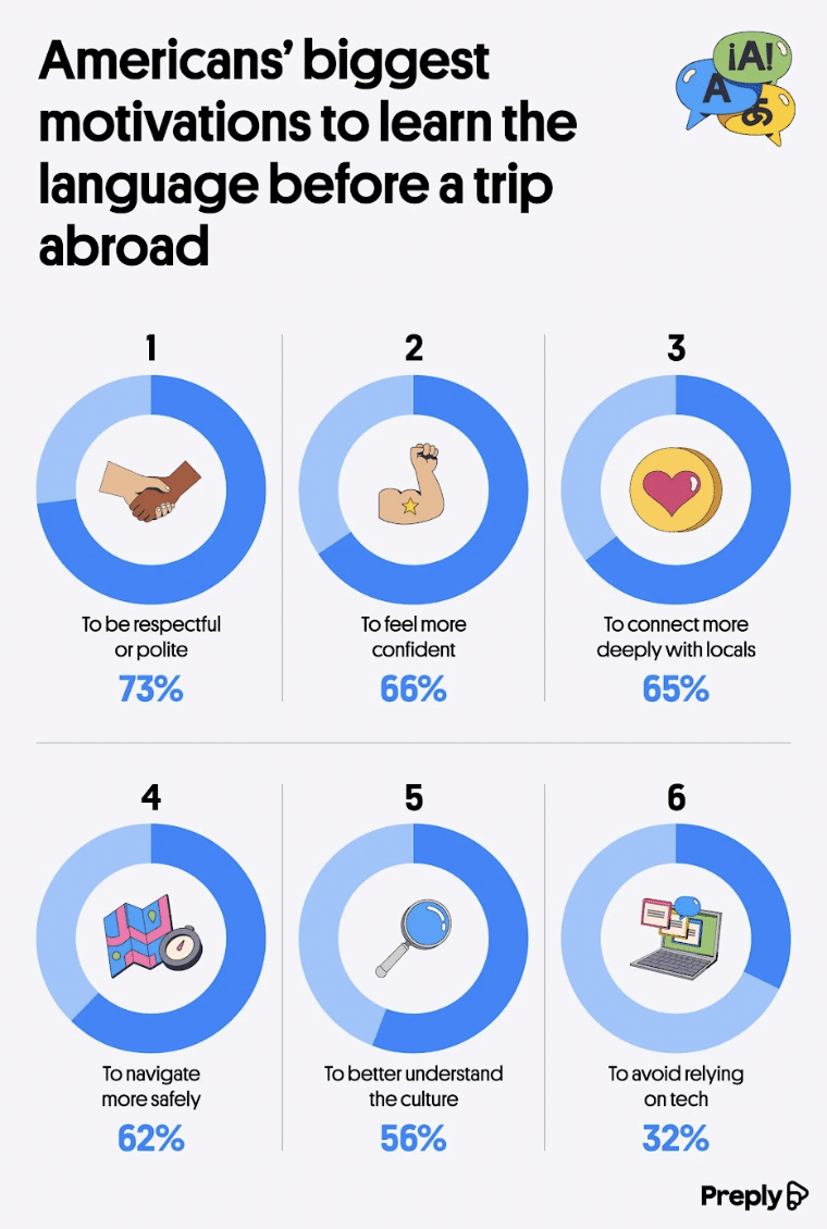
The final visual aid examines what motivates travelers to study a language before setting out on a trip. Half of Americans who traveled abroad took some kind of language class beforehand. The top reason chosen by 73% of respondents was a desire to be polite and respectful. Two-thirds wanted to feel more confident when traveling, and 65% hoped to connect more deeply with locals. Looking ahead, 65% of Americans said they want to learn more of the local language before a future trip.
That doesn’t mean travelers are abandoning their apps. More than two-fifths expect to rely on translation tools more the next time they travel. One in six plan to use these tools less.
Preply offers us a balanced conclusion. Translation apps are a remarkable technology that works best in moderation. Knowing a handful of phrases can transform a transactional exchange into a genuine moment of connection. That connection is something no app has managed to replicate.

As new technologies transform industries and create new skills demand, this analysis from Altium ranks states by how well their workforces are positioned to meet the future and a changing economy. The article, graphs, and maps show that tech readiness doesn’t always match a high-tech reputation.
Click below to zoom.
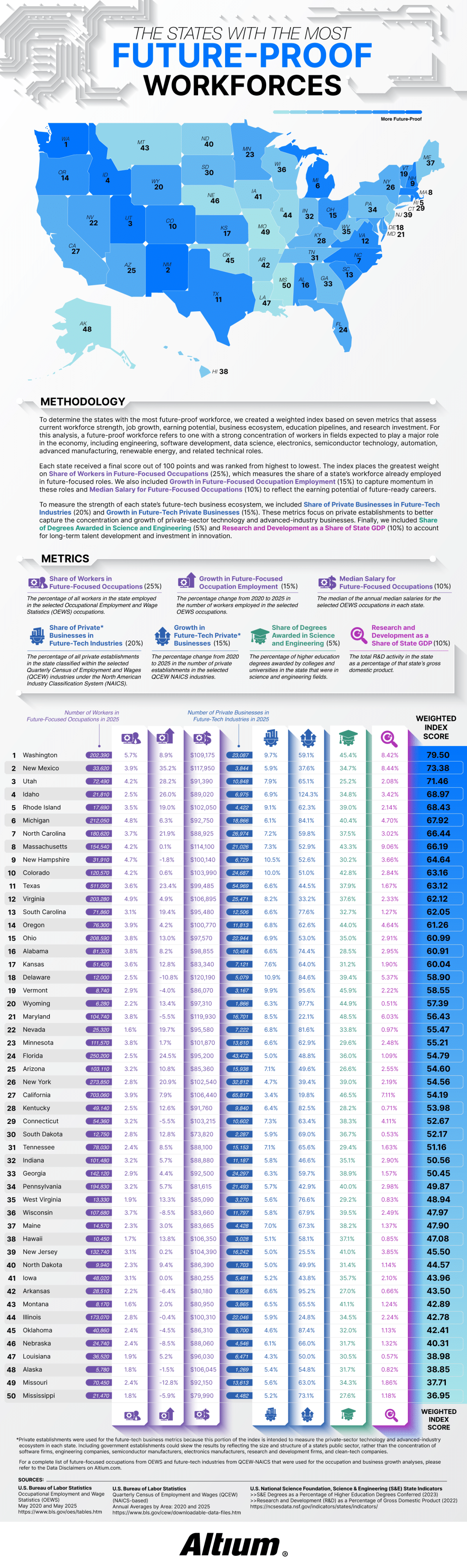
Altium defined a future-proof workforce as one with a large share of workers in fields expected to drive economic growth over the next few decades. The study tracked 30 occupations using data from the Bureau of Labor Statistics, including electrical and computer hardware engineers, software developers, data scientists, solar installers, semiconductor processing technicians, CNC programmers, and wind turbine technicians. The team considered 27 “future-tech” industries from aerospace to renewable energy to semiconductor manufacturing and R&D services.
Each state received a score out of 100 based on seven weighted metrics. The largest factor at 25% was the share of workers already employed in future-focused positions. The share of private businesses in future-tech industries was worth 20%. Employment growth and business growth from 2020 to 2025 counted for 15%. Median salary and research and development as a share of state GDP each accounted for 10%, and the share of science and engineering degrees made up the final 5%.
Washington took first place with a score of 79.50. Nearly 6% of the workforce there holds future-focused jobs and earns a median salary of $109,175. Washington’s future-tech businesses grew 59.1% over five years. The article credits the state’s concentration of software and aerospace employers, noting that Washington leads the nation in aerospace sales, exports, and employment.
The runner-up is more surprising! New Mexico ranked second, thanks to its 35.2% growth in future-focused employment. That’s the fastest growth rate in the country. Thanks to national laboratories and an expanding aerospace sector, it has one of the highest median salaries in the study at $117,950. Utah, Idaho, and Rhode Island round out the top five rankings. Idaho stood out for business expansion, with future-tech businesses growing by an eyebrow-raising 124.3%.
The study’s most confusing findings relate to California. The state employs 703,060 people in future-focused occupations, more than any other state, yet it only ranks at #27. Although California is strong in engineering education and R$D investment, future-tech industries make up only 3.4% of its private businesses. Its five-year business growth rate of 19.8% is the lowest in the nation.
Smaller states benefited when technology made up a larger slice of their economies. Rhode Island’s future-tech businesses represent 9.1% of its private sector and grew 62.3%. New Hampshire ranked ninth with the highest future-tech business share in the top ten at 10.5%. Rounding out the top ten were Michigan, North Carolina, Massachusetts, and Colorado.
Mississippi finished last with a score of 36.95, followed by Missouri, Alaska, Louisiana, and Nebraska. Several of these states saw a decline in future-focused occupations. The key takeaway is that a state’s headcount or Silicon Valley reputation alone doesn’t define its readiness for the future. A growing technical workforce and a dense base of tech businesses best position a state for the future.
Around 80% of Americans believe that learning a few words of the local language matters before they travel abroad. Only 58% of those Americans actually go so far as to learn some words. That twenty-two-point gap is the basis of Preply’s report on language anxiety and travel, supplemented by visuals to support the data on this anxiety.
The report opens on this contradiction between belief and action and sharpens the data. It shows that 40% of travelers admit to cramming language lessons at the airport or on the plane. Only 25% begin practicing the language of their destination months ahead of time. 32% side-step the problem entirely by choosing destinations where English is the dominant language or prevalent enough to carry travelers through.
Two ranked charts are the center of the report and comparing their results offers eye-opening details. The first chart shows that in 2026, Italy topped the wish list of American travel destinations. Australia, Ireland, the UK, and France followed.
Click below to zoom.
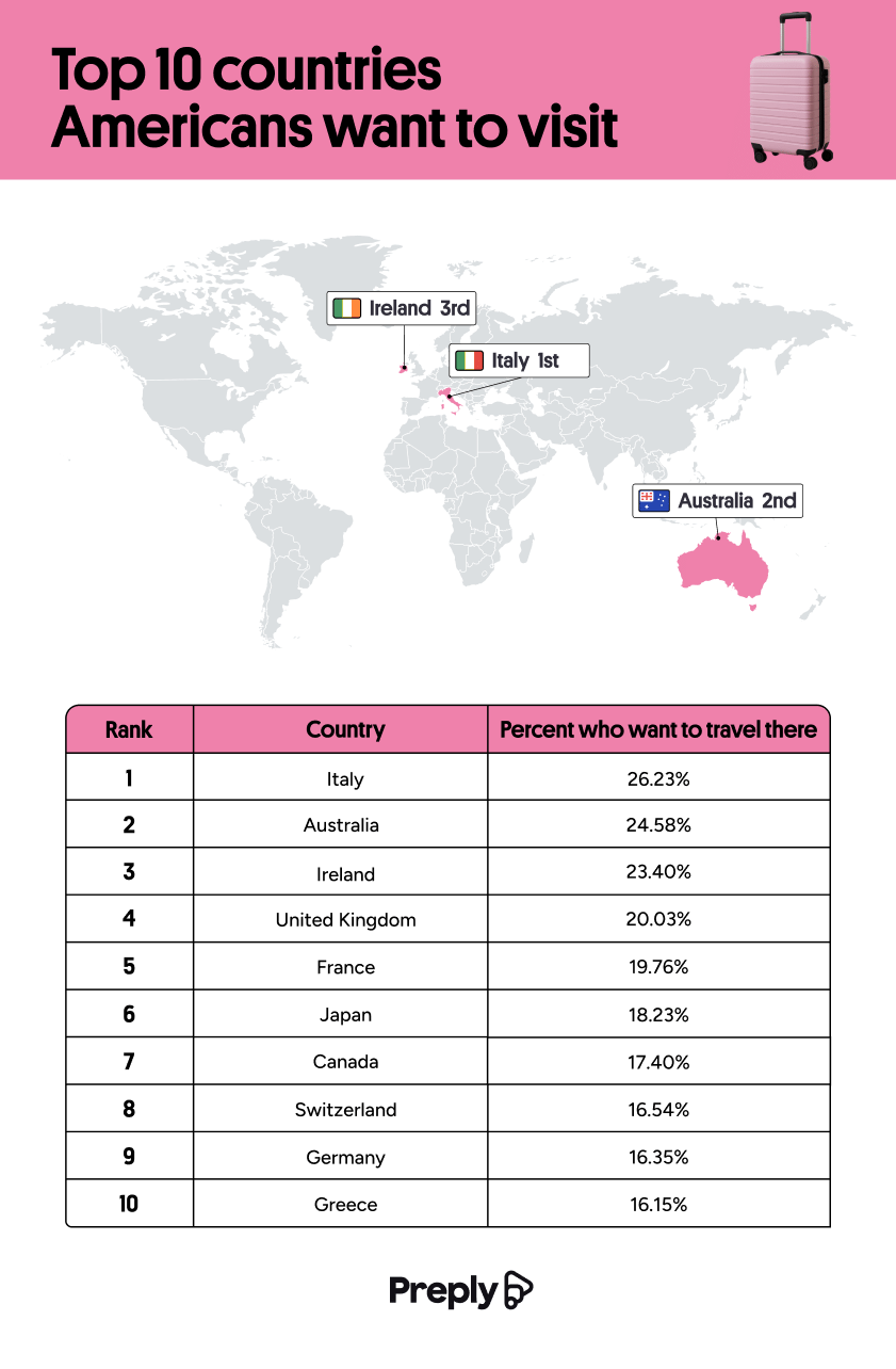 The second chart ranked where Americans would consider living. Australia and the UK tie at 20% of the answers, and Canada follows closely at 19%. Three of the top five travel destinations are largely English-speaking, and the relocation list you’ll note was entirely English-speaking.
Japan demonstrates this split dramatically. 18% of Americans would like to visit Japan, but only 10% would consider living there. Comfort clearly wins out over desire when it comes to relocation.
The demographic section shows even more interesting trends. Gen Z is nearly three times as likely as Boomers to want to visit Japan (24.4% versus 8.6%). They’re also more than twice as likely to consider living there (13.4% versus 5.3%). Ireland runs the opposite direction, with 26.2% of Boomers wishing to visit and only 9.8% of Gen Z. This is the biggest generational gap in the survey.
The pattern suggests that Boomers gravitate toward English-speaking destinations, while Gen Z showed stronger interest in places like Japan, Korea, Brazil, Colombia, and Thailand. Gender splits emerged too, with women favoring Italy, Ireland, and Greece, and men dreaming of Japan at 24% versus women’s 14%.
A horizontal bar graph ranks the barriers to visiting non-English-speaking destinations. 37% of Americans assume the native language is too difficult to learn. 35% believe English is understood well enough to get by without learning. 33% of respondents said they’re bad at learning languages, 32% cite lacking the time to learn, and 31% fear offending a native speaker by mistake. When ranking language intimidation by country, China led at 37%, Japan followed at 34%, then Korea at 24%, and Thailand at 13%.
A graphic on language faux pas showed that 35% of Americans point to menu items rather than attempting pronunciation, 23% speak louder and slower, and 17% buy American fast food for familiarity—only 15% attempt to mimic the local accent, which the Preply team gently discouraged.
The big takeaway seems to be that 45% of Americans would travel more if they spoke another language.
-
 Business Visualizations2 years ago
America’s Most Valuable Companies Ranked by Profit per Employee
-
 Business Visualizations2 years ago
The Biggest Fortune 500 Company in Every State
-
 Business Visualizations1 year ago
The Biggest Employers by Industry
-

 Charts2 years ago
Map Uncovers Countries with Most Powerful Passports
-
 Business Visualizations1 year ago
The Largest Companies in America That Are Still Run by the Person Who Founded Them
-
 Charts2 years ago
Study Highlights Disparity Between Homelessness Rates and Empty Housing
-
 Misc Visuals2 years ago
Exploring Science Fiction Technology That Became a Reality
-
 Charts1 year ago
New Study Reveals Details About American Intimacy