Timelines
New Timeline Shows Average Global Temperatures for Every Month From 1880 Through 2021
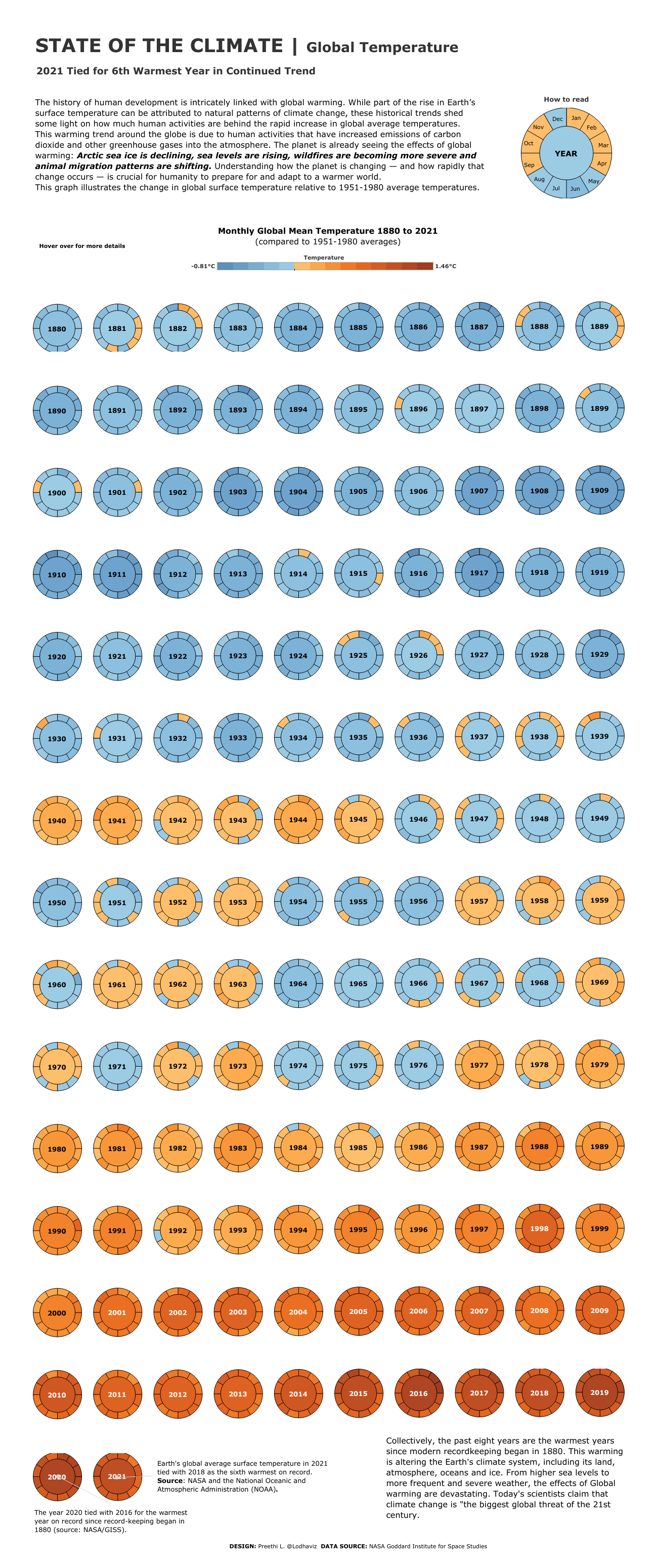
The subject of climate change is one that continues to be heavily debated, and with good reason. From the NASA Goddard Institute for Space Studies, here is a visual representation of the monthly global mean temperature, spanning from 1880 through 2021. The visual is laid out where the each year can be read as a clock, in terms of the months going clockwise, along with colors to indicate their average temperatures during those times of the year.
Did you know that since 1880, when modern record-keeping began, that the last eight years have been the warmest? Earth’s climate system is being altered by this consistent warming, and we’re seeing that the effects of Global Warming and becoming verse than ever before.
Climate change is will undoubtedly affect every country in the world, however it will hit some countries much harder than others. Six places from around the world that will prove to be especially vulnerable in regards to the impending impacts of climate change include Haiti, Nigeria, Yemen, Manila, Kiribati, and United Arab Emirates. They will all face changes for one reason or another, however all are scary.
In United Arab Emirates, for example, the sea levels have continued to race at an uncomfortable pace, and are at risk of facing water stress, which puts pressure on the UAE to spend much more energy and resources than they currently are on cooling.
According to the visual, and per NASA and the National Oceanic and Atmospheric Administration (NOAA), the global average surface temperature on Earth just last year in 2021 was tied with 2018 as being the sixth warmest year on record during that span. According to scientists around the globe today, the the climate change that we’re experiencing here on Earth is being referred to as “the biggest global threat of the 21st century.”
