Maps
Comparing Gun Friendliness in Each State to Their Firearm Homicide Rate
Guns have always been a topic of contention in America. Pro-gun roups constantly clash with gun-control advocates over second amendment rights. It is often at the forefront of political debate, Republicans typically being on the pro-gun side and Democrats being for stricter gun control. When there is a violent mass shooting or an uptick in gun violence in the United States, new gun control measures become a renewed topic of discussion on news programs. Many major federal gun control laws in the United States are the result of a violent firearm-related incident. Although there are several federal gun control laws, state gun laws can vary greatly. For example, you can openly carry a firearm with a license if you are in the state of Texas. In New York, you can only carry concealed with a license. NY state also prohibits any state resident without a NYS Pistol License from owning a handgun at all, but if you were a resident in South Carolina you could walk into a gun shop and walk out with a handgun without needing a license. It can be much easier or more difficult to obtain firearms depending on your geographic location.
But do a state’s gun control restrictions have any effect on the gun violence in that state?
This extensive map from Joslyn Law Firm called ‘Comparing Gun Control Measures to Gun-Related Homicides by State‘ is an excellent resource. They give each state a ‘gun friendliness score’ and the lower the score, the tougher the gun restrictions.
Click below to zoom

Below are the 10 states with the highest firearm homicide rates in the country along with their gun-friendliness scores:
- Louisiana: 11.0 (3)
- Mississippi: 10.2 (5)
- Alabama: 9.5 (4)
- Missouri: 8.5 (5)
- Maryland: 7.4 (1)
- South Carolina: 7.4 (3)
- Tennessee: 6.7 (4)
- Illinois: 6.5 (2)
- Arkansas: 6.2 (3)
- Georgia: 6.2 (4)
Business Visualizations
Study Examines Where People Think AI Will Improve Their Work Lives
AI is embedded in workplaces worldwide by this point, and yet workers’ feelings about it vary dramatically. A study by Qualtrics examined how geography was related to feelings about AI in the workplace. They found that only 37% of workers globally believed that AI would improve their jobs. That average hides a 45-point difference between the most optimistic country, which is China, and the most skeptical, Japan.
Click here to zoom.
Nearly 80% of global companies report using AI in some capacity, and research indicates productivity gains, with lower-skilled workers benefiting the most. Even if this is the case, employee sentiment isn’t nearly as unified. The numbers the team shows here indicate a healthy level of AI skepticism. In fact, more than half of workers think AI will improve their lives in just 6 out of 32 countries studied. That means there are more skeptics than people excited about what AI will bring to the workplace. But why does optimism cluster in some regions while most remain skeptical?
Here are a few of the countries where optimism runs high:
- China – 62% of workers are optimistic
- Indonesia – 59%
- Peru – 57%
- South Africa – 53%
- Thailand – 52%
There is a mid-tier region with fewer optimistic workers, but still a healthy percentage. This includes Mexico, Brazil, India, Colombia, and Malaysia. Many of these countries have developing economies or a heavy state investment in AI infrastructure, as is the case in China. Workers in these places view AI as a tool to close skill gaps, raise wages, and improve living standards. These regional differences are easy to spot thanks to the map Qualtrics created, which color codes the level of optimism/skepticism.
At the other end of the spectrum, we find the highest number of skeptics in Western Europe and English-speaking countries. Here are the countries with the least faith in AI:
- United States – 31% of workers are optimistic
- Australia – 29%
- Great Britain – 26%
- Canada – 24%
- Japan – 17%
- Poland – 21%
The media narratives in these countries frame AI as a risk of automation-driven job loss, which shapes people’s perceptions even when AI adoption in their workplaces is the same as in optimistic locations. These nations are the same that rank lowest on the belief that AI will improve the job market.
Economic research suggests that AI tends to reshuffle tasks within a role rather than eliminate that job outright. New skills will be required to work with AI, and some positions will shift, but historically, new digital tools have created more roles than they’ve erased. The gap between the hard data and public sentiment in skeptical countries is definitely worth examining and tells a story.
As AI rolls out unevenly across the world’s workforce, it’s important for employers to understand where their employees actually stand on the issue. Beyond regional stereotypes or headline-driven assumptions, employers must look at facts like the data presented here to make thoughtful AI adoption decisions.
Charts
The U.S. Cities Where Renting Means Bracing for a Move
Moving consistently ranks among life’s most stressful experiences, behind only divorce and the death of a loved one. This difficulty isn’t even distributed by location. Some cities make a renter’s move dramatically more difficult than others. Rove Lab’s analysis of 55 major U.S. metro areas, scored across 13 factors including population density, rental housing, transportation, and weather, shows which cities make moving a logistical nightmare.
Click below to zoom.
The New York-Newark-Jersey City metro area is the most difficult one to move from, with a score of 77.16. There are several reasons it’s so difficult. For one, it has the highest population density in the country, at 3,247.7 people per square mile. It also has the lowest renter turnover at 19.7%, indicating fierce competition for available units. 57.2% of rental properties are large buildings with more than 10 units, and the median building age is 65. This means these older buildings have narrow stairwells, slow elevators, and tight corners, a nightmare on moving day. On top of this, the transit density at peak hours is 212 vehicles per square mile. Trying to move out of an older building with narrow hallways, busy stairs and elevators, and limited street parking is truly challenging.
Move-in difficulty varies widely by city. Los Angeles isn’t the densest city, but it has the worst traffic congestion in the country, with 7 hours and 49 minutes of traffic per weekday, due to urban sprawl and car dependence in the region. Washington, D.C. has the oldest housing units, making it more challenging to navigate furniture on move-in day, especially in dense transit corridors. San Francisco and Chicago are mid-density metros with older buildings and a high number of large buildings with many units, driving up the scores. Boston and Seattle round out the top of the most difficult cities, thanks to lots of snow in Boston and tons of rainy days in Seattle, which make moving in more difficult.
Thankfully, the team’s data also shows that not every city is a move-in nightmare. Austin is a standout city with the highest renter turnover in the country. A pandemic-era construction boom created an oversupply of new, modern housing units, which led landlords to offer move-in incentives and upgrades. Fresno, Riverside-San Bernardino, and Birmingham all offer easier moves thanks to a low population density, newer rental stock, and less traffic. The weather’s role shouldn’t be overlooked. Rochester, Buffalo, and Pittsburgh all have lots of snowy and rainy days, which can really put a literal and figurative damper on moving day.
The Rove Lab team’s work reframes the question of which cities are best and worst to live in through a specific, practical lens. Your housing is one of the most important parts of your life in a new city, and finding the best rental and having a good move-in experience will set the tone for a new start. Wherever you’re headed, knowing what you’re walking into can help you have the best experience.
Business Visualizations
Find the Places in the U.S. Where People Are Most Eager to Find a Job
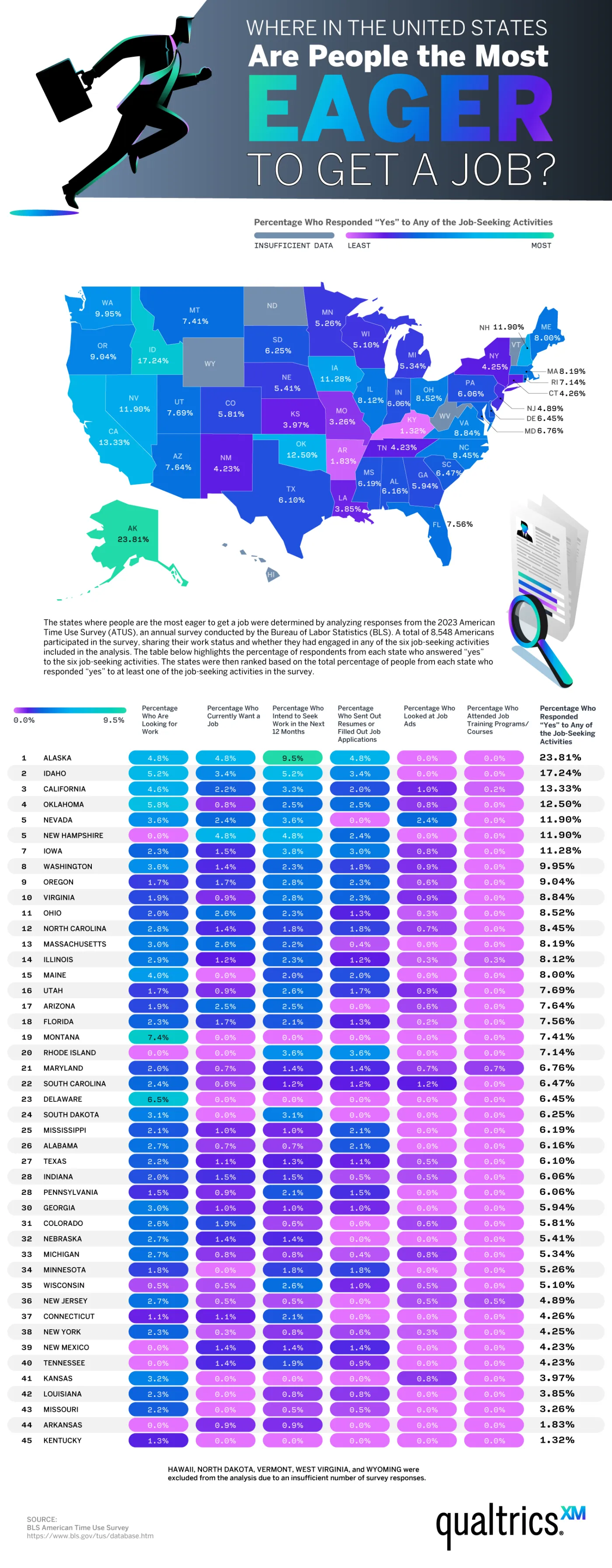
Job searching is stressful and the current employment market isn’t the strongest. The Bureau of Labor Statistics (BLS) says that the average job search lasts 23.3 weeks. That’s a long haul. The World Economic Forum does see the market becoming more dynamic soon with new and emerging job opportunities. Qualtrics added to this top with a new map showing where we’ll find the most active job seekers in the U.S. They drew on data from the BLS’s American Time Use Survey.
Click below to zoom.
The team’s main visual for their data is a color-coded map of the 50 states, ranked by the percentage of residents who reported engaging in job-seeking activities. These could include looking for work, wanting a job, submitting applications, intending to seek work soon, looking at job ads, or attending job training. Five states had to be excluded from the ranking because of insufficient survey data. This included Hawaii, Vermont, North Dakota, West Virginia, and Wyoming.
These states were found to have the most people wanting new jobs:
- Alaska — 23.81% (standout leader)
- Idaho — 17.24%
- California — 13.33%
- Oklahoma — 12.5%
- Nevada & New Hampshire — tied at 11.9%
- Iowa — 11.28%
- Washington — 9.95%
- Oregon — 9.04%
- Virginia — 8.84%
This list shows Western and Pacific states dominating the top. Alaska as a standout leader might come as a surprise because it’s not due to a job shortage. There is actually a workforce shortage in Alaska. In 2024, Alaska created 5,400 new jobs with more expected in 2025. $20 billion in infrastructure development is expected to generate 20,000 more jobs by 2030. So, Alaska’s high job-seeking activity reflects a growing, dynamic economy with ample room for pivots and career changes.
States with the lowest rankings were Kentucky (1.32%), Arkansas (1.83%), and Missouri (3.26%). These states may have lower unemployment rates, different market conditions, or demographic factors that influenced their ranking. The data make it clear that job-seeking activity varies widely by state, tied to local economic conditions, perhaps more so than national trends. Job seekers should take advantage of training programs, the federal jobs board, and role-specific job search sites. It also shows that securing talent is only one step toward building a loyal, long-term workforce. Only 42% of workers feel engaged, which is a major reason they may seek new jobs.
Beyond a snapshot of where Americans are currently looking for work, these data points to a bigger reality: labor-market “energy” is uneven, and high job-seeking activity can signal opportunity as much as instability. In states like Alaska, movement may reflect an expanding, restructuring economy in which workers feel empowered (or required) to pivot as new roles and industries emerge. For job seekers, the practical takeaway is to align search strategy with local conditions. Prioritize skills-building and credentials that travel across employers, use targeted boards and training pipelines, and treat mobility as a long-term advantage rather than a short-term disruption. Organizations and individuals that read these regional signals early and invest accordingly will be best positioned to thrive as the economy continues to evolve.
-

 Business Visualizations2 years ago
Everything Owned by Apple
-

 Business Visualizations2 years ago
America’s Most Valuable Companies Ranked by Profit per Employee
-

 Business Visualizations1 year ago
The Biggest Fortune 500 Company in Every State
-

 Business Visualizations12 months ago
The Biggest Employers by Industry
-

 Timelines2 years ago
Timeline Charts the Development of Communications Technology
-

 Business Visualizations7 months ago
The Largest Companies in America That Are Still Run by the Person Who Founded Them
-

 Maps2 years ago
A Map to Gold and Silver
-

 Timelines2 years ago
The Evolution of Baby Names: A Century of Trends


