
Business Visualizations
30 Statistics That Show the Alarming Reality of Data Breaches

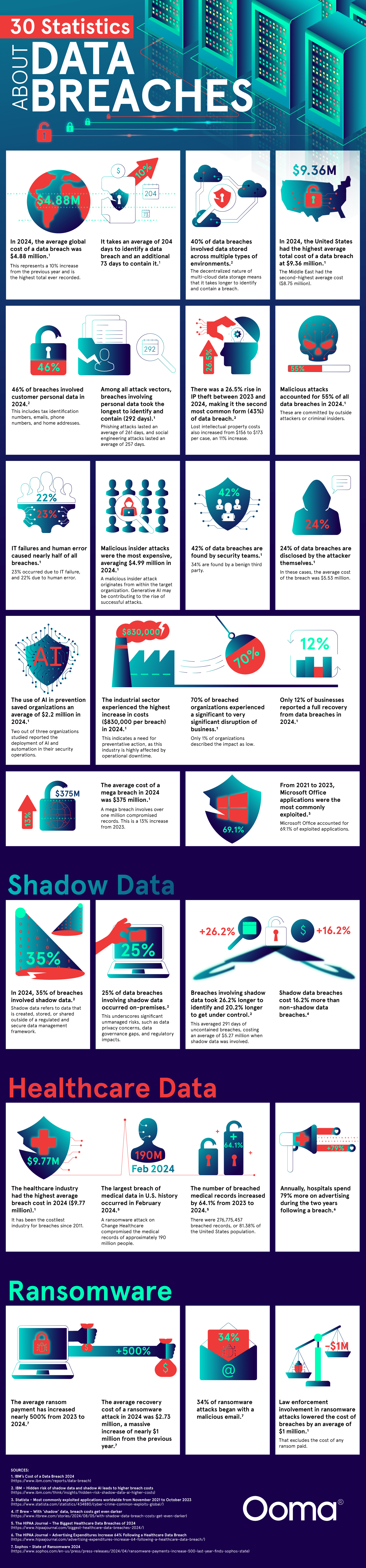
Ooma’s new infographic shows that data breaches are a huge concern and much more common than we would like to think. Their new graphic offers 30 statistic-based facts that show us the harsh reality. Companies have limited time to react to data breaches before they hit the news cycle, and software developers have to stay on their toes to prevent security threats. Data breaches hand over customer contact details, proprietary software, and employee information to bad actors, so taking these threats seriously is of the utmost importance.
Click below to zoom.
Record High Levels of Financial Damage
The financial stakes of data breaches have never been higher. The data shows that in 2024, the average global cost of a data breach reached an all-time high of $4.88 million, a 10% increase. On average, American organizations bear the highest costs, at $9.36 million per breach. The U.S. healthcare industry is hit the hardest, with average data breach costs around $9.77 million.
Mega breaches incur the highest costs and the most damage. A mega breach involves over a million records and costs an enormous $375 million to rectify. The largest data breach was the Change Healthcare attack in February 2024, which exposed 190 million medical records and caused over $2 billion in damages. This was the largest medical data breach in American history.
Human Error Leads to Cyberattacks
55% of all data breaches are malicious attacks, with the remaining attacks split between human error and system failures. This shows that nearly half of breaches are due to internal vulnerabilities instead of being caused by the power of a sophisticated external attack. Out of all applications, Microsoft Office suffers 69.1% of cyberattacks, which means that everyday office tools can become a major target, taking advantage of employee vulnerability.
When someone inside an organization leads the attack, the expenses are highest, averaging $4.99 million. Ransomware is still a big danger, with the costs of attacks increasing by 500% between 2023 and 2024 and the average recovery cost around $2.73 million.
Delays in Detection and Containment
The amount of time it takes for organizations to detect a data breach is a bit shocking. It takes an average of 204 days to discover the breach and then another 73 days to contain it. That’s a nearly 10-month data exposure window. Most distressing is the fact that personal data breaches take the longest to detect and contain – an average of 292 days.
Recovery and Data Breach Prevention
The aftermath of a data breach remains a big challenge. Only 12% of businesses report making a full financial recovery after the breach. 70% of breached organizations have significant disruptions to business, and only 1% describe the breach as low-impact. Healthcare businesses have the longest-lasting effects with major damage to their reputation. They need to spend 79% more on marketing for the two years following a data breach. Strategic investments in cybersecurity offer stronger protection, and using AI in security operations can save around $2.2 million. Overall, this graphic emphasizes the importance of investing in strong cybersecurity.
As new technologies transform industries and create new skills demand, this analysis from Altium ranks states by how well their workforces are positioned to meet the future and a changing economy. The article, graphs, and maps show that tech readiness doesn’t always match a high-tech reputation.
Click below to zoom.
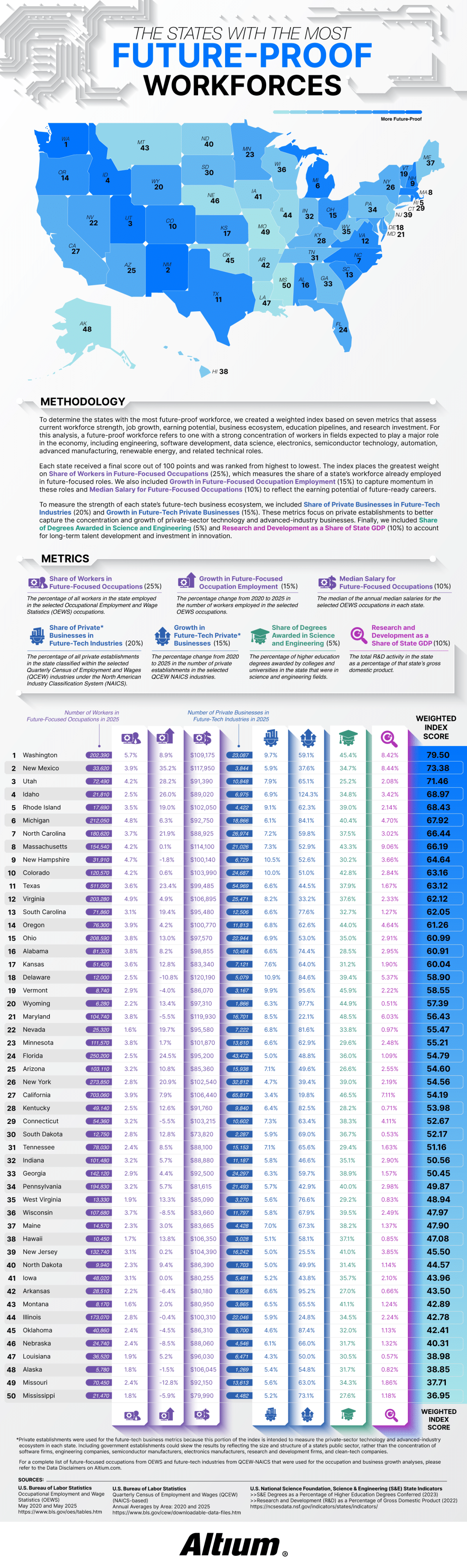
Altium defined a future-proof workforce as one with a large share of workers in fields expected to drive economic growth over the next few decades. The study tracked 30 occupations using data from the Bureau of Labor Statistics, including electrical and computer hardware engineers, software developers, data scientists, solar installers, semiconductor processing technicians, CNC programmers, and wind turbine technicians. The team considered 27 “future-tech” industries from aerospace to renewable energy to semiconductor manufacturing and R&D services.
Each state received a score out of 100 based on seven weighted metrics. The largest factor at 25% was the share of workers already employed in future-focused positions. The share of private businesses in future-tech industries was worth 20%. Employment growth and business growth from 2020 to 2025 counted for 15%. Median salary and research and development as a share of state GDP each accounted for 10%, and the share of science and engineering degrees made up the final 5%.
Washington took first place with a score of 79.50. Nearly 6% of the workforce there holds future-focused jobs and earns a median salary of $109,175. Washington’s future-tech businesses grew 59.1% over five years. The article credits the state’s concentration of software and aerospace employers, noting that Washington leads the nation in aerospace sales, exports, and employment.
The runner-up is more surprising! New Mexico ranked second, thanks to its 35.2% growth in future-focused employment. That’s the fastest growth rate in the country. Thanks to national laboratories and an expanding aerospace sector, it has one of the highest median salaries in the study at $117,950. Utah, Idaho, and Rhode Island round out the top five rankings. Idaho stood out for business expansion, with future-tech businesses growing by an eyebrow-raising 124.3%.
The study’s most confusing findings relate to California. The state employs 703,060 people in future-focused occupations, more than any other state, yet it only ranks at #27. Although California is strong in engineering education and R$D investment, future-tech industries make up only 3.4% of its private businesses. Its five-year business growth rate of 19.8% is the lowest in the nation.
Smaller states benefited when technology made up a larger slice of their economies. Rhode Island’s future-tech businesses represent 9.1% of its private sector and grew 62.3%. New Hampshire ranked ninth with the highest future-tech business share in the top ten at 10.5%. Rounding out the top ten were Michigan, North Carolina, Massachusetts, and Colorado.
Mississippi finished last with a score of 36.95, followed by Missouri, Alaska, Louisiana, and Nebraska. Several of these states saw a decline in future-focused occupations. The key takeaway is that a state’s headcount or Silicon Valley reputation alone doesn’t define its readiness for the future. A growing technical workforce and a dense base of tech businesses best position a state for the future.

Moving into a first apartment is a rite of passage, but the math behind making it a reality is becoming a bigger obstacle. The metros with the strongest job markets also have the steepest living costs, and over the past few years, rent in these areas has climbed faster than paychecks. Cheap rent isn’t the only solution, though. Thin wages and flat hiring shut young people out of many cities.
Rove Lab’s new analysis identifies the cities in the middle ground with the most to offer young people establishing their lives. The study examined the 100 most populous U.S. metro areas and scored each one on 10 different metrics grouped into three weighted categories.
Click below to zoom.
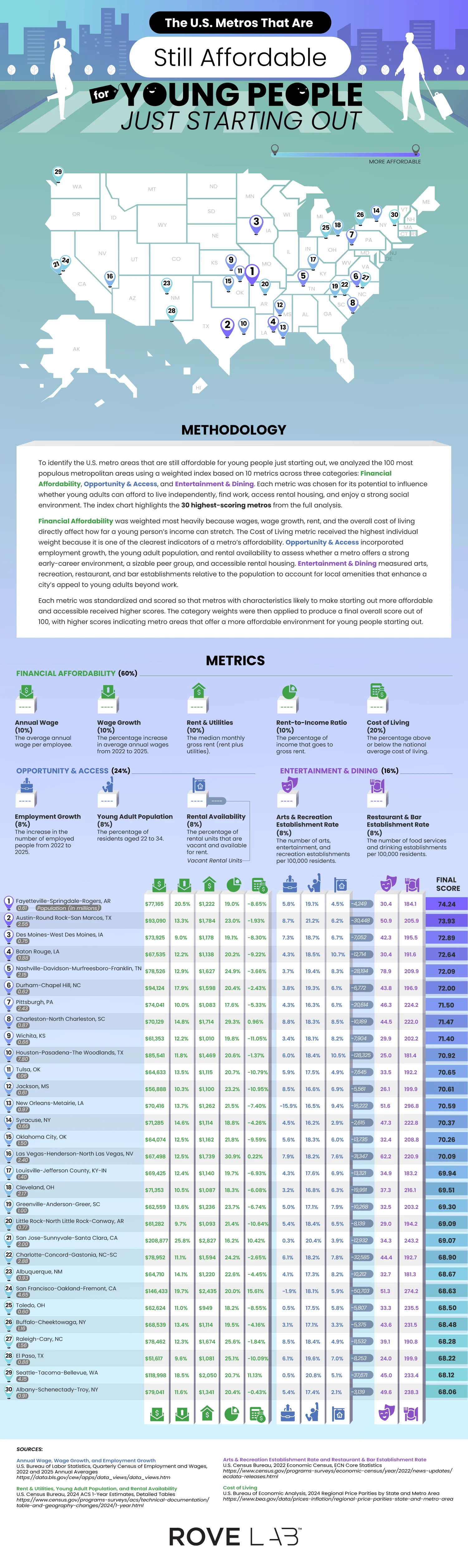
Financial affordability was the most important category, carrying 60% of the weight. This category covers average annual wage, wage growth, median rent and utility costs, rent-to-income ratio, and cost of living relative to the national average. Cost of living alone received 20% of the weight, the heaviest single metric in the study. Opportunity and access accounted for 24% and included employment growth, number of residents between 22 and 34, and amount of rental vacancy. The final 16% went to entertainment and dining, tracking the number of arts and recreation venues and restaurants and bars per 100,000 residents. Each metric was standardized, scored, and weighted into a final number out of 100.
The winning city was Fayetteville-Springdale-Rogers, Arkansas, with a score of 74.24. This isn’t an obvious winner until you look at the numbers. Wages increased by 20.5% from 2022 to 2025, with the average wage at $77,165 and a cost of living that’s 8.65% below the national average. This combination creates a rent-to-income ratio of 19%, leaving young people with money to save, potentially for the elusive dream of homeownership. Fortune 500 companies, Walmart, J.B. Hunt, and Tyson, have a home in the area and likely explain wage strength.
Austin-Round Rock-San Marcos followed with a 73.93 score, driven by a thriving tech sector that’s seen 8.7% employment growth, and the area offers 30,000 vacant rental units for newcomers. Des Moines, Baton Rouge, and Nashville round out the top five.
A few cities earned high rankings thanks to low housing costs. Pittsburgh was seventh overall with a rent-to-income ratio of 17.6%. Wichita, ranked ninth, has low rent and utilities and a low cost of living that’s 11.05% below average. Toledo, number 25 on the list, has the cheapest housing of all cities on the list, with an average of $949 a month.
The most surprising cities on the list are Californian. San Jose-Sunnyvale-Santa Clara ranks 21st, and San Francisco-Oakland-Fremont lands 24th, despite costs of living well above the national average. Salaries do the heavy lifting, averaging $208,877 and $146,433, respectively. This pulls down San Jose’s rent-to-income ratio to 16.2%, the lowest on the list.
If you were to ask the average American on the street to name the industries that power the national economy, they’ll likely reply “manufacturing” or “tech.” But the Bureau of Economic Analysis says otherwise. As Ooma’s study shows, real estate, rental, and leasing hold the biggest slice of the U.S. economy.
In 2024, the U.S. produced more than $29 trillion in economic output, which outstripped Germany, China, and Japan combined. Looking at how gross domestic product (GDP) breaks down by industry shows the value added by sector after subtracting the costs of the inputs that industry consumed. For example, a carmaker buys steel, rubber, and semiconductors. The value added is the difference between those purchases and the selling price of the finished car. Add up that gap, the value added across every industry in the country, and you arrive at the GDP.
Click below to zoom.
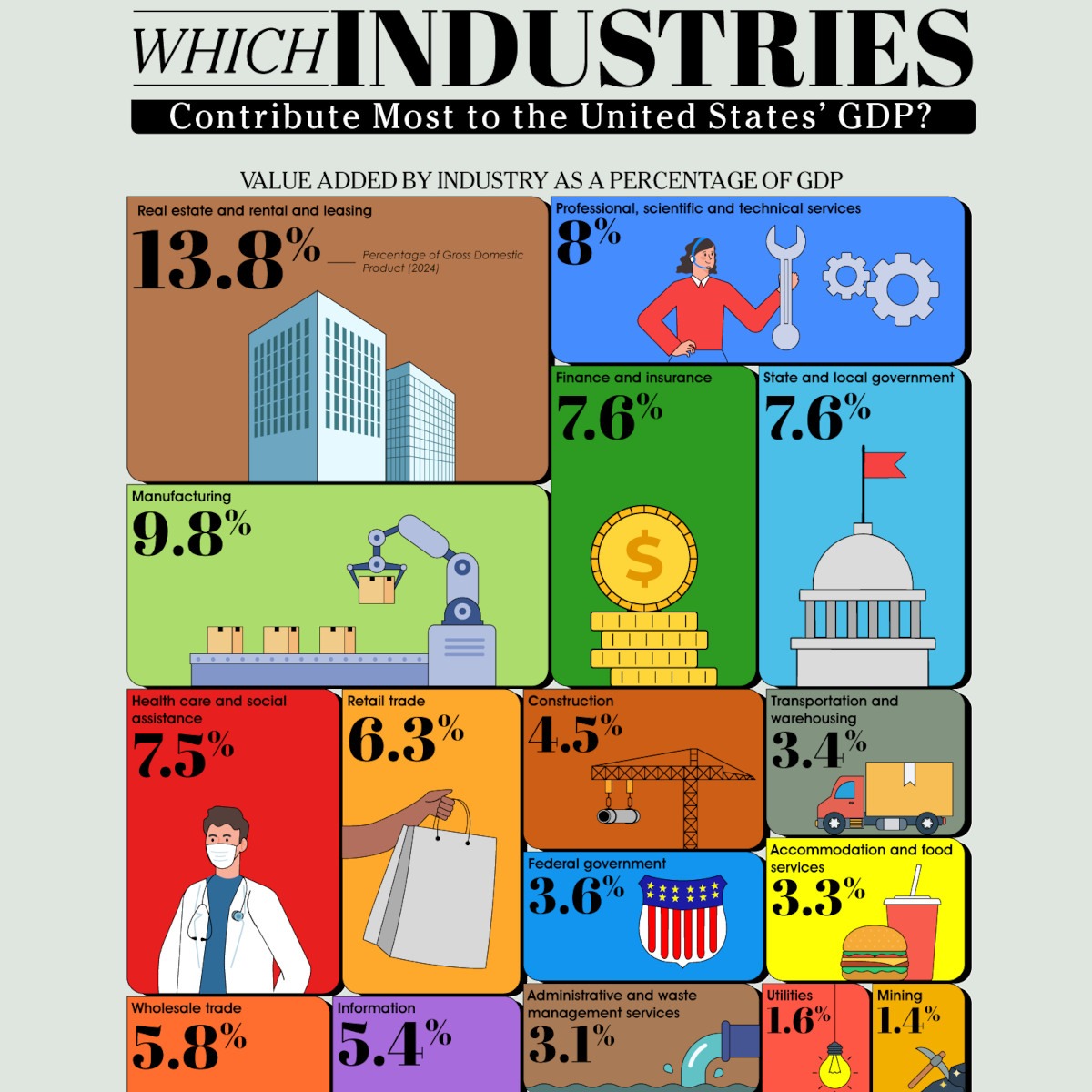
When Ooma ranked industries by their GDP, they found out that the money is concentrated in these industries:
Real estate, rental, and leasing – 13.8%: Real estate alone accounted for $3.68 trillion, the biggest of any sub-industry in the economy. Every mortgage payment, property tax bill, apartment lease, and commercial rent check pours into this sector. Rising home ownership costs over the past decade have pushed more citizens into renting, which has only inflated this industry.
Manufacturing – 9.8%: Factory employment has fallen for forty years due to automation and offshoring, but output hasn’t fallen. Chemical products created $554 billion, and computer and electronic products contributed $299.8 billion to the U.S. economy, helping keep the nation among the world’s top manufacturing nations despite a smaller workforce.
Professional, scientific, and technical services – 8.0%: This industry is made up of law firms, consultancies, engineering firms, and software developers. Legal services alone created $387.7 billion, and computer systems design added $552.2 billion to the American economy. This strongly shows how the American economy leans toward knowledge work.
Finance and insurance – 7.6%: Credit intermediation and Federal Reserve banks generated $1.01 trillion, insurance carriers contributed $791.8 billion, and securities and commodity contracts brought in $396.1 billion.
State and local government – 7.6%: Many rankings leave out these sectors, but government at the state and local level added $2.07 trillion, second only to real estate among all the sub-industries.
Health care and social assistance – 7.5%: Ambulatory care brought in $1.08 trillion and hospitals contributed $691.5 billion. This reflects genuine demand from an aging population and the fact that the U.S. spends more per capita on healthcare than any other developed nation.
Below these top-tier industries, retail trade, wholesale trade, information (Google, Meta, cloud providers, telecom), data processing, and internet publishing followed. Construction closed out the top ten industries at 4.5%, rising and falling in contributions with the real estate sector.
The largest components of American GDP aren’t the ones that produce a physical product. They’re the industries that manage property, deliver care, sell expertise, and move money.
-
 Business Visualizations2 years ago
America’s Most Valuable Companies Ranked by Profit per Employee
-
 Business Visualizations2 years ago
The Biggest Fortune 500 Company in Every State
-
 Business Visualizations1 year ago
The Biggest Employers by Industry
-

 Charts2 years ago
Map Uncovers Countries with Most Powerful Passports
-
 Business Visualizations1 year ago
The Largest Companies in America That Are Still Run by the Person Who Founded Them
-

 Charts2 years ago
Study Highlights Disparity Between Homelessness Rates and Empty Housing
-

 Misc Visuals2 years ago
Exploring Science Fiction Technology That Became a Reality
-

 Charts1 year ago
New Study Reveals Details About American Intimacy