Business Visualizations
Popular Chip Brands Ranked by the Percentage of Air in Their Bags
When shopping, there’s actually quite a bit of misleading packaging out there that you need to be careful of. When it comes to snacks, you’ve surely noticed that when you open the bag or canister of tasty chips, the packages aren’t always exactly full.
Here’s a look at several popular brands of potato chips, and how much “air” is typically in each package. The reason for this is a process called “slack fill,” which some even think makes the snacks have a better taste. By allowing this space in the packaging, the package is better protected from damage during transit, according to manufacturers.
Based on this, a bag of Cheetos has the most air at 59%. The lowest shown here would be Fritos at 19%.
This pictorial fraction chart visualization was created by Reddit user /u/doughilarious and was originally shared in the /r/DataisBeautiful Subreddit.
Click below to zoom
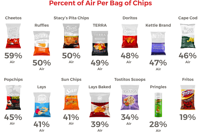
Here’s how they break down as far as air in the bag goes:
- Cheetos: 59% air
- Ruffles: 50% air
- Stacy’s Pita Chips: 50% air
- TERRA: 49% air
- Doritos: 48% air
- Kettle Brand: 47% air
- Cape Cod: 46% air
- Popchips: 45% air
- Lays: 41% air
- Sun Chips: 41% air
- Lays Baked: 39% air
- Tostitos Scoops: 34% air
- Pringles: 28% air
- Fritos: 19% air
By putting this extra space in the bag, chips are given a longer shelf life, moisture is kept away, and it keeps the chips whole. Keeping the moisture away is incredibly important, because it allows the snacks to stay nice and tasty until you’re ready to eat them.
The prices on these different brands can vary as well, so where are you really getting the best bang for your buck when it comes to potato chips? What do you think?
Business Visualizations
Chart Tracks E-Commerce Brands with the Biggest Gains and Losses
Online shopping, known as e-commerce, took the shopping world by storm. Today, one-fifth of all retail sales come from e-commerce. Economists predict e-commerce will only continue to grow in the coming years. This industry can be lucrative but not without risks. The competition is tight as the team at LLCAttorney proves with this chart tracking the e-commerce brands with the biggest gains and losses. The results show the shifting e-commerce landscape and just how much of a difference there is between leading retailers and struggling brands.
Click below to zoom.
As we would expect from this global-dominant brand, Amazon leads the e-commerce industry with the biggest gains. In 2025, Amazon’s revenue amounted to a whopping $95.22 billion. Ever since Amazon debuted as a bookseller in 1994, it has had a meteoric rise, earning more each year. The biggest leap in the company’s earnings occurred between 2017 and 2018, with a 172.8% increase. Amazon only suffered one year in the red after it invested heavily in Rivian, a failed electric vehicle venture. Amazon’s massive catalog of over 12 million products, its entertainment subscription services, digital books, and convenient, fast delivery service make Amazon the powerhouse it is today.
Right behind Amazon, we find the Chinese brand, Alibaba, which earned $21.76 billion in 2025. Alibaba sells a wide range of products at wholesale prices. You’ll find electronics, home goods, beauty products, and even industrial supplies in their offerings. Alibaba’s business-to-business marketplace, which connects small and mid-size businesses directly to manufacturers, allows them to source bulk goods and makes this brand a popular choice. Other Chinese brands top the e-commerce earnings list too, like PDD Holdings (Pinduoduo) and Jingdong Mall (JD.com). Each of the top four e-commerce companies earned over 5 billion in revenue.
Turning to the other end of the chart, we find the brand with the most losses in 2025: Lightspeed POS. They reported a devastating $670 million loss. They earned $1.15 billion, but it wasn’t enough to cover their expenses. This Canadian e-commerce brand is a point-of-sale system for retailers and restaurants. It was once considered a promising company with rapid growth, but its revenue has shrunk significantly in the past few years as competitors have taken bites out of Lightspeed POS’s market. The British brand, ASOS, a clothing retailer, also suffered a massive $500 billlion loss in 2025. American brand Wayfair suffered losses, too, which is surprising considering its past popularity as an affordable home goods retailer with a big selection.
The figures we see here demonstrate that e-commerce is an industry with diverse companies and varying success rates. With tremendous gains and equally earth-shattering losses, we can see e-commerce is volatile, competitive, full of opportunities and challenges alike. The team’s data show that the industry’s biggest giants will be difficult to surpass. Companies like Amazon have set an astronomically high bar for success.
Business Visualizations
Map Displays Unemployment Rates Around the World
The unemployment rate is a percentage that reflects the number of people in the labor force who are without a job. This is calculated by dividing the number of unemployed people by the labor force and multiplying by 100. Because unemployment can have a drastic impact on a nation’s economy, the team at Qualtrics examined global patterns and mapped unemployment rates. To be considered unemployed for this study means a person doesn’t have a job but is available for work. That means people who are retired, disabled, or laid off don’t count in the figures.
Click below to zoom.
According to the team’s data, the country with the highest employment rate is Eswatini at 37.64%. This is a landlocked nation in Southern Africa, formerly known as Swaziland. This is one of the world’s last absolute monarchies, and it suffers economically like many of its neighbors, including South Africa, Botswana, and the Republic of the Congo. In particular, the youth of Eswatini are unemployed. The unemployment crisis is attributed to skill gaps in eligible workers.
It’s good to be at the low end of the unemployment spectrum. The nation Qatar has the lowest unemployment rate in the world at .13%. This comes as no surprise from a nation rich in petroleum and natural gas. Qatar has valuable real estate and has long been a haven for the wealthy, which lends itself to a booming economy with plenty of employment opportunities. Other nations that aren’t struggling with unemployment are Cambodia, Niger, and Thailand, due to high manufacturing production and/or a bustling tourism industry.
These countries have the lowest unemployment rates:
- Qatar
- Cambodia
- Niger
- Thailand
- Burundi
- Chad
- Bahrain
- Cuba
- Laos
- Benin
We see a very wide gap between the countries with the highest and lowest unemployment rates. Many factors can affect unemployment, but one of the biggest is changes in the size of the labor force. A struggling economy doesn’t necessarily indicate a high unemployment rate. If it’s difficult enough to find a job, people will give up, and they’ll no longer be counted in the unemployment numbers. That said, the unemployment rate does tend to increase in hard times. Global unemployment peaked in 2009 during the financial crisis.
In summary, unemployment rates reveal much about the economic health and social dynamics of countries worldwide. While nations like Eswatini face challenges due to skill gaps and limited job opportunities, others, such as Qatar, benefit from abundant resources and thriving industries. The disparity highlights how factors such as labor force size, economic stability, and industry growth affect employment levels. Understanding these global patterns is essential for policymakers and organizations aiming to address unemployment and foster sustainable growth. By analyzing the causes and consequences, we can better support individuals and communities striving for economic security and opportunity.
Business Visualizations
Key Statistics Help Us Understand Customer Churn
Customers have an abundance of choice in all industries these days. When customers switch to a new option, companies call this “customer churn.” Customer churn can be a major detriment to business. In nearly every industry, loyal repeat customers can make or break a business. The team at Qualtrics helps us understand the state of customer churn in the past year with 30 key statistics illustrating the landscape. They took a well-rounded approach to their research, using facts that reveal how many customers are leaving, which industries have high churn, and other factors that help us understand why customer churn happens and how to prevent it.
Click below to zoom.
Customer churn gives businesses a way to quantify how well they’re retaining customers. Churn rate is calculated by dividing the number of customers lost over a set period of time by the total number of customers at the start of that period. This calculation yields the number of customers who didn’t return to do business. High churn rates often signal poor retention strategies or a mismatch between what customers expected and received. We can’t underestimate competitor appeal, though. The team’s data shows that 71% of businesses list price increases as their number one reason for losing customers.
The data make it clear that churn rates vary widely across industries. 61% of retail companies say churn rates are one of the biggest challenges in their quest for success. This could be due to the high level of competition and vastly different prices found in the retail sector. Financial, cable, and credit companies experience high churn rates too, around 25%. We can conclude that spending and saving may have the greatest impact on churn, based on industry rates. The big-box electronics industry only has an 11% churn rate, possibly due to fewer choices, but it may have stronger brand loyalty. For example, you’ll rarely see an X-Box fan make the switch to PlayStation. Speaking of the gaming space, apps don’t enjoy the same low churn rate as consoles might. With a 27.7% churn rate, many people give up on gaming apps and try something new after 30 days.
Data might point the way to solutions to reduce customer churn. We can see subscription-based companies with an exceptionally low churn rate of 3.27%. Software and business subscriptions have lower churn rates than digital media and entertainment subscriptions, but they are still among the lowest we’re seeing. A subscription-based service works hard to keep its subscribers, so maybe other types of businesses could learn something from its strategies. For example, social media apps have an enormous churn rate of 93.3% over 24 months. It’s clear that whatever value customers hoped to get from the platform didn’t materialize.
This information-rich graphic leaves us with a lot to think about. By comparing churn rates across industries, we can reflect on key differences that affect these numbers. Perhaps the most important statistic to hold on to is that U.S. companies could save over $35 billion per year by reducing their churn rates.
-

 Business Visualizations2 years ago
Everything Owned by Apple
-
 Business Visualizations1 year ago
America’s Most Valuable Companies Ranked by Profit per Employee
-
 Business Visualizations1 year ago
The Biggest Fortune 500 Company in Every State
-

 Business Visualizations12 months ago
The Biggest Employers by Industry
-

 Timelines2 years ago
Timeline Charts the Development of Communications Technology
-

 Business Visualizations7 months ago
The Largest Companies in America That Are Still Run by the Person Who Founded Them
-
 Maps2 years ago
A Map to Gold and Silver
-
 Timelines2 years ago
The Evolution of Baby Names: A Century of Trends


