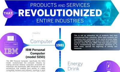
Charts
Study Analyzes Kindergarten Measles Vaccination Gaps Across America
As of April 2025, there have been 16 measles outbreaks in the United States, a number that has jumped significantly over the past few years. A new study from PA Requirements shows this has a connection to vaccination gaps. Kindergarten vaccinations help protect citizens against diseases like measles and contribute to our population achieving herd immunity, which eradicates the threat of the disease. However, the team’s study reveals that a combination of policy, vaccine access, and community factors is hindering our progress toward this goal.
Click below to zoom.
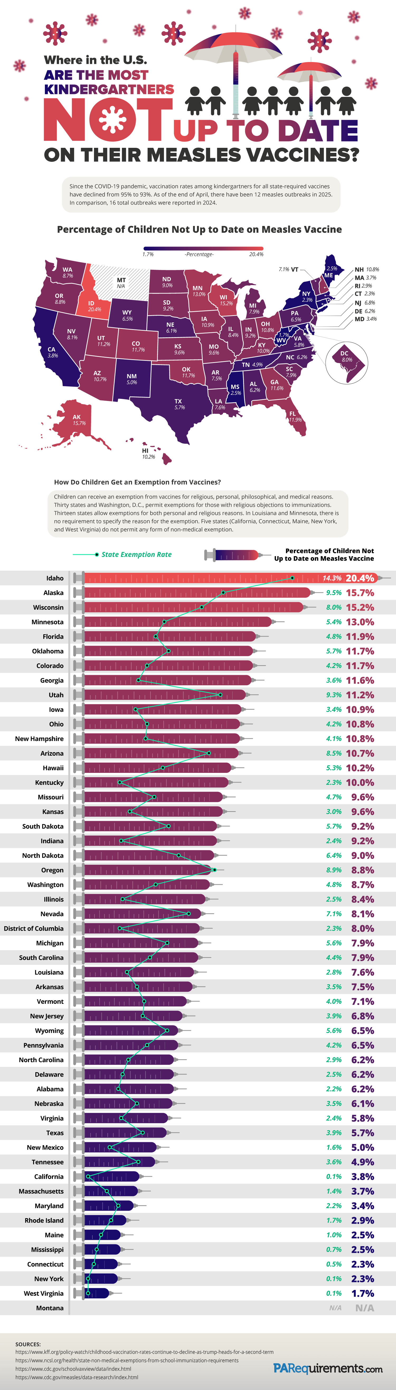
The team found that these states had the highest percentage of children not vaccinated for measles:
- Idaho: 20.4%
- Alaska: 15.7%
- Wisconsin: 15.2%
- Minnesota: 13.0%
- Florida: 11.9%
- Oklahoma: 11.7%
- Colorado: 11.7%
- Utah: 11.2%
- Iowa: 10.9%
- Ohio: 10.8%
It can be useful to compare these numbers to the states with the lowest rates of unvaccinated children:
- West Virginia: 1.7%
- New York: 2.3%
- Connecticut: 2.3%
- Mississippi: 2.5%
- Maine: 2.5%
- Rhode Island: 2.9%
- Maryland: 3.4%
- Massachusetts: 3.7%
- California: 3.8%
We can observe some interesting regional patterns by examining the map, such as lower vaccination rates in the Midwest and Southwest.
Among the states with high rates of vaccination, we find that these five states don’t allow non-medical vaccination exemptions: Maine, New York, West Virginia, Connecticut, and California. It’s no surprise that stricter policies lead to a greater number of vaccinations. Among states with lower rates, we find more relaxed laws that allow for greater exemptions on the basis of religion, philosophy, and other personal reasons. Comparing each state to its neighbors reveals patterns and trends that might imply cultural differences affecting vaccination rates in different regions. We can look for locations with a high prevalence of religions that outlaw vaccines to identify reasons for the numbers on the map. Check the numbers on the states with the largest cities, and you might find stricter vaccination laws there to help prevent disease spread in population-dense areas.
There’s no doubt that state policies correlate directly with vaccination rates when we look at the numbers presented on the team’s graphic. Many states require certain vaccinations, like measles, in order to enroll in public school. These laws and requirements also directly impact vaccination rates. Looking at insurance costs and access to vaccine clinics in rural areas may also reveal why some areas have more unvaccinated children than others. Some states have created initiatives to encourage vaccination and provide education, leading to higher vaccination rates.
Overall, studies like these greatly benefit public health by increasing awareness and education about diseases like measles. People who shy away from vaccines often find them untrustworthy. The only way to convince them otherwise is to answer their questions and present them with transparent data that’s easy to understand, just like the information shown in this graphic, regarding the risks associated with declining vaccines. These studies provide policymakers, parents, and public health officials with more information to make informed decisions for the health of their children and communities.
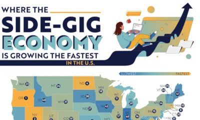


A new study by LLC Attorney examines the booming side-gig economy across the United States, identifying which states have seen the largest increases in freelance work and why. The piece introduces us to an expanding “Gig Economy” driven by apps and services like Uber, DoorDash, and Fiverr. These apps have made on-demand work accessible on a wide scale. While the side-gig economy is growing overall, the team shows that growth isn’t evenly distributed. Some states have far more gig workers than others.
Click below to zoom.
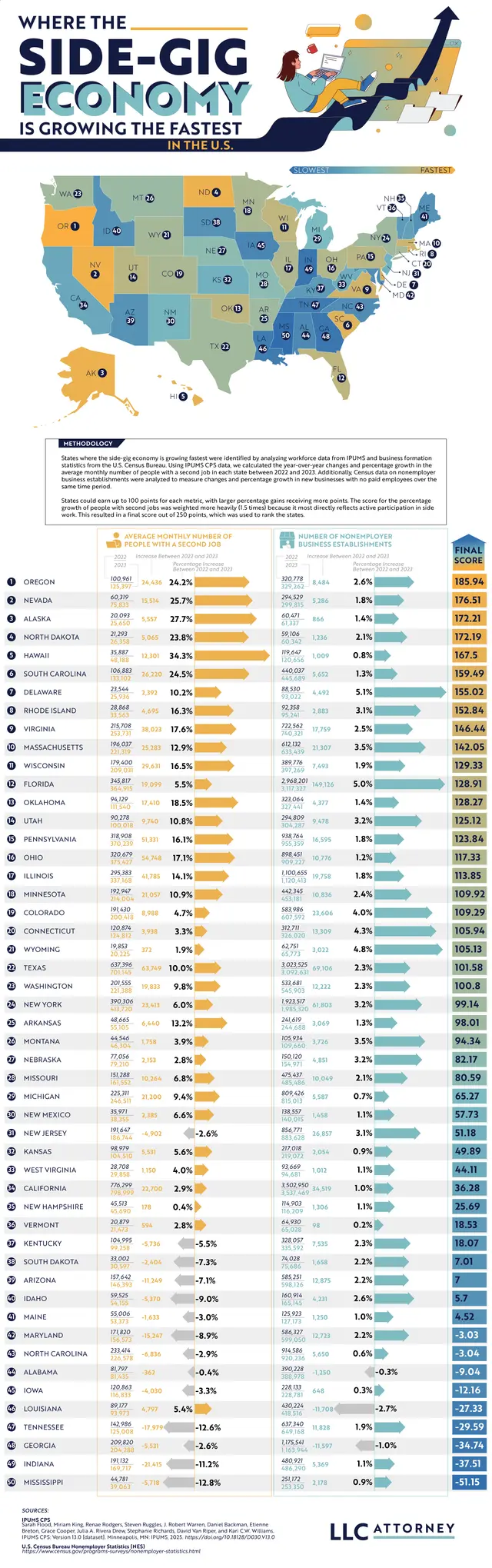
To get the data needed to create the map, the team analyzed year-over-year changes in the average monthly number of people holding a second side gig job and the growth of non-employer business establishments. Drawing on data from IPUMS CPS and the U.S. Census Bureau, the team created a color-coded map.
The top five states show us an interesting geographic picture. Oregon claimed the number one spot with a 24.2% rise in the average monthly number of people working a second gig job. Oregon has the highest number of gig workers in general. Nevada had one of the largest increases, at 25.7%, thanks to its tourism-heavy economy, which naturally generates demand for ride-sharing, Airbnb, and delivery services. Alaska takes third place, despite its smaller population. It had a 27.7% increase, while North Dakota follows in fourth with a 23.8% rise. Hawaii rounds up the top five with a huge 34.3% jump in residents working two jobs between 2022 and 2023.
These specific states lead the way because of two recurring issues. High costs of living, with rising costs of food, healthcare, and housing outpacing wage growth in these regions, lead more people to take on second jobs out of necessity. Hawaii has steep grocery and housing costs; Oregon and Nevada face similar cost-of-living issues.
These top-ranking states might appear to be thriving if we look at the Gig Economy numbers, but they have less diverse job markets, often relying on tourism. These seasonal and unpredictable jobs lead workers to seek ways to diversify their income.
The top ten states with the biggest gig economies are:
- Oregon
- Nevada
- Alaska
- North Dakota
- Hawaii
- South Carolina
- Delaware
- Rhode Island
- Virginia
- Massachusetts
Gig work can be convenient and a big asset to small business owners, but it also has downsides. Gig roles rarely include health insurance or benefits, income tends to be inconsistent, and the work is for people who don’t mind flying solo without coworker interaction. It does support independence and a flexible work schedule for people who value those qualities.
This map helps us understand the lasting changes the gig economy has had on the American economy. Side gig trends reflect how workers respond to economic changes, whether they face setbacks or opportunities. Side gigs create a fairly straightforward, low-effort way to make money, but they also drive steeper competition for jobs. Visualizing data can help us understand what drives economies and helps gig workers decide what opportunities will help them grow.
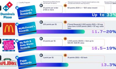
Most of us get tired of brands asking for our phone numbers and email addresses because we’re spammed with too many advertisements. But sometimes, providing your contact information will connect you with a brand’s loyalty program, which can offer discounts, free prizes, and cash back. One in ten companies has a loyalty rewards program, so the team at Qualtrics decided to analyze which one gives you the biggest return on investment. They focused only on base-level, free-to-join programs that give customers rewards through regular shopping; that way, the results truly reflect the rewards you earn for the money you spend.
Click below to zoom.
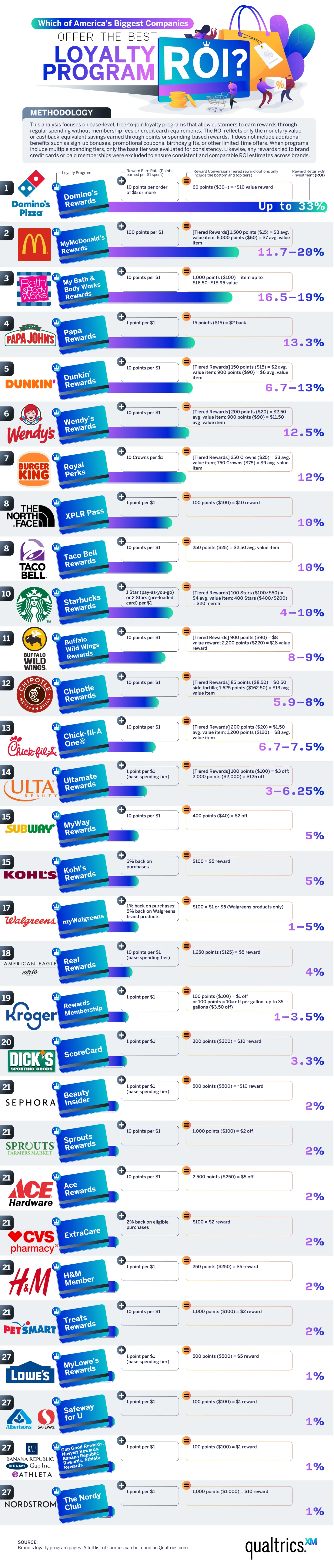
In the food and beverage industry, Domino’s Pizza offers the best ROI. The team calculated an almost 33% ROI for Dominos, which is by far the best offer, even across industries. You’ll receive about $10 of free food for every $30 spent. McDonald’s isn’t far behind at an 11 to 20% ROI with the MyMcDonald’s Rewards app. You’ll earn 100 points for every dollar spent, and you can use these points to purchase menu items. Papa John’s, Dunkin’, Wendy’s, and Burger King also have strong programs, with ROIs between 10% and 13%. The fast-food industry offers some of the best loyalty programs, earning eight out of the ten best rewards programs on the list.
In the retail and beauty space, Bath & Body Works leads with a 16.5%–19% ROI through the My Bath & Body Works Rewards program. The program allows shoppers to redeem points earned through purchases for free items, early access to sales, and an annual birthday gift. Ulta Beauty’s Ultamate Rewards program offers a decent ROI, too, at 3% to 6% for items that are normally on the expensive side. Their competitor Sephora has a Beauty Insider program that offers a lower 2% ROI, but exclusive free samples and early access to new products supplement it.
Brand rewards are weaker among clothing retailers. H&M, Gap Inc., and American Eagle/Aerie offer a 1%–4% ROI. These programs are still useful for loyal shoppers who know they’ll buy from these brands repeatedly.
Pharmacy and grocery store rewards can be a great help for budget-savvy shoppers. These stores have lower ROIs but can still offer decent rewards. Walgreens’ program took the lead, offering 1% back on most purchases and 5% back on Walgreens’ brand products, resulting in significant savings on generics. CVS has an ExtraCare program with a higher 2% ROI and personalized coupons.
In the grocery sector, Kroger and Safeway/Albertsons offer the highest ROIs, between 1% and 3.5%. These chains also offer a fuel rewards program that can be an incredible budget-saving boon. Lowe’s and Ace Hardware offer 1%–2% rewards programs that may be most helpful to frequent shoppers and small business owners who need materials from these stores.
Outdoor lovers and athletes can earn powerful rewards through the North Face’s XPLR Pass, which offers a 10% ROI, and the Dick’s Sporting Goods ScoreCard program offers a 3.3% ROI. The findings on this chart can help you save big the next time you shop!
A new article from RoveLab presents a data-driven exploration of home-life habits in the United States, examining how much time Americans spend at home and how that changes across each state. Drawing on data from the American Time Use Survey and the Integrated Public Use Microdata Series, the study constructs a ranking of states based on how much time residents spend at home. This data combined at-home activity levels with remote work prevalence.
RoveLab situates its analysis within broader behavioral shifts in the American lifestyle. On average, Americans spend around 18 hours per day at home (including sleep), which reflects a gradual decline in time spent outside the home over the past two decades. This trend pre-dates the COVID-19 pandemic, which spiked time spent at home and prompted the rise of remote work.
Click below to zoom.
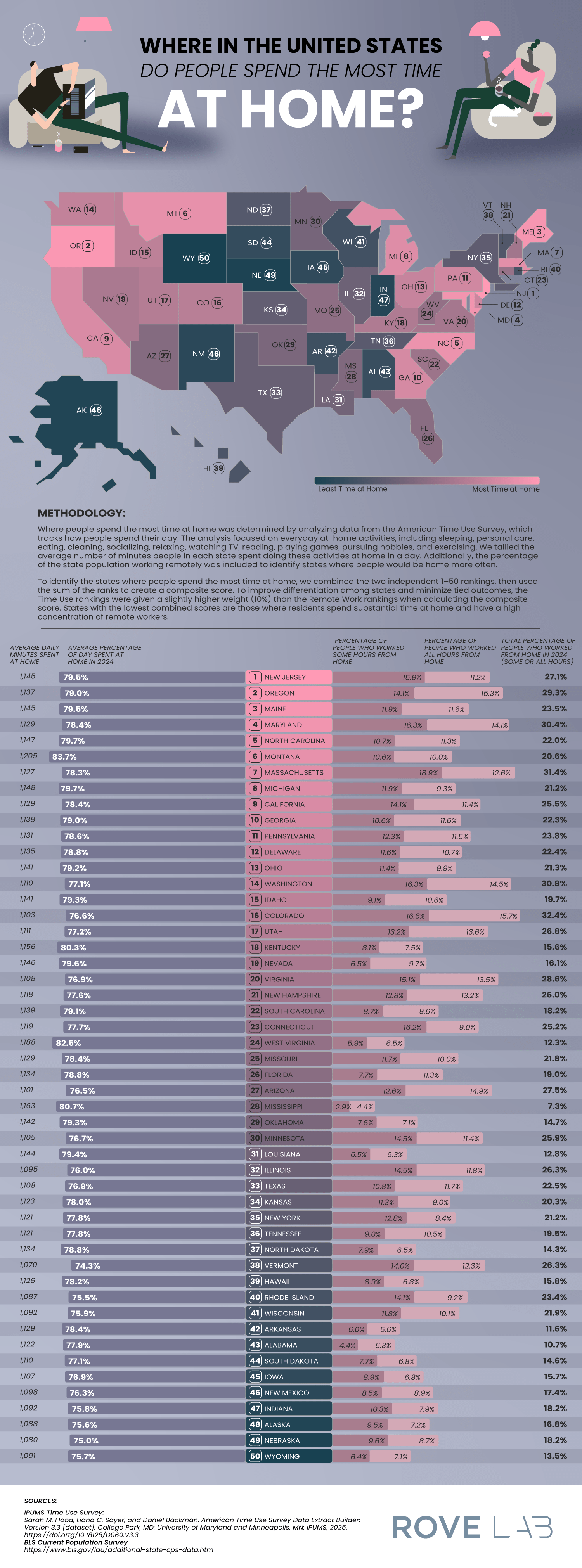
Other important facts on time spent at home add more context:
- 80% of Americans engage in daily household activities like cleaning, cooking, and home maintenance.
- 94% of Americans participate in leisure activities at home, including gaming, socializing, and exercise.
- Most Americans watch about 3.57 hours of television daily, which is more than the average amount of daily time spent on household tasks.
These statistics show that a home is the central site of both productivity and leisure, underscoring the growing connection between work and private life.
To determine which state residents are the most homelife-centric, the researchers developed a scoring system that incorporated:
- Average percentage of the day spent at home
- Average daily minutes spent at home
- Percentage of residents working remotely
- Weighted ranking emphasizing time-use data slightly more than remote work numbers
This multi-factor approach shows the team’s effort to balance behavioral statistics with labor trends, offering a comprehensive view of domestic time use.
The team found that residents in these states spend the most time at home:
- New Jersey: 5% of the day is spent at home (1,1495 minutes) and 27.1% of residents work remotely.
- Oregon: 79% of the day is spent at home and 29.3% of residents work remotely.
- Maine: 79% of the day is spent at home and 23.5% of residents work remotely.
New Jersey’s lead position is due to several structural factors, such as its proximity to major employment centers and a highly educated workforce, with over 40% of residents holding a bachelor’s degree. These factors create a population ideal for telecommuting. It shows us that socioeconomic factors can shape our daily routines.
At the low end of the scoring, Wyoming ranks as the state where people spend the least amount of time at home. This reflects a low rate of remote work. Montana relies on industries like agriculture, mining, and tourism, which all require in-person workers. The team also speculates that Wyoming’s emphasis on outdoor recreation leads residents to both work and play outside their homes.
By combining time-use data with employment patterns, the study provides valuable insight into how regional differences, evolving job requirements, and leisure habits shape modern American life.
-

 Business Visualizations2 years ago
Everything Owned by Apple
-

 Business Visualizations1 year ago
America’s Most Valuable Companies Ranked by Profit per Employee
-

 Business Visualizations1 year ago
The Biggest Fortune 500 Company in Every State
-

 Business Visualizations10 months ago
The Biggest Employers by Industry
-
 Business Visualizations2 years ago
New Animated Map Shows Airbnb’s Fully Booked Cities Along the 2024 Eclipse Path of Totality
-

 Timelines1 year ago
Timeline Charts the Development of Communications Technology
-
 Charts2 years ago
How Many Crayola Crayon Colors Are There? A Lot.
-

 Business Visualizations6 months ago
The Largest Companies in America That Are Still Run by the Person Who Founded Them