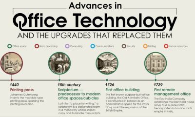
Ooma’s new article, “Advances in office technology and the upgrades that replaced them,” brings us on a sweeping journey through...


When you visit a mattress store or browse through mattress options online, there are a lot of choices that make us feel like we’re choosing from...
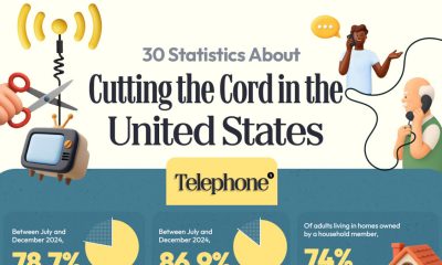
A new article from Ooma examines the facts surrounding Americans’ decision to abandon cable television and landline phones in favor of Internet-based and wireless alternatives. This...
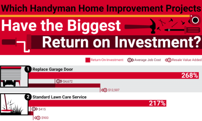
Deciding which home improvement projects are worth your time and money can yield big payoffs. Whether you think you’ll sell yourself soon or want to increase...
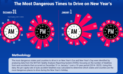
Millions of Americans travel for New Year’s Eve and Day celebrations, but unfortunately, the last night of the year can be one of the most dangerous...
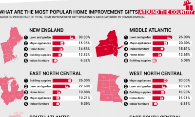
As the holidays approach, American families are thinking about gift-giving, and a trend stands out: Americans are giving home improvement and hardware items as useful and...
Many American families realize that location can have a major impact on their childhood experiences. The team at HireAHelper examines which U.S. cities offer the best...
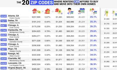

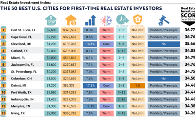
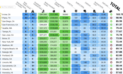
Home ownership is a dream shared by many Americans, but the goal posts for achieving this dream move further out of reach every year. In 2025,...


Americans will collectively lose over $2 billion to scams this year. As technology advances, scammers and fraudsters use more sophisticated tactics that are harder for victims...


Many Americans are devoted to their pets and consider their furry friends a part of the family. That means they want to include them in travel...
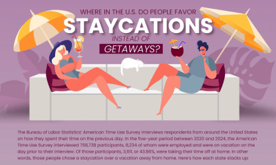

Many Americans find that staycations can be just as relaxing as a getaway vacation, but without the expense and hassle. For people who appreciate their home...
![]()