Maps
The Population Density of Europe (and the World) in Two 3-D Maps
How many people live in Europe? The population of Europe is around 745 million people, or 10% of the world population. Internationally recognized data analyst, mapmaker, author, and visual storyteller Alasdair Rae has transformed this figure into a captivating population density map of the entire continent! Check it out:
Click below to zoom
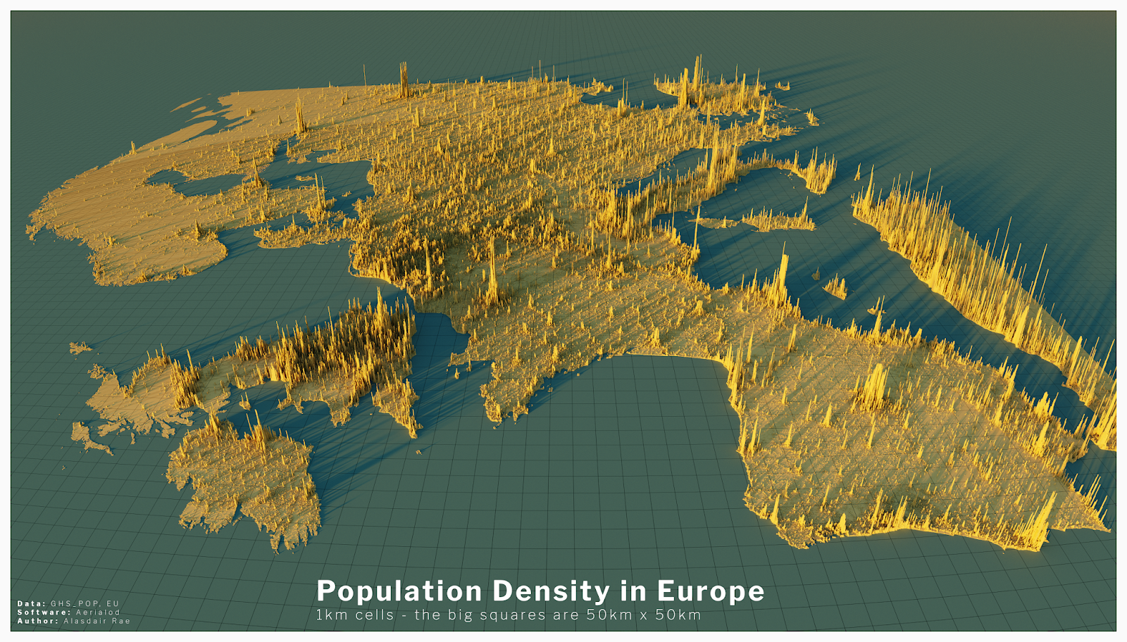
Rae states: “The maps below use 1km x 1km data and the height of the bars represents the number of people living in any one square. The big squares are 50km x 50km (about 30 miles) and are there to provide sense of scale. The highest 1km densities are found in Spain and France, and Madrid, Barcelona and Paris in particular where you get values of more than 50,000.” You can explore more detailed sections of Europe here, as well as the creator’s insights and methods. You can also other fascinating data visualizations, such as the most densely population square kilometer in every U.S. state!
This got me thinking – what would an entire world map made like this look like? He actually made a complete map too! I wanted to provide both maps to provide a more “big picture” understanding of scale.
Click below to zoom
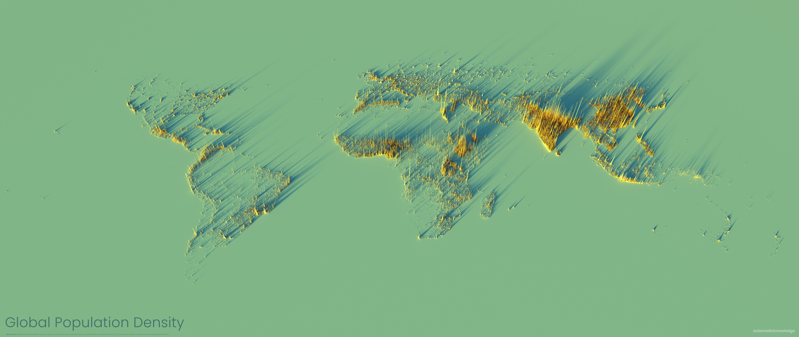
As you can see, in the grand scheme of the whole planet, Europe’s population density seems so humble. So what are the most densely populated cities in the world based on people per square kilometer? Try to take a guess based off of this map (test your geography knowledge!) and then check the list:
- Manila, Philippines (Asia) – 43,062
- Mandaluyong, Philippines (Asia) – 38,495
- Pateros, Philippines (Asia) – 37,061
- Caloocan, Philippines (Asia) – 31,233
- Bnei Brak, Israel (Asia) – 30,001
- Kathmandu, Nepal (Asia) – 29,161
- Dkaka, Bangladesh (Asia) – 29,069
- Makati, Philippines (Asia) – 28,975
- Port-au-Prince, Haiti (North America) – 27,395
- Levallois-Perret, France (Europe) – 26,713
The European city with the highest population density is Levallois-Perret in France, but it is nearly 20,000 people per square kilometer less than Manila, the most densely populated city in the world. While Americans in New York City or Los Angeles may fret over crowds and traffic, the truth is, none of America’s cities even rank in the top 50 for population density.
Anyone who chats, texts, or scrolls social media will see text depicting laughter many times a day. A new map from Preply shows that the way laughter is portrayed changes dramatically depending on the language. In this “Laughing Around the World” map, Preply cataloged 26 different ways people express their mirth online, from familiar acronyms to creative onomatopoeia.
Click below to zoom.
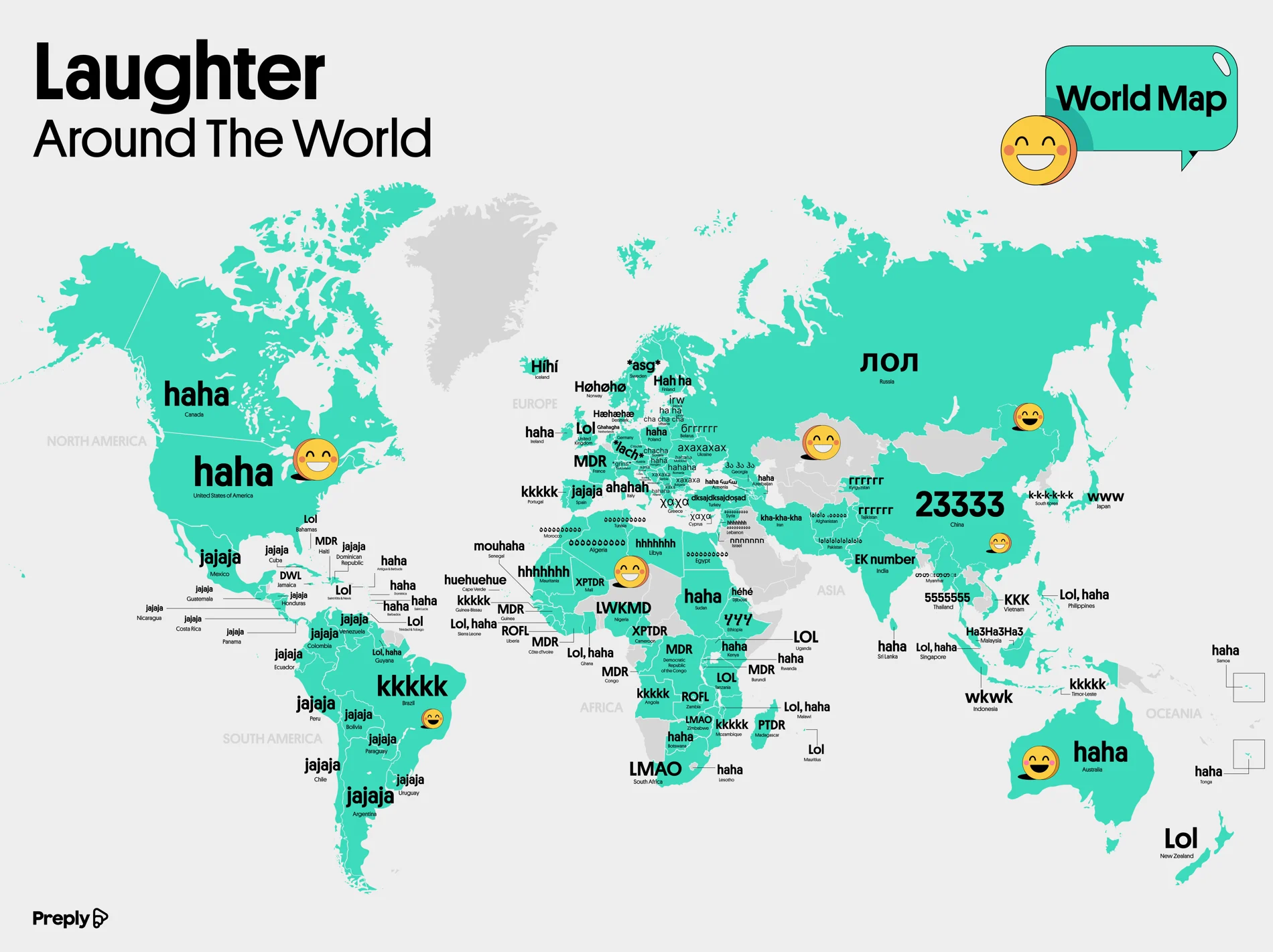
Some of the most distinct forms of laughter aren’t words at all. Thai speakers type out “55555” because the Thai word for that number sounds like “ha!” The more 5s Thai texters type, the bigger the laugh. Mandarin speakers type “23333,” while Japanese users type “www,” because the Japanese word for laughter is warau, and they think a “w” resembles a grinning face.
Other forms of laughter come straight from keyboard mechanics. Indonesians type “wkwkwk” mostly because “k” is easier to reach on a home-row keyboard than “h.” Brazilian and Portuguese speakers write out “kkkkkk” or “rsrsrsrs,” which derives from riso, the Portuguese word for laughter. The map also shows the Korean letters for laughter, which are romanized as “kkkk” or “hhhhh.”
English alone has spawned a range of laughter abbreviations, including LOL, LMAO, LMFAO, and ROFL. Other languages followed this lead. French speakers might type out “MDR” or mort de rire, which means “dead from laughing.” The French also use PTDR, or pete de rire, and XPTDR for even greater laughter. Nigerians type LWKM, which translates to “laugh wan kill me,” and LWKMD, or “laugh wan kill me, die.” In Jamaica, you’ll get a text reading DWL for “dead wild laugh.” And Estonians text “IRW,” shorthand for the word irvitamina, which describes a certain type of laugh.
In many languages, online laughter is phonetic based on whatever alphabet the speaker uses. Spanish type “jajaja,” which is the same as “hahaha,” with “jejejeje” indicating irony and “jijijiji” meaning mischief. Persian Farsi uses letters that spell out “kha-kha-kha.” Russian Cyrillic spells out “axaxaxa,” and Ukrainians have a version that indicates that their “axaxaxa” is sarcastic. Greek offers letters for basic laughter, sneaky laughter, giggling, and evil laughter.
Some options show the texture of a language. Italians write out “ahahaha” or “ehehehe” because their language lacks a strong aspirated “h” sound. Germans like to indicate stage direction with an asterisk, so they’ll text “*grins*” or “*lack*.” Polish teens spell out “heheszki,” which means something like “kicking and laughing.” Lithuanians send “cha cha cha,” but they mean laughter, not dancing.
The takeaway from this joyful map is that laughter is universal, but remarkably local in how it’s expressed through a keyboard. Our text-based laughter is shaped by phonetics, slang, alphabet, and the quirks of the keyboard style we use. In a world connected by social media, it’s helpful to recognize the symbols used by our international neighbors to better understand them and communicate clearly. Laughter text also offers a unique look at various languages and their shapes and textures.
Why do some people absorb new information like a sponge while others labor for hours over a textbook? According to a study by Preply, the answer lies in their learning style. The team set out to map which styles dominate across the United States. Preply emphasizes the importance of its study by citing research showing that more than half of Americans spend under two hours a day studying, with teenagers reporting feeling distracted. At the same time, the majority of Americans believe that different learning styles exist. To identify which styles are most common and where, Preply analyzed a year of Google Trends data across 50 states to map the dominant learning style in each.
Click below to zoom.
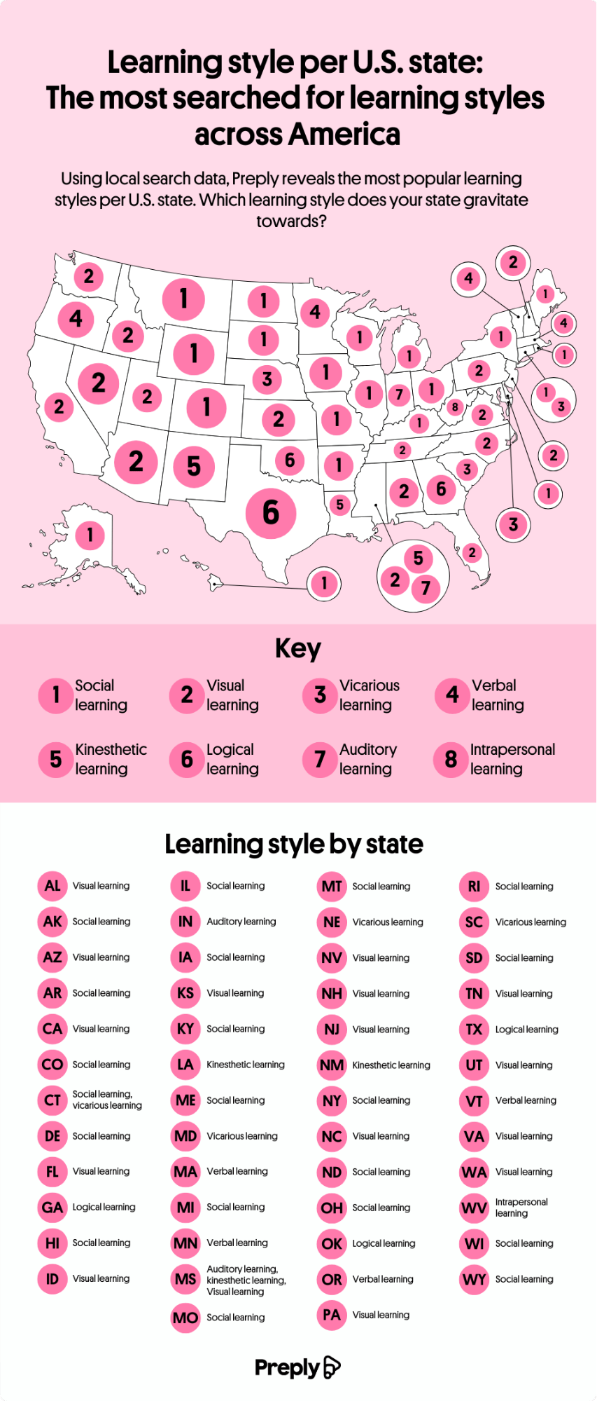
A Nation of Social Learners
The study’s standout finding is that 40% of Americans are social learners, making it the single most common learning style in the country. Social learners take in information through interaction and conversation. According to the map, 20 states favor the study-buddy approach, including Connecticut and New York.
Visual learning came in second place. These learners thrive on aids like flowcharts, maps, doodles, and color-coded notes. Preply found that visual learners are concentrated in California, Florida, and Washington. Together, social and visual learners account for more than 70% of Americans.
The Less Common Learning Styles
The remaining six styles in Preply’s study, verbal, vicarious, kinesthetic, logical, auditory, and intrapersonal, are much less prevalent, making up just 34% of preferences combined. Verbal and vicarious learning tie as the third most popular style, but together account for only about 8%. The map reveals some notable patterns. While the West skews heavily toward visual learners, the eastern half of the country shows more variance. Massachusetts and Vermont residents lean toward verbal learning, while Connecticut and New Yorkers favor social learning.
A few individual states stand out as outliers. Auditory learning, which is learning through hearing information, leads in only two states: Mississippi and Indiana. West Virginia is the only state in the country that favors intrapersonal, solitary learning. This is the least preferred learning style nationwide.
What We Can Learn from These Findings
Preply began their study with a seed list of widely recognized learning styles drawn from educational resources, then measured popularity using Google Trends data from 12 months across 50 states. Where multiple styles ranked equally in a state, the team treated them as equally popular. The point Preply drew from this data is the recognition that how you learn is a useful step toward more effective studying, particularly in a country where study time is short and distractions are plentiful.
What emerges from the team’s map is a portrait of a country that isn’t uniform. No single learning style dominates everywhere, and neighboring states can be quite different from one another. This study serves as a reminder that study habits are shaped by geography, culture, and personal preference. The Preply study is another in a long line of ideas about how people learn, drawing on theories from Aristotle to Howard Gardner, to Neil Fleming.
Compatibility is usually our biggest driver in the search for a romantic partner, but it turns out that age is still a major part of that compatibility. Tawkify’s matchmaking service surveyed about 98,798 Americans over two years, asking whether they’d date someone older and younger and how far outside their own age range they’d go. The data reveal both geographic and dating patterns, with a recurring pattern: smaller dating pools push singles to date across wider age ranges.
Click below to zoom.
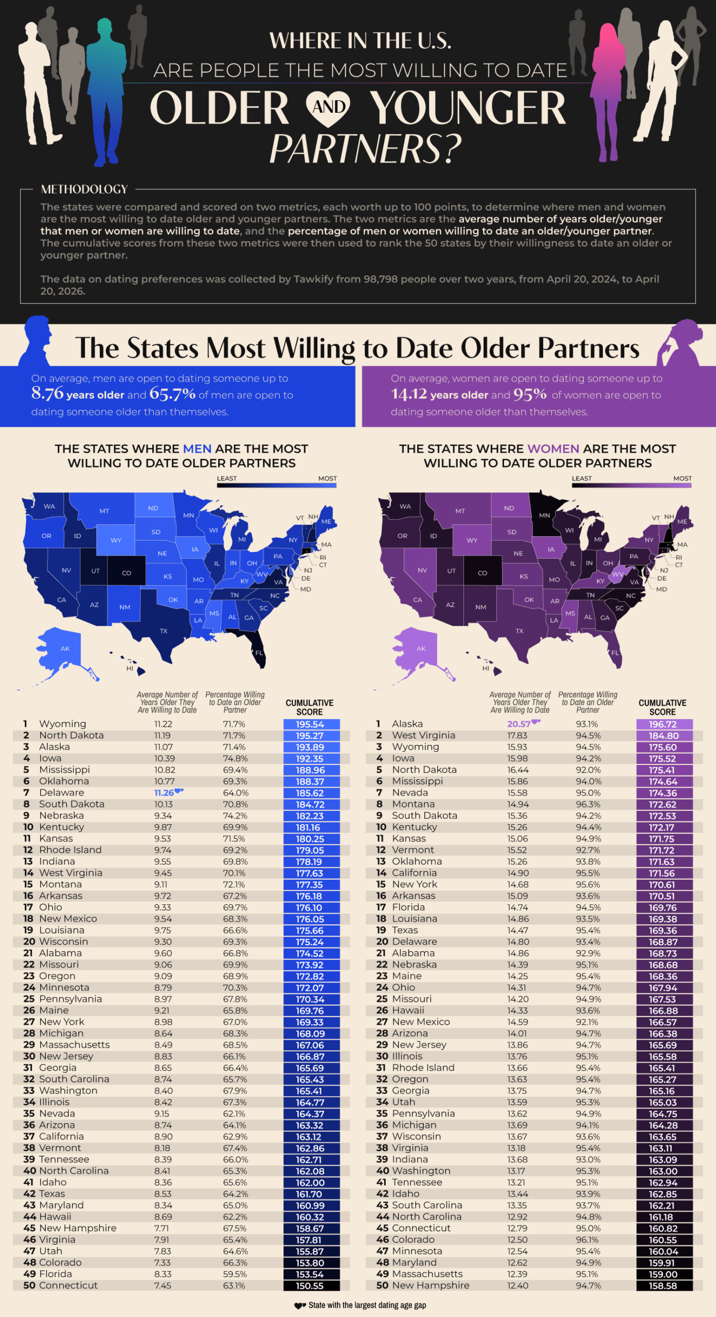
Wyoming tops the list of states with men willing to date outside their age range. 71.1% of Wyoming singles are willing to date an average of 11.22 years older than they are. North Dakota and Alaska also appeared in the top three. Delaware emerged as an interesting outlier. They have the largest average age gap in dating among men, at 11.26 years. 93.1% of Alaskan women are open to dating older partners, and they have the nation’s largest age gap by far at 20.57 years. West Virginia and Wyoming women follow in second and third. It seems that less-populated states show greater willingness to date outside their age range, which could be a very simple explanation. A smaller dating pool means singles widening their options.
As for willingness to date younger partners, Hawaii leads for both genders. 96.8% of Hawaiian men are willing to date someone younger, with 18.59 years as an acceptable age gap. This is the widest that appears in the study. 92% of Hawaiian women are open to dating younger, but their average age gap is only 9 years. Hawaii has an older-than-average population, with a median age of 41.5 years, so this limited island dating pool makes dating younger people more common. The runners-up for willingness to date younger were Nevada, Idaho, and Maine.
According to the data, women are dramatically more open to dating older than men are. 95% of women would date an older partner, compared with 65.7% of men. This pattern flips with dating younger. 96.5% of men would date someone much younger, with a national average age difference of 14.7 years. 88.1% of women would date younger men, but at a much smaller average age gap of 7.14 years. This shows that across the country, men tend to date younger partners, while women tend to date older partners. Women are consistently willing to tolerate a wider gap when dating up.
The team threw us a little fun fact from the Guinness Book of World Records, which lists Gertrude and John Janeway, married in 1927, as the largest spousal age gap of 63 years. Age-gap relationships can succeed but face challenges like judgment and assumptions about power dynamics and differing life stages. Strong communication, shared values, and aligned goals matter most in relationships, more than the number of years lived. Geography and gender seem to shape who Americans date, but the data also suggest that openness to age-gap romances often comes down to opportunity.
-

 Business Visualizations2 years ago
Everything Owned by Apple
-

 Business Visualizations2 years ago
America’s Most Valuable Companies Ranked by Profit per Employee
-

 Business Visualizations1 year ago
The Biggest Fortune 500 Company in Every State
-

 Business Visualizations1 year ago
The Biggest Employers by Industry
-

 Timelines2 years ago
Timeline Charts the Development of Communications Technology
-

 Business Visualizations9 months ago
The Largest Companies in America That Are Still Run by the Person Who Founded Them
-
 Charts2 years ago
Map Uncovers Countries with Most Powerful Passports
-
 Maps2 years ago
A Map to Gold and Silver