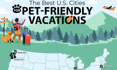

Many Americans are devoted to their pets and consider their furry friends a part of the family. That means they want to include them in travel...
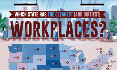

The team at Stratus Building Solutions reveals which states have the cleanest and dirtiest workplaces in a new study. Cleanliness is often an overlooked but powerful...

Vacation rentals have opened up a whole new way to travel for people all over the world. Through platforms like Vrbo and Airbnb, travelers rent lofts,...
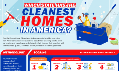

The Oxi Fresh team has revealed the state of home cleanliness across the United States with a map ranking states by their score on the custom-made...


In the corporate world, leadership changes are practically expected. CEOs come and go, boards shuffle seats, and strategies pivot with the seasons. For most large corporations,...
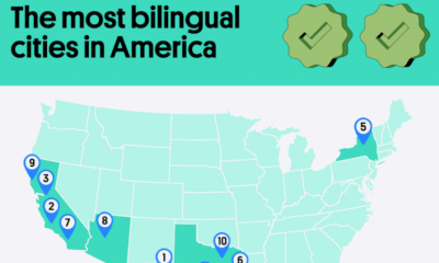

The United States is home to a diverse array of cultures, ethnicities, and languages. It attracts visitors and immigrants from all around the world, so it’s...
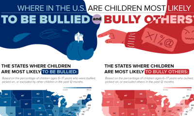

A new map from the team at PA Requirements displays the locations in the U.S. where children are most likely to bully and be bullied. Unfortunately,...
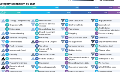

The team at Qualtrics released a fascinating new study on the 100 most common ways people are using AI in 2025. They gathered their data from...
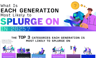

Spending money is a deeply personal choice, but it can still signal values, needs, and priorities on a larger scale. The team at Qualtrics specifically examined...
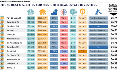

People who want to jump into the real estate investment market have an important question to contend with: Which city should they invest their money in?...