Business Visualizations
Chart Visualizes the Price of the Ford Mustang Every Year Since Debut
The Ford Mustang is a legendary American muscle car that symbolizes the culture of open-road freedom. The Ford Motor Company designed the vehicle to embody the European sports car, but with a price point that’s more attainable for middle-class Americans. The idea was a massive success. The first Mustang debuted in 1964, and the Mustang enjoys a legacy and loyal fans to this day. The team at Speedway Motors celebrates the Mustang with an illustrated graphic depicting each Mustang iteration, along with the price at release and the price adjusted for inflation.
Click below to zoom.
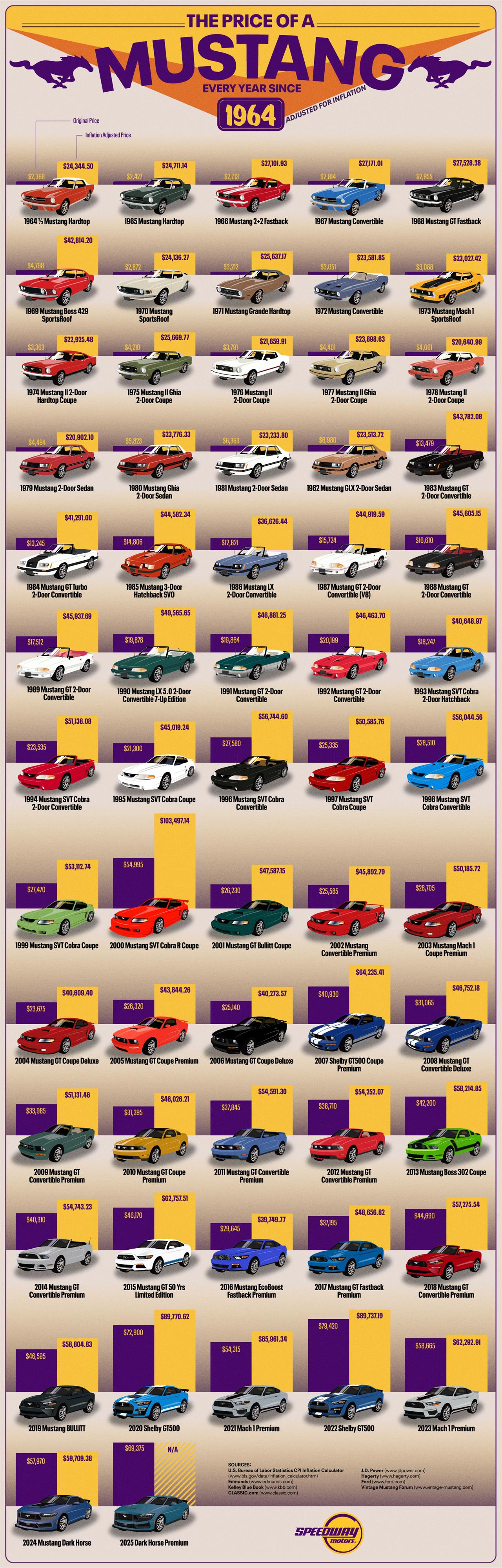
Through this detailed and illustrated chart, we can see the evolution of this vehicle. The first Mustang Hardtop was priced at $2,368, which is $24,3444 in today’s market, emphasizing its affordability in the world of muscle cars. While the Mustang was a gamble, it proved to be a phenomenon and sold over 100,000 cars in its first four months. The Mustangs’ popularity persisted throughout the ‘60s, and Ford focused on improved performance and power, which meant prices rose. This trend continued until the early ‘70s gas crisis when Ford had to adjust to new consumer demands for better fuel mileage. They designed the Mustang II with a smaller chassis and less muscle to adjust to the changes in the economy.
The Mustang’s popularity hit a dip in the early ‘80s, and the Camaro almost outsold it. Ford innovated and adjusted again with the release of the Fox Mustang, designed to be versatile as a day-to-day muscle car. As technology advanced into the ‘90s, Ford introduced popular new features like a V8 engine and SN-95 chassis, which we can see featured in the Mustang GT.
Today’s Mustang is loaded with the most innovative features, designed for performance and comfort. The current model is the Dark Horse Premium, which sells for $69,375. While it’s a flashy and popular car, it lacks some of the performance boosts of past models, yet the price is high.
The Mustangs’ prices have risen a lot over the decades, for several key reasons besides inflation. First, safety standards have increased with innovative technology making drivers safer. Some safety features are required, while others are sought-after bonuses that drivers are looking for. A key aspect of a muscle car is the power and performance. Modern technology advances the performance of the vehicle, but that engineering comes at a higher price point. Material costs have advanced as well, from labor to raw materials. Cars, in general, are now more expensive to build.
The team’s chart is a true testament to the power of visual data. Through the images and price points, we can see changes in the Mustang reflecting cultural and economic shifts, creating a fascinating timeline of an icon among automobiles. Do you have a favorite Mustang model? What do you think about the price changes over time?
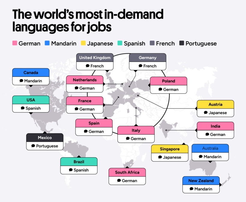
Many studies have proven the cognitive benefits of learning a second language, which is especially powerful for children. A new Preply study turns to the career world and the monetary benefits of being bilingual. After examining thousands of job advertisements, the team examined how language skills impact hiring trends, salaries, and career growth potential. Their findings help workers definitively decide whether a bilingual career is worth the study. Results show that salary gaps vary widely across countries, and some languages offer stronger benefits than others. Different industries value bilingual workers more than others too. The team’s analysis is a thorough examination of how bilingual abilities can impact a career.
Click below to zoom.
Despite variances, the Preply found that bilingual jobs do indeed pay more. The study found that bilingual workers earn an average of $9,353 more a year. In some countries, that amount is even higher, proving that a second language is one of the most valuable skills you can add to your resume.
These are the countries where speaking a second language pays the most:
- Spain – bilingual workers earn 19.4% more than single-language workers
- USA – 18.8% more
- Poland – 18.6% more
- UK – 11.5% more
- Italy – 4.8% more
- Canada – 3.3% more
Not all languages are worth the same salary increase. Research has uncovered five languages that lead to the highest salary increases. Japanese, Portuguese, Italian, German, and Russian are the most lucrative to learn. Japanese is the most valuable language to learn, giving workers a 20.9% salary increase with fluency. Japan is a world leader in engineering, technology, and the automobile industry, so Japanese fluency allows workers to communicate with these world-leading Japanese brands. The value of Portuguese lies in the many countries that speak it, including Brazil and parts of Africa. Italian fluency comes in handy, particularly in the tourism industry.
Speaking of industry differences, bilingual ability is more valued in some sectors than others. These American sectors had the highest number of job openings that required a second language:
- Sales
- Customer Service
- Social work
- Property and real estate
- Education
- Manufacturing
- Logistics
- Consulting and Strategy
- Accounting and Finance
- Healthcare and Nursing
- Marketing and PR
- Hospitality and Catering
Some of the positions this can lead to include call center reps, account managers, nurses, teachers, hotel managers, tech support experts, social workers, and salespeople.
In the USA, Spanish is the most sought-after second language. In Europe, many countries seek German and French speakers. Remember that it’s never too late to start to learn a second language. You’ll still see career benefits. While you may have to invest in hiring a tutor or start a class, this data makes it clear that this investment will pay off in the long run. Learning a second language not only enriches your life but can also open new doors and career possibilities. If you want to change careers, a second language can help you do this, and if you want to advance, a second language might be the key.
Breakthroughs in technology can revolutionize industries and even give birth to new industries previously unimagined. The Qualtrics team explored the world’s most revolutionary products and services, arranged on a timeline that teaches us not only which tech has caused the biggest changes, but also how these developments interact with each other and advance technology and our lives as a whole. The timeline spans 1981 to 2022. It covers the realms of Computing and Internet, Entertainment and Media, and Mobile and Digital Services. Each item on the timeline has changed its industry and even changed the way humans live.
In the world of computing and Internet services, the timeline covers:
- IBM Personal Computer
- America Online
- Microsoft Windows 95
- Google Search Engine
- OpenAI ChatGPT
Click below to zoom.
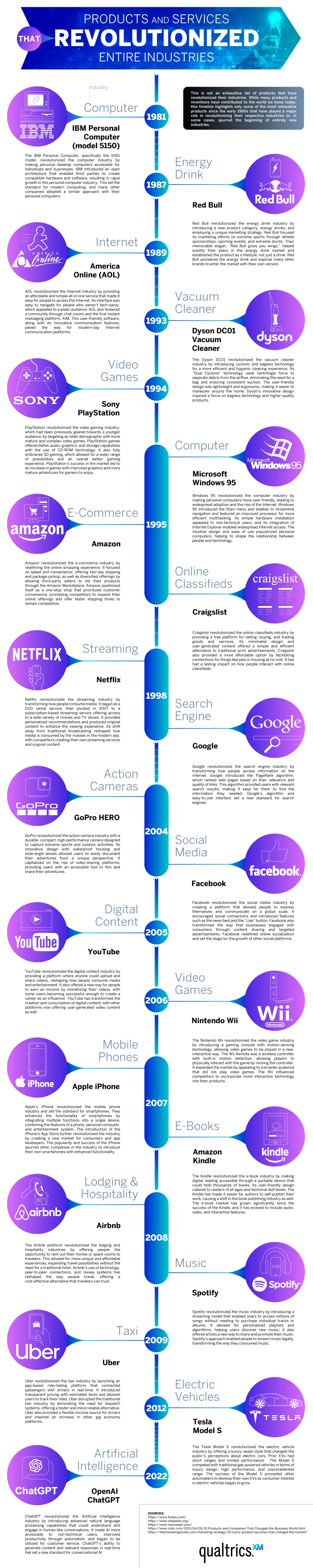
The timeline covers the world of entertainment, featuring Sony PlayStation, Amazon, Craigslist, Netflix, Facebook, YouTube, and Nintendo Wii as the gamechangers. In the mobile and digital services realm, there’s a surprising diversity of products from smartphone models to apps like Uber to the Dyson DC01 Vacuum Cleaner, and even Red Bull energy.
It’s no secret that the personal computer revolutionized the business and computing industries. Before IBM’s PC, there was no market for personal computers; today, they’re a staple of modern life. Another 1980s brand, Red Bull, created a market where none previously existed. People traditionally get their caffeine fix from coffee, but energy drinks offer an easier-to-grab option on the go. Red Bull partnered with extreme-sports marketing to turn energy drinks into a lifestyle.
The timeline highlights AOL Instant Messenger as the Internet’s first big revolution. It’s a precursor to social media and helped make the World Wide Web a means of quick, easy communication. In 1998, Google Search Engines made the Internet an invaluable tool for knowledge. Google made it far easier to find websites of value on any topic under the sun (and even some beyond!)
From here on, the timeline is dominated by a range of innovative apps and Internet-based services. Amazon is the worldwide leader in e-commerce. It changed the way consumers shop forever, offering low prices, convenience, and fast delivery. Netflix changed the way people consume films and television by offering the first-ever streaming service. They offer an enormous library of new and old titles. No more waiting for a syndicated show to air. Netflix created a demand for “binge-worthy” content. The entertainment world touches every area of traditional arts and media. We see the Amazon Kindle changing how many book lovers read, offering a digital library that saves physical space and even money for some titles. Spotify became the leader of music streaming in 2008. Some think of it as the Netflix of music. Memberships offer unlimited streaming access to millions of songs and artists.
These are just a few of the industries that have been revolutionized by technology. We haven’t even touched on AI! Dive into the timeline to learn more about the most pivotal products and services of the modern era.
“Artificial intelligence” may be the biggest buzzword of 2026. It seems like every industry is incorporating AI into its practices, but it has had the biggest impact in the business sector. Nearly 80% of businesses use AI in some way. Qualtrics has quantified the massive impact AI has on business with a chart listing 25 key statistics that illustrate its influence. These statistics help us understand how and why businesses are using AI to reach the next level.
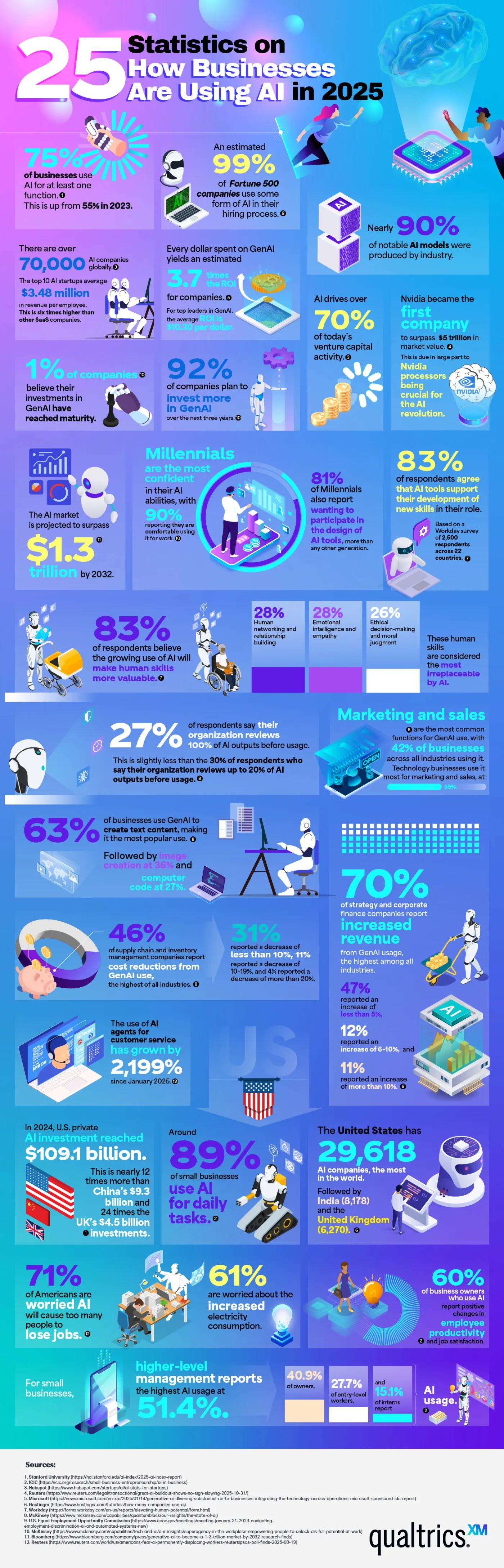
Many of the statistics listed show why businesses are so drawn to AI. In 2025, three out of four companies used AI regularly for at least one task. 99% of Fortune 500 companies use AI in their hiring process to screen applicants for predicted success in a role. 83% of business professionals say they’re using AI to learn new skills to further their career. Perhaps the most compelling reason businesses turn to AI is their profits. Every dollar invested in generative AI yields an average return of $3.70. Businesses are embracing what they see as AI’s stronger performance and competitive edge.
There is no doubt that AI is profitable, as these figures show. 70% of companies report increased revenue that they attribute to generative AI. Supply chains use AI to streamline logistics, and on the marketing side of business, 42% report using AI for content generation. Customer service has seen a huge explosion in AI usage, almost a 2000% increase.
AI has strong momentum, with about 70,000 companies using it globally. U.S. private investment in AI is around $109.1 billion. 90% of the world’s AI models are the work of private industry rather than government-funded research or academia, highlighting that business not only uses AI but also fuels its creation.
Small businesses are a part of these statistics. 89% of small businesses use AI in their daily operations, often for financial management and customer service. 60% of small business owners say AI has improved their employees’ productivity. Executives and senior managers are the most avid users of AI, but use by interns and entry-level employees rises every year.
Here are a few other jaw-dropping statistics that show how enormous a presence AI has in the business industry:
- AI drives over 70% of venture capital activity.
- 92% of companies plan to invest more in AI within the next three years.
- 63% of businesses use AI to generate text-based content.
- The use of AI customer service agents has grown by 2,199% since January.
- The United States is home to 29,618 AI companies, which is more than any other country.
These statistics underscore that AI is becoming a regular part of everyday business practices. Companies often say they believe AI amplifies their employee’s natural talents. Whether used for strategy, customer service, or content generation, it seems AI is here to stay.
-

 Business Visualizations1 year ago
Everything Owned by Apple
-

 Business Visualizations1 year ago
America’s Most Valuable Companies Ranked by Profit per Employee
-

 Business Visualizations1 year ago
The Biggest Fortune 500 Company in Every State
-

 Business Visualizations10 months ago
The Biggest Employers by Industry
-
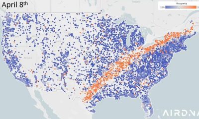
 Business Visualizations2 years ago
New Animated Map Shows Airbnb’s Fully Booked Cities Along the 2024 Eclipse Path of Totality
-

 Timelines1 year ago
Timeline Charts the Development of Communications Technology
-
 Charts2 years ago
How Many Crayola Crayon Colors Are There? A Lot.
-

 Business Visualizations6 months ago
The Largest Companies in America That Are Still Run by the Person Who Founded Them