Misc Visuals
Exploring Science Fiction Technology That Became a Reality
Science fiction often features futuristic technology that once seemed unimaginable. Yet, many sci-fi stories have accurately predicted innovations that eventually became real. Throughout history, countless fictional inventions have transitioned from mere ideas to actual advancements. This fascinating work from AI PRM illustrates the time gap between when these imaginative concepts first appeared in fiction and when they were finally brought to life.
Click below to zoom.
Their research examined sci-fi technology that exists today in these categories:
- Space Exploration
- Communication
- Robotics and AI
- Health and Biotechnology
- Weapons and Defense
When the 1927 film Metropolis became a hit, it was difficult to imagine that the video calls in the movie would ever become a reality, but today, this is a commonplace technology we rely on. The team shows us that the first real-world video phone was created by AT&T in 1964. In 2003, Skype made video calls widely accessible.
As for artificial intelligence in our lives, E.M. Forster’s The Machine Stops depicted a world where people had automated phones that could respond to their commands and help them manage their lives. This became a common trope in science fiction, but today, with the rise of devices like Alexa and Google Home, this technology doesn’t seem unusual at all. Believe it or not, when Jules Verne’s Twenty Thousand Leagues Under the Sea was released in 1870, submarines seemed like a feat of imagination to the reading public. But the Nautilus was inspired by a French sub prototype. The first submarine was launched just a few years later by Isaac Peral in 1888. Explore more technology once thought impossible throughout the team’s article.
Misc Visuals
Preply Presents a Language and Career Mobility Report for 2026
The team at Preply has completed its 2026 report on Language and Global Career Mobility. This study was performed across three English-speaking countries and examined why people are moving abroad and what languages they’re learning to prepare for the transition. It’s no secret that learning a second and even a third language can boost career prospects, but this study shows that this is key to helping people achieve their dreams of moving abroad. The survey included 1,800 respondents from the U.S., the UK, and Canada.
Many people aim to move abroad as job opportunities shrink at home. 40% of the survey respondents said their home country’s economy was in decline, and around the same number had either experienced job loss or were close to someone who had lost their job in the past two years. Those dreaming of an adventure outside their country are seeking a fresh start that can help them gain a more secure footing in a career, along with the ability to find new opportunities, grow, and thrive. 92% of people moving abroad said knowing the local language is critical to success.
The survey results are rich with detail. We learned that 63% of Gen Z have experienced job loss in the last 24 months. 81% of people open to relocating to a new country are more likely to do so now than they were two years ago. The biggest motivations for moving are the cost of living and the hope for a better quality of life. 75% say that learning the local language boosted their confidence and certainty about moving. 93% of respondents said they’d take advantage of language learning if their employers offered it. Clearly, there’s a strong willingness to learn new languages!
Click below to zoom.
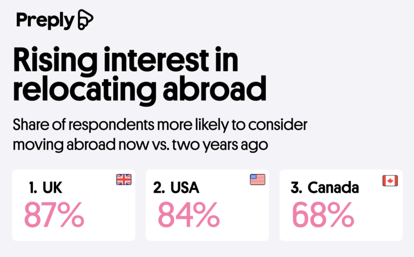
Since the year 2000, international travel has doubled. As traveling abroad becomes more common, life abroad begins to feel more accessible and possible. An enormous 82% of the survey respondents said they were open to moving abroad. Interest is highest in the UK at 87%, followed by the U.S. at 84%, with Canada trailing at 68%. As always, people are interested in moving abroad because they imagine they’ll have a better life there, but the team dug up a few more specific reasons as well. Some people are drawn to the culture, lifestyle, or language of the country they want to move to, while others are drawn to it for its healthcare, market access, and political and economic stability.
Today, many people in major cities around the world are fluent in English, and there are countless apps to aid translation. The benefits of learning a language are clear from this study. The confidence and personal transformations it inspires are priceless. Three in four learners say that learning a new language had a strong impact on their personal growth and even changed their lives. This study strongly underscores the personal empowerment that language learning provides.
Misc Visuals
Discover the Movies Best for English Language Learning
Whoever said learning English is difficult and boring hasn’t seen this new study from Preply. It turns out that watching movies can help you improve your English learning, hooray! What better way to learn while having fun than sitting down with a bucket of popcorn and a good movie? Immersing yourself in popular media is a proven way to improve your real-world use of a language. Films can help you practice filling in comprehension gaps using context clues and studying facial expressions and body language for cues. Preply offers us a comprehensive watch guide of the best and worst films for learning English. They analyzed the 150 highest-grossing movies to present popular and enjoyable choices. Their score is based on the average number of words per minute, the difficulty of the vocabulary used, and the ease of watching with subtitles, which makes it easier to follow along.
Click below to zoom.
The team found that the best films for learning English are:
- Dawn of the Planet of the Apes
- Maleficent
- The Hobbit: Battle of the Five Armies
- Spider-Man 3
- The Hunger Games
Dawn of the Planet of the Apes has a low word count per minute and a simple vocabulary. This action-packed film should be easy to follow for those who don’t understand every word. The same is true of the Disney film, Maleficent, a retelling of Sleeping Beauty from the villain’s point of view.
Popular films that will give English language learners the most trouble are:
- The Wandering Earth
- Oppenheimer
- Barbie
- Shrek 2
- Finding Dory
This list has a few surprising results. While it’s no surprise to see the long, heavy, historical drama Oppenheimer on the list, it is funny to see it beside its famous marketing partner, Barbie, a much lighter film that released on the same day. But Barbie is chock-full of banter and musical numbers that add up to a high word count per minute and a frenetic movie for English learners to keep up with. This is the same reason animated films like Shrek 2 and Finding Dory made the list.
The team’s research points to fantasy and adventure films as the best genre for English learning, due to the large, dramatic, action-filled visuals that can help cue the meaning of dialogue. Epic quests and romantic films make for the best storylines. In keeping with these findings, they determined that the franchises best for learning English are The Hobbit films, the Spider-Man series, and the James Bond films. The team also separately emphasized films with high and low word-per-minute rates, which indicate how easy it will be to read the subtitles. Finding Dory is the most difficult to follow (thanks to the chatterbox of a fish in the starring role), and once again, Dawn of the Planet of the Apes comes up on top. This list is a great study tool for English students and one that ESL teachers should bookmark for lesson plans.
Charts
Key Takeaways from Preply’s Global Language Report
Language learning is experiencing a worldwide boom driven by curiosity, career ambitions, and digital access. The team at Preply conducts a Global Language Learning report every year or two, drawing on data from language learners in 180 countries and over 90 languages. Here we see them list key insights and analyses from that report.
Click below to zoom.
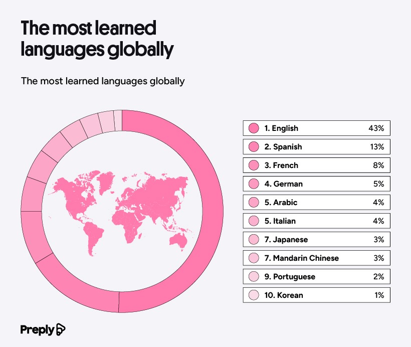
One of the most significant data points is that English remains the leading language worldwide, but the landscape is shifting. 43% of Preply’s language learners studied English. Spanish came in second at 13%, followed by French at 8% and German at 5%. There are regional differences too. In North America, Spanish was studied more than English by 1%, reflecting a demand for bilingual people in the workforce. English dominates as the most studied in Europe at 49%.
Click below to zoom.
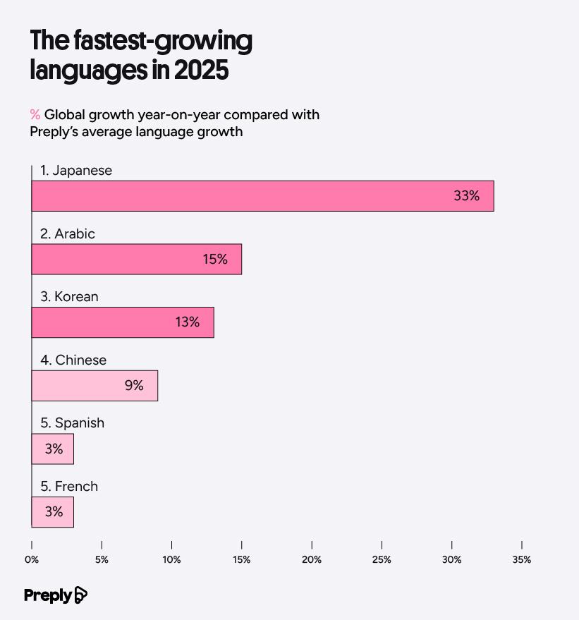
The team’s study also reflected the languages growing fastest. Japanese, Arabic, and Korean had the fastest growth on Preply. 33% of Preply learners chose to study Japanese, 15% studied Arabic, and 13% studied Korean. Cultural forces could drive this interest. K-pop, K-dramas, and anime have exploded in popularity, leading fans to have a natural interest in the Japanese and Korean languages. Arabic growth is likely tied to expanding global business ties with Arabic-speaking nations. Across languages, most learners are motivated to achieve fluency in another language for career advancement. 35% report learning a language to improve their job prospects. English learners are the most career-driven, with 52% studying for this reason. Hobbies and personal passions come in second at 31%, particularly for Italian, Japanese, and Arabic learners. People who studied Dutch, Portuguese, and German were likely to say they wanted to learn more about their heritage/family connections, or to prepare for relocation.
The economic stakes for language learning are high. The UK estimates that removing language barriers could bring in an estimated $19 billion per year. A Eurobarometer survey found that 33% of small and medium-sized enterprises exporting with the EU cite language and regulatory differences as their biggest obstacles. Health benefits emerge, too, with bilingual brains proving more resilient against dementia and Alzheimer’s disease.
The study also included some insight into AI’s impact on language learning. About 80% of students and recent graduates report using AI in their studies and it seems language learning is no exception. Despite this, 71% of Preply students said they would feel more confident speaking to a human tutor than relying on an AI app alone. This suggests that most students feel AI can complement their studies but doesn’t replace a human tutor.
One of the biggest themes in the report’s data is that language learning is not just a personal achievement but also an economic asset, a cognitive investment, and a cultural bridge. People are drawn to language learning for so many strong reasons. If you’re thinking about learning a language, there have never been more reasons to get started, whether you’re motivated by passion, your career, or traveling around the world.
-
 Business Visualizations2 years ago
Everything Owned by Apple
-
 Business Visualizations2 years ago
America’s Most Valuable Companies Ranked by Profit per Employee
-
 Business Visualizations1 year ago
The Biggest Fortune 500 Company in Every State
-

 Business Visualizations12 months ago
The Biggest Employers by Industry
-
 Timelines2 years ago
Timeline Charts the Development of Communications Technology
-
 Business Visualizations7 months ago
The Largest Companies in America That Are Still Run by the Person Who Founded Them
-
 Maps2 years ago
A Map to Gold and Silver
-
 Timelines2 years ago
The Evolution of Baby Names: A Century of Trends


![Best movies for English language learning [Study]](https://thechartistry.com/wp-content/uploads/2026/04/movies-best-for-English-learning.png)
