Maps
Penis Lengths Around the World
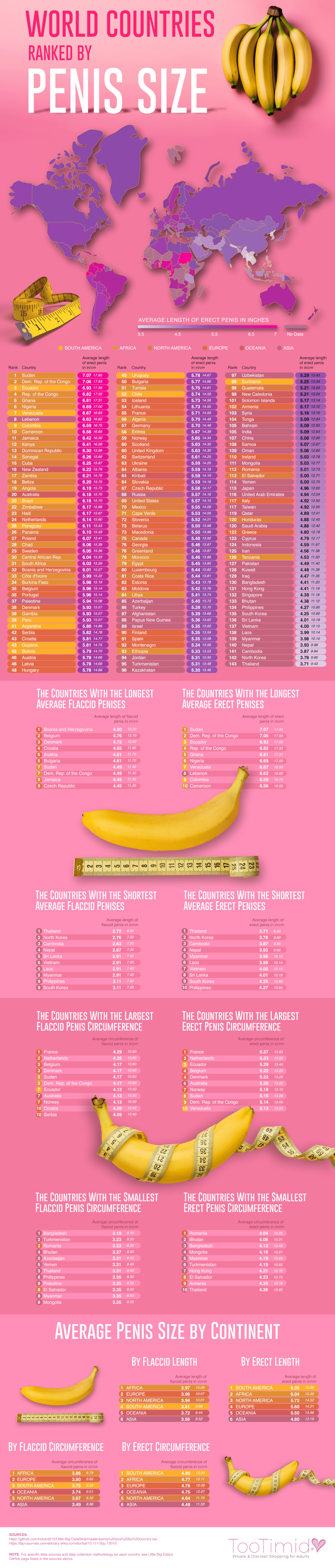
Who says size doesn’t matter? Certainly not the men of Sudan who were found to have the world’s largest average penis size. According to sex-toy site TooTimid.com, the average length of an erect penis in Sudan is 7.07 inches long, or 17.95 cm for our metric friends. Sudan’s impressive average length just barely beat out its neighboring country, the Democratic Republic of the Congo, which had a reported average penis length of 7.06 inches when erect. We have to say, with average lengths that long the banana was a great choice to represent the male member on this pretty pink graphic! If you’re wondering what the average penis size is in other countries, TooTimid put together quite the compendium of worldwide penis lengths. Their inclusive chart ranks 143 countries on the average length of an erect penis among its male citizens. In addition to erect penis sizes, they’ve even highlighted the top ten countries that were found to have the longest average flaccid penis. If you’re more interested in girth than length, the top ten lists for the countries with the largest penis circumference (both erect and flaccid) are also waiting to be discovered by you below. What about the countries with the shortest penis size? Don’t worry, the team at TooTimid covered that too! This chart of countries ranked by penis size truly has it all. How does your member measure up to the rest of the world? Check out the map of average penis sizes around the world and see for yourself!
Click below to zoom
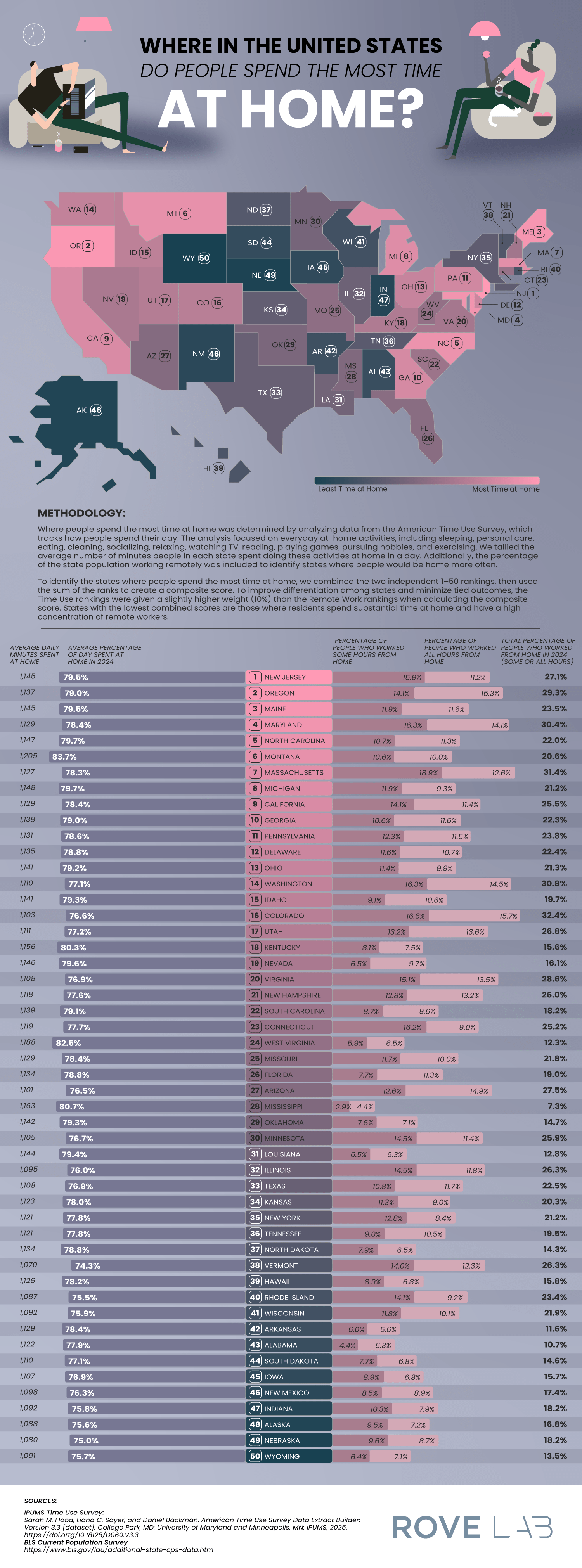
A new article from RoveLab presents a data-driven exploration of home-life habits in the United States, examining how much time Americans spend at home and how that changes across each state. Drawing on data from the American Time Use Survey and the Integrated Public Use Microdata Series, the study constructs a ranking of states based on how much time residents spend at home. This data combined at-home activity levels with remote work prevalence.
RoveLab situates its analysis within broader behavioral shifts in the American lifestyle. On average, Americans spend around 18 hours per day at home (including sleep), which reflects a gradual decline in time spent outside the home over the past two decades. This trend pre-dates the COVID-19 pandemic, which spiked time spent at home and prompted the rise of remote work.
Click below to zoom.
Other important facts on time spent at home add more context:
- 80% of Americans engage in daily household activities like cleaning, cooking, and home maintenance.
- 94% of Americans participate in leisure activities at home, including gaming, socializing, and exercise.
- Most Americans watch about 3.57 hours of television daily, which is more than the average amount of daily time spent on household tasks.
These statistics show that a home is the central site of both productivity and leisure, underscoring the growing connection between work and private life.
To determine which state residents are the most homelife-centric, the researchers developed a scoring system that incorporated:
- Average percentage of the day spent at home
- Average daily minutes spent at home
- Percentage of residents working remotely
- Weighted ranking emphasizing time-use data slightly more than remote work numbers
This multi-factor approach shows the team’s effort to balance behavioral statistics with labor trends, offering a comprehensive view of domestic time use.
The team found that residents in these states spend the most time at home:
- New Jersey: 5% of the day is spent at home (1,1495 minutes) and 27.1% of residents work remotely.
- Oregon: 79% of the day is spent at home and 29.3% of residents work remotely.
- Maine: 79% of the day is spent at home and 23.5% of residents work remotely.
New Jersey’s lead position is due to several structural factors, such as its proximity to major employment centers and a highly educated workforce, with over 40% of residents holding a bachelor’s degree. These factors create a population ideal for telecommuting. It shows us that socioeconomic factors can shape our daily routines.
At the low end of the scoring, Wyoming ranks as the state where people spend the least amount of time at home. This reflects a low rate of remote work. Montana relies on industries like agriculture, mining, and tourism, which all require in-person workers. The team also speculates that Wyoming’s emphasis on outdoor recreation leads residents to both work and play outside their homes.
By combining time-use data with employment patterns, the study provides valuable insight into how regional differences, evolving job requirements, and leisure habits shape modern American life.
Preply’s new article on the most popular couple pet names in each state digs into one of life’s little joys: what couples call their partners. The piece also explores the importance couples place on these names. This is a crash course on love language, with “babe” and “honey” taking center stage, along with a surprising amount of “dumpling.”
The researchers surveyed thousands of U.S. residents nationwide and asked about their use of affectionate nicknames in relationships. They gave each state a score from 0 to 100 based on nickname frequency, variety, and whether folks saved their partner’s pet name on their phone instead of their given name. Basically, the more “boo” and the less “hey you,” the higher the score earned.
Click below to zoom.
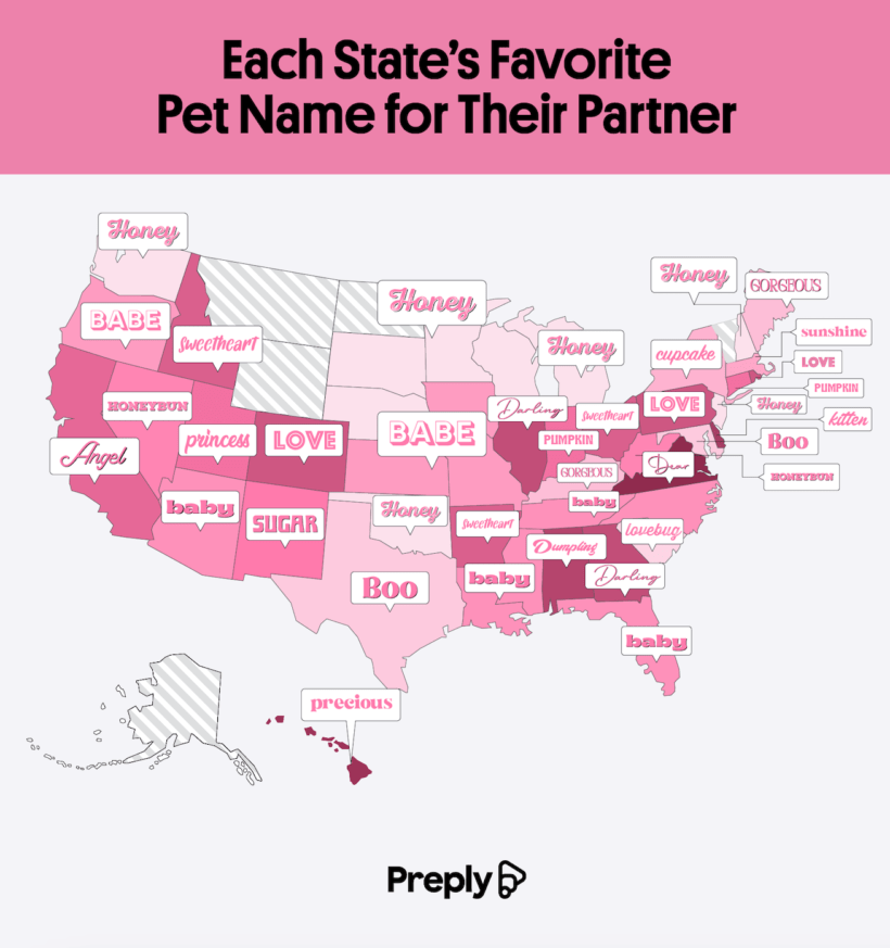
Topping the nickname list with nearly perfect scores were New York (99.84), Virginia (98.30), and Nevada (98.04). If you’ve ever wondered which states are all over pet names like syrup on pancakes, here’s your answer. Virginians are particularly committed. They love nicknames so much that many people save them as contacts in their phones, and they will proudly defend their choice. Meanwhile, Nevadans use nicknames as flashy as the Las Vegas Strip.
On the other hand, some states are less than enthusiastic about nicknames. Minnesota holds the dubious honor of being the least likely to use a pet name and label the behavior as cringe. They’re followed by Colorado and Massachusetts. In Minnesota, you’re more likely to hear someone say “sweetheart” with more sarcasm than sweetness.
An extra fun section displays the team’s favorite unique couple nicknames and the state where they found them. While “babe,” “love,” and “honey” might be the most commonplace, some couples would rather put their own unique spin on relationship names.
- Honey is the most common pick in the country. This warm, golden classic is popular in Nebraska, Michigan, New Jersey, and Washington.
- Baby reigns as the most popular nickname in Florida, Arizona, and Tennessee, showing off a more playful vibe.
- Cupcake takes the cake for New York, where it seems to be a sweet and city-trendy name.
- Dumpling is Alabama’s favorite and seriously adorable nickname, while the sweet “sugar” is the most popular in New Mexico.
- In places like Nevada and West Virginia, some fun and old-fashioned nicknames are popular, like “honeybun.” Why settle for honey when you can add the buns?
These quirky, regional flavors of affection paint a sweet picture of romance in the U.S. Almost two-thirds of all couples surveyed are called “love,” “honey,” or “babe” by their partners, often more than by their actual names. Around 69% of Americans believe pet names strengthen their relationship and feel nervous or suspicious that something is wrong when their partner doesn’t use their nickname. Over a third of people admitted to using the same nickname across different relationships, indicating that these names come as natural old favorites more than specific choices to match certain personalities. This map is a fun look at the way Americans express love through names.
Millions of Americans travel for New Year’s Eve and Day celebrations, but unfortunately, the last night of the year can be one of the most dangerous for drivers. CarInsurance.com analyzed data from the National Highway Traffic Safety Administration to find that certain states and counties have consistently higher fatality rates on December 31 and January 1. The team identified where and when the risks are highest.
Click below to zoom.
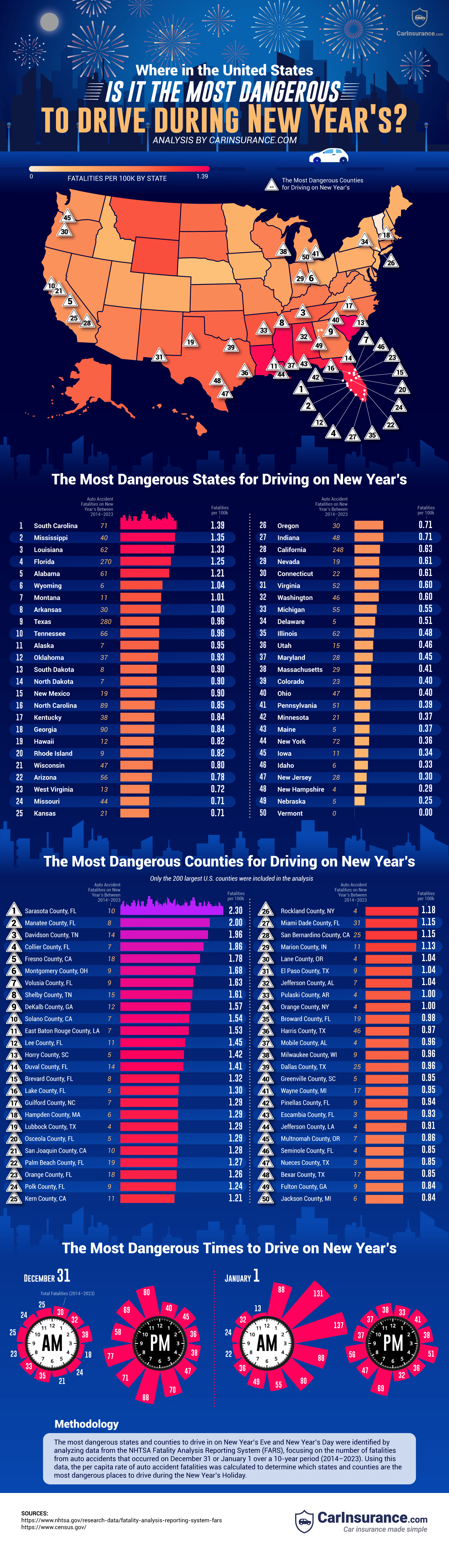
The team’s analysis examined NHTSA fatality numbers between 2014 and 2023, then adjusted this data relative to population to calculate the number of fatalities per 100,000 residents. They discovered that these states had the highest per-capita traffic deaths on New Year’s Eve:
- South Carolina – 1.39 deaths per 100,000 (71 total)
- Mississippi – 1.35 deaths per 100,000 (40 total)
- Louisiana – 1.33 deaths per 1000,000 (62 total)
Florida was also a high-risk location. Its deaths per capita rank fourth on the list, but the total number of New Year’s Eve fatalities are much higher than the top three states, with 270 deaths in total. This is largely due to Florida’s large population and number of dangerous counties.
Focusing on these high-risk counties revealed some especially hazardous locations. The deadliest U.S. counties on New Year’s Eve and Day were:
- Sarasota County, Florida – 2.3 fatalities per 100,000 (10 deaths)
- Manatee County, Florida – 2.0 per 100,000 (8 deaths)
- Davidson County, Tennessee – 1.96 per 100,000 (14 deaths)
Sarasota and Manatee counties are both linked to high rates of DUI-related traffic fatalities, which can help explain their placement at the top of the list.
The danger not only varies by place, but by the time of day. On New Year’s Eve, the deadliest hours occur between 2 a.m. and 3 a.m. for 38 recorded fatalities. On New Year’s Day, the early morning hours are by far the most dangerous, with 137 deaths occurring between 2 a.m. and 3 a.m. and 131 deaths between 1 a.m. and 2 a.m.
Over the decades, we see 1,047 deaths on December 31st and 1,474 on January 1st, so New Year’s Day has the most fatalities overall, which is probably due to partygoers under the influence returning home in the early morning hours.
The largest contributor to New Year’s traffic deaths is certainly alcohol impairment. For example, in 2022, 37% of deadly crashes on New Year’s Day involved an alcohol impaired driver. This number varies year-to-year, but it does highlight how common drunk driving is during holiday celebrations.
This pattern aligns with a broader national trend of alcohol-impaired driving leading to traffic fatalities. In 2023, a third of U.S. traffic deaths involved drunk drivers, prompting campaigns run during the holiday period with slogans like, “Drive sober or get pulled over.”
Understanding the safety facts the team outlined can help drivers make safe decisions over the holidays. We can see from the data that they should avoid driving between 1 a.m. and 3 a.m. on New Year’s Eve and New Year’s Day. They should arrange a sober ride and never drive under the influence. Always wear a seatbelt and be extra alert when driving.
-

 Business Visualizations1 year ago
Everything Owned by Apple
-

 Business Visualizations1 year ago
America’s Most Valuable Companies Ranked by Profit per Employee
-

 Business Visualizations1 year ago
The Biggest Fortune 500 Company in Every State
-

 Business Visualizations10 months ago
The Biggest Employers by Industry
-
 Business Visualizations2 years ago
New Animated Map Shows Airbnb’s Fully Booked Cities Along the 2024 Eclipse Path of Totality
-

 Business Visualizations2 years ago
Everything the Luxury Giant LVMH Owns in One Chart
-

 Timelines1 year ago
Timeline Charts the Development of Communications Technology
-
 Charts2 years ago
How Many Crayola Crayon Colors Are There? A Lot.