Charts
The Nature Timespiral Reveals the History of Earth From the Big Bang Until Today
In the grand scheme of time and space, the existence of humanity is a mere drip in the ocean of reality. Or is it? Either way, this utterly breathtaking visualization by Pablo Carlos Budassi shows us how we are just a tiny thread in a colossal tapestry of stardust:
Click below to zoom
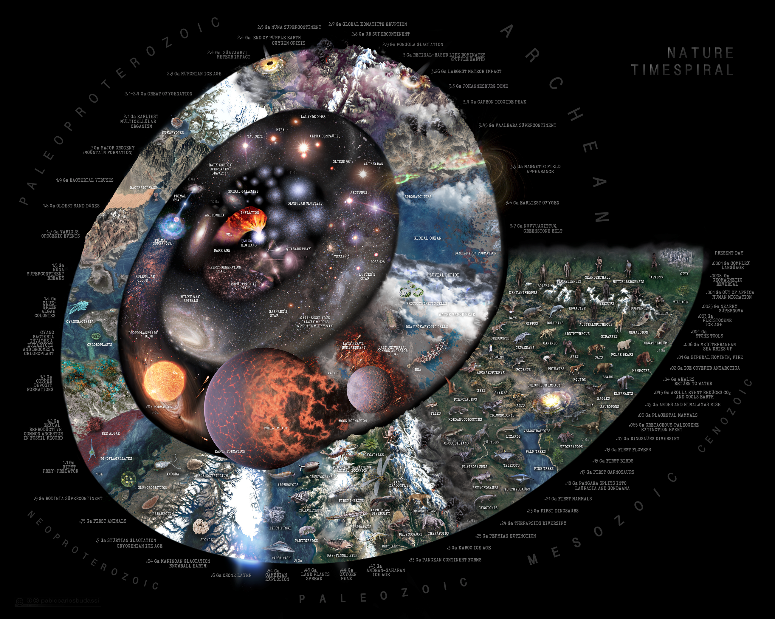
It is no easy task to visualize the entire history of the planet in a gorgeous, mesmerizing way, but illustrator Budassi has achieved it. When I first saw this visualization, I literally gasped and immediately investigated if it is available for purchase because I would love to see it on my wall everyday (and I would be honored to support such a talented artist). It somehow remains minimalist while capturing an incredible wealth of information and detail. The colors convey the timeline of cataclysmic events that have created the lush, diverse world we call home today.
I also love beautiful things that I can learn from while admiring them. For example, I had no idea what the last universal common ancestor (LUCA) was. Around 4 billion years ago (the Earth and moon formed 4.5 billion years ago, for context), LUCA existed. It is believed that this microbe was the beginning of life on Earth, making it the first ancestor of all living creatures. There is evidence that it lived a somewhat alien lifestyle, thriving deep underground in iron-sulfur hydrothermal events. It did not breathe air and was capable of producing its own food using the dark, metal-rich environment surrounding it. Gotta love a strong, independent microbe!
In 1993, when the Internet became publicly available, the average speed was 14.4 Kb/s, and today, the average speed is 214 Mb/s. These are huge leaps in speed that can be difficult to understand. The team at Ooma shows the progression of this leap with a timeline of Internet speeds year by year. Tracking these Internet speeds can help us understand the technological developments that made this possible and show how the Internet has proliferated in daily life.
Click below to zoom.
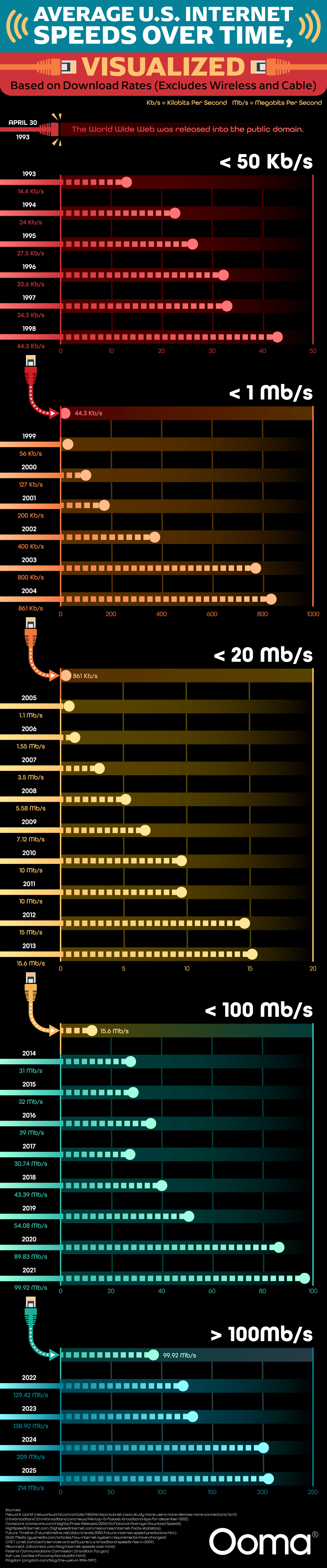
At the top of the timeline, we see Internet speeds throughout the ‘90s at their slowest. Internet users had dial-up modems using phone lines to connect to the web. This was the slowest version of Internet technology we have seen on the timeline. The team provides context for the speed, explaining it would take almost four seconds to download an image of a meme, 11 minutes and 41 seconds to download an MP3 file of a song, and almost 34 hours to download the film, “The Dark Knight.” The peak speed reached in the dial-up era was 44.3 Kb/s. The graph shows significant jumps in speed in 1999, 2005, 2014, and 2022. These jumps occurred mainly due to technological advances, such as the creation of broadband and satellite Internet, as well as the expansion of access to higher speeds.
Context for today’s speeds compared to the past shows that it takes less than a second to download a meme, half a second to download an MP3, and only 8 seconds to download a long movie like “The Dark Knight.” Even though there have been vast improvements, the United States doesn’t have the fastest Internet speeds in the world. Singapore and the United Arab Emirates have higher speeds. The team tells us this is because of America’s vast landmass. It has been a challenge to provide high-speed Internet to rural areas, but there have been big improvements. Thanks to satellite Internet connections, people in more remote areas can have access to higher speeds.
Current projections show that by 2025, most of the world will have Internet access, even in remote areas with less infrastructure. The best equipment will be able to download a terabyte of data in just seconds through the use of fiber-optic cables, which are much faster than coaxial cables.
While there’s been great progress in providing high-speed Internet to rural areas, millions of Americans still don’t have access to high-speed Internet. The challenge is how to connect these locations to broadband. There are countless ways we have seen the Internet improve quality of life for people, from bringing them the ability to use telehealth, to social connections, to remote work opportunities. Timelines like this one from Ooma highlight progress but also remind us of the work that still needs to be done to improve American infrastructure. When we’ve seen such huge leaps in speeds, it’s not fair for some people to lack access to reliable Internet because of where they live.
NapLab looked at a sensitive topic for Americans everywhere by mapping survey results, which expose where people have engaged in and experienced the most infidelity. We can see from the results that cheating is, unfortunately, a very common experience, at least for the people who responded to the survey.
Click below to zoom.
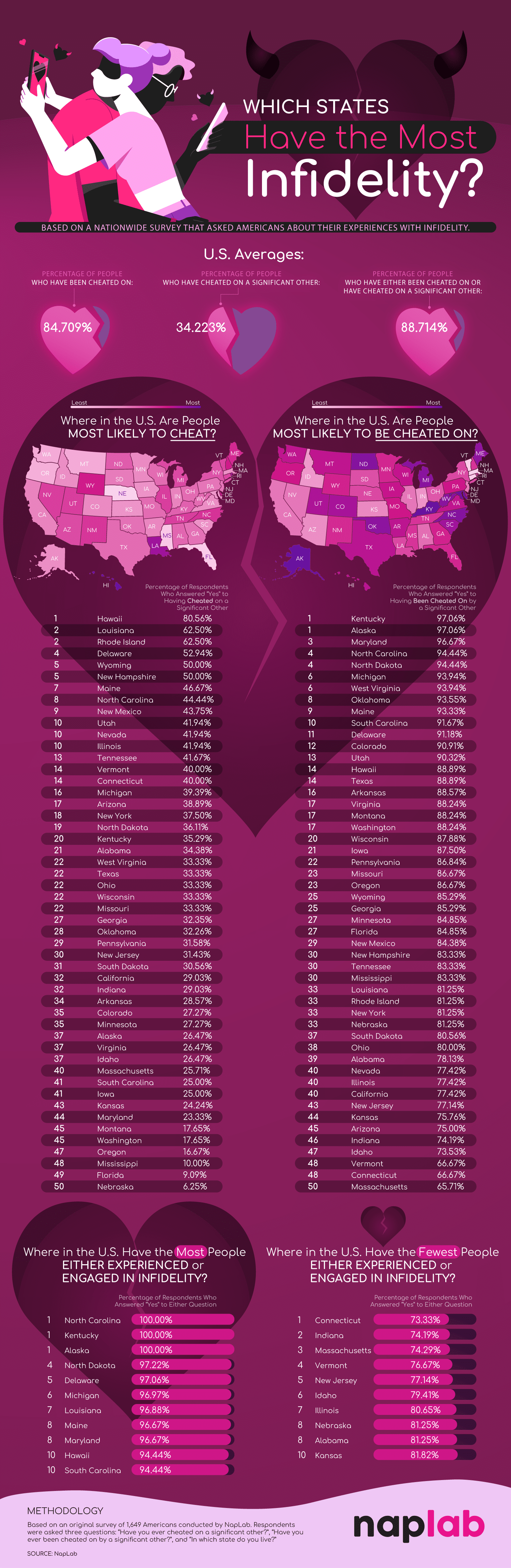
The team’s data yields some surprising results. For example, 100% of respondents in North Carolina, Kentucky, and Alaska said they had cheated or been cheated on. Overall, in every state, over half the respondents said they have been cheated on. These are some hefty statistics.
Overall, these states ranked highest with residents most likely to cheat:
- Hawaii
- Louisiana
- Rhode Island
- Delaware
- Wyoming
- New Hampshire
- Maine
- North Carolina
- New Mexico
- Utah
These are the states where people are most likely to be cheated on:
- Kentucky
- Alaska
- Maryland
- North Carolina
- North Dakota
- Michigan
- West Virginia
- Oklahoma
- Maine
- South Carolina
Studies like this one can help us take steps to understand why infidelity occurs. Infidelity can be tricky to even define. Some may consider emotional involvement to be cheating, while others only consider physical romantic acts to be cheating. In other relationships, physical acts outside the relationship are acceptable as long as both partners are comfortable with them and the behavior stays within certain boundaries defined by the couple.
The data shows an interesting pattern, which is that more people reported being cheated on than cheating. This makes sense as cheating usually comes with a sense of shame. Not everyone admits to having cheated, but those who have been cheated on feel a sense of pain and outrage that makes them more likely to share their experience. Another interesting pattern is that the number of people who have self-reported that they cheated and have been cheated on is similar. That implies that many people have been both the cheater and the victim. How might that affect someone’s views on infidelity? The survey certainly leads to many more interesting questions.
People cheat for many varied reasons, including personal choices, social pressures, cultural norms, and dissatisfaction. Some couples say financial stress pushes them apart and builds resentment. The data may show some evidence for this, as low-income states like Kentucky and Louisiana rank highly on the list.
The team’s study leads to many more interesting questions to examine. For example, does age have anything to do with cheating rates? Studies seem to indicate it’s a yes. There have also been studies centered on gender, finding that men are more likely to cheat than women. Cultural factors are certainly impactful. A lot of research shows religious couples are less likely to cheat on one another, and the same is true in more conservative regions. This could be an inaccurate depiction, though, since stronger shame and taboos will make people more likely to carefully hide their infidelity and not admit to it. There’s no doubt that this study is a thought-provoking one.
As of April 2025, there have been 16 measles outbreaks in the United States, a number that has jumped significantly over the past few years. A new study from PA Requirements shows this has a connection to vaccination gaps. Kindergarten vaccinations help protect citizens against diseases like measles and contribute to our population achieving herd immunity, which eradicates the threat of the disease. However, the team’s study reveals that a combination of policy, vaccine access, and community factors is hindering our progress toward this goal.
Click below to zoom.
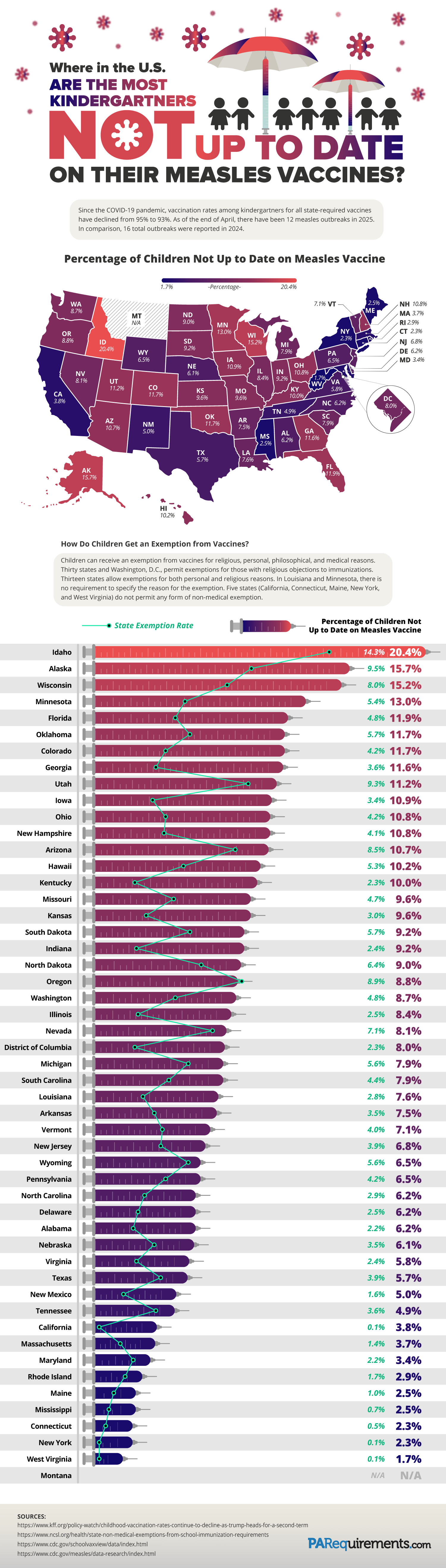
The team found that these states had the highest percentage of children not vaccinated for measles:
- Idaho: 20.4%
- Alaska: 15.7%
- Wisconsin: 15.2%
- Minnesota: 13.0%
- Florida: 11.9%
- Oklahoma: 11.7%
- Colorado: 11.7%
- Utah: 11.2%
- Iowa: 10.9%
- Ohio: 10.8%
It can be useful to compare these numbers to the states with the lowest rates of unvaccinated children:
- West Virginia: 1.7%
- New York: 2.3%
- Connecticut: 2.3%
- Mississippi: 2.5%
- Maine: 2.5%
- Rhode Island: 2.9%
- Maryland: 3.4%
- Massachusetts: 3.7%
- California: 3.8%
We can observe some interesting regional patterns by examining the map, such as lower vaccination rates in the Midwest and Southwest.
Among the states with high rates of vaccination, we find that these five states don’t allow non-medical vaccination exemptions: Maine, New York, West Virginia, Connecticut, and California. It’s no surprise that stricter policies lead to a greater number of vaccinations. Among states with lower rates, we find more relaxed laws that allow for greater exemptions on the basis of religion, philosophy, and other personal reasons. Comparing each state to its neighbors reveals patterns and trends that might imply cultural differences affecting vaccination rates in different regions. We can look for locations with a high prevalence of religions that outlaw vaccines to identify reasons for the numbers on the map. Check the numbers on the states with the largest cities, and you might find stricter vaccination laws there to help prevent disease spread in population-dense areas.
There’s no doubt that state policies correlate directly with vaccination rates when we look at the numbers presented on the team’s graphic. Many states require certain vaccinations, like measles, in order to enroll in public school. These laws and requirements also directly impact vaccination rates. Looking at insurance costs and access to vaccine clinics in rural areas may also reveal why some areas have more unvaccinated children than others. Some states have created initiatives to encourage vaccination and provide education, leading to higher vaccination rates.
Overall, studies like these greatly benefit public health by increasing awareness and education about diseases like measles. People who shy away from vaccines often find them untrustworthy. The only way to convince them otherwise is to answer their questions and present them with transparent data that’s easy to understand, just like the information shown in this graphic, regarding the risks associated with declining vaccines. These studies provide policymakers, parents, and public health officials with more information to make informed decisions for the health of their children and communities.
-

 Business Visualizations9 months ago
Everything Owned by Apple
-

 Business Visualizations8 months ago
America’s Most Valuable Companies Ranked by Profit per Employee
-

 Business Visualizations1 month ago
The Biggest Employers by Industry
-
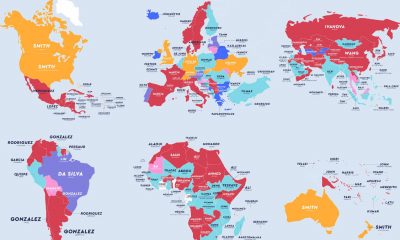
 Maps2 years ago
The Most Popular Surnames in Countries Around the World
-

 Business Visualizations4 months ago
The Biggest Fortune 500 Company in Every State
-
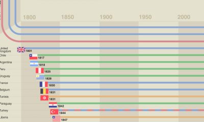
 Timelines1 year ago
A History of the Oldest Flags in the World
-
 Maps1 year ago
Penis Lengths Around the World
-
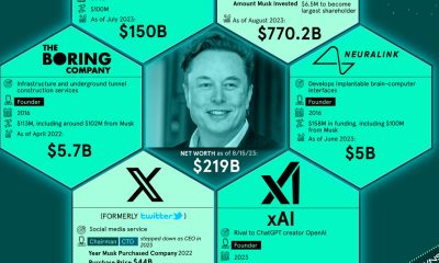
 Business Visualizations2 years ago
How Many Companies Does Elon Musk Own?