Finance Visualizations
Visualizing the Gender Pay Gap Over Time
Data can be the key to exposing injustices in society. These graphs are a strong example of that. They examine the pay gap between men and women ever since the introduction of the Equal Pay Act. This legislation was supposed to eliminate the gap entirely, but we can see from the graphs that even sixty years later, the gap still exists. There has been some improvement. In the 60’s the pay gap was $0.61 to the man’s dollar and we’re now up to $0.84 to a man’s dollar in 2022. Graphs like this make it clear when we still have work to do:
Click below to zoom
The Equal Pay Act was introduced to give workers of all kinds more rights. It covered child labor as well as the gender-based wage gap. Following the timeline displayed, we can see that it certainly had an effect on the wage gap, but it didn’t close it entirely, and change came slowly. It’s no coincidence that this came about in the 1960s since previously, it was uncommon for women to work outside the home. When they did, they were limited to roles like nursing, teaching, and secretarial positions. The feminist movement of the 60s helped millions of women enter the workforce, but it was clear right away they wouldn’t be treated the same as their male coworkers. We love how the data presents a detailed picture of this issue. You can see comparisons by the dollar and by yearly salary. In both cases, women consistently lag behind for no discernible reason other than their gender. Using calculations based on all this data, we can predict that if change continues at this rate, the gap won’t close for another few decades. We hope visualizations like this can help inspire faster change!
Charts
The Most Expensive U.S. States to Own a Car
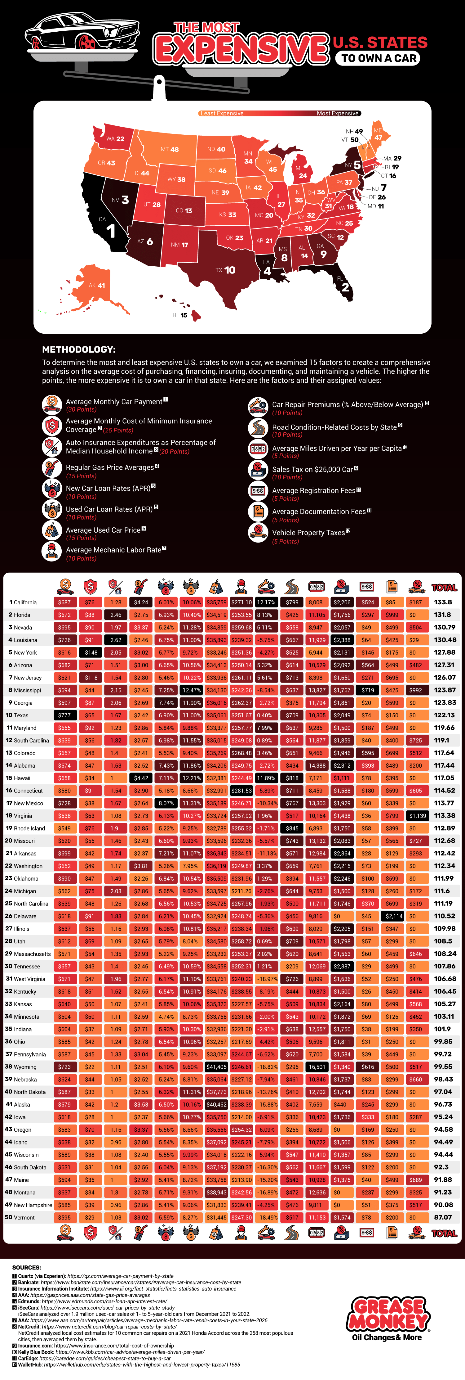
America’s infrastructure depends on vehicle use, making driving a necessary reality for many people. According to research, 78% of workers aged 16 and over use a car to get to work. Few Americans never or rarely drive. Car costs can be prohibitive, and more people struggle to afford vehicle ownership each year as car prices rise. Add other state-level fees to the mix, and vehicles can be a struggle to afford. The team at Grease Monkey helped determine the most affordable and expensive states to own a car in.
Click below to zoom.
They found that California is the most expensive state for car ownership. The high costs in California are largely due to maintenance talks. There are higher car repair premiums, higher gas prices, higher registration fees, higher car insurance premiums, and above-average monthly car payments in California. All of these combine to make California a highly expensive state in which to own a car.
If you’re looking to save on vehicle expenses, look no further than Vermont. It scored nearly 50 points lower than California according to the team’s system. Vermont has the third-lowest car insurance rates, third-lowest repair premiums, and low registration fees and sales taxes. There are no vehicle property taxes in Vermont, another major source of savings.
To create such a comprehensive study, the team looked at 15 different data sets and awarded points based on these sets:
- Average monthly car payment
- Average monthly cost of minimum insurance coverage
- Auto insurance expenditures as a percentage of median household income
- Regular gas price averages
- New car loan rates
- Used car loan rates
- Average used car price
- Average Mechanic labor rate
- Care repair premiums
- Road condition-related costs by state
- Average miles driven per year per capita
- Sales tax on a $25,000 car
After California, the most expensive states to own a vehicle in were Florida, Nevada, Louisiana, New York, Arizona, New Jersey, Mississippi, Georgia, and Texas. If you’re looking for more affordable states other than Vermont, turn to New Hampshire, Montana, Maine, South Dakota, Wisconsin, Idaho, Oregon, Iowa, Alaska, and North Dakota. The team’s study is an exhaustive examination of all the costs that stack up to make driving prohibitive. Many of the more expensive states have a generally high cost of living, so this information could be useful to anyone looking to relocate to a more affordable state.
Although it might seem counterintuitive, thorough annual maintenance on your car can keep your costs down in the long term. Regular oil changes, brake service, and tire rotations can extend the life of your car, which has a big impact on your savings. For car insurance, investigate special programs you may qualify for, like being a safe driver or completing a defensive driving course. This map can help us reflect on the many expenses that come with car ownership and prompt us to think of ways we can save money and keep driving costs reasonable.
Business Visualizations
Where in the U.S. Are Different Tech Sectors Growing the Fastest?
Tech is one of the world’s biggest industries, with many of the dominant Fortune 500 tech companies based in the United States. Four tech companies alone are worth trillions of dollars, and though the industry is full of rapid changes, it’s not going anywhere. The Pulse team examined locations around the country where key tech industries are booming and mapped their findings. The map shows that while Silicon Valley is the traditional home of the tech industry, there are growing tech centers around the country.
Click below to zoom.
One of the sectors spreading geographically is computing infrastructure and data services. Somerset, New Jersey, is the hub of this sector, with a significant employment increase between 2023 and 2024. Dense fiber networks and proximity to financial clients in New York City make New Jersey an ideal location for this sector. However, Ada County, Idaho, and a few counties in Maryland also support this sector.
As for custom computer programming services, the biggest hub is in Norfolk City, Virginia. There are several major software firms there, supported by the Norfolk Innovation Corridor, a “technology zone” that includes businesses, public works, hospitals, and universities. Tech startups here earn major tax incentives and other benefits. Georgia and Maine have growing centers of custom programming services too.
Software publishing is booming in the state of Texas. In Bexar, Texas, employment in this sector had doubled. San Antonio and Austin are also full of software publishing companies. Pittsburgh emerges as a hub for software publishing too, thanks to the University of Pittsburgh.
Web search portals and information services have a home in the New York City metropolitan area, particularly in Union and Essex counties. Multnomah County, Oregon, home of Portland, also has a healthy number of companies in this sector, along with many other types of creative and digital media companies.
Semiconductors are commonly manufactured in Williamson County, Texas, north of Austin. Samsung made a $17 billion investment in a semiconductor facility in Taylor, Texas, making the area a leader in the industry. NVIDIA, located in Santa Clara County, California, is another leader in this industry.
From Ohio to Maine, it’s clear that California doesn’t have the tech industry on lock. Many other cities have responded to the booming economy supported by thriving tech companies. Many cities have been totally revolutionized thanks to a major tech company opening its headquarters there. Tech businesses bring skilled workers with money to spend on many other local industries, so many communities welcome these companies with open arms.
Students and entrepreneurs can use data and maps like this to pinpoint where they may want to relocate for their job search or startup. Overall, this map offers a fascinating way to look at the state of the American tech industry by shifting our focus away from Silicon Valley and considering how tech could impact other states and cities in the future.
Business Visualizations
Timeline Showcasing the Remarkable History of How We Pay
Before we used banks, barcodes, or Bitcoin, humans still developed sophisticated point-of-sale systems to exchange something of value with a stranger. We’ve reinvented solutions time and again over human history, and the team at Qualtrics created a timeline that shows us the story of this history is a lot more dramatic than your tap-to-pay transaction suggests.
Trading between humans began with the exchange of goods rather than coins or paper. Livestock, pelts, and food were the stuff of life, the most valuable items we could possess. There was no central authority to set prices and values for these things, so trades were negotiated on a case-by-case basis. The first move toward abstraction came with the exchange of goods for cowry shells and tally sticks. An interesting fact: cowry shells have been found across continents, even among civilizations that never met each other.
A major currency turning point in the ancient world was Mesopotamia’s clay tokens, used to exchange for grain and to pay off debts. Ancient Egyptians expanded on this with labor tokens that existed in a tiered system as an early form of payroll. The Code of Hammurabi, from 1750 BC, established complex rules governing credit, debt, and contracts. Economic regulation is a lot older than many people may assume.
When the Silk Road opened in 138 BC, goods, currencies, and ideas traveled thousands of miles. Muslim merchants created sakk, a document that ordered banks to pay a third party, so they didn’t have to travel with heavy coins. The sakk is the direct ancestor of a check. The Song Dynasty of China created a system of paper receipts called jiaozi, which became the world’s first paper currency.
During the Industrial Revolution, James Ritty created the mechanical cash register to help secure coins and bills from untrustworthy cashiers pocketing spare change. He called the machine, “the Incorruptible Cashier.” The Diners Club card, introduced in 1950 by American Express, became the first plastic credit card. A pack of Wrigley’s Juicy Fruit gum became the first product with a barcode scanned at the checkout in 1974.
The digital age brought about the most dramatic and rapid development. In 2009, Square turned smartphones into point-of-sale registers. This dramatically lowered barriers to entry for small businesses everywhere that could process QR codes and contactless payment methods to sell goods and services. The newest advances are in the realm of biometrics. Michigan businesses started using payments triggered by eye recognition in 2023.
From clay tokens to retinal scans, we’ve come a long way in economic innovation. These advances and technologies tell the story of humans creating solutions to the problem of developing enough trust to trade with strangers. The timeline also shows us how commerce is so tightly woven into human history and development. Some may say it’s the keystone, the foundation of human civilization. This piece is an entertaining and informative visual tale of the development of money, sales, and trade.
-
 Business Visualizations2 years ago
Everything Owned by Apple
-
 Business Visualizations1 year ago
America’s Most Valuable Companies Ranked by Profit per Employee
-
 Business Visualizations1 year ago
The Biggest Fortune 500 Company in Every State
-
 Business Visualizations11 months ago
The Biggest Employers by Industry
-

 Business Visualizations2 years ago
New Animated Map Shows Airbnb’s Fully Booked Cities Along the 2024 Eclipse Path of Totality
-
 Timelines1 year ago
Timeline Charts the Development of Communications Technology
-

 Charts2 years ago
How Many Crayola Crayon Colors Are There? A Lot.
-
 Business Visualizations6 months ago
The Largest Companies in America That Are Still Run by the Person Who Founded Them


