Finance Visualizations
150 Years of U.S. National Debt in One Chart
Today, the national debt of the United States of America stands at an eye-watering 28 trillion dollars and rising. The CARES Act of 2020 and other stimulus bills due to COVID have added massive increases in a short period of time. To see how we got to this place to being with Visual Capitalist has this great interactive timeline of US debt over the past 150 years.
Click below to use the interactive version
Starting in the year 1900 only 4.8% of the total national debt was held by the public. After World War I in 1910 that percentage jumped to 10. In 1920 following the Great Depression that number doubled to 22.9%. Ten years later that number would be in the billions, 16 billion to be exact with President Roosevelt’s New Deal in 1930. World War II would see this number jump to 40 billion or 75.1% of the GDP. The Korean War of 1950 would add hundreds of billions to the debt clock in only ten years bringing the total in 1950 to $257 billion but bringing the GDP down to 56.8%. The next big increase would come in 1980 when president Reagan introduced his tax cuts causing the gross debt to jump to over 900 billion. Ten years later it would see another massive jump to over $3,233 billion dollars with the Gulf War. Thirty years later the COVID-19 pandemic caused the average debt held by the public to sky rocket to 105.6 percent in 2020 , over $27,748 billion dollars. By 2050 it is estimated that the percentage of debt held by the public will be almost 200 percent.
Before we used banks, barcodes, or Bitcoin, humans still developed sophisticated point-of-sale systems to exchange something of value with a stranger. We’ve reinvented solutions time and again over human history, and the team at Qualtrics created a timeline that shows us the story of this history is a lot more dramatic than your tap-to-pay transaction suggests.
Trading between humans began with the exchange of goods rather than coins or paper. Livestock, pelts, and food were the stuff of life, the most valuable items we could possess. There was no central authority to set prices and values for these things, so trades were negotiated on a case-by-case basis. The first move toward abstraction came with the exchange of goods for cowry shells and tally sticks. An interesting fact: cowry shells have been found across continents, even among civilizations that never met each other.
A major currency turning point in the ancient world was Mesopotamia’s clay tokens, used to exchange for grain and to pay off debts. Ancient Egyptians expanded on this with labor tokens that existed in a tiered system as an early form of payroll. The Code of Hammurabi, from 1750 BC, established complex rules governing credit, debt, and contracts. Economic regulation is a lot older than many people may assume.
When the Silk Road opened in 138 BC, goods, currencies, and ideas traveled thousands of miles. Muslim merchants created sakk, a document that ordered banks to pay a third party, so they didn’t have to travel with heavy coins. The sakk is the direct ancestor of a check. The Song Dynasty of China created a system of paper receipts called jiaozi, which became the world’s first paper currency.
During the Industrial Revolution, James Ritty created the mechanical cash register to help secure coins and bills from untrustworthy cashiers pocketing spare change. He called the machine, “the Incorruptible Cashier.” The Diners Club card, introduced in 1950 by American Express, became the first plastic credit card. A pack of Wrigley’s Juicy Fruit gum became the first product with a barcode scanned at the checkout in 1974.
The digital age brought about the most dramatic and rapid development. In 2009, Square turned smartphones into point-of-sale registers. This dramatically lowered barriers to entry for small businesses everywhere that could process QR codes and contactless payment methods to sell goods and services. The newest advances are in the realm of biometrics. Michigan businesses started using payments triggered by eye recognition in 2023.
From clay tokens to retinal scans, we’ve come a long way in economic innovation. These advances and technologies tell the story of humans creating solutions to the problem of developing enough trust to trade with strangers. The timeline also shows us how commerce is so tightly woven into human history and development. Some may say it’s the keystone, the foundation of human civilization. This piece is an entertaining and informative visual tale of the development of money, sales, and trade.
Most of us get tired of brands asking for our phone numbers and email addresses because we’re spammed with too many advertisements. But sometimes, providing your contact information will connect you with a brand’s loyalty program, which can offer discounts, free prizes, and cash back. One in ten companies has a loyalty rewards program, so the team at Qualtrics decided to analyze which one gives you the biggest return on investment. They focused only on base-level, free-to-join programs that give customers rewards through regular shopping; that way, the results truly reflect the rewards you earn for the money you spend.
Click below to zoom.
In the food and beverage industry, Domino’s Pizza offers the best ROI. The team calculated an almost 33% ROI for Dominos, which is by far the best offer, even across industries. You’ll receive about $10 of free food for every $30 spent. McDonald’s isn’t far behind at an 11 to 20% ROI with the MyMcDonald’s Rewards app. You’ll earn 100 points for every dollar spent, and you can use these points to purchase menu items. Papa John’s, Dunkin’, Wendy’s, and Burger King also have strong programs, with ROIs between 10% and 13%. The fast-food industry offers some of the best loyalty programs, earning eight out of the ten best rewards programs on the list.
In the retail and beauty space, Bath & Body Works leads with a 16.5%–19% ROI through the My Bath & Body Works Rewards program. The program allows shoppers to redeem points earned through purchases for free items, early access to sales, and an annual birthday gift. Ulta Beauty’s Ultamate Rewards program offers a decent ROI, too, at 3% to 6% for items that are normally on the expensive side. Their competitor Sephora has a Beauty Insider program that offers a lower 2% ROI, but exclusive free samples and early access to new products supplement it.
Brand rewards are weaker among clothing retailers. H&M, Gap Inc., and American Eagle/Aerie offer a 1%–4% ROI. These programs are still useful for loyal shoppers who know they’ll buy from these brands repeatedly.
Pharmacy and grocery store rewards can be a great help for budget-savvy shoppers. These stores have lower ROIs but can still offer decent rewards. Walgreens’ program took the lead, offering 1% back on most purchases and 5% back on Walgreens’ brand products, resulting in significant savings on generics. CVS has an ExtraCare program with a higher 2% ROI and personalized coupons.
In the grocery sector, Kroger and Safeway/Albertsons offer the highest ROIs, between 1% and 3.5%. These chains also offer a fuel rewards program that can be an incredible budget-saving boon. Lowe’s and Ace Hardware offer 1%–2% rewards programs that may be most helpful to frequent shoppers and small business owners who need materials from these stores.
Outdoor lovers and athletes can earn powerful rewards through the North Face’s XPLR Pass, which offers a 10% ROI, and the Dick’s Sporting Goods ScoreCard program offers a 3.3% ROI. The findings on this chart can help you save big the next time you shop!
“Artificial intelligence” may be the biggest buzzword of 2026. It seems like every industry is incorporating AI into its practices, but it has had the biggest impact in the business sector. Nearly 80% of businesses use AI in some way. Qualtrics has quantified the massive impact AI has on business with a chart listing 25 key statistics that illustrate its influence. These statistics help us understand how and why businesses are using AI to reach the next level.
Many of the statistics listed show why businesses are so drawn to AI. In 2025, three out of four companies used AI regularly for at least one task. 99% of Fortune 500 companies use AI in their hiring process to screen applicants for predicted success in a role. 83% of business professionals say they’re using AI to learn new skills to further their career. Perhaps the most compelling reason businesses turn to AI is their profits. Every dollar invested in generative AI yields an average return of $3.70. Businesses are embracing what they see as AI’s stronger performance and competitive edge.
There is no doubt that AI is profitable, as these figures show. 70% of companies report increased revenue that they attribute to generative AI. Supply chains use AI to streamline logistics, and on the marketing side of business, 42% report using AI for content generation. Customer service has seen a huge explosion in AI usage, almost a 2000% increase.
AI has strong momentum, with about 70,000 companies using it globally. U.S. private investment in AI is around $109.1 billion. 90% of the world’s AI models are the work of private industry rather than government-funded research or academia, highlighting that business not only uses AI but also fuels its creation.
Small businesses are a part of these statistics. 89% of small businesses use AI in their daily operations, often for financial management and customer service. 60% of small business owners say AI has improved their employees’ productivity. Executives and senior managers are the most avid users of AI, but use by interns and entry-level employees rises every year.
Here are a few other jaw-dropping statistics that show how enormous a presence AI has in the business industry:
- AI drives over 70% of venture capital activity.
- 92% of companies plan to invest more in AI within the next three years.
- 63% of businesses use AI to generate text-based content.
- The use of AI customer service agents has grown by 2,199% since January.
- The United States is home to 29,618 AI companies, which is more than any other country.
These statistics underscore that AI is becoming a regular part of everyday business practices. Companies often say they believe AI amplifies their employee’s natural talents. Whether used for strategy, customer service, or content generation, it seems AI is here to stay.
-

 Business Visualizations2 years ago
Everything Owned by Apple
-

 Business Visualizations1 year ago
America’s Most Valuable Companies Ranked by Profit per Employee
-

 Business Visualizations1 year ago
The Biggest Fortune 500 Company in Every State
-

 Business Visualizations11 months ago
The Biggest Employers by Industry
-
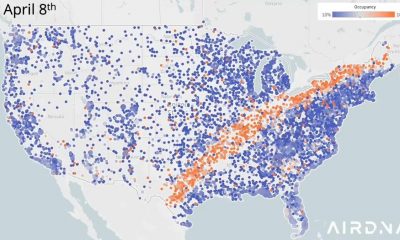
 Business Visualizations2 years ago
New Animated Map Shows Airbnb’s Fully Booked Cities Along the 2024 Eclipse Path of Totality
-

 Timelines1 year ago
Timeline Charts the Development of Communications Technology
-
 Charts2 years ago
How Many Crayola Crayon Colors Are There? A Lot.
-

 Business Visualizations6 months ago
The Largest Companies in America That Are Still Run by the Person Who Founded Them
1 Comment