Business Visualizations
Pharma Companies Ranked by Revenue per Second
Pharmaceuticals in America are notoriously expensive, sometimes to the point of being out of reach for those who truly need them. For example, in 2019, people in the U.S. paid an average of $30,808 for a 28-day supply of Harvoni, a medication for hepatitis C. The same medication costs $4,944 in Chile and $14,720 in Switzerland! What about Lantus, a long-acting insulin for diabetes? The cost of 5 syringes is $59 in Greece, $80 in Germany, and $107 in the United Arab Emirates. In the United States, 5 syringes cost a staggering $419! The global pharmaceutical market earned over $1.4 trillion in 2021. $574 billion of that belonged to the United States, making it by far the most dominant player in the field. So just how profitable are pharmaceutical companies? The team at Insurist has created this striking visual guide to how much the biggest pharmaceutical companies make per second.
Click below to zoom
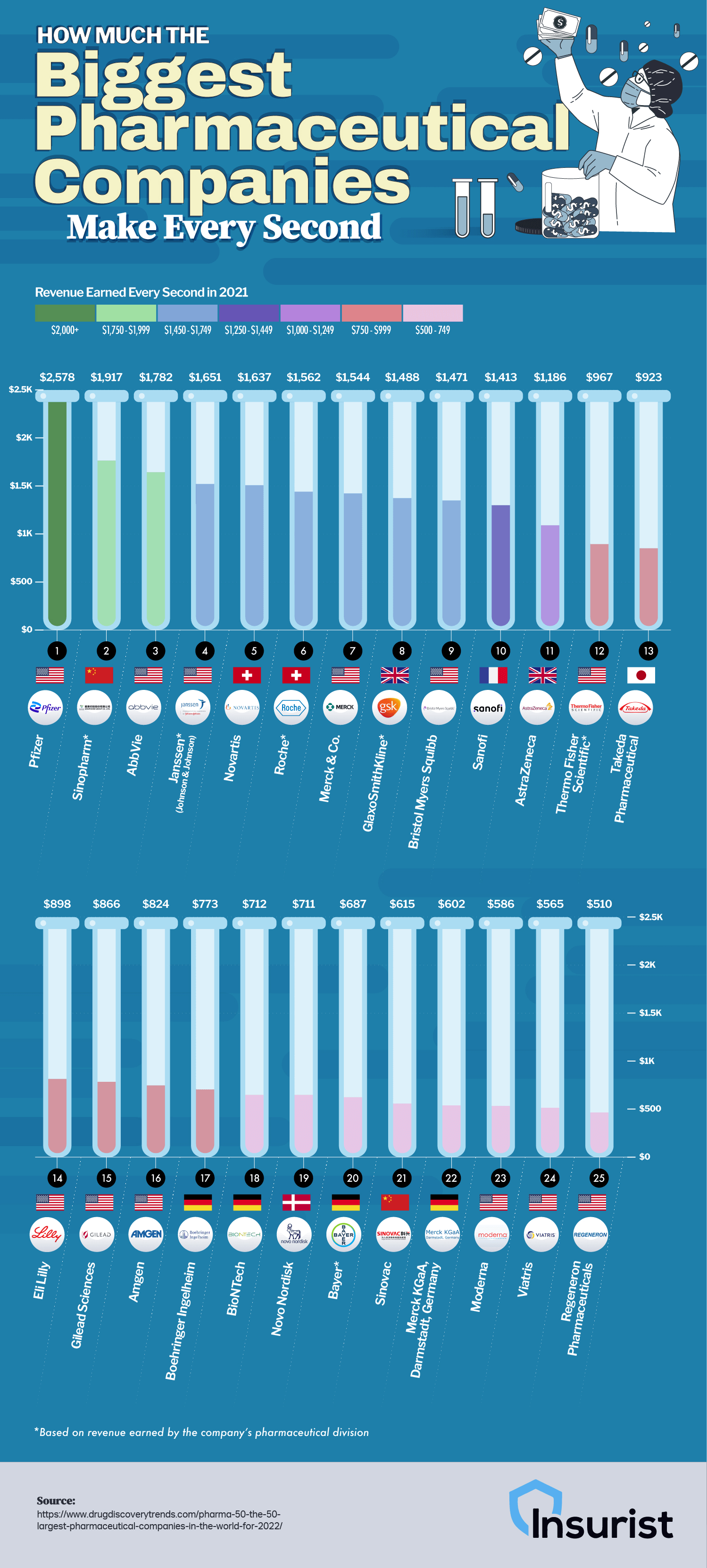
The mos profitable pharmaceutical company, Pfizer, made a mind-blowing $2,578 per second in 2021! Pfizer made $81.288 billion in 2021, nearly double the profit it made in 2020. Pfizer’s massive surge in revenue is attributed to creating the mRNA vaccine for COVID, which has claimed 70% of the U.S. and European markets. They also created Paxlovid, the antiviral of choice used to treat coronavirus symptoms. So thank goodness for Pfizer – just imagine how many lives Pfizer scientists have saved. Overall I really love how they chose to visualize the revenue – it is creative, eye-catching, and aesthetically pleasing!
Student Choice has released the 206 updated version of its ongoing study tracking how America’s most popular college majors have changed over time. The analysis drew data from 105,623 student loan applications, using them as a proxy for where students are placing their bets on their future. The idea is that a student’s choice of major reveals more than their individual preferences. They can reflect labor shortages, salary expectations, emerging technologies, and shifting cultural attitudes about which degrees are most valuable. The team also supplied a graph comparing today’s top majors with those from four and eight years ago.
Click below to zoom.
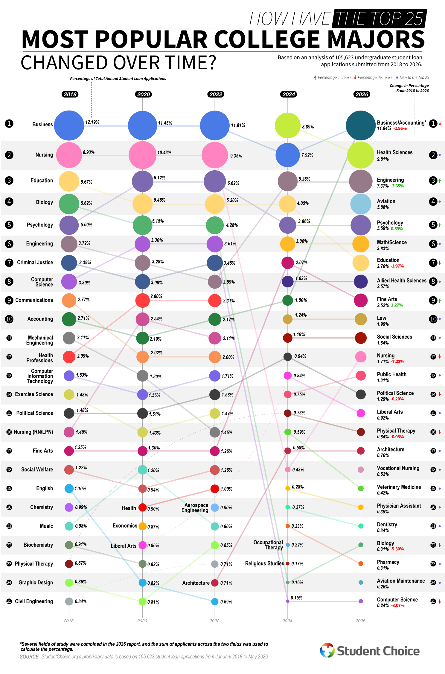
There has been a lot of disruption in recent years, but business majors have held steady. Business has been the leading major commanding between 11.45% and 12.81% of applications in 2017 and 2023. But that dominance has wobbled. In 2025, only 5.27% of applications were for a business major, but that percentage spiked back up in 2026 to 11.94%, still making it the most popular major.
Healthcare was consistently a top-two major for years, peaking in 2023 at 10.87% of applications. Now, nursing has tumbled to just 1.71% of applications in 2026. Health sciences replaced it to turn 9.81% with allied health sciences, public health, physical therapy, physician assistant studies, dentistry, and pharmacy, all landing in the top 25 of most popular majors.
The biggest growth seen in the study is in engineering and aviation. Engineering climbed from 3.91% to 7.37% in 2026. A 3.46-point gain is one of the biggest increases in this dataset. Aviation didn’t crack the top 25 of majors until 2025, when it had explosive growth, then settled into fourth place in 2026 at 5.88%. The surge in aviation maintenance rankings points to broader interest in the field, likely inspired by well-documented pilot shortages. When there’s a need, hungry young students will step up to fill it.
Psychology enjoyed modest and steady growth, inching from 4.99% in 2017 to 5.59% in 2026. Computer science took a surprising fall from a rising 3.61% to only .24% in 2026, ranking dead last in the top 25. Student Choice believes this could be due to some reporting category changes in 2025, but also speaks to the volatility of the tech job market.
Liberal arts and education lost ground, with education sliding from 5.99% of applications in 2017 to 3.70% in 2026. This decline is linked to teaching wages failing to keep up with other fields. Communications, English, and History all dropped off the top 25 entirely, yet Fine Arts bucked the trend, doubling in popularity from 1.35% to 2.25%, cracking the top ten most popular majors.
Overall, students are becoming more specialized and career-focused, drawn to healthcare, engineering, and aviation, while retreating from generalist majors and degrees that were once safe bets. The team at Student Choice cites finances as one of the biggest concerns central to a student’s decision on what major they choose
Small business owners wear many hats, but cybersecurity has slowly become one of the largest and flashiest hats. Ooma created a cybersecurity guide for small business owners, presented in a detailed chart that tackles a problem most owners face, but few know how to navigate. They struggle to figure out which protections really matter and which investments are simply expensive noise. The stakes are real. The team’s data show that 67% of businesses report more cyberattacks in 2024, and more than 40% of attacks target small businesses specifically. The team’s core message is one of hope: the basics of cybersecurity are far simpler than the security industry makes them seem.
Click below to zoom.
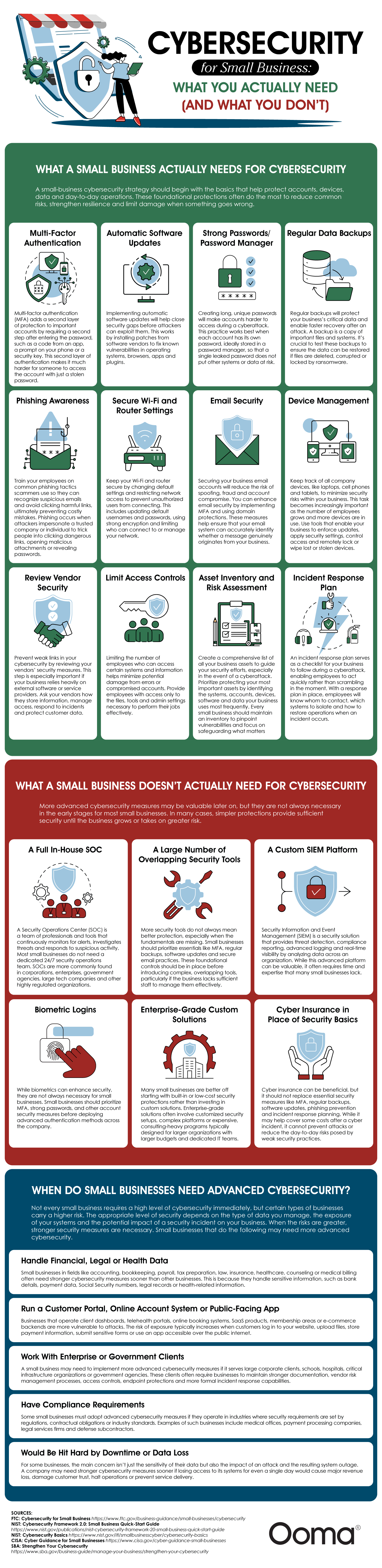
What Owners Really Need
The team’s suggestions are organized into a clear checklist. Multi-factor authentication tops the list as the single most effective tactic small businesses should use. It requires a second verification step after the typical password. From there, the list includes automatic software updates to patch security updates, strong passwords, and regular data backups that are tested so ransomware can’t hold operations hostage.
The human layer gets equal consideration. Training staff to spot phishing emails, limiting system access to only those who need it, and managing company devices with the ability to remotely lock them or wipe misplaced phones and laptops are all important guidelines. Rounding out the list are secure Wi-Fi and router settings, email protections, vendor security reviews, asset inventories, and a written incident response plan that guides employees on how to respond rather than scrambling during a cyberattack.
The Steps You Can Skip
The guide stands out from other security content in this section. It doesn’t shy away from naming the protections most small businesses are oversold. They name a full in-house Security Operations Center, custom SIEM platforms, and overlapping tools as the most unnecessary. Biometric logins and enterprise-grade custom solutions are labeled as answers to problems that don’t exist at the scale of a small business. Cyber insurance was a solid maybe that could be useful, but no substitute for backups and multi-factor authentication.
Situations That Call for Advanced Security
The article doesn’t label cybersecurity as one-size-fits-all. They list businesses in the financial, legal, and health data sectors as needing advanced cybersecurity, which could include customer portals, telehealth systems, and e-commerce backends. Not only are these data types subject to privacy laws, but when these systems go down, businesses can pay a heavy toll, so stronger defenses are worth the investment.
The team’s overall message is that cybersecurity isn’t all-or-nothing. Small businesses should build a solid foundation and scale up only when risk and growth push them to do so. Some of the guide’s authoritative sources include the FTC, NIST, CISA, and SBA. The guide makes cybersecurity feel manageable for small businesses by focusing on practical steps instead of expensive extras. Strong passwords, backups, training, and multi-factor authentication create a reliable foundation. As risks grow, businesses can add advanced protections, but the smartest first move is mastering the basics.
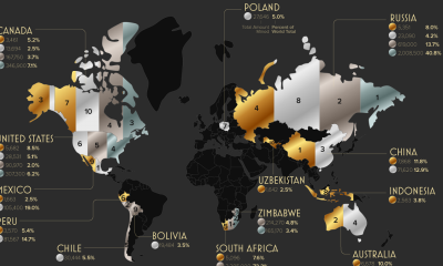
The invisible digital infrastructure is all around us. It powers every bank login, online order, every text sent, and every social media update posted. Vast networks that many of us rarely think about make these actions possible. Access to the digital infrastructure shapes a population’s economic standing and it even keeps entire governments running smoothly. Therefore, it’s no surprise that some countries spend huge sums to stay competitive in the digital infrastructure sector and there are clear winners as we can see in Ooma’s new study.
Click below to zoom.
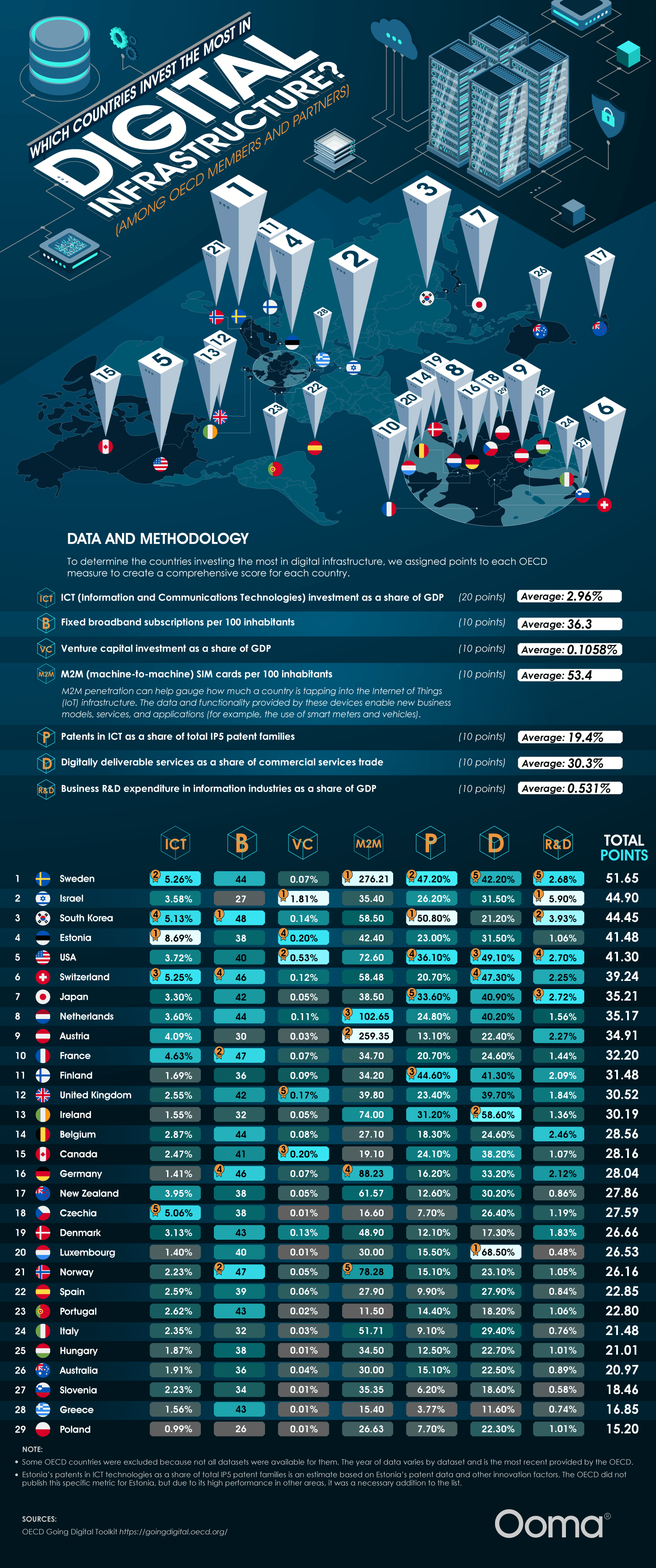
Think of this way: rather than roads and bridges, broadband networks, data centers, and cloud systems, the key to mobile connectivity is a country’s most valuable asset, which powers AI servers and social media. Advanced digital infrastructure correlates with higher GDP growth, higher productivity, a viable remote workforce, and a more digitally skilled workforce. These systems also allow faster access to government services, which can even be lifesaving since they offer quicker communication during emergencies like natural disasters.
The team’s study found 5 countries leading this digital infrastructure race. Sweden is in first place now with strong assets across the board, led by broadband subscriptions and business R&D spending. Israel is in second place with outsized venture capital relative to their GDP and heavy research funding into digital infrastructure. South Korea is in third, powered by ICT patents and top-tier broadband reach. Believe it or not, Estonia edges out the U.S. in fourth place. They’re a global digital pioneer with the most ICT investment as a share of GDP. The U.S. ranks #5, driven by digitally deliverable services and venture capital. The team used a points-based score across seven OECD measures, which include ICT investment, broadband, venture capital investment, M2M SIM cards, ICT patents, digital services trade, and business R&D.
These investments have a number of real-world impacts. In Estonia, they have nearly all their government services available online and a digital ID that can be used for everything from remote voting to public transport. Sweden has a highly developed e-commerce sector, universal household Internet connectivity, and, as a result, Stockholm is Europe’s financial hub. In Israel, the National Digital Agency and the Digital Israel initiative weave tech across education, government, and healthcare, transforming the country into a startup magnet. South Korea has one of the fastest Internet speeds globally and they dominate consumer electronics, competitive gaming, and semiconductors.
Countries investing in digital infrastructure are positioned to be world superpowers. Businesses in these countries benefit from fast communication and a digitally literate workforce. But seamless connectivity shouldn’t depend on geography. Every country and all people can benefit from a more digitally connected world, so the more countries that improve their digital infrastructure, the better. The leading countries on this chart can serve as role models while countries further down the list highlight areas for improvement and potential investment.
-

 Business Visualizations2 years ago
Everything Owned by Apple
-

 Business Visualizations2 years ago
America’s Most Valuable Companies Ranked by Profit per Employee
-

 Business Visualizations1 year ago
The Biggest Fortune 500 Company in Every State
-

 Business Visualizations1 year ago
The Biggest Employers by Industry
-
 Charts2 years ago
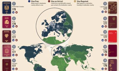
Map Uncovers Countries with Most Powerful Passports
-

 Timelines2 years ago
Timeline Charts the Development of Communications Technology
-

 Business Visualizations10 months ago
The Largest Companies in America That Are Still Run by the Person Who Founded Them
-
 Maps2 years ago
A Map to Gold and Silver