Misc Visuals
Study Compares the World’s Longest Sniper Shots
The team at Sightmark offered us a look into the world’s most impressive sniper shots with a chart showing how the longest shots ever made measure up. Their display is rich with details, including the sniper’s origin country, the weapon and ammo used, and, of course, the length of the shot with handy comparison visuals that highlight the skill needed to make these incredible shots.
Click below to zoom.
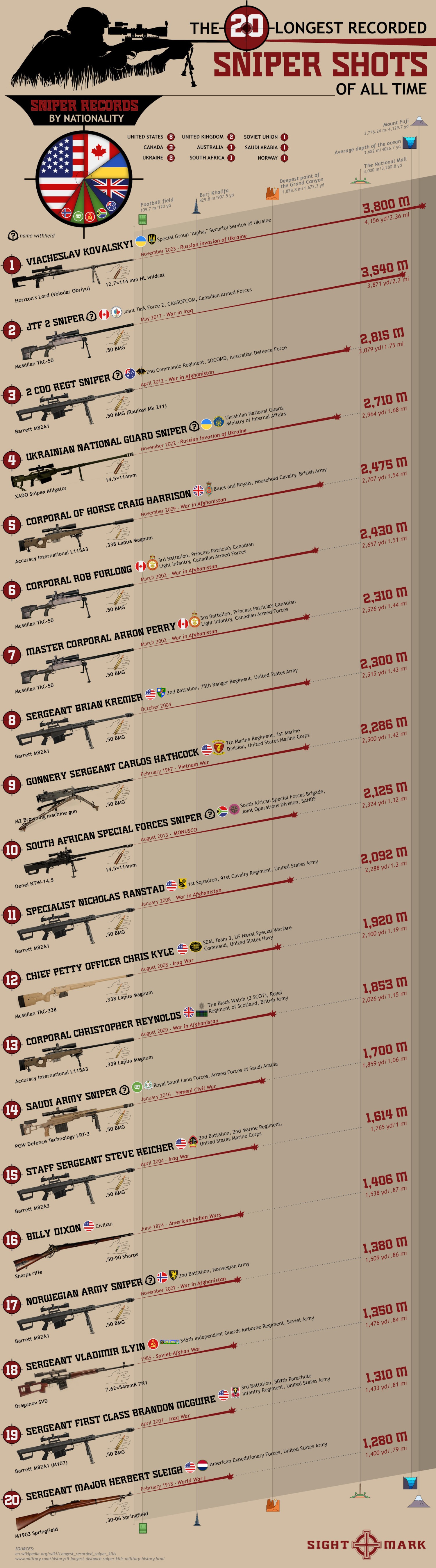
These were the longest sniper shots made, according to their research:
- Viacheslav Kovalskyi (Ukraine) – 2.36 mile shot
- JTF 2 Sniper (Canada) – 2.2-mile shot
- 2 Cdo Regt Sniper (Australia) – 1.75-mile shot
- Ukrainian National Guard Sniper (Ukraine) – 1.68-mile shot
- Corporal of Horse Craig Harrison (United Kingdom) 1.54 mile shot
- Corporal Rob Furlong (Canada) – 1.51 mile shot
- Master Corporal Arron Perry (Canada) – 1.44 mile shot
- Sergeant Brian Kremer (United States) – 1.43-mile shot
- Gunnery Sergeant Carlos Hathcock (United States) – 1.42-mile shot
- South African Special Forces Sniper (South Africa) – 1.32-mile shot
We can see that some of the names of the top snipers have been withheld from public records for reasons of military confidentiality. Many of these snipers belong to their nation’s most elite military units, undertaking dangerous and highly secretive missions. The data shows us the precision skill it takes to be one of the world’s best long-distance marksmen. Helpful context provides further jaw-dropping statistics. For example, Kovalski’s shot over 2.36 miles was longer than the Washington Mall. He had a spotter helping him with conditions, but he missed his first shot, breaking the record with his second.
Most of us get tired of brands asking for our phone numbers and email addresses because we’re spammed with too many advertisements. But sometimes, providing your contact information will connect you with a brand’s loyalty program, which can offer discounts, free prizes, and cash back. One in ten companies has a loyalty rewards program, so the team at Qualtrics decided to analyze which one gives you the biggest return on investment. They focused only on base-level, free-to-join programs that give customers rewards through regular shopping; that way, the results truly reflect the rewards you earn for the money you spend.
Click below to zoom.
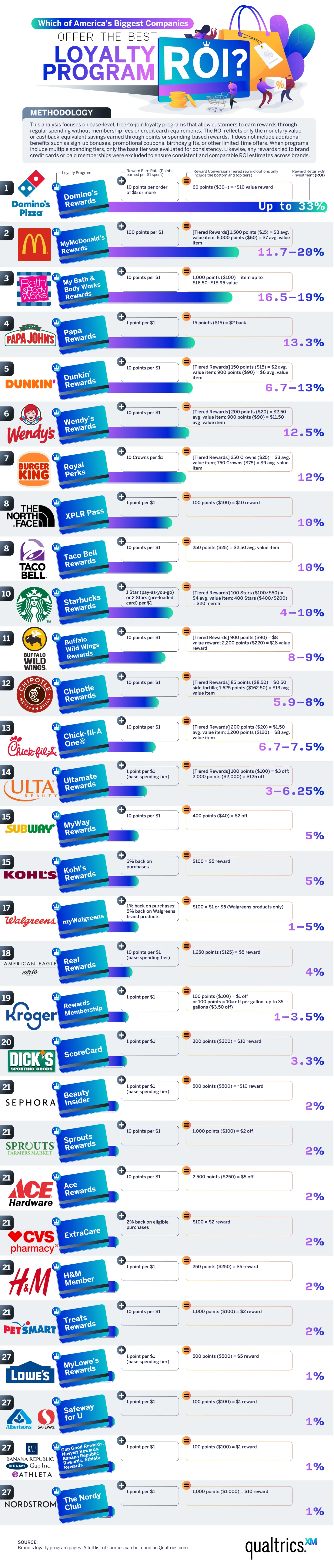
In the food and beverage industry, Domino’s Pizza offers the best ROI. The team calculated an almost 33% ROI for Dominos, which is by far the best offer, even across industries. You’ll receive about $10 of free food for every $30 spent. McDonald’s isn’t far behind at an 11 to 20% ROI with the MyMcDonald’s Rewards app. You’ll earn 100 points for every dollar spent, and you can use these points to purchase menu items. Papa John’s, Dunkin’, Wendy’s, and Burger King also have strong programs, with ROIs between 10% and 13%. The fast-food industry offers some of the best loyalty programs, earning eight out of the ten best rewards programs on the list.
In the retail and beauty space, Bath & Body Works leads with a 16.5%–19% ROI through the My Bath & Body Works Rewards program. The program allows shoppers to redeem points earned through purchases for free items, early access to sales, and an annual birthday gift. Ulta Beauty’s Ultamate Rewards program offers a decent ROI, too, at 3% to 6% for items that are normally on the expensive side. Their competitor Sephora has a Beauty Insider program that offers a lower 2% ROI, but exclusive free samples and early access to new products supplement it.
Brand rewards are weaker among clothing retailers. H&M, Gap Inc., and American Eagle/Aerie offer a 1%–4% ROI. These programs are still useful for loyal shoppers who know they’ll buy from these brands repeatedly.
Pharmacy and grocery store rewards can be a great help for budget-savvy shoppers. These stores have lower ROIs but can still offer decent rewards. Walgreens’ program took the lead, offering 1% back on most purchases and 5% back on Walgreens’ brand products, resulting in significant savings on generics. CVS has an ExtraCare program with a higher 2% ROI and personalized coupons.
In the grocery sector, Kroger and Safeway/Albertsons offer the highest ROIs, between 1% and 3.5%. These chains also offer a fuel rewards program that can be an incredible budget-saving boon. Lowe’s and Ace Hardware offer 1%–2% rewards programs that may be most helpful to frequent shoppers and small business owners who need materials from these stores.
Outdoor lovers and athletes can earn powerful rewards through the North Face’s XPLR Pass, which offers a 10% ROI, and the Dick’s Sporting Goods ScoreCard program offers a 3.3% ROI. The findings on this chart can help you save big the next time you shop!
A survey of over 1,000 Americans revealed that they would rather sit in silence than force out awkward small talk. The Preply team examined a few facets of idle chit chat, especially with strangers, and found that Americans have some interesting and perhaps unexpected preferences. They delved into who Americans prefer chatting with, the topics they loathe and love, and differences in how generations feel about small talk. Whether you’re strong and silent or a social butterfly, the results are sure to interest you!
The most important aspect of conversation just might be the topic. The survey asked Americans what subjects they turn to when they have to make small talk. The most popular answers are weather, plans, and work. Respondents felt that these topics are inoffensive and relatable to anyone they might strike up a conversation with. Americans dread having to speak about family, sports, or politics. These are either too personal, too niche, or too controversial.
Click below to zoom.
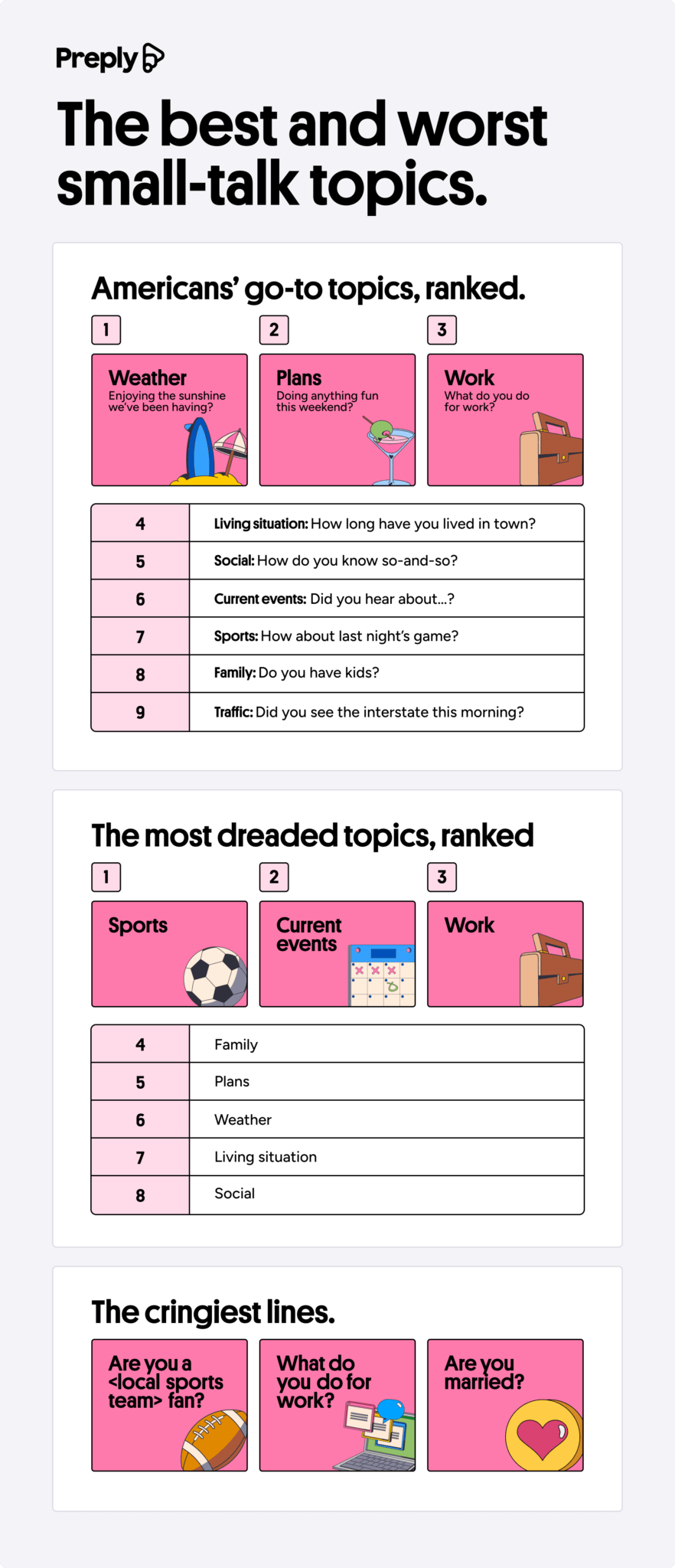 As for the lines, what do Americans hate the most? These are the ones to avoid:
- Are you a (local sports team) fan?
- What do you do for work?
- Are you married?
While work might seem like an easy entry point for a conversation, many Americans find the topic stale or feel embarrassed to talk about what they do for work.
In general, Americans would prefer to avoid small talk altogether and describe it as an awkward experience. Seven in ten survey respondents preferred sitting in silence to chatting. Small talk may be lost to time, as the survey found that 2 in 3 Americans take out their phones to avoid it. Gen Z is the most likely to use this tactic. A whopping 89% of them admitted to using this tactic. Only 30% of Baby Boomers use the see strategy.
If small talk is such a dreaded activity, why do so many Americans start up a chat? It may be because 91% of Americans think small talk will turn into a deeper conversation. Many people believe that first impressions are important, and small talk is often our first interaction with others. Statistics show that older people are more interested in using small talk to learn more about others than younger people. 23% of Baby Boomers report making small talk to get to know others, while only 7% of Gen Zers do the same.
Despite a distaste for small talk, half of Americans say they do it anyway just to be polite. 44% of Gen Z said they used small talk to avoid awkward feelings, while only 21% of Baby Boomers felt the same.
Naturally, Americans vastly prefer making small talk with friends, family, and coworkers. They would prefer skipping it with strangers, restaurant workers, and retail employees. A majority of Americans think their parents are the chattiest people they know, with 37% of people saying mothers make the most small talk. Americans have a reputation for friendliness, but these survey results indicate it may be less genuine and more a matter of politeness.
“Artificial intelligence” may be the biggest buzzword of 2026. It seems like every industry is incorporating AI into its practices, but it has had the biggest impact in the business sector. Nearly 80% of businesses use AI in some way. Qualtrics has quantified the massive impact AI has on business with a chart listing 25 key statistics that illustrate its influence. These statistics help us understand how and why businesses are using AI to reach the next level.
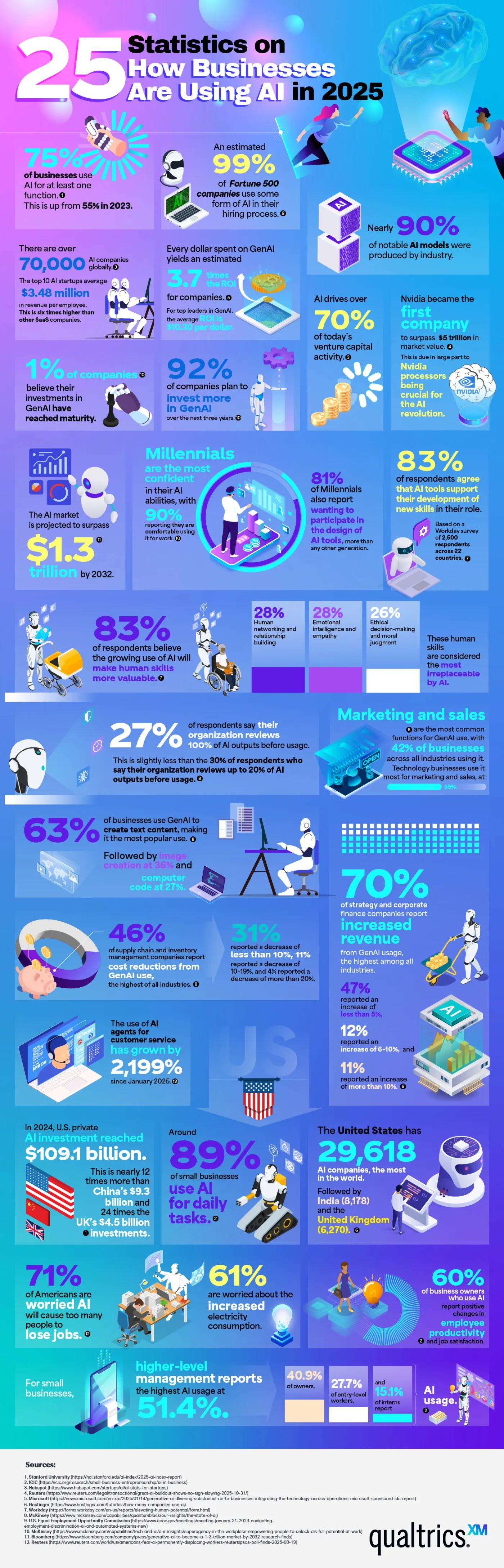
Many of the statistics listed show why businesses are so drawn to AI. In 2025, three out of four companies used AI regularly for at least one task. 99% of Fortune 500 companies use AI in their hiring process to screen applicants for predicted success in a role. 83% of business professionals say they’re using AI to learn new skills to further their career. Perhaps the most compelling reason businesses turn to AI is their profits. Every dollar invested in generative AI yields an average return of $3.70. Businesses are embracing what they see as AI’s stronger performance and competitive edge.
There is no doubt that AI is profitable, as these figures show. 70% of companies report increased revenue that they attribute to generative AI. Supply chains use AI to streamline logistics, and on the marketing side of business, 42% report using AI for content generation. Customer service has seen a huge explosion in AI usage, almost a 2000% increase.
AI has strong momentum, with about 70,000 companies using it globally. U.S. private investment in AI is around $109.1 billion. 90% of the world’s AI models are the work of private industry rather than government-funded research or academia, highlighting that business not only uses AI but also fuels its creation.
Small businesses are a part of these statistics. 89% of small businesses use AI in their daily operations, often for financial management and customer service. 60% of small business owners say AI has improved their employees’ productivity. Executives and senior managers are the most avid users of AI, but use by interns and entry-level employees rises every year.
Here are a few other jaw-dropping statistics that show how enormous a presence AI has in the business industry:
- AI drives over 70% of venture capital activity.
- 92% of companies plan to invest more in AI within the next three years.
- 63% of businesses use AI to generate text-based content.
- The use of AI customer service agents has grown by 2,199% since January.
- The United States is home to 29,618 AI companies, which is more than any other country.
These statistics underscore that AI is becoming a regular part of everyday business practices. Companies often say they believe AI amplifies their employee’s natural talents. Whether used for strategy, customer service, or content generation, it seems AI is here to stay.
-

 Business Visualizations1 year ago
Everything Owned by Apple
-

 Business Visualizations1 year ago
America’s Most Valuable Companies Ranked by Profit per Employee
-

 Business Visualizations1 year ago
The Biggest Fortune 500 Company in Every State
-

 Business Visualizations10 months ago
The Biggest Employers by Industry
-
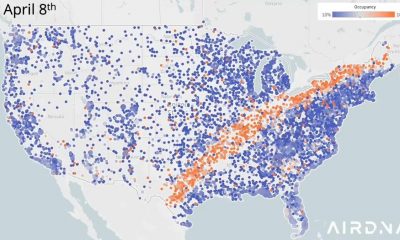
 Business Visualizations2 years ago
New Animated Map Shows Airbnb’s Fully Booked Cities Along the 2024 Eclipse Path of Totality
-

 Timelines1 year ago
Timeline Charts the Development of Communications Technology
-
 Charts2 years ago
How Many Crayola Crayon Colors Are There? A Lot.
-

 Business Visualizations6 months ago
The Largest Companies in America That Are Still Run by the Person Who Founded Them