
Charts
Study Shows Where Americans Are Most Open to Age-Gap Dating

Compatibility is usually our biggest driver in the search for a romantic partner, but it turns out that age is still a major part of that compatibility. Tawkify’s matchmaking service surveyed about 98,798 Americans over two years, asking whether they’d date someone older and younger and how far outside their own age range they’d go. The data reveal both geographic and dating patterns, with a recurring pattern: smaller dating pools push singles to date across wider age ranges.
Click below to zoom.
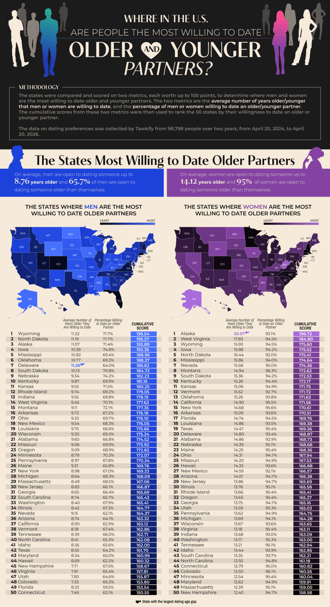
Wyoming tops the list of states with men willing to date outside their age range. 71.1% of Wyoming singles are willing to date an average of 11.22 years older than they are. North Dakota and Alaska also appeared in the top three. Delaware emerged as an interesting outlier. They have the largest average age gap in dating among men, at 11.26 years. 93.1% of Alaskan women are open to dating older partners, and they have the nation’s largest age gap by far at 20.57 years. West Virginia and Wyoming women follow in second and third. It seems that less-populated states show greater willingness to date outside their age range, which could be a very simple explanation. A smaller dating pool means singles widening their options.
As for willingness to date younger partners, Hawaii leads for both genders. 96.8% of Hawaiian men are willing to date someone younger, with 18.59 years as an acceptable age gap. This is the widest that appears in the study. 92% of Hawaiian women are open to dating younger, but their average age gap is only 9 years. Hawaii has an older-than-average population, with a median age of 41.5 years, so this limited island dating pool makes dating younger people more common. The runners-up for willingness to date younger were Nevada, Idaho, and Maine.
According to the data, women are dramatically more open to dating older than men are. 95% of women would date an older partner, compared with 65.7% of men. This pattern flips with dating younger. 96.5% of men would date someone much younger, with a national average age difference of 14.7 years. 88.1% of women would date younger men, but at a much smaller average age gap of 7.14 years. This shows that across the country, men tend to date younger partners, while women tend to date older partners. Women are consistently willing to tolerate a wider gap when dating up.
The team threw us a little fun fact from the Guinness Book of World Records, which lists Gertrude and John Janeway, married in 1927, as the largest spousal age gap of 63 years. Age-gap relationships can succeed but face challenges like judgment and assumptions about power dynamics and differing life stages. Strong communication, shared values, and aligned goals matter most in relationships, more than the number of years lived. Geography and gender seem to shape who Americans date, but the data also suggest that openness to age-gap romances often comes down to opportunity.

Sometimes you confidently belt out a song and discover years later that you misheard the lyrics and sang it wrong this whole time. We’ve been there. Preply unveiled a fun, often humorous study showing the most misheard song lyrics, some of which verge on ridiculous. For example, in Manfred Mann’s “Blinded by the Light,” many people hear the lyric “revved up like deuce” as “wrapped up like a douche.” That would be an embarrassing one to unleash at karaoke. The team’s data reveals that mishearing lyrics is a predictable outcome of speed, vocabulary, and accents skewed in audio mixing.
Click below to zoom.
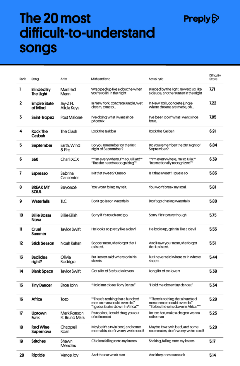 The article introduces us to an interesting word, “mondegreen.” This word was coined in 1954 to describe a misheard lyric that can completely change a song’s meaning. Preply lists the most common causes of mondegreen as tricky vocabulary, unfamiliar accents, sound-alike words, fast tempos, unclear pronunciation, and background music that obscures vocals. Language educators love to use mondegreens as teaching moments on the importance of pronunciation and clear vocabulary.
A chart lists the most commonly misheard lyrics. As we mentioned, Alfred Mann’s “Blinded by the Light” tops the list as the most difficult to understand. AI correctly transcribed only 61% of the lyrics, and the song earned a readability score of 85 despite the song’s even pace of 80 words per minute. Jay-Z and Alicia Keys’ “Empire State of Mind” was number two on the list. The lyrics move fast at 158 words per minute, and the most famous mishearing is a hilarious mistake. The true lyric is “concrete jungle where dreams are made, oh,” but listeners believe they’re hearing “concrete jungle, wet dream, tomato.” The third on the list is Post Malone’s “Saint Tropez.” AI failed to correctly transcribe 32% of the lyrics, and, believe it or not, the real lyrics “since fetus” appear in the song, but listeners, perhaps understandably, think the lyric is “since Phoenix.” You’ll see two famously misheard songs on the list that have been the subject of memes. A lyric from Sabrina Carpenter’s summer hit “Espresso” has an “I guess so” that listeners thought was “queso.” Taylor Swift is often misheard, too, as we can see on the chart. Everyone loves to bring up the “Starbucks lovers” from “Blank Space.” (She’s saying, “long list of ex-lovers.”)
The team’s data also revealed that Lady Gaga is one of the most difficult artists to understand. She had 306 misheard lyric submissions. She tends to use unconventional pronunciation in the song “Poker Face,” which alone ranks 81st in misheard lyric reports. Taylor Swift had 300 submissions across her extensive catalog, and Kelly Clarkson rounds up the top three most misheard artists list, with “Since U Been Gone” and “Because of You” having the most misheard lyric reports.
In general, the Preply team found that strong regional accents and faster genres like rap make individual words harder to understand. Mishearing lyrics is a normal function of our brain, filling in gaps in our understanding.
AI is embedded in workplaces worldwide by this point, and yet workers’ feelings about it vary dramatically. A study by Qualtrics examined how geography was related to feelings about AI in the workplace. They found that only 37% of workers globally believed that AI would improve their jobs. That average hides a 45-point difference between the most optimistic country, which is China, and the most skeptical, Japan.
Click here to zoom.
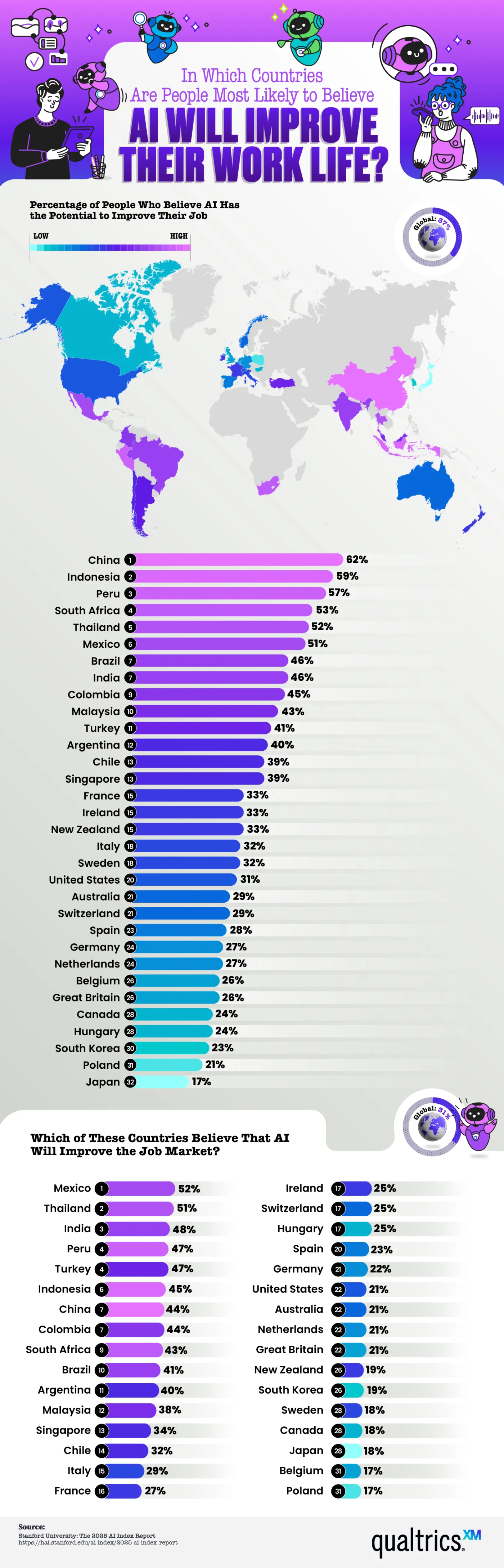
Nearly 80% of global companies report using AI in some capacity, and research indicates productivity gains, with lower-skilled workers benefiting the most. Even if this is the case, employee sentiment isn’t nearly as unified. The numbers the team shows here indicate a healthy level of AI skepticism. In fact, more than half of workers think AI will improve their lives in just 6 out of 32 countries studied. That means there are more skeptics than people excited about what AI will bring to the workplace. But why does optimism cluster in some regions while most remain skeptical?
Here are a few of the countries where optimism runs high:
- China – 62% of workers are optimistic
- Indonesia – 59%
- Peru – 57%
- South Africa – 53%
- Thailand – 52%
There is a mid-tier region with fewer optimistic workers, but still a healthy percentage. This includes Mexico, Brazil, India, Colombia, and Malaysia. Many of these countries have developing economies or a heavy state investment in AI infrastructure, as is the case in China. Workers in these places view AI as a tool to close skill gaps, raise wages, and improve living standards. These regional differences are easy to spot thanks to the map Qualtrics created, which color codes the level of optimism/skepticism.
At the other end of the spectrum, we find the highest number of skeptics in Western Europe and English-speaking countries. Here are the countries with the least faith in AI:
- United States – 31% of workers are optimistic
- Australia – 29%
- Great Britain – 26%
- Canada – 24%
- Japan – 17%
- Poland – 21%
The media narratives in these countries frame AI as a risk of automation-driven job loss, which shapes people’s perceptions even when AI adoption in their workplaces is the same as in optimistic locations. These nations are the same that rank lowest on the belief that AI will improve the job market.
Economic research suggests that AI tends to reshuffle tasks within a role rather than eliminate that job outright. New skills will be required to work with AI, and some positions will shift, but historically, new digital tools have created more roles than they’ve erased. The gap between the hard data and public sentiment in skeptical countries is definitely worth examining and tells a story.
As AI rolls out unevenly across the world’s workforce, it’s important for employers to understand where their employees actually stand on the issue. Beyond regional stereotypes or headline-driven assumptions, employers must look at facts like the data presented here to make thoughtful AI adoption decisions.
Moving consistently ranks among life’s most stressful experiences, behind only divorce and the death of a loved one. This difficulty isn’t even distributed by location. Some cities make a renter’s move dramatically more difficult than others. Rove Lab’s analysis of 55 major U.S. metro areas, scored across 13 factors including population density, rental housing, transportation, and weather, shows which cities make moving a logistical nightmare.
Click below to zoom.
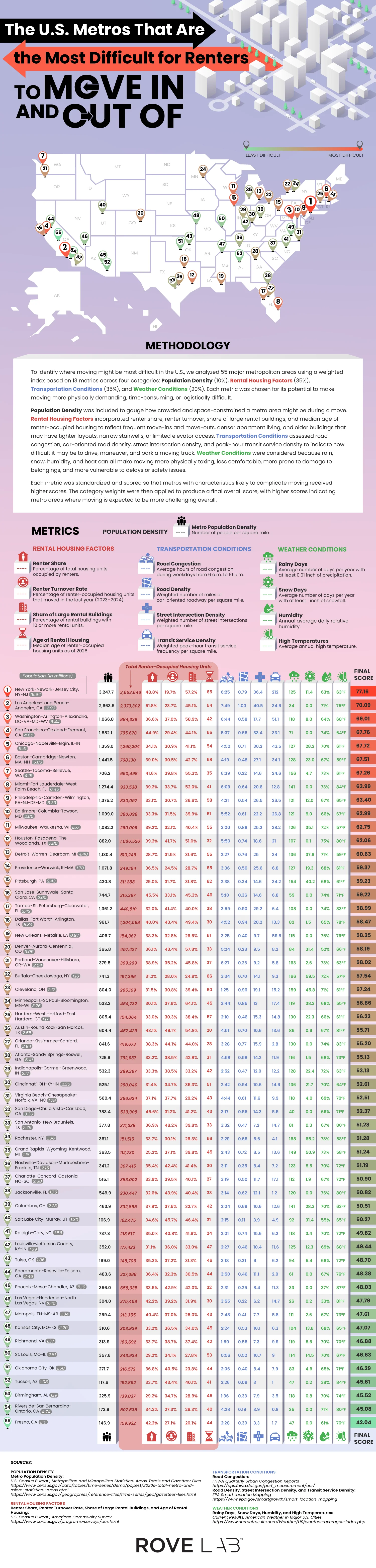
The New York-Newark-Jersey City metro area is the most difficult one to move from, with a score of 77.16. There are several reasons it’s so difficult. For one, it has the highest population density in the country, at 3,247.7 people per square mile. It also has the lowest renter turnover at 19.7%, indicating fierce competition for available units. 57.2% of rental properties are large buildings with more than 10 units, and the median building age is 65. This means these older buildings have narrow stairwells, slow elevators, and tight corners, a nightmare on moving day. On top of this, the transit density at peak hours is 212 vehicles per square mile. Trying to move out of an older building with narrow hallways, busy stairs and elevators, and limited street parking is truly challenging.
Move-in difficulty varies widely by city. Los Angeles isn’t the densest city, but it has the worst traffic congestion in the country, with 7 hours and 49 minutes of traffic per weekday, due to urban sprawl and car dependence in the region. Washington, D.C. has the oldest housing units, making it more challenging to navigate furniture on move-in day, especially in dense transit corridors. San Francisco and Chicago are mid-density metros with older buildings and a high number of large buildings with many units, driving up the scores. Boston and Seattle round out the top of the most difficult cities, thanks to lots of snow in Boston and tons of rainy days in Seattle, which make moving in more difficult.
Thankfully, the team’s data also shows that not every city is a move-in nightmare. Austin is a standout city with the highest renter turnover in the country. A pandemic-era construction boom created an oversupply of new, modern housing units, which led landlords to offer move-in incentives and upgrades. Fresno, Riverside-San Bernardino, and Birmingham all offer easier moves thanks to a low population density, newer rental stock, and less traffic. The weather’s role shouldn’t be overlooked. Rochester, Buffalo, and Pittsburgh all have lots of snowy and rainy days, which can really put a literal and figurative damper on moving day.
The Rove Lab team’s work reframes the question of which cities are best and worst to live in through a specific, practical lens. Your housing is one of the most important parts of your life in a new city, and finding the best rental and having a good move-in experience will set the tone for a new start. Wherever you’re headed, knowing what you’re walking into can help you have the best experience.
-

 Business Visualizations2 years ago
Everything Owned by Apple
-

 Business Visualizations2 years ago
America’s Most Valuable Companies Ranked by Profit per Employee
-
 Business Visualizations1 year ago
The Biggest Fortune 500 Company in Every State
-

 Business Visualizations1 year ago
The Biggest Employers by Industry
-
 Timelines2 years ago
Timeline Charts the Development of Communications Technology
-
 Business Visualizations8 months ago
The Largest Companies in America That Are Still Run by the Person Who Founded Them
-
 Maps2 years ago
A Map to Gold and Silver
-

 Charts2 years ago
Map Uncovers Countries with Most Powerful Passports