
Charts
Study Shows Worldwide Opinions on AI Use

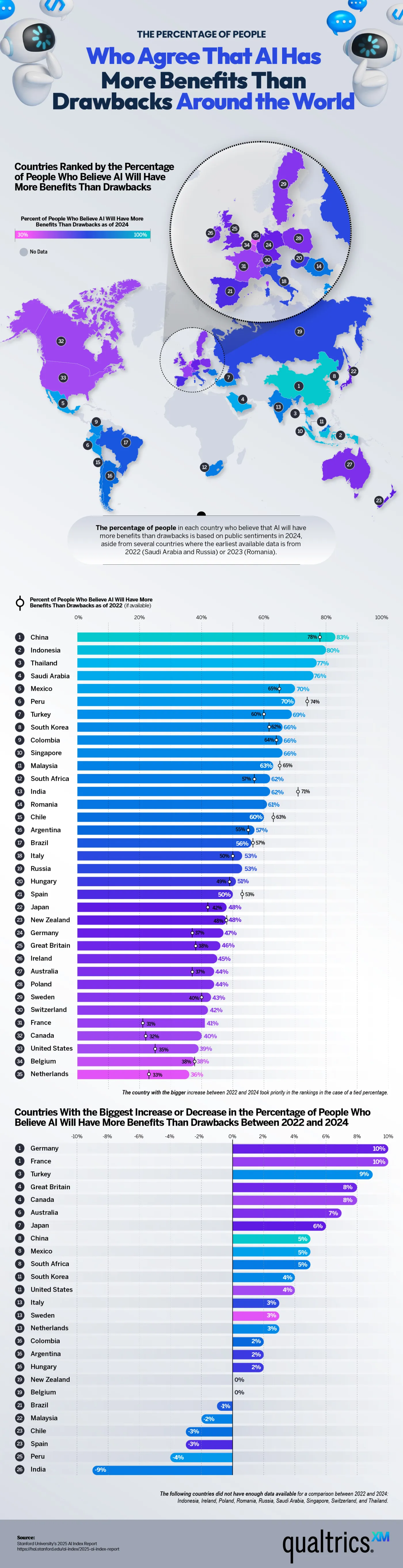
Artificial intelligence has infiltrated our everyday lives thanks to text generative applications. From huge corporations to individual users chatting on their smartphones, AI companies have developed ways to use AI in countless aspects of life. It has the potential to make huge, important leaps in technological progress, but it also comes with a host of concerns and dangers. The team at Qualtrics shows us the many different opinions on AI by mapping out opinions across the world. Their map shows us the percentage of people in each country who think AI has more benefits than drawbacks and vice versa.
Click below to zoom.
AI is gaining popularity around the world. People are using it at work to automate simple, repetitive tasks, speeding up their processes. It performs well as a data analyst and excels at the most mundane tasks, so many workers feel freed up to use their time and energy on more rewarding, nuanced work that requires creativity. AI can even identify the early stages of disease, allowing overloaded doctors to use it to assist them and process more patients. Many people in the healthcare field hope it will help with new discoveries and medical progress. AI has long been used in smart homes responding to requests to adjust the thermostat, start up a sound system, and monitor security.
Alongside the exciting possibilities AI offers, there are many concerns. AI has been used to create deep fakes, spread misinformation, and displace workers. People fear it could drastically disrupt the economy, and when some countries are considering using it as warfare, it’s natural for major fears to follow. Another major AI concern is resource constraints. Environmentalists have pointed to the heat AI data centers produce and the absolutely massive amount of water they consume to keep them cool.
How do these viewpoints vary around the world? According to the team’s data, China holds the most trust in AI, with 83% believing it brings more benefits than drawbacks. They’re closely followed by Indonesia at 80% and Thailand at 77%. Western European countries seem to be the most hesitant to embrace AI. 47% of German respondents believe AI will do more harm than good, followed by 41% in France and 36% in the Netherlands. This is a less-than-50 % approval rating. The United States has a 39% AI approval rating, but trust in AI there has risen by 4% in the past few years. This is a bit of a surprise, as American companies are leading AI development. This could be due to reports of data centers in the US disrupting neighborhood health and peace.
This map is a fascinating way to examine the rapidly changing world of AI through the lens of public opinion. Confidence in AI seems to be growing, but many unknowns remain regarding its effects on society and health. While some fear it may replace them at their job, others are hopeful that it will make work and life better.

As new technologies transform industries and create new skills demand, this analysis from Altium ranks states by how well their workforces are positioned to meet the future and a changing economy. The article, graphs, and maps show that tech readiness doesn’t always match a high-tech reputation.
Click below to zoom.
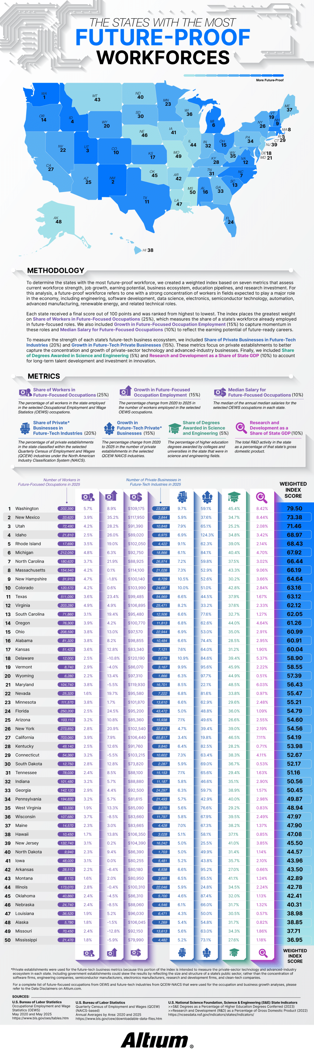
Altium defined a future-proof workforce as one with a large share of workers in fields expected to drive economic growth over the next few decades. The study tracked 30 occupations using data from the Bureau of Labor Statistics, including electrical and computer hardware engineers, software developers, data scientists, solar installers, semiconductor processing technicians, CNC programmers, and wind turbine technicians. The team considered 27 “future-tech” industries from aerospace to renewable energy to semiconductor manufacturing and R&D services.
Each state received a score out of 100 based on seven weighted metrics. The largest factor at 25% was the share of workers already employed in future-focused positions. The share of private businesses in future-tech industries was worth 20%. Employment growth and business growth from 2020 to 2025 counted for 15%. Median salary and research and development as a share of state GDP each accounted for 10%, and the share of science and engineering degrees made up the final 5%.
Washington took first place with a score of 79.50. Nearly 6% of the workforce there holds future-focused jobs and earns a median salary of $109,175. Washington’s future-tech businesses grew 59.1% over five years. The article credits the state’s concentration of software and aerospace employers, noting that Washington leads the nation in aerospace sales, exports, and employment.
The runner-up is more surprising! New Mexico ranked second, thanks to its 35.2% growth in future-focused employment. That’s the fastest growth rate in the country. Thanks to national laboratories and an expanding aerospace sector, it has one of the highest median salaries in the study at $117,950. Utah, Idaho, and Rhode Island round out the top five rankings. Idaho stood out for business expansion, with future-tech businesses growing by an eyebrow-raising 124.3%.
The study’s most confusing findings relate to California. The state employs 703,060 people in future-focused occupations, more than any other state, yet it only ranks at #27. Although California is strong in engineering education and R$D investment, future-tech industries make up only 3.4% of its private businesses. Its five-year business growth rate of 19.8% is the lowest in the nation.
Smaller states benefited when technology made up a larger slice of their economies. Rhode Island’s future-tech businesses represent 9.1% of its private sector and grew 62.3%. New Hampshire ranked ninth with the highest future-tech business share in the top ten at 10.5%. Rounding out the top ten were Michigan, North Carolina, Massachusetts, and Colorado.
Mississippi finished last with a score of 36.95, followed by Missouri, Alaska, Louisiana, and Nebraska. Several of these states saw a decline in future-focused occupations. The key takeaway is that a state’s headcount or Silicon Valley reputation alone doesn’t define its readiness for the future. A growing technical workforce and a dense base of tech businesses best position a state for the future.
Around 80% of Americans believe that learning a few words of the local language matters before they travel abroad. Only 58% of those Americans actually go so far as to learn some words. That twenty-two-point gap is the basis of Preply’s report on language anxiety and travel, supplemented by visuals to support the data on this anxiety.
The report opens on this contradiction between belief and action and sharpens the data. It shows that 40% of travelers admit to cramming language lessons at the airport or on the plane. Only 25% begin practicing the language of their destination months ahead of time. 32% side-step the problem entirely by choosing destinations where English is the dominant language or prevalent enough to carry travelers through.
Two ranked charts are the center of the report and comparing their results offers eye-opening details. The first chart shows that in 2026, Italy topped the wish list of American travel destinations. Australia, Ireland, the UK, and France followed.
Click below to zoom.
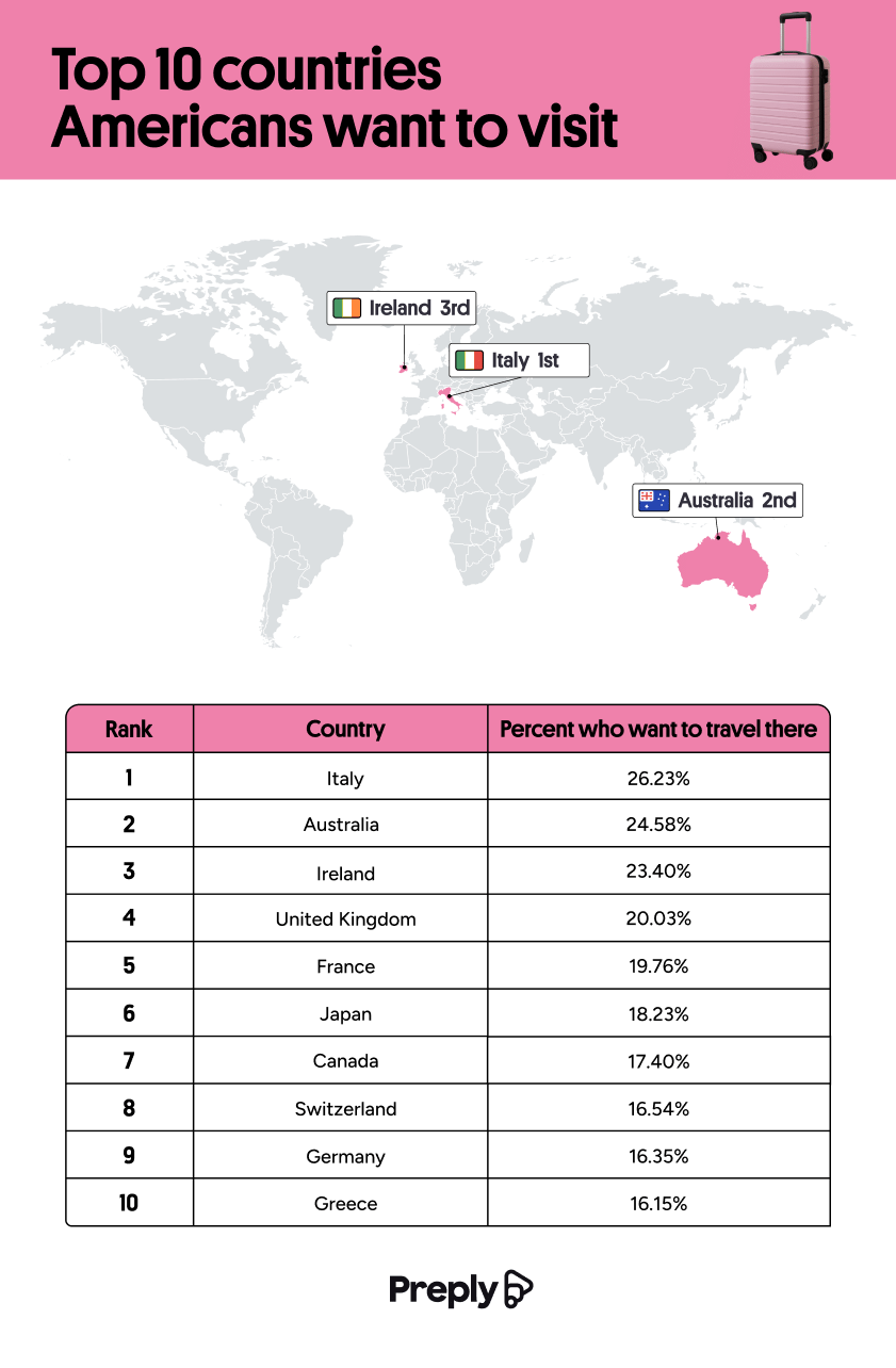 The second chart ranked where Americans would consider living. Australia and the UK tie at 20% of the answers, and Canada follows closely at 19%. Three of the top five travel destinations are largely English-speaking, and the relocation list you’ll note was entirely English-speaking.
Japan demonstrates this split dramatically. 18% of Americans would like to visit Japan, but only 10% would consider living there. Comfort clearly wins out over desire when it comes to relocation.
The demographic section shows even more interesting trends. Gen Z is nearly three times as likely as Boomers to want to visit Japan (24.4% versus 8.6%). They’re also more than twice as likely to consider living there (13.4% versus 5.3%). Ireland runs the opposite direction, with 26.2% of Boomers wishing to visit and only 9.8% of Gen Z. This is the biggest generational gap in the survey.
The pattern suggests that Boomers gravitate toward English-speaking destinations, while Gen Z showed stronger interest in places like Japan, Korea, Brazil, Colombia, and Thailand. Gender splits emerged too, with women favoring Italy, Ireland, and Greece, and men dreaming of Japan at 24% versus women’s 14%.
A horizontal bar graph ranks the barriers to visiting non-English-speaking destinations. 37% of Americans assume the native language is too difficult to learn. 35% believe English is understood well enough to get by without learning. 33% of respondents said they’re bad at learning languages, 32% cite lacking the time to learn, and 31% fear offending a native speaker by mistake. When ranking language intimidation by country, China led at 37%, Japan followed at 34%, then Korea at 24%, and Thailand at 13%.
A graphic on language faux pas showed that 35% of Americans point to menu items rather than attempting pronunciation, 23% speak louder and slower, and 17% buy American fast food for familiarity—only 15% attempt to mimic the local accent, which the Preply team gently discouraged.
The big takeaway seems to be that 45% of Americans would travel more if they spoke another language.

Moving into a first apartment is a rite of passage, but the math behind making it a reality is becoming a bigger obstacle. The metros with the strongest job markets also have the steepest living costs, and over the past few years, rent in these areas has climbed faster than paychecks. Cheap rent isn’t the only solution, though. Thin wages and flat hiring shut young people out of many cities.
Rove Lab’s new analysis identifies the cities in the middle ground with the most to offer young people establishing their lives. The study examined the 100 most populous U.S. metro areas and scored each one on 10 different metrics grouped into three weighted categories.
Click below to zoom.
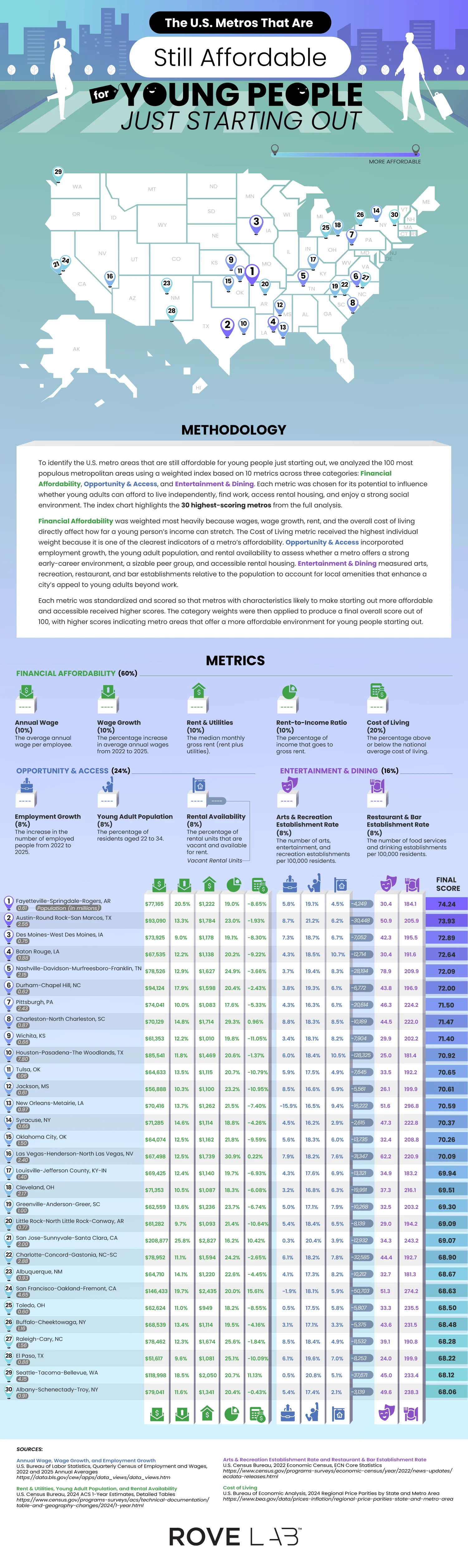
Financial affordability was the most important category, carrying 60% of the weight. This category covers average annual wage, wage growth, median rent and utility costs, rent-to-income ratio, and cost of living relative to the national average. Cost of living alone received 20% of the weight, the heaviest single metric in the study. Opportunity and access accounted for 24% and included employment growth, number of residents between 22 and 34, and amount of rental vacancy. The final 16% went to entertainment and dining, tracking the number of arts and recreation venues and restaurants and bars per 100,000 residents. Each metric was standardized, scored, and weighted into a final number out of 100.
The winning city was Fayetteville-Springdale-Rogers, Arkansas, with a score of 74.24. This isn’t an obvious winner until you look at the numbers. Wages increased by 20.5% from 2022 to 2025, with the average wage at $77,165 and a cost of living that’s 8.65% below the national average. This combination creates a rent-to-income ratio of 19%, leaving young people with money to save, potentially for the elusive dream of homeownership. Fortune 500 companies, Walmart, J.B. Hunt, and Tyson, have a home in the area and likely explain wage strength.
Austin-Round Rock-San Marcos followed with a 73.93 score, driven by a thriving tech sector that’s seen 8.7% employment growth, and the area offers 30,000 vacant rental units for newcomers. Des Moines, Baton Rouge, and Nashville round out the top five.
A few cities earned high rankings thanks to low housing costs. Pittsburgh was seventh overall with a rent-to-income ratio of 17.6%. Wichita, ranked ninth, has low rent and utilities and a low cost of living that’s 11.05% below average. Toledo, number 25 on the list, has the cheapest housing of all cities on the list, with an average of $949 a month.
The most surprising cities on the list are Californian. San Jose-Sunnyvale-Santa Clara ranks 21st, and San Francisco-Oakland-Fremont lands 24th, despite costs of living well above the national average. Salaries do the heavy lifting, averaging $208,877 and $146,433, respectively. This pulls down San Jose’s rent-to-income ratio to 16.2%, the lowest on the list.
-
 Business Visualizations2 years ago
America’s Most Valuable Companies Ranked by Profit per Employee
-
 Business Visualizations2 years ago
The Biggest Fortune 500 Company in Every State
-
 Business Visualizations1 year ago
The Biggest Employers by Industry
-

 Charts2 years ago
Map Uncovers Countries with Most Powerful Passports
-
 Business Visualizations1 year ago
The Largest Companies in America That Are Still Run by the Person Who Founded Them
-
 Timelines2 years ago
Timeline Charts the Development of Communications Technology
-
 Charts2 years ago
Study Highlights Disparity Between Homelessness Rates and Empty Housing
-
 Misc Visuals2 years ago
Exploring Science Fiction Technology That Became a Reality