
Charts
Where in the U.S. Have the Highest (and Lowest) High School Graduation Rates?

The United States is a colossal country with an incredible range of beliefs, livelihoods, and experiences. One thing that unifies the vast majority of America is school. Federal laws require that children receive some form of education (public, private, homeschooling, etc.) for a period of time. In 2021, the average high school graduation rate in the United States was 85.3%. This incredibly detailed chart by the U.S. Career Institute explores how this rate varies across U.S. counties.
Click below to zoom
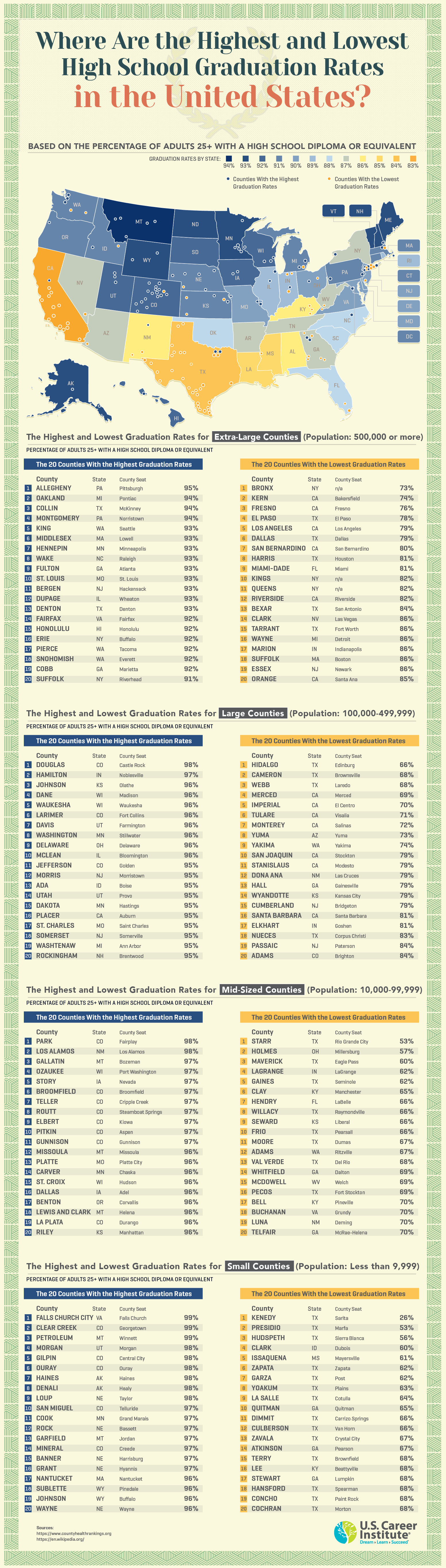
Visually, I really appreciate the use of formal, “prestigious” colors for the heat map and throughout the chart. The header font is excellent; I am planning to use it in some of my own projects! The diploma-like border is a nice touch. Let’s take a closer look at the extra-large and small counties so we can get a more complete picture of how graduation rates vary across America.
Here are the top five extra-large counties with the high school highest graduation rates:
- Alleghany, Pennsylvania – 95%
- Oakland, Michigan – 94%
- Collin, Texas – 94%
- Montgomery, Pennsylvania – 94%
- King, Washington – 93%
And here are the five extra-large counties with the lowest high school graduation rates:
- Bronx, NY – 73%
- Kern, California – 74%
- Fresno, California – 76%
- El Paso, Texas – 78%
- Los Angeles, California – 79%
Here are the top 5 small counties with the highest high school graduation rates:
- Falls Church City, Virginia – 99%
- Clear Creek, Colorado – 99%
- Petroleum, Montana – 99%
- Morgan, Utah – 98%
- Gilpin, Colorado – 98%
And lastly, here are the top 5 small counties with the lowest high school graduation rates:
- Kenedy, Texas – 26%
- Presidio, Texas – 53%
- Hudspeth, Texas – 56%
- Clark, Idaho – 60%
- Issaquena, Mississippi – 61%
I suppose not everything is bigger in Texas after all. All kidding aside, I looked into why the education system in Texas is failing so many children. Some issues I encountered are low teacher salary, dropouts from traditional schooling in favor of trade school or other alternatives, gun violence, mental health struggles, and conflict surrounding how to assess children’s performance. It is such a massive state, so it is no wonder that reform comes slowly and with a lot of resistance.

Americans collectively owe $1.863 trillion in student loans spread across roughly 43 million borrowers. A new analysis from Student Choice examines whether a $400 monthly payment is as affordable in every state. The gap between the most and least affordable states paints a picture of the complexities of debt, living expenses, and wages.
Student Choice scored 50 states on five metrics weighted by how directly living there affects student loan affordability. The heaviest metric is the student-loan-to-income ratio (40%), followed by delinquency rate (20%), rent-to-income ratio (15%), household debt-to-income ratio (15%), and cost of living (10%). Each state gets a final score, and a higher score means loans are harder to afford. Monthly payments are estimated from Department of Education data, assuming a 5.99% interest rate and a standard 10-year repayment plan.
Click below to zoom.
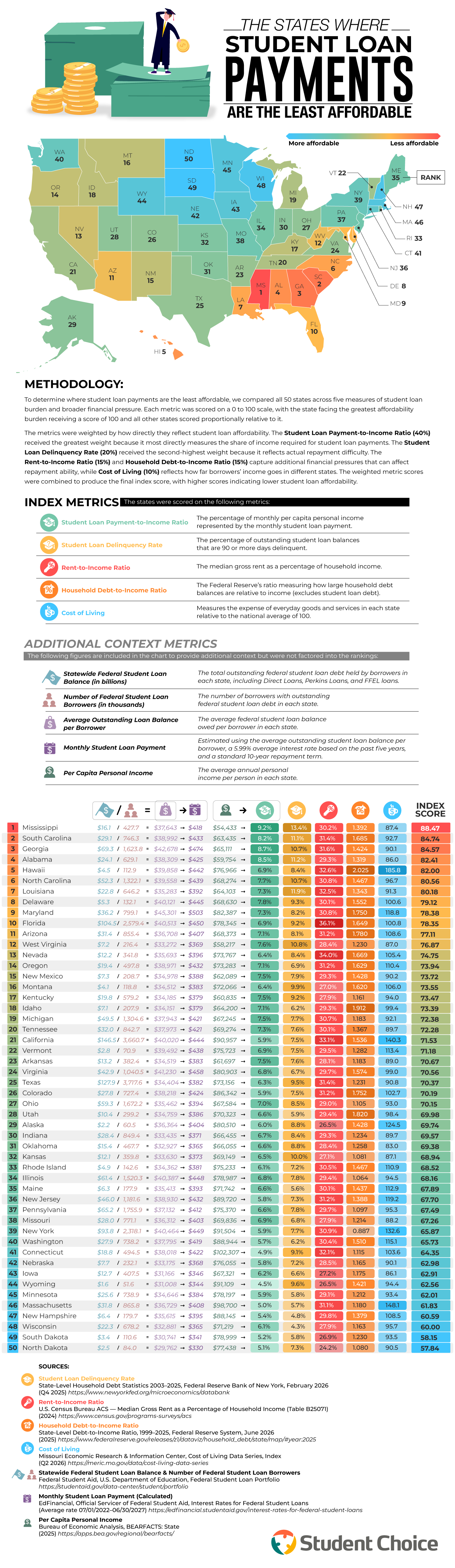
Mississippi is the least affordable state, largely because of low incomes. The per capita personal income in this state is $54,433, the lowest in the country. That means an average loan payment of $418 a month takes up 9.2% of income. Mississippi also has the nation’s highest delinquency rate, with 13.4% of student loan balances at 90 days or more past due.
The article makes a stark comparison with Connecticut borrowers who pay about the same amount each month at $422 but earn twice as much, so that payments take up just 4.9% of their income.
South Carolina, Georgia, and Alabama follow Mississippi, with much of the South clustered at the top of the ranking. Hawaii is the biggest outlier in the top 10. Its cost-of-living index of 185.8 is nearly double the national average, pushing the state to fifth place.
North Dakota is the most affordable state, with the lowest average loan balance at $29,762, the lowest average monthly payment at $330, and the lowest rent-to-income ratio in the nation at 24.2%. South Dakota trails by .31 points and has a lower delinquency rate than its neighbor. The rest of the top 10 most affordable states are Wisconsin, New Hampshire, Minnesota, and, believe it or not, Massachusetts and Connecticut. High incomes in those last two states offset their high costs.
The national average estimated student loan payment is $419 a month. Maryland borrowers pay the most on average at $503, followed by Georgia, Virginia, Florida, and New York. The article offers practical guidance, advising borrowers to keep loans under 10% of their income and to use the 50/30/20 budgeting rule. It also suggests borrowers refinance their loans if payments become unmanageable.
The article includes a detailed table with all the findings and data from all 50 states. You’ll find each state’s rank, federal loan balance, number of borrowers, average balance, estimated monthly payment, and per capita income. Borrowers comparing where to live or wondering whether their location is affecting the affordability of their loan payments can see exactly where their state lands, along with the details in this helpful study.
In some U.S. cities, a night out costs over twice as much as a night in, and in some locations, up to three times as much! A study from Rove Lab gathered data and compared doing the same date-night activity at home versus out across the 50 most populous U.S. cities.
Rove Lab compared the cost of two fixed dates. A night out included dinner for two at a restaurant, four beers at a pub, two five-mile taxi rides, and two movie tickets. A night in included ingredients for a home-cooked steak dinner, four store-bought beers, and a $5.99 stream rental. They used local prices from LivingCost.org and calculated a “premium for going out” in each city, which represents how much more a night out costs than a night in.
Click below to zoom.
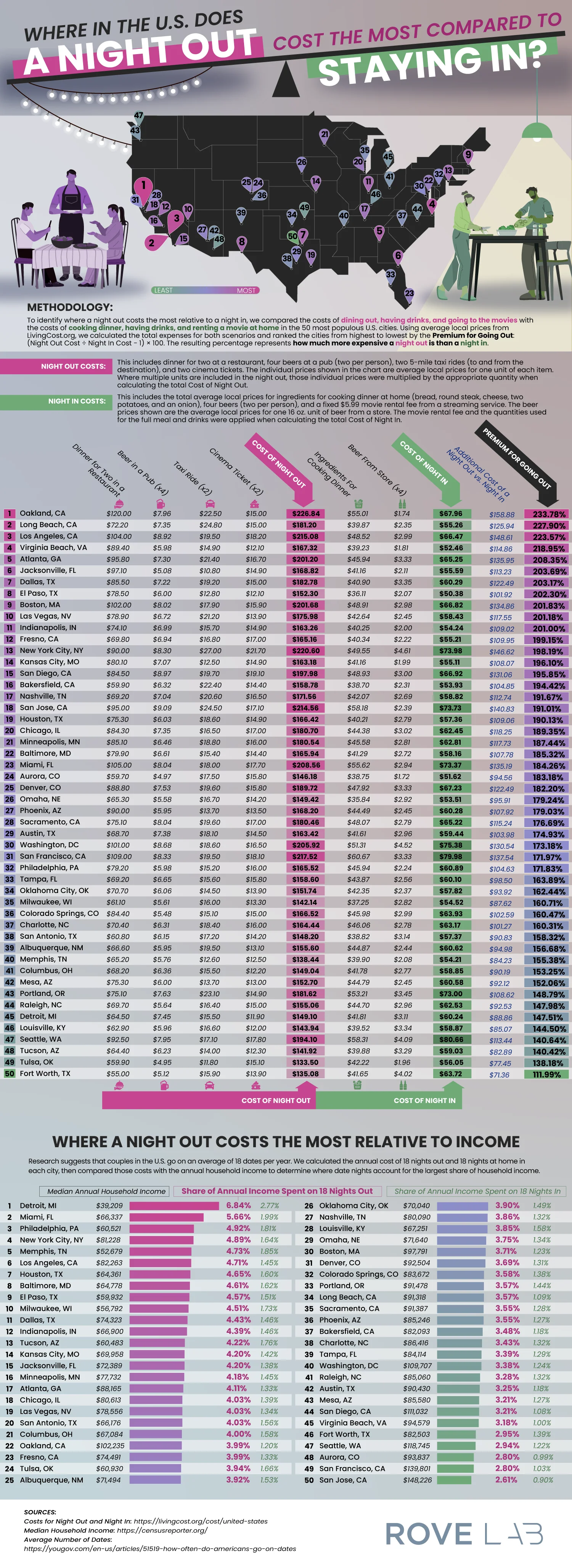
Oakland, California tops the list as the most expensive location for a date night. Dinner, drinks, a movie, and a taxi will cost $226.84 there compared to the $67.96 you’d spend on a night in. That’s a 234% premium for going out. Long Beach and Los Angeles were followed behind with premiums over 220%. Virginia Beach and Atlanta round out the top 5, and Jacksonville, Dallas, El Paso, Boston, and Las Vegas complete the top 10.
Some of the results are a little surprising. You might expect New York City to breach the top ten, and it does have the second-most expensive night out at $220.60, but it ranks only 13th because staying in is expensive there as well, so it has a lower premium. San Francisco and San Jose dropped in ranking for the same reason. At the other end of the list, Fort Worth offers the most affordable night out at a 112% premium.
Another ranking in the study might be even more revealing. Research shows U.S. couples have about 18 dates per year, so Rove Lab calculated what share of each city’s median household income goes to these dates. Detroit residents take the hardest hit. 18 nights out cost about $2,684, or 6.84% of a median income, compared with 2.77% for 18 nights in. Miami, Philadelphia, and New York City also rank highly on this metric.
San Jose is at the opposite end of the spectrum. It has one of the most expensive nights out, but high median incomes mean 18 dates take up only 2.61% of a typical household’s earnings. Local prices and incomes vary dramatically, so a city that looks expensive by one metric can look affordable based on another.
The team’s article included two full tables of data. The first lists all 50 cities with item-by-item prices, totals, the dollar difference, and the premium percentage. The second table shows each city’s median income compared to nights out vs. nights in. A summary of findings includes tips for making the most of an affordable night at home. This data might make couples think twice about how they spend their date nights and whether or not they want to adjust their budgets.
Subtitles were an accessibility feature viewers usually didn’t pay attention to unless they were hearing-impaired. These days, though, subtitles are a popular option when watching TV. Preply’s survey of 1,265 Americans found that half of them watch TV with subtitles on for reasons beyond hearing loss or watching foreign films in another language.
A Generational Trend
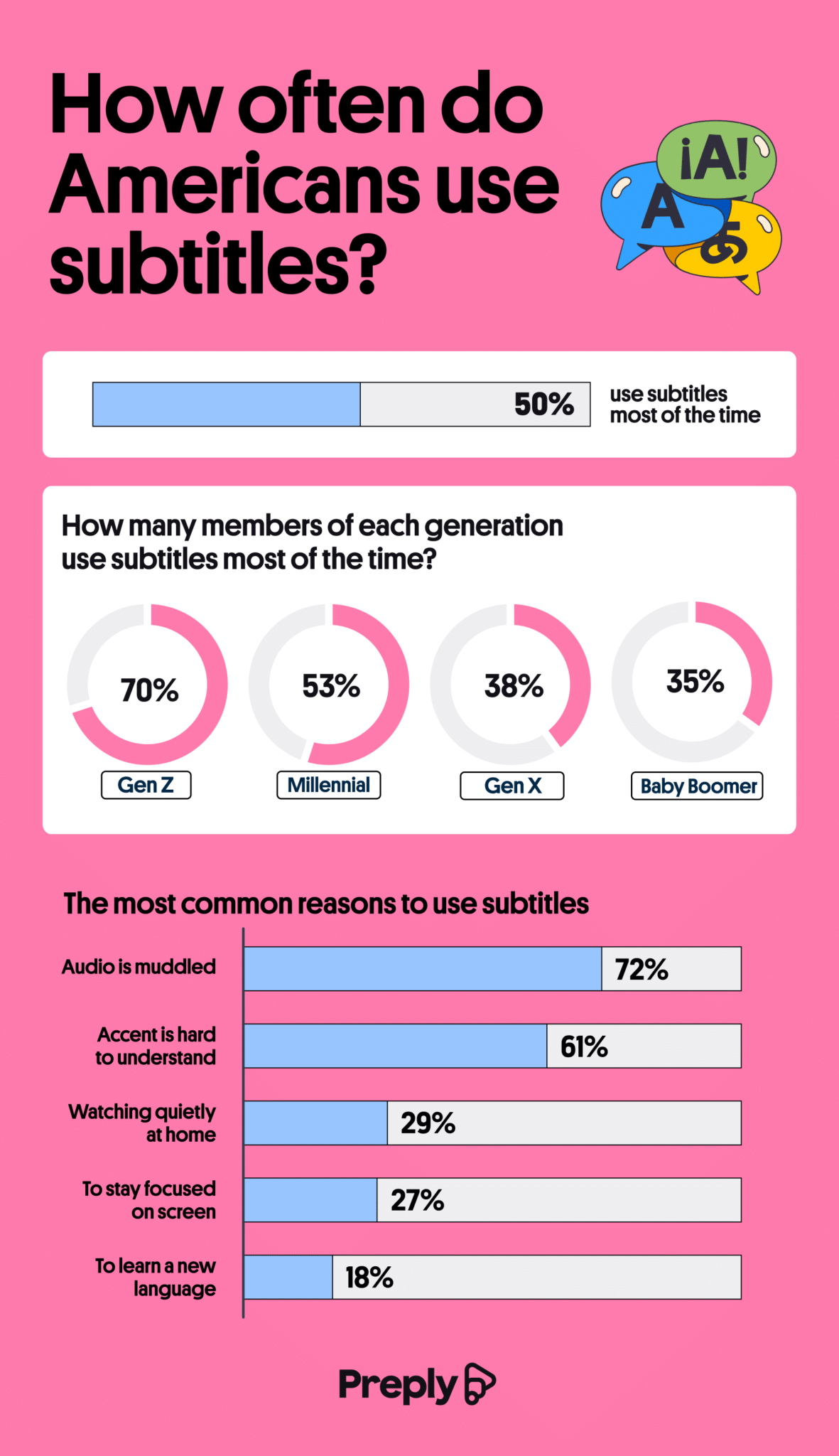
89% of the people surveyed by Preply have used subtitles at some point. Differences emerge when it comes to how often people use subtitles. Gen Z uses them the most. 70% say they have subtitles on 70% of the time, and Millennials are just above the average amount at 53%. Gen X and Baby Boomers are the least likely to use subtitles. The team graphed data on how often each generation uses subtitles.
Click below to zoom.
Sound Mixing Issues Get the Blame
The most common reason respondents said they use subtitles is muddled audio. 78% of people who use subtitles say that loud background music drowns out dialogue. 55% of people believed that dialogue is harder to hear now than it used to be. 61% of people say accents make a film more difficult to understand, so they turn on subtitles. Some people use subtitles to keep the TV volume down or to stay focused while they’re dealing with children, pets, or work.
Click below to zoom.
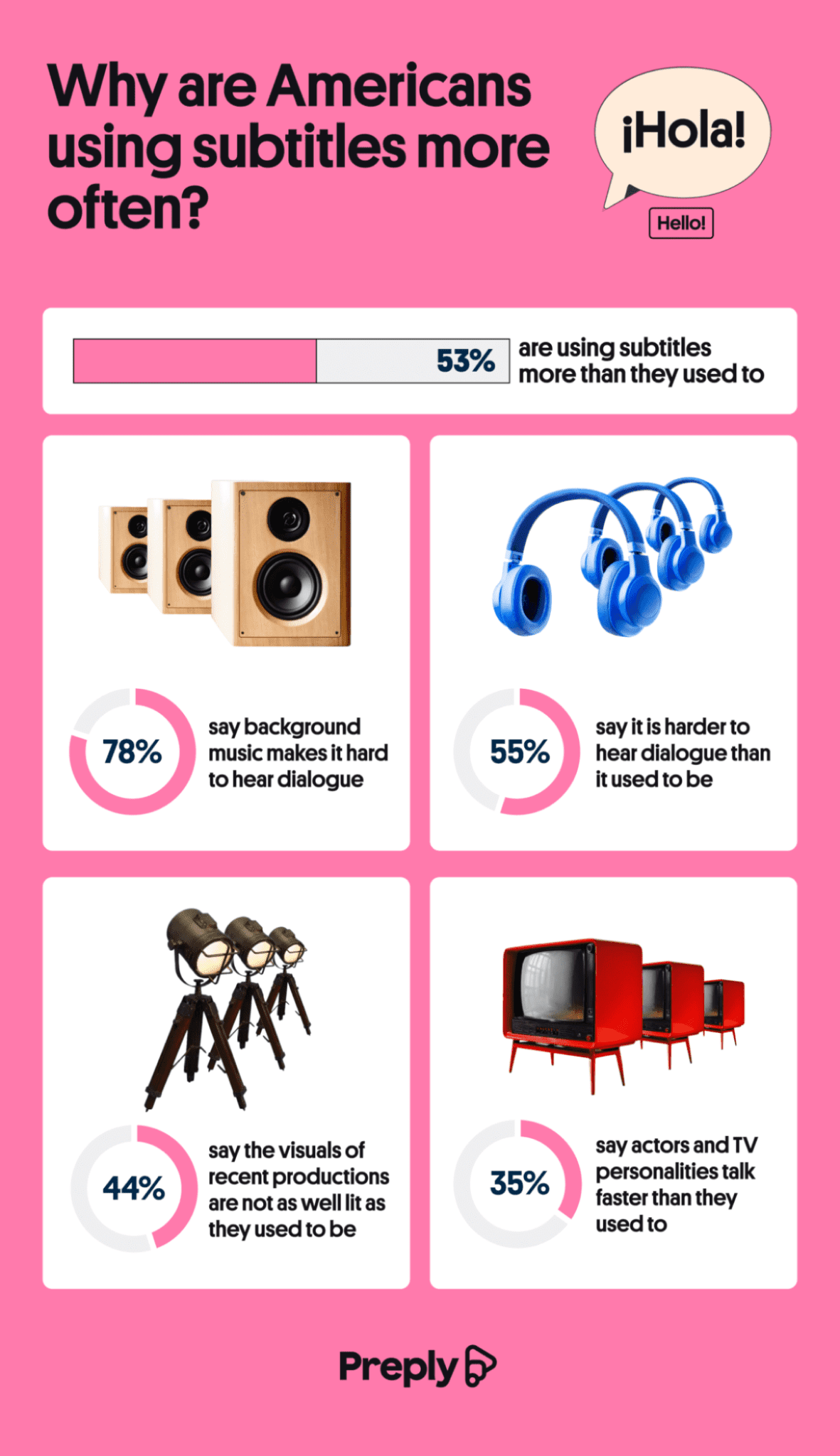
Sound-mixing complaints tie into another emerging opinion about modern television. 44% of viewers think that shows and films are shot in darker tones than in the past. They don’t like the aesthetic, and they think it’s harder to see. Another 35% of people think actors speak faster now than they used to, which also contributes to the use of subtitles.
The Most Subtitled Shows and Stars
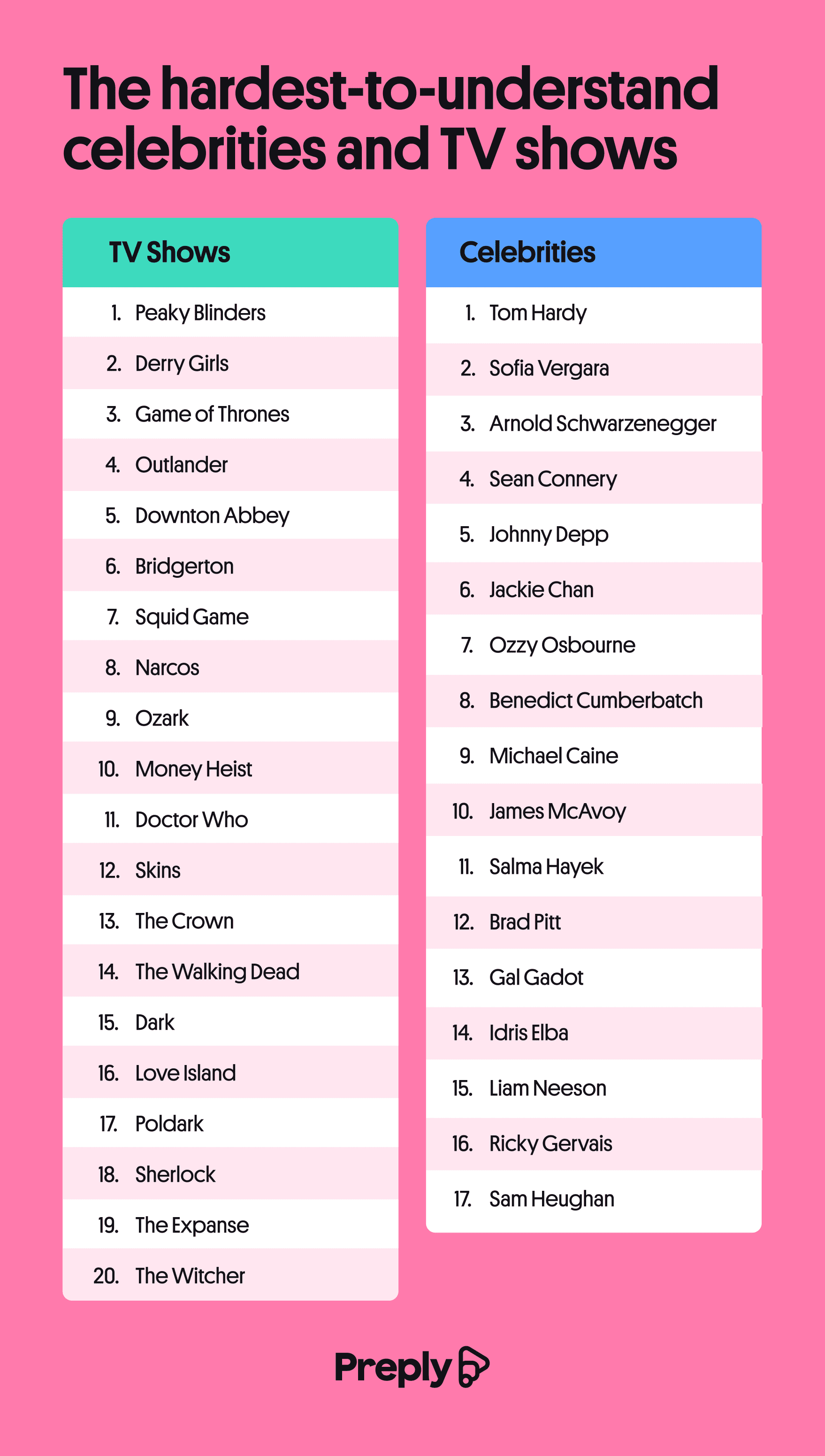
A fun section of the study delves into the shows and stars that get the subtitle treatment the most. The most subtitled shows were Peaky Blinders, Derry Girls, and Game of Thrones. Tom Hardy, Sofia Vergara, and Arnold Schwarzenegger were cited as the most difficult-to-understand celebrities. Over half of viewers say they turn on subtitles to follow dialogue with accents they find hard to understand.
Click below to zoom.
Subtitles While in Public
A big difference in TV viewing now is that many people watch on their devices while out in public. 74% of Gen Z does this, citing that they watch on public transit, at work, and even while walking and driving. Divided attention is probably part of what’s increasing the appeal of subtitles for this group. For those watching online clips on platforms like YouTube and TikTok, 41% turn on subtitles.
Foreign Films and Language Learning
62% of respondents said they use subtitles more for streaming services than regular TV channels. They said that Amazon Prime, Netflix, and Hulu have the best subtitle features. For foreign-language shows, like the popular Korean series Squid Game, 74% preferred watching in Korean with subtitles over the English dub. 26% of respondents say they use subtitles to help them learn a new language.
-
 Charts6 months ago
Survey Finds the Most Misheard Song Lyrics
-
 Charts6 months ago
Study Shows Where Americans Are Most Open to Age-Gap Dating
-
 Maps6 months ago
New Study Presents a State-by-State Look at Learning Styles
-
 Maps5 months ago
Map Shows 26 Ways to Say “Haha”
-
 Business Visualizations4 months ago
How the Top 25 College Majors Have Shifted: Student Choice’s 2026 Update
-

 Business Visualizations6 months ago
Study Examines Where People Think AI Will Improve Their Work Lives
-
 Maps6 months ago
Study Examines the Power of Phone Calls on Lonely Seniors
-
 Charts6 months ago
The U.S. Cities Where Renting Means Bracing for a Move