Business Visualizations
Chart Highlights Recalls in the Automaker Industry
When it comes to automobile safety recalls, the manufacturers with the highest recall counts are most often those that have had recurring issues spanning multiple years. This chart created by Automotive Touchup highlights the auto manufacturers that have issued the most safety recalls in recent years.
Click below to zoom
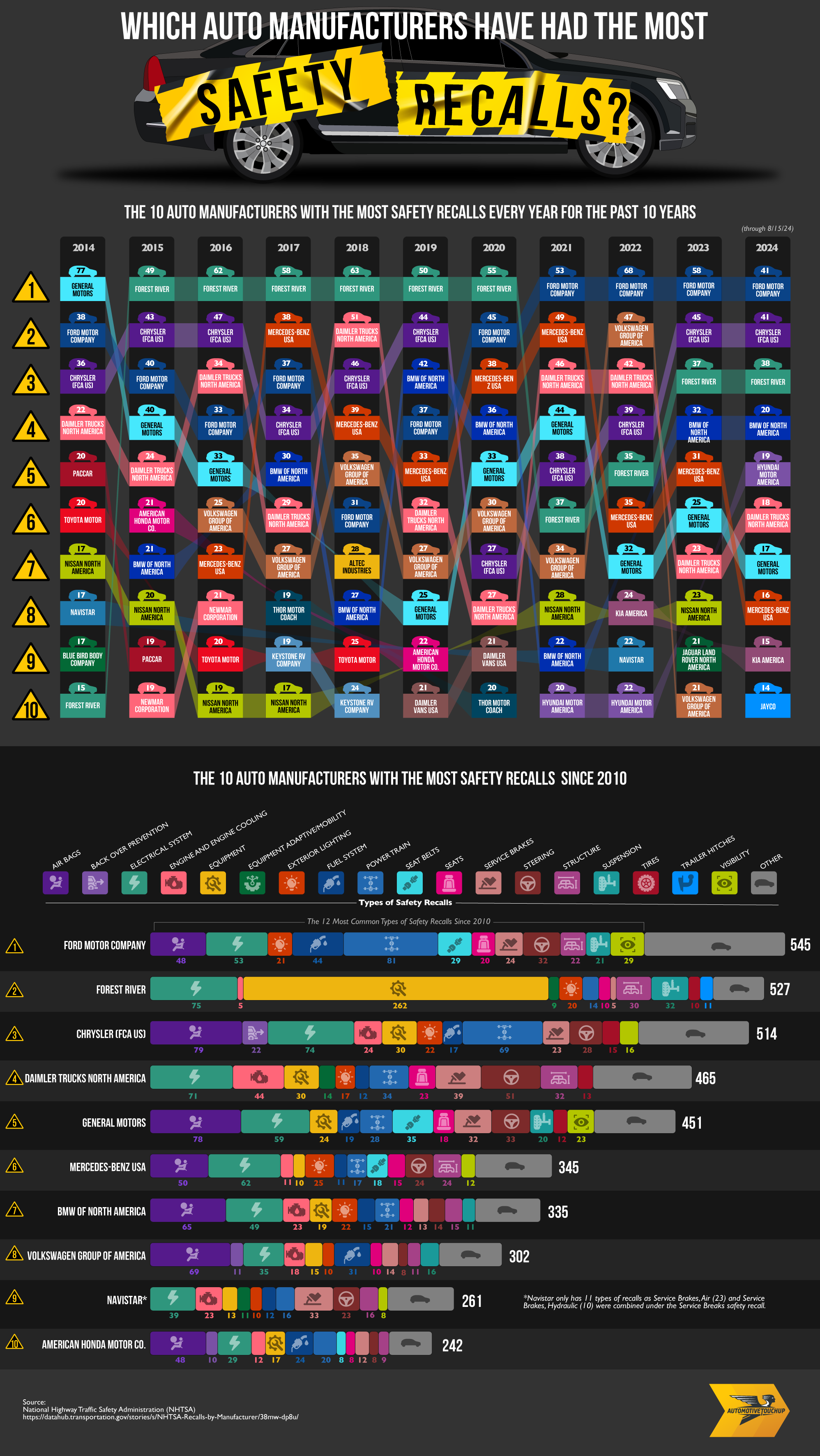
As stated in data released by the National Highway Traffic Safety Administration, Ford Motor Company has had the highest number of recalls since 2010 with a count of 545 total. Many of these recalls had to do with Ford’s airbags, electrical systems, fuel systems, powertrains, and other components.
Not far behind Ford Motor Company is Forest River with a total of 527 recalls since 2010. Forest River is the largest manufacturer in the United States for recreational vehicles and trailers. The size and complexity of an RV means there are more areas throughout the vehicle where issues could arise. Therefore, Forest River’s vehicles are more susceptible to errors that could require safety recalls than traditional automobiles.
Chrysler, also known as Stellantis since a merger with brands like Dodge and Jeep in 2021, has had 514 recalls since 2010. As one of the largest automobile manufacturers in the United States, their number of recalls is nearly proportionate to their share of the U.S. automobile market. Daimler Trucks North America ranks fourth with 465 safety recalls, mostly due to the steering and electrical systems in their trucks.
Despite being the largest automaker in the United States and seeing increased sales in recent years, General Motors comes in only fifth place. Hopefully, they will continue this drop in the number of safety recalls of their vehicles in upcoming years.
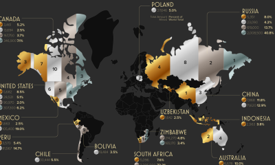
AI is embedded in workplaces worldwide by this point, and yet workers’ feelings about it vary dramatically. A study by Qualtrics examined how geography was related to feelings about AI in the workplace. They found that only 37% of workers globally believed that AI would improve their jobs. That average hides a 45-point difference between the most optimistic country, which is China, and the most skeptical, Japan.
Click here to zoom.
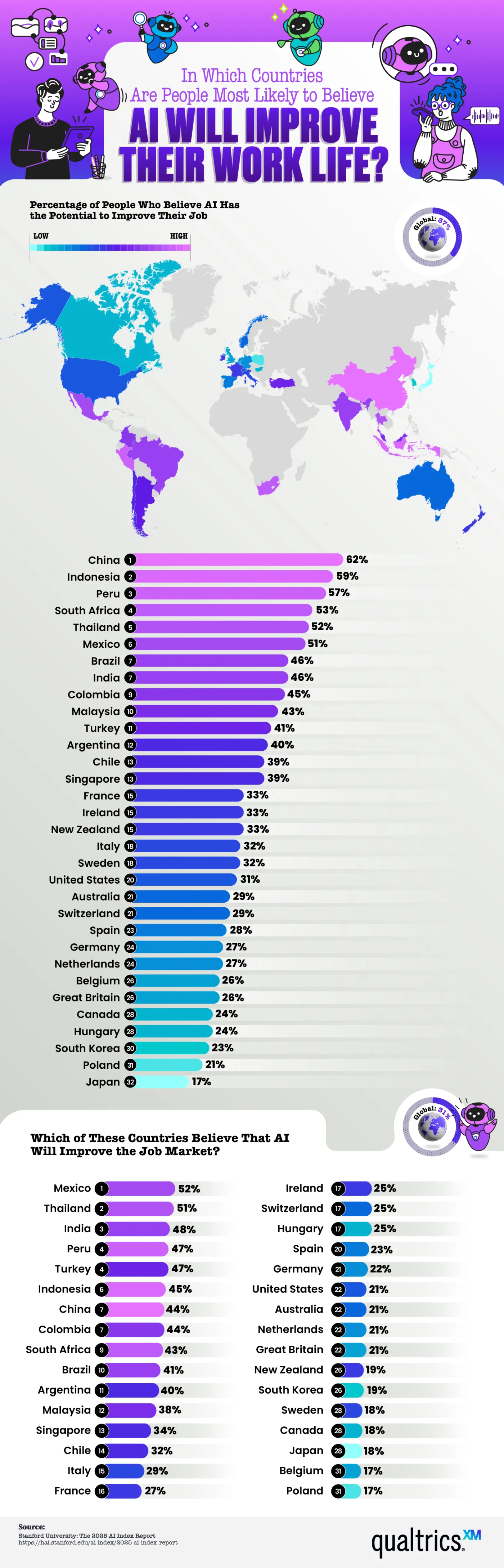
Nearly 80% of global companies report using AI in some capacity, and research indicates productivity gains, with lower-skilled workers benefiting the most. Even if this is the case, employee sentiment isn’t nearly as unified. The numbers the team shows here indicate a healthy level of AI skepticism. In fact, more than half of workers think AI will improve their lives in just 6 out of 32 countries studied. That means there are more skeptics than people excited about what AI will bring to the workplace. But why does optimism cluster in some regions while most remain skeptical?
Here are a few of the countries where optimism runs high:
- China – 62% of workers are optimistic
- Indonesia – 59%
- Peru – 57%
- South Africa – 53%
- Thailand – 52%
There is a mid-tier region with fewer optimistic workers, but still a healthy percentage. This includes Mexico, Brazil, India, Colombia, and Malaysia. Many of these countries have developing economies or a heavy state investment in AI infrastructure, as is the case in China. Workers in these places view AI as a tool to close skill gaps, raise wages, and improve living standards. These regional differences are easy to spot thanks to the map Qualtrics created, which color codes the level of optimism/skepticism.
At the other end of the spectrum, we find the highest number of skeptics in Western Europe and English-speaking countries. Here are the countries with the least faith in AI:
- United States – 31% of workers are optimistic
- Australia – 29%
- Great Britain – 26%
- Canada – 24%
- Japan – 17%
- Poland – 21%
The media narratives in these countries frame AI as a risk of automation-driven job loss, which shapes people’s perceptions even when AI adoption in their workplaces is the same as in optimistic locations. These nations are the same that rank lowest on the belief that AI will improve the job market.
Economic research suggests that AI tends to reshuffle tasks within a role rather than eliminate that job outright. New skills will be required to work with AI, and some positions will shift, but historically, new digital tools have created more roles than they’ve erased. The gap between the hard data and public sentiment in skeptical countries is definitely worth examining and tells a story.
As AI rolls out unevenly across the world’s workforce, it’s important for employers to understand where their employees actually stand on the issue. Beyond regional stereotypes or headline-driven assumptions, employers must look at facts like the data presented here to make thoughtful AI adoption decisions.
Logos are among the most dramatic and important aspects of marketing, shaping how consumers view a brand in ways that aren’t always visible. Logo designs are based on psychology, which informs us how shapes and colors make us feel, and how they can shape a brand’s trustworthiness and credibility. If a brand changes its logo, it must be done with care and intention, and with a clear reason to justify the switch. The team at LogoMaker displays the most effective logo switches and rebrands in a graphic based on increased web traffic.
Click below to zoom.
![]()
The team chose web traffic as an indicator of a successful logo because in the world of marketing, clicks and traffic are closely linked with sales and brand awareness. It’s a quantifiable way to measure customer behavior. The team used SEMrush traffic data to estimate traffic changes in the three months leading up to their rebrand announcement, compared with the two months after the launch. Their graph isolates traffic rates to the time of the rebrand to get the most accurate depiction of the effects. The team also helpfully included the old and new logos so readers can form their own opinions about changes.
According to the team’s results, these were the brands with the biggest traffic increases after their new logo launched:
- Pfizer
- MLB
- Premier League
- The Guardian
- Southwest
- VISA
- Target
- Jaguar
- IHOP
- Spotify
We see a wide range of industries represented in these results. Pfizer takes the lead after redesigning its logo from a pill shape to a double helix. This is also a good example of other factors, in addition to the rebrand, causing the traffic spikes. The rebrand occurred in 2021, the height of the COVID-19 pandemic, when the world was hoping for a company like Pfizer to develop an effective vaccine.
After Pfizer, we see a few sports leagues on the chart. Major League Soccer, or MLS, is in second place, followed by the UK’s Premier League in third. Both of them dramatically simplified their logos, making them clearer and possibly more memorable, as the increased traffic indicates. In fact, many of the companies on the list seem to have opted for simpler logo designs. This is quite possibly so the logos are more visible when they’re small, like on a phone screen. This could also reflect a changing aesthetic, shifting from the more stylized and classical designs of the 90s and 00s to today’s more bold, minimalist style.
The trend toward minimalist logo redesign reflects evolving consumer preferences and the demands of digital media. Companies across diverse industries, from pharmaceuticals to sports and retail, are embracing simpler, more impactful designs that enhance brand recognition and visibility in an increasingly mobile world. These changes not only boost traffic but also demonstrate how branding adapts to cultural shifts and technological advancements, helping organizations stay relevant and competitive in today’s fast-paced landscape.
Job searching is stressful and the current employment market isn’t the strongest. The Bureau of Labor Statistics (BLS) says that the average job search lasts 23.3 weeks. That’s a long haul. The World Economic Forum does see the market becoming more dynamic soon with new and emerging job opportunities. Qualtrics added to this top with a new map showing where we’ll find the most active job seekers in the U.S. They drew on data from the BLS’s American Time Use Survey.
Click below to zoom.
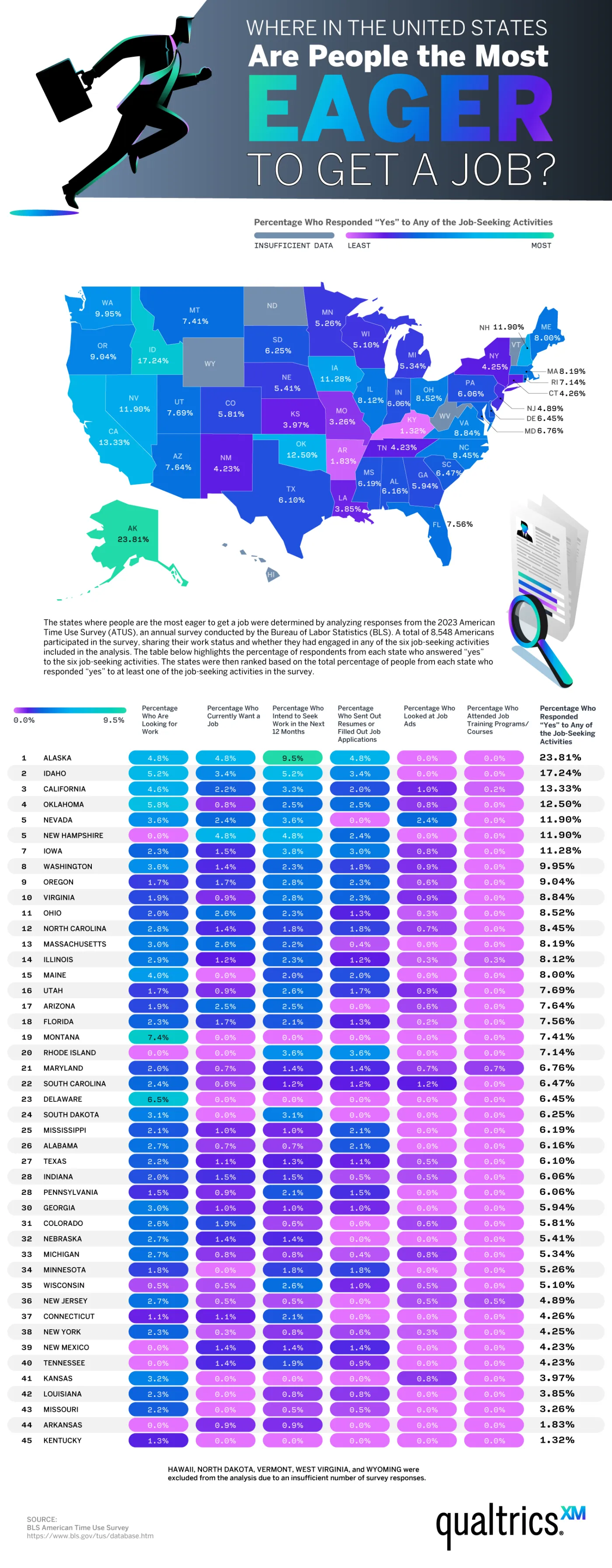
The team’s main visual for their data is a color-coded map of the 50 states, ranked by the percentage of residents who reported engaging in job-seeking activities. These could include looking for work, wanting a job, submitting applications, intending to seek work soon, looking at job ads, or attending job training. Five states had to be excluded from the ranking because of insufficient survey data. This included Hawaii, Vermont, North Dakota, West Virginia, and Wyoming.
These states were found to have the most people wanting new jobs:
- Alaska — 23.81% (standout leader)
- Idaho — 17.24%
- California — 13.33%
- Oklahoma — 12.5%
- Nevada & New Hampshire — tied at 11.9%
- Iowa — 11.28%
- Washington — 9.95%
- Oregon — 9.04%
- Virginia — 8.84%
This list shows Western and Pacific states dominating the top. Alaska as a standout leader might come as a surprise because it’s not due to a job shortage. There is actually a workforce shortage in Alaska. In 2024, Alaska created 5,400 new jobs with more expected in 2025. $20 billion in infrastructure development is expected to generate 20,000 more jobs by 2030. So, Alaska’s high job-seeking activity reflects a growing, dynamic economy with ample room for pivots and career changes.
States with the lowest rankings were Kentucky (1.32%), Arkansas (1.83%), and Missouri (3.26%). These states may have lower unemployment rates, different market conditions, or demographic factors that influenced their ranking. The data make it clear that job-seeking activity varies widely by state, tied to local economic conditions, perhaps more so than national trends. Job seekers should take advantage of training programs, the federal jobs board, and role-specific job search sites. It also shows that securing talent is only one step toward building a loyal, long-term workforce. Only 42% of workers feel engaged, which is a major reason they may seek new jobs.
Beyond a snapshot of where Americans are currently looking for work, these data points to a bigger reality: labor-market “energy” is uneven, and high job-seeking activity can signal opportunity as much as instability. In states like Alaska, movement may reflect an expanding, restructuring economy in which workers feel empowered (or required) to pivot as new roles and industries emerge. For job seekers, the practical takeaway is to align search strategy with local conditions. Prioritize skills-building and credentials that travel across employers, use targeted boards and training pipelines, and treat mobility as a long-term advantage rather than a short-term disruption. Organizations and individuals that read these regional signals early and invest accordingly will be best positioned to thrive as the economy continues to evolve.
-

 Business Visualizations2 years ago
Everything Owned by Apple
-

 Business Visualizations2 years ago
America’s Most Valuable Companies Ranked by Profit per Employee
-

 Business Visualizations1 year ago
The Biggest Fortune 500 Company in Every State
-

 Business Visualizations1 year ago
The Biggest Employers by Industry
-

 Timelines2 years ago
Timeline Charts the Development of Communications Technology
-

 Business Visualizations9 months ago
The Largest Companies in America That Are Still Run by the Person Who Founded Them
-
 Charts2 years ago
Map Uncovers Countries with Most Powerful Passports
-
 Maps2 years ago
A Map to Gold and Silver