Charts
The U.S. Cities Where Renting Means Bracing for a Move
Moving consistently ranks among life’s most stressful experiences, behind only divorce and the death of a loved one. This difficulty isn’t even distributed by location. Some cities make a renter’s move dramatically more difficult than others. Rove Lab’s analysis of 55 major U.S. metro areas, scored across 13 factors including population density, rental housing, transportation, and weather, shows which cities make moving a logistical nightmare.
Click below to zoom.
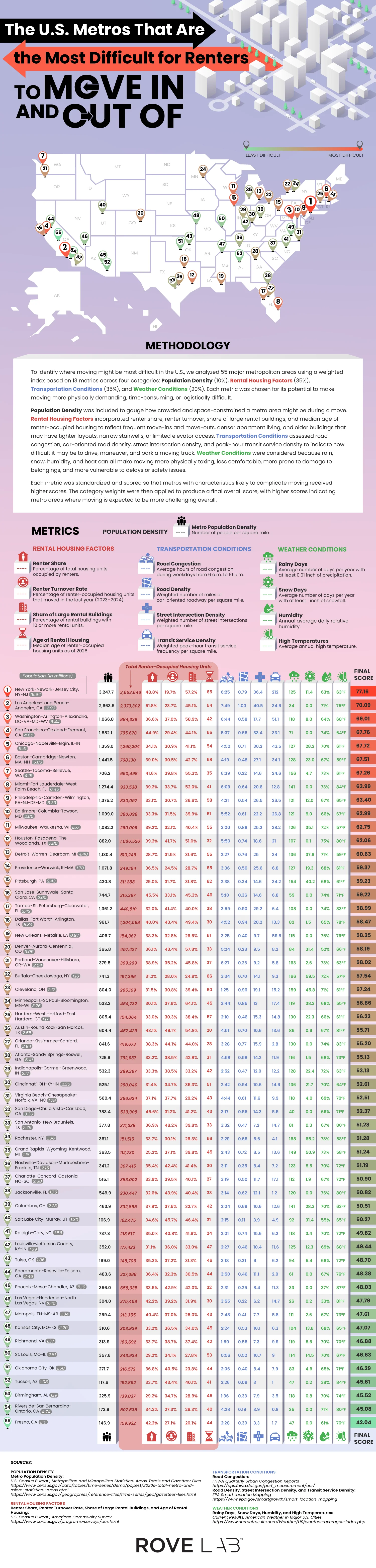
The New York-Newark-Jersey City metro area is the most difficult one to move from, with a score of 77.16. There are several reasons it’s so difficult. For one, it has the highest population density in the country, at 3,247.7 people per square mile. It also has the lowest renter turnover at 19.7%, indicating fierce competition for available units. 57.2% of rental properties are large buildings with more than 10 units, and the median building age is 65. This means these older buildings have narrow stairwells, slow elevators, and tight corners, a nightmare on moving day. On top of this, the transit density at peak hours is 212 vehicles per square mile. Trying to move out of an older building with narrow hallways, busy stairs and elevators, and limited street parking is truly challenging.
Move-in difficulty varies widely by city. Los Angeles isn’t the densest city, but it has the worst traffic congestion in the country, with 7 hours and 49 minutes of traffic per weekday, due to urban sprawl and car dependence in the region. Washington, D.C. has the oldest housing units, making it more challenging to navigate furniture on move-in day, especially in dense transit corridors. San Francisco and Chicago are mid-density metros with older buildings and a high number of large buildings with many units, driving up the scores. Boston and Seattle round out the top of the most difficult cities, thanks to lots of snow in Boston and tons of rainy days in Seattle, which make moving in more difficult.
Thankfully, the team’s data also shows that not every city is a move-in nightmare. Austin is a standout city with the highest renter turnover in the country. A pandemic-era construction boom created an oversupply of new, modern housing units, which led landlords to offer move-in incentives and upgrades. Fresno, Riverside-San Bernardino, and Birmingham all offer easier moves thanks to a low population density, newer rental stock, and less traffic. The weather’s role shouldn’t be overlooked. Rochester, Buffalo, and Pittsburgh all have lots of snowy and rainy days, which can really put a literal and figurative damper on moving day.
The Rove Lab team’s work reframes the question of which cities are best and worst to live in through a specific, practical lens. Your housing is one of the most important parts of your life in a new city, and finding the best rental and having a good move-in experience will set the tone for a new start. Wherever you’re headed, knowing what you’re walking into can help you have the best experience.


The invisible digital infrastructure is all around us. It powers every bank login, online order, every text sent, and every social media update posted. Vast networks that many of us rarely think about make these actions possible. Access to the digital infrastructure shapes a population’s economic standing and it even keeps entire governments running smoothly. Therefore, it’s no surprise that some countries spend huge sums to stay competitive in the digital infrastructure sector and there are clear winners as we can see in Ooma’s new study.
Click below to zoom.
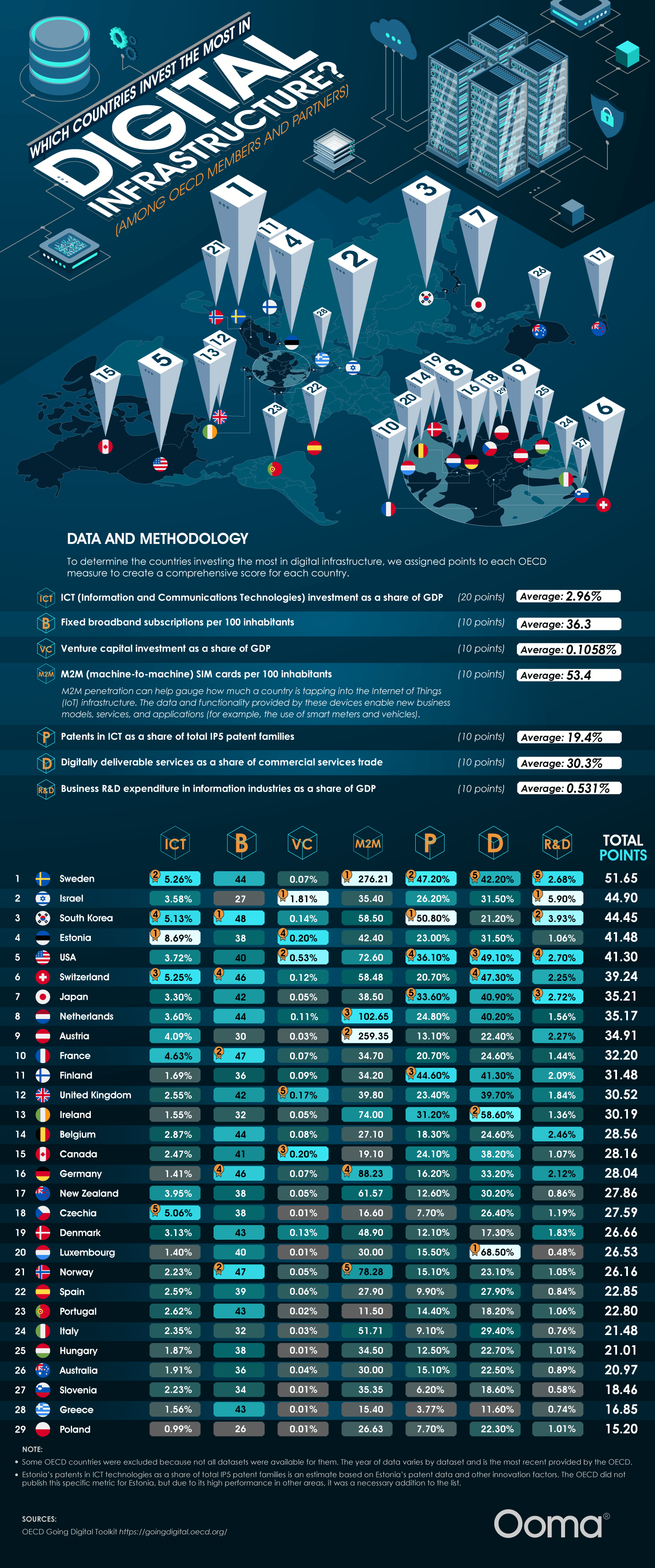
Think of this way: rather than roads and bridges, broadband networks, data centers, and cloud systems, the key to mobile connectivity is a country’s most valuable asset, which powers AI servers and social media. Advanced digital infrastructure correlates with higher GDP growth, higher productivity, a viable remote workforce, and a more digitally skilled workforce. These systems also allow faster access to government services, which can even be lifesaving since they offer quicker communication during emergencies like natural disasters.
The team’s study found 5 countries leading this digital infrastructure race. Sweden is in first place now with strong assets across the board, led by broadband subscriptions and business R&D spending. Israel is in second place with outsized venture capital relative to their GDP and heavy research funding into digital infrastructure. South Korea is in third, powered by ICT patents and top-tier broadband reach. Believe it or not, Estonia edges out the U.S. in fourth place. They’re a global digital pioneer with the most ICT investment as a share of GDP. The U.S. ranks #5, driven by digitally deliverable services and venture capital. The team used a points-based score across seven OECD measures, which include ICT investment, broadband, venture capital investment, M2M SIM cards, ICT patents, digital services trade, and business R&D.
These investments have a number of real-world impacts. In Estonia, they have nearly all their government services available online and a digital ID that can be used for everything from remote voting to public transport. Sweden has a highly developed e-commerce sector, universal household Internet connectivity, and, as a result, Stockholm is Europe’s financial hub. In Israel, the National Digital Agency and the Digital Israel initiative weave tech across education, government, and healthcare, transforming the country into a startup magnet. South Korea has one of the fastest Internet speeds globally and they dominate consumer electronics, competitive gaming, and semiconductors.
Countries investing in digital infrastructure are positioned to be world superpowers. Businesses in these countries benefit from fast communication and a digitally literate workforce. But seamless connectivity shouldn’t depend on geography. Every country and all people can benefit from a more digitally connected world, so the more countries that improve their digital infrastructure, the better. The leading countries on this chart can serve as role models while countries further down the list highlight areas for improvement and potential investment.
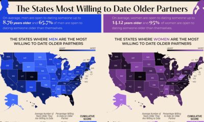
Compatibility is usually our biggest driver in the search for a romantic partner, but it turns out that age is still a major part of that compatibility. Tawkify’s matchmaking service surveyed about 98,798 Americans over two years, asking whether they’d date someone older and younger and how far outside their own age range they’d go. The data reveal both geographic and dating patterns, with a recurring pattern: smaller dating pools push singles to date across wider age ranges.
Click below to zoom.
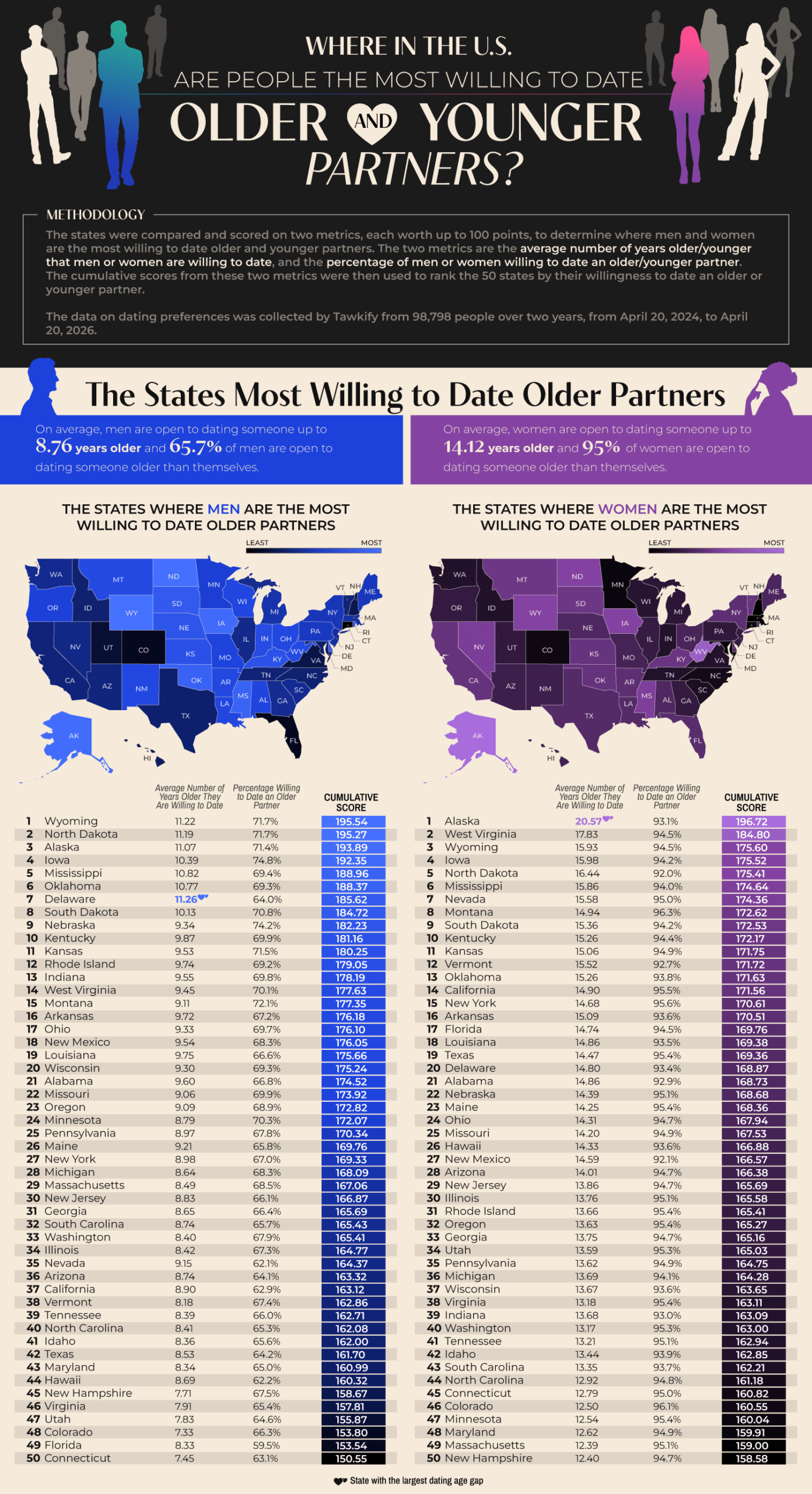
Wyoming tops the list of states with men willing to date outside their age range. 71.1% of Wyoming singles are willing to date an average of 11.22 years older than they are. North Dakota and Alaska also appeared in the top three. Delaware emerged as an interesting outlier. They have the largest average age gap in dating among men, at 11.26 years. 93.1% of Alaskan women are open to dating older partners, and they have the nation’s largest age gap by far at 20.57 years. West Virginia and Wyoming women follow in second and third. It seems that less-populated states show greater willingness to date outside their age range, which could be a very simple explanation. A smaller dating pool means singles widening their options.
As for willingness to date younger partners, Hawaii leads for both genders. 96.8% of Hawaiian men are willing to date someone younger, with 18.59 years as an acceptable age gap. This is the widest that appears in the study. 92% of Hawaiian women are open to dating younger, but their average age gap is only 9 years. Hawaii has an older-than-average population, with a median age of 41.5 years, so this limited island dating pool makes dating younger people more common. The runners-up for willingness to date younger were Nevada, Idaho, and Maine.
According to the data, women are dramatically more open to dating older than men are. 95% of women would date an older partner, compared with 65.7% of men. This pattern flips with dating younger. 96.5% of men would date someone much younger, with a national average age difference of 14.7 years. 88.1% of women would date younger men, but at a much smaller average age gap of 7.14 years. This shows that across the country, men tend to date younger partners, while women tend to date older partners. Women are consistently willing to tolerate a wider gap when dating up.
The team threw us a little fun fact from the Guinness Book of World Records, which lists Gertrude and John Janeway, married in 1927, as the largest spousal age gap of 63 years. Age-gap relationships can succeed but face challenges like judgment and assumptions about power dynamics and differing life stages. Strong communication, shared values, and aligned goals matter most in relationships, more than the number of years lived. Geography and gender seem to shape who Americans date, but the data also suggest that openness to age-gap romances often comes down to opportunity.
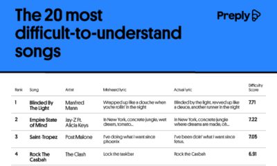
Sometimes you confidently belt out a song and discover years later that you misheard the lyrics and sang it wrong this whole time. We’ve been there. Preply unveiled a fun, often humorous study showing the most misheard song lyrics, some of which verge on ridiculous. For example, in Manfred Mann’s “Blinded by the Light,” many people hear the lyric “revved up like deuce” as “wrapped up like a douche.” That would be an embarrassing one to unleash at karaoke. The team’s data reveals that mishearing lyrics is a predictable outcome of speed, vocabulary, and accents skewed in audio mixing.
Click below to zoom.
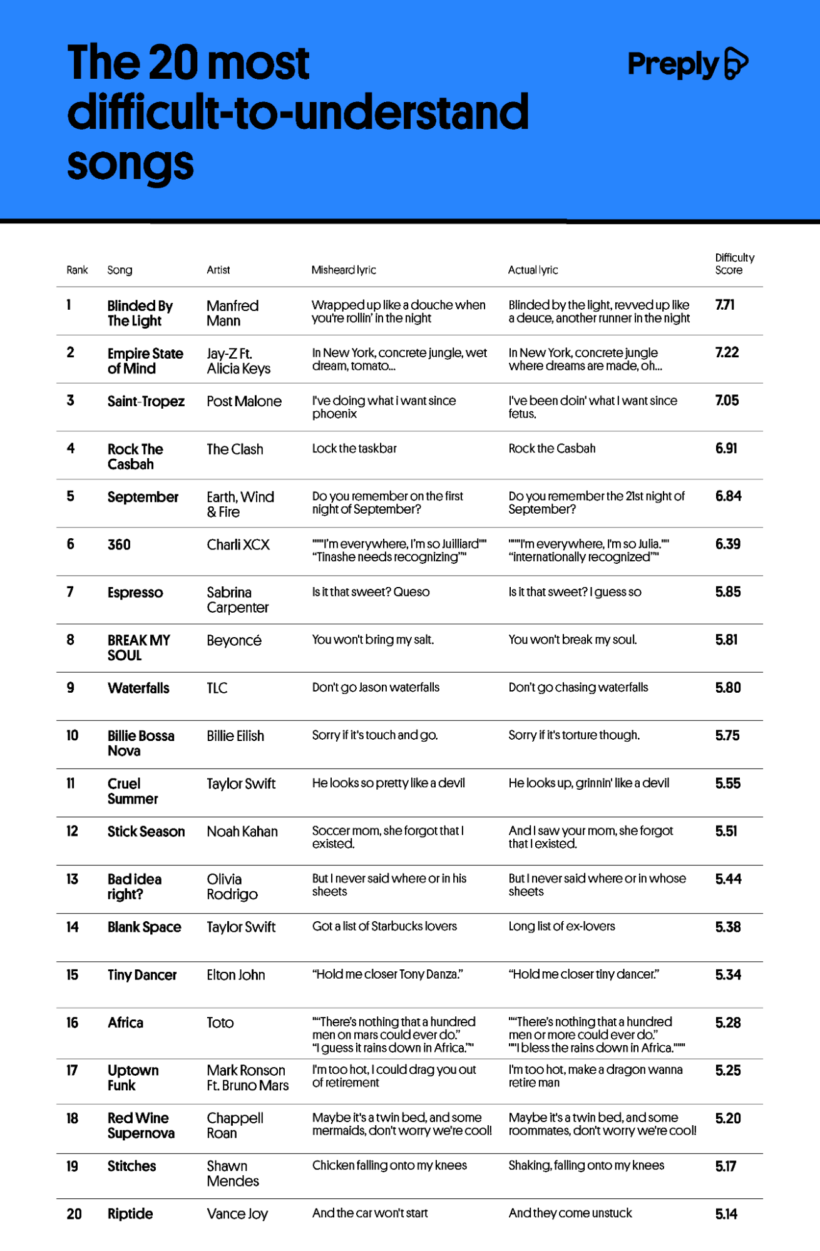 The article introduces us to an interesting word, “mondegreen.” This word was coined in 1954 to describe a misheard lyric that can completely change a song’s meaning. Preply lists the most common causes of mondegreen as tricky vocabulary, unfamiliar accents, sound-alike words, fast tempos, unclear pronunciation, and background music that obscures vocals. Language educators love to use mondegreens as teaching moments on the importance of pronunciation and clear vocabulary.
A chart lists the most commonly misheard lyrics. As we mentioned, Alfred Mann’s “Blinded by the Light” tops the list as the most difficult to understand. AI correctly transcribed only 61% of the lyrics, and the song earned a readability score of 85 despite the song’s even pace of 80 words per minute. Jay-Z and Alicia Keys’ “Empire State of Mind” was number two on the list. The lyrics move fast at 158 words per minute, and the most famous mishearing is a hilarious mistake. The true lyric is “concrete jungle where dreams are made, oh,” but listeners believe they’re hearing “concrete jungle, wet dream, tomato.” The third on the list is Post Malone’s “Saint Tropez.” AI failed to correctly transcribe 32% of the lyrics, and, believe it or not, the real lyrics “since fetus” appear in the song, but listeners, perhaps understandably, think the lyric is “since Phoenix.” You’ll see two famously misheard songs on the list that have been the subject of memes. A lyric from Sabrina Carpenter’s summer hit “Espresso” has an “I guess so” that listeners thought was “queso.” Taylor Swift is often misheard, too, as we can see on the chart. Everyone loves to bring up the “Starbucks lovers” from “Blank Space.” (She’s saying, “long list of ex-lovers.”)
The team’s data also revealed that Lady Gaga is one of the most difficult artists to understand. She had 306 misheard lyric submissions. She tends to use unconventional pronunciation in the song “Poker Face,” which alone ranks 81st in misheard lyric reports. Taylor Swift had 300 submissions across her extensive catalog, and Kelly Clarkson rounds up the top three most misheard artists list, with “Since U Been Gone” and “Because of You” having the most misheard lyric reports.
In general, the Preply team found that strong regional accents and faster genres like rap make individual words harder to understand. Mishearing lyrics is a normal function of our brain, filling in gaps in our understanding.
-

 Business Visualizations2 years ago
Everything Owned by Apple
-

 Business Visualizations2 years ago
America’s Most Valuable Companies Ranked by Profit per Employee
-

 Business Visualizations1 year ago
The Biggest Fortune 500 Company in Every State
-

 Business Visualizations1 year ago
The Biggest Employers by Industry
-

 Timelines2 years ago
Timeline Charts the Development of Communications Technology
-
 Charts2 years ago
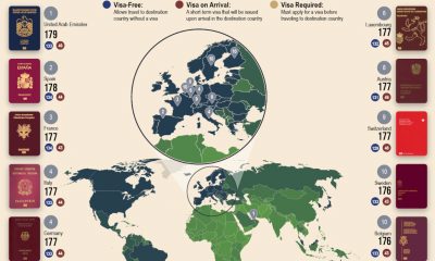
Map Uncovers Countries with Most Powerful Passports
-

 Business Visualizations9 months ago
The Largest Companies in America That Are Still Run by the Person Who Founded Them
-
 Maps2 years ago
A Map to Gold and Silver