Finance Visualizations
How Big of a House Can You Get for $1M Around the United States?
A million dollars is a million dollars, right? Well, it turns out that a million dollars can go a lot further in some U.S. cities than it can in others. This new 3D bar graph map visualization from RoofClaim.com reveals just how far (or not so far) your dollar can go when it comes to buying a house. The results are fascinating:
Click below to zoom

In Detroit, Michigan, you can buy a 22,000-plus square foot mega-mansion for $1 million. That’s nearly half the size of a football field. And in Memphis, Tennessee, you can get a similarly-sized 17,847 sq ft home for the same amount of money. Although, the local market in Memphis seems to be turning around this year.
On the other end of the spectrum, the real estate market in San Francisco is a whole different story. With one million dollars you’d only be able to get about 909 square feet. In Detroit, a home of that size would only run you about $40,905. But, just because housing prices are low, doesn’t mean it’s a good buy. Be sure to do your own research.
So why is it that real estate markets in the same country can be priced so wildly different? Well, that’s a complicated answer. A lot of factors come into play when it comes to real estate value in a specific city. Some include housing availability, crime rate, the job market, waterfront or other favorable views, and more. In San Francisco, it’s emerging that housing prices are so high that even highly paid tech workers can’t afford to live there.
How does your local city or town stack up? Let us know in the comments!
Business Visualizations
Chart Tracks E-Commerce Brands with the Biggest Gains and Losses
Online shopping, known as e-commerce, took the shopping world by storm. Today, one-fifth of all retail sales come from e-commerce. Economists predict e-commerce will only continue to grow in the coming years. This industry can be lucrative but not without risks. The competition is tight as the team at LLCAttorney proves with this chart tracking the e-commerce brands with the biggest gains and losses. The results show the shifting e-commerce landscape and just how much of a difference there is between leading retailers and struggling brands.
Click below to zoom.
As we would expect from this global-dominant brand, Amazon leads the e-commerce industry with the biggest gains. In 2025, Amazon’s revenue amounted to a whopping $95.22 billion. Ever since Amazon debuted as a bookseller in 1994, it has had a meteoric rise, earning more each year. The biggest leap in the company’s earnings occurred between 2017 and 2018, with a 172.8% increase. Amazon only suffered one year in the red after it invested heavily in Rivian, a failed electric vehicle venture. Amazon’s massive catalog of over 12 million products, its entertainment subscription services, digital books, and convenient, fast delivery service make Amazon the powerhouse it is today.
Right behind Amazon, we find the Chinese brand, Alibaba, which earned $21.76 billion in 2025. Alibaba sells a wide range of products at wholesale prices. You’ll find electronics, home goods, beauty products, and even industrial supplies in their offerings. Alibaba’s business-to-business marketplace, which connects small and mid-size businesses directly to manufacturers, allows them to source bulk goods and makes this brand a popular choice. Other Chinese brands top the e-commerce earnings list too, like PDD Holdings (Pinduoduo) and Jingdong Mall (JD.com). Each of the top four e-commerce companies earned over 5 billion in revenue.
Turning to the other end of the chart, we find the brand with the most losses in 2025: Lightspeed POS. They reported a devastating $670 million loss. They earned $1.15 billion, but it wasn’t enough to cover their expenses. This Canadian e-commerce brand is a point-of-sale system for retailers and restaurants. It was once considered a promising company with rapid growth, but its revenue has shrunk significantly in the past few years as competitors have taken bites out of Lightspeed POS’s market. The British brand, ASOS, a clothing retailer, also suffered a massive $500 billlion loss in 2025. American brand Wayfair suffered losses, too, which is surprising considering its past popularity as an affordable home goods retailer with a big selection.
The figures we see here demonstrate that e-commerce is an industry with diverse companies and varying success rates. With tremendous gains and equally earth-shattering losses, we can see e-commerce is volatile, competitive, full of opportunities and challenges alike. The team’s data show that the industry’s biggest giants will be difficult to surpass. Companies like Amazon have set an astronomically high bar for success.
Charts
The Most Expensive U.S. States to Own a Car
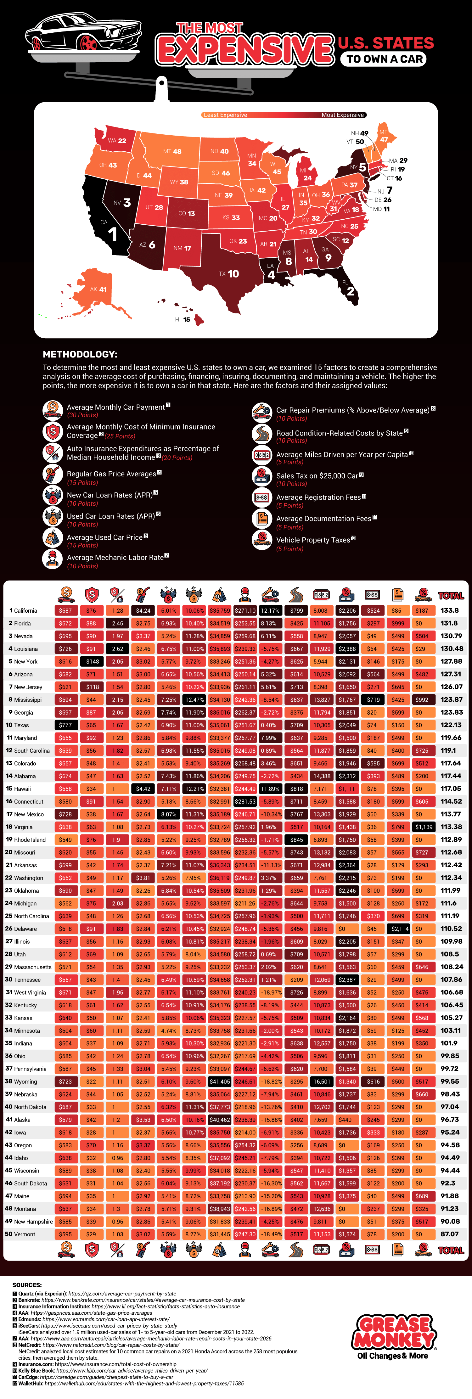
America’s infrastructure depends on vehicle use, making driving a necessary reality for many people. According to research, 78% of workers aged 16 and over use a car to get to work. Few Americans never or rarely drive. Car costs can be prohibitive, and more people struggle to afford vehicle ownership each year as car prices rise. Add other state-level fees to the mix, and vehicles can be a struggle to afford. The team at Grease Monkey helped determine the most affordable and expensive states to own a car in.
Click below to zoom.
They found that California is the most expensive state for car ownership. The high costs in California are largely due to maintenance talks. There are higher car repair premiums, higher gas prices, higher registration fees, higher car insurance premiums, and above-average monthly car payments in California. All of these combine to make California a highly expensive state in which to own a car.
If you’re looking to save on vehicle expenses, look no further than Vermont. It scored nearly 50 points lower than California according to the team’s system. Vermont has the third-lowest car insurance rates, third-lowest repair premiums, and low registration fees and sales taxes. There are no vehicle property taxes in Vermont, another major source of savings.
To create such a comprehensive study, the team looked at 15 different data sets and awarded points based on these sets:
- Average monthly car payment
- Average monthly cost of minimum insurance coverage
- Auto insurance expenditures as a percentage of median household income
- Regular gas price averages
- New car loan rates
- Used car loan rates
- Average used car price
- Average Mechanic labor rate
- Care repair premiums
- Road condition-related costs by state
- Average miles driven per year per capita
- Sales tax on a $25,000 car
After California, the most expensive states to own a vehicle in were Florida, Nevada, Louisiana, New York, Arizona, New Jersey, Mississippi, Georgia, and Texas. If you’re looking for more affordable states other than Vermont, turn to New Hampshire, Montana, Maine, South Dakota, Wisconsin, Idaho, Oregon, Iowa, Alaska, and North Dakota. The team’s study is an exhaustive examination of all the costs that stack up to make driving prohibitive. Many of the more expensive states have a generally high cost of living, so this information could be useful to anyone looking to relocate to a more affordable state.
Although it might seem counterintuitive, thorough annual maintenance on your car can keep your costs down in the long term. Regular oil changes, brake service, and tire rotations can extend the life of your car, which has a big impact on your savings. For car insurance, investigate special programs you may qualify for, like being a safe driver or completing a defensive driving course. This map can help us reflect on the many expenses that come with car ownership and prompt us to think of ways we can save money and keep driving costs reasonable.
Business Visualizations
Where in the U.S. Are Different Tech Sectors Growing the Fastest?
Tech is one of the world’s biggest industries, with many of the dominant Fortune 500 tech companies based in the United States. Four tech companies alone are worth trillions of dollars, and though the industry is full of rapid changes, it’s not going anywhere. The Pulse team examined locations around the country where key tech industries are booming and mapped their findings. The map shows that while Silicon Valley is the traditional home of the tech industry, there are growing tech centers around the country.
Click below to zoom.
One of the sectors spreading geographically is computing infrastructure and data services. Somerset, New Jersey, is the hub of this sector, with a significant employment increase between 2023 and 2024. Dense fiber networks and proximity to financial clients in New York City make New Jersey an ideal location for this sector. However, Ada County, Idaho, and a few counties in Maryland also support this sector.
As for custom computer programming services, the biggest hub is in Norfolk City, Virginia. There are several major software firms there, supported by the Norfolk Innovation Corridor, a “technology zone” that includes businesses, public works, hospitals, and universities. Tech startups here earn major tax incentives and other benefits. Georgia and Maine have growing centers of custom programming services too.
Software publishing is booming in the state of Texas. In Bexar, Texas, employment in this sector had doubled. San Antonio and Austin are also full of software publishing companies. Pittsburgh emerges as a hub for software publishing too, thanks to the University of Pittsburgh.
Web search portals and information services have a home in the New York City metropolitan area, particularly in Union and Essex counties. Multnomah County, Oregon, home of Portland, also has a healthy number of companies in this sector, along with many other types of creative and digital media companies.
Semiconductors are commonly manufactured in Williamson County, Texas, north of Austin. Samsung made a $17 billion investment in a semiconductor facility in Taylor, Texas, making the area a leader in the industry. NVIDIA, located in Santa Clara County, California, is another leader in this industry.
From Ohio to Maine, it’s clear that California doesn’t have the tech industry on lock. Many other cities have responded to the booming economy supported by thriving tech companies. Many cities have been totally revolutionized thanks to a major tech company opening its headquarters there. Tech businesses bring skilled workers with money to spend on many other local industries, so many communities welcome these companies with open arms.
Students and entrepreneurs can use data and maps like this to pinpoint where they may want to relocate for their job search or startup. Overall, this map offers a fascinating way to look at the state of the American tech industry by shifting our focus away from Silicon Valley and considering how tech could impact other states and cities in the future.
-
 Business Visualizations2 years ago
Everything Owned by Apple
-
 Business Visualizations2 years ago
America’s Most Valuable Companies Ranked by Profit per Employee
-
 Business Visualizations1 year ago
The Biggest Fortune 500 Company in Every State
-
 Business Visualizations12 months ago
The Biggest Employers by Industry
-

 Timelines2 years ago
Timeline Charts the Development of Communications Technology
-
 Business Visualizations7 months ago
The Largest Companies in America That Are Still Run by the Person Who Founded Them
-
 Maps2 years ago
A Map to Gold and Silver
-

 Timelines2 years ago
The Evolution of Baby Names: A Century of Trends


