Interactive Visualizations
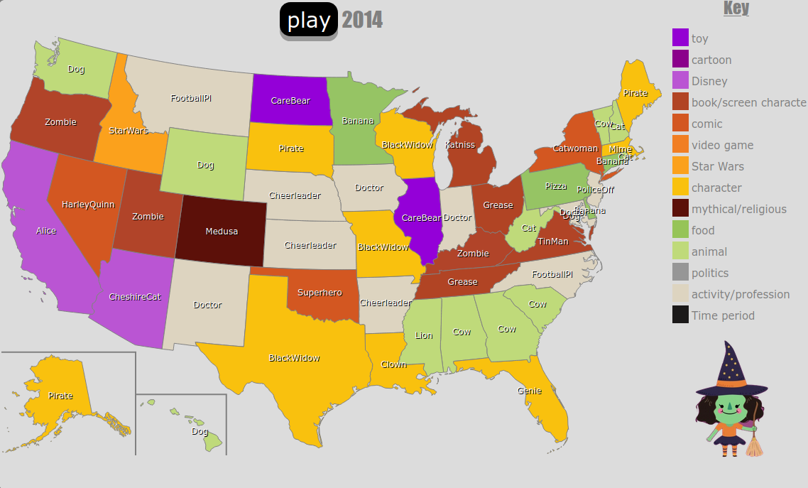
America’s Most Searched Halloween Costumes Over the Years
What is America dressing up as for Halloween this year? How about for the past 6 years? This animated thematic map, created by DATABAYOU, shows what the most Googled Halloween costume was for every state since 2014. The animation plays through each year, displaying the name of the costume that was the most searched in each state, color coded to the “class” that each falls into. With 14 different classes of costume to assign to these searches, it’s interesting to see how the trends change year-by-year, and state-by-state. The color-coded classes include: toy, cartoon, Disney, book/tv/movie character, comic, video game, Star Wars, character (such as a clown, ninja, or pirate), mythical/ religious, food, animal, politics, activity/profession, and time period. While some of the costumes that appear on the interactive map could fall into two different categories, the creator classified them according to their own personal experiences.
Click here for the original animated map.
Click here for the original animated map.
Watching the costume timeline play across the map, it’s easy to see the trends that were popular for each particular year. You can tell that 2016 was an election year with New York’s most searched costume being Hillary Clinton while Florida dominated the searches with Melania Trump costume ideas. One fifth of the country wanted to get decked out in 1980s attire in 2017, while searches for Batman and Black Panther costumes surged in other states. In 2019 it seems that everyone felt like being a creepy clown as searches for IT appeared the most, showing up in fifteen states. What sort of costumes can you expect to see this year? According to the map there will be plenty of witches and dinosaurs out roaming the streets in search of candy. What were some costume trends that stood out to you over the years?
It is August and we have dreamy, creamy ice cream on the mind! The team at CivicScience has scooped up data on the ice cream consumption habits of Americans. According to their research, 65% of U.S. adults consume ice cream at least once monthly, with over a third enjoying a sweet frozen treat monthly. 46% report having at least two different types of ice cream or other frozen treats at home currently – I can attest to that personally with mint chip ice cream and coconut popsicles! Let’s grab a spoon and dig into this delicious data:
As a chocolate lover, I was surprised to discover that vanilla holds a 51% to 49% majority among American ice cream eaters. Gen Z and hybrid workers lead the charge for vanilla, so I wonder if trends will shift towards vanilla more and more in the future. I can’t say I cone-done that! What about matcha ice cream, the relative newcomer to the U.S. creamery scene? 17% have tried it, 13% intend to try it, and a whopping 70% are not interested at all! I personally enjoy the herbal, earthy sweetness of matcha ice cream, but I have to be in a certain mood to actually buy it. Dairy Queen takes the crown for the favorite place to get ice cream with 23% out of the chain locations. 38% chose other, so that gives me hope that local ice cream shops are thriving! Non-dairy ice cream has slowly been trending up from 38% in 2019 to 41% now, with the pandemic sprinkling some interest. All ice cream is welcome here – except butter pecan!
You might be surprised that the states with the most land don’t necessarily have the most national parks or state parks. This interactive map and visualization from Playground Equipment gives you a rather interesting look at not only which states have the most and least amount of national parks and state parks, but which states have the highest and lowest percentage of land coverage for these parks across their states.
Click below to zoom
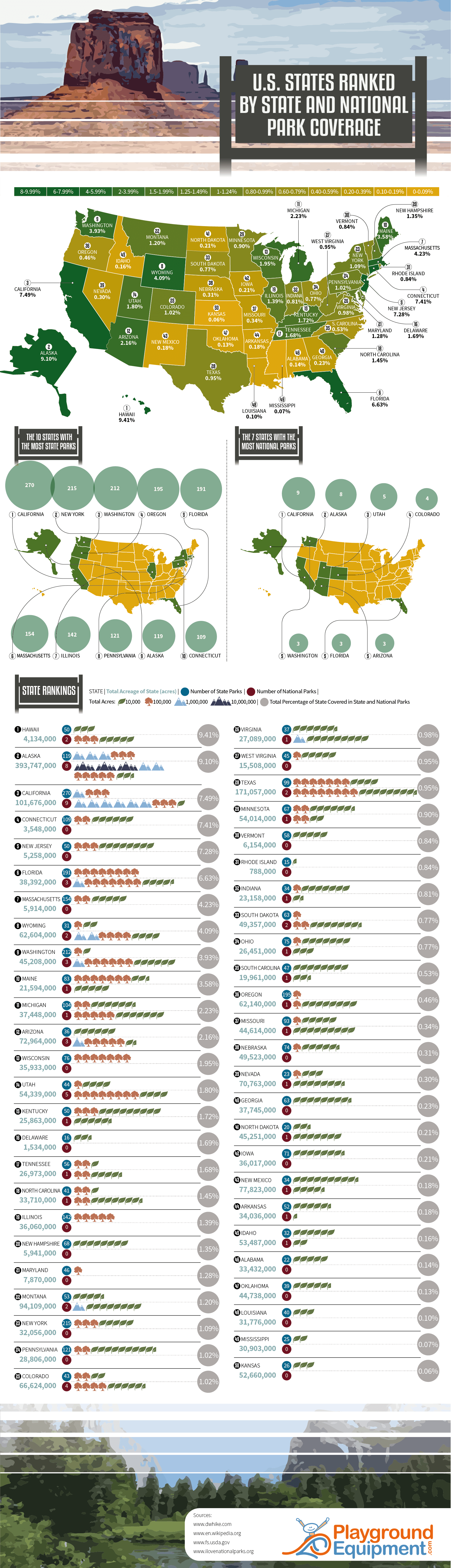
While it may not be the biggest state in terms of size, it’s actually Hawaii that can claim being the state with the highest percentage of national park and state park coverage. Of Hawaii’s 4.1 million acres across the state, 9.41% are covered by either national parts of state parks. There are 50 state parks in Hawaii that span 30,000 acres collectively, with the state’s two national parks covering up 358,870 acres of land.
In comparison, Kansas has the lowest percentage of their overall land dedicated to state parks or national parks. In Kansas, only 0.06% of the state’s 52.6 million acres are covered by state parks or national parks, despite the state being home to 26 state parks. There are zero national parks in Kansas.
California, New York and Washington are the only three states across the country that have more than 200 national parks. Of the 3,729 state parks across the United States, 1,083 (29%) of them are within California, New York, Washington, Oregon and Florida. These are the ten states across America that have the most state parks.
- California: 270
- New York: 215
- Washington: 212
- Oregon: 195
- Florida: 191
- Massachusetts: 154
- Illinois: 142
- Pennsylvania: 121
- Alaska: 119
- Connecticut: 109
California also has more national parks than any other state. Nine of the 61 national parks (14.75%) are located across 6.3 million acres in California. These are the states that are home to the most national parks across the United States.
- California: 9
- Alaska: 8
- Utah: 5
- Colorado: 4
- Arizona, Florida and Washington (tied): 3
Today, the national debt of the United States of America stands at an eye-watering 28 trillion dollars and rising. The CARES Act of 2020 and other stimulus bills due to COVID have added massive increases in a short period of time. To see how we got to this place to being with Visual Capitalist has this great interactive timeline of US debt over the past 150 years.
Click below to use the interactive version
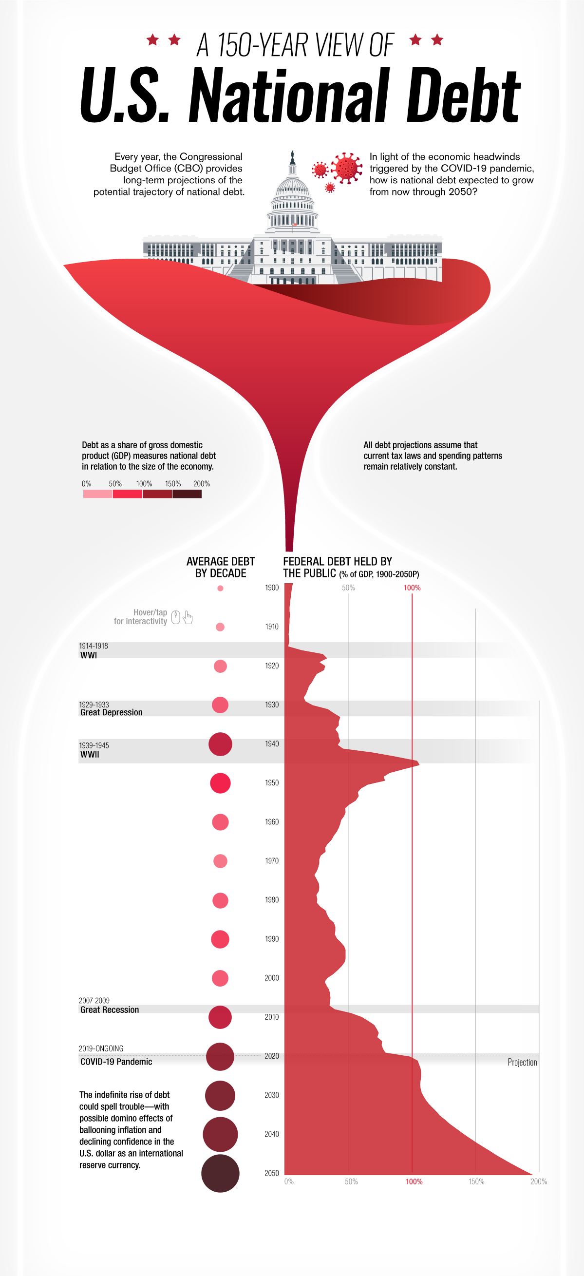
Starting in the year 1900 only 4.8% of the total national debt was held by the public. After World War I in 1910 that percentage jumped to 10. In 1920 following the Great Depression that number doubled to 22.9%. Ten years later that number would be in the billions, 16 billion to be exact with President Roosevelt’s New Deal in 1930. World War II would see this number jump to 40 billion or 75.1% of the GDP. The Korean War of 1950 would add hundreds of billions to the debt clock in only ten years bringing the total in 1950 to $257 billion but bringing the GDP down to 56.8%. The next big increase would come in 1980 when president Reagan introduced his tax cuts causing the gross debt to jump to over 900 billion. Ten years later it would see another massive jump to over $3,233 billion dollars with the Gulf War. Thirty years later the COVID-19 pandemic caused the average debt held by the public to sky rocket to 105.6 percent in 2020 , over $27,748 billion dollars. By 2050 it is estimated that the percentage of debt held by the public will be almost 200 percent.
-

 Business Visualizations2 years ago
Everything Owned by Apple
-

 Business Visualizations2 years ago
America’s Most Valuable Companies Ranked by Profit per Employee
-

 Business Visualizations1 year ago
The Biggest Fortune 500 Company in Every State
-

 Business Visualizations1 year ago
The Biggest Employers by Industry
-

 Timelines2 years ago
Timeline Charts the Development of Communications Technology
-

 Business Visualizations9 months ago
The Largest Companies in America That Are Still Run by the Person Who Founded Them
-
 Charts2 years ago
Map Uncovers Countries with Most Powerful Passports
-
 Maps2 years ago
A Map to Gold and Silver