Maps
How Does Every U.S. State Compare in Their Recess Policies?
If you are in your twenties or older, you probably look back to your elementary school days and remember recess fondly. Sadly, over the years some schools in the US have done away with recess entirely in order to boost test scores. Even though there are studies that contradict that very notion. In 2016, psychologist Karrie Godwin researched the attentiveness of elementary students during class and found they could focus better with lessons that were taught with short breaks. Recess and brain breaks not only help students decompress, but also encourages them to practice social skills and allows them to play creatively with their own imaginations. The students in the study were found to be more focused and less distracted when they were allowed short breaks. You may be surprised to find out that most states do not have any laws that require recess in schools. There are only five states that mandate a 20-minute break. This map of recess policies across America gives each state a grade letter score from A to F.
Click below to zoom
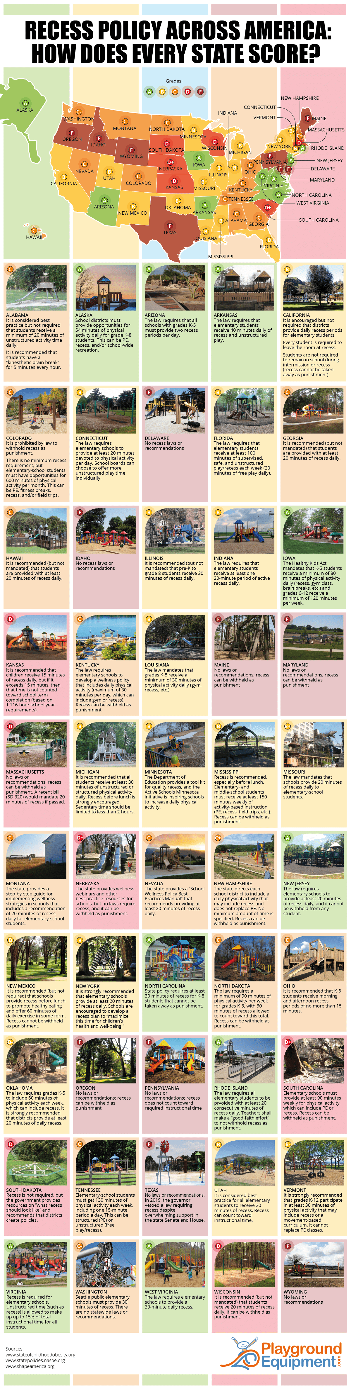
Massachusetts which is currently receives a D score has the opportunity to improve their grade if a recent bill is passed that requires 20 minutes of recess. There are some states like Maine, Maryland, Oregon, South Carolina, and Wisconsin where recess can be withheld from a student as a form of punishment. The best recess policies on the map are found in states that mandate 20-30 minutes of daily recess. Alaska, Arizona, Iowa, Arkansas, West Virginia, North Carolina, Virginia, New Jersey, and Rhode Island all got A’s.
AI is spreading rapidly, especially in the workplace. According to surveys, 46% of American workers have used AI a few times in the past year. As the AI industry rapidly expands, Ooma examined how quickly U.S. states are adopting artificial intelligence in the workplace with a data-driven snapshot of current usage and future expectations. Using U.S. Census Bureau survey data, the team’s work highlights geographic trends and broader implications for business as AI becomes more enmeshed in daily business dealings.
Click below to zoom.
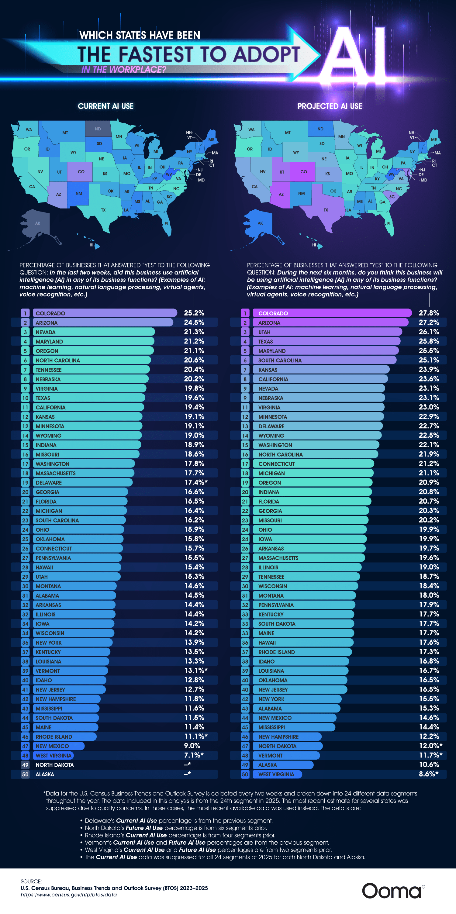
The team’s research ranks states on two key metrics: current AI adoption (whether businesses have recently used AI tools) and projected adoption (whether businesses expect to use AI in the near future). These combined elements allow us to see not only where AI is already in use, but where momentum is building. The infographic provides a visual way to compare states and identify these patterns.
One of the most striking findings is that Colorado, Arizona, and Nevada lead the way in the current AI usage. Over one-fifth of his businesses have recently adopted AI. Colorado stands out as a top state, with 25% of businesses already using AI in some capacity. These tools can include machine learning, virtual assistants, natural language processing, and other AI capabilities, supplementing everyday business tasks such as data analysis, communication, and customer service.
The map also reveals that the same states dominate in projections for future AI use. Colorado and Arizona take top rankings once again. This suggests that early adopters are more likely to keep investing in AI and remain in their leadership positions. States like Utah and Texas ranked highly in future projections, indicating these are emerging areas for AI growth.
We can see states on the opposite end of the spectrum, lagging behind the leaders. West Virginia, Alaska, and parts of the Northeast report much lower levels of current and anticipated use. Even though it’s an economically robust and influential state, New York ranks low for adoption, showing that size and economic power don’t always indicate rapid AI growth.
The team’s work suggests that differences might be influenced by factors like industry composition, workforce skills, and access to tech infrastructure. States with strong technology sectors and a growing startup economy are the most likely to adopt AI quickly, while states with more traditional economies and heavy reliance on physical labor might have slower transitions.
Remember that AI adoption is still in the early stages. Even in leading states, only one in four businesses reports using AI, so there’s still a lot of room for growth. This aligns with broader trends showing AI is expanding rapidly, but it hasn’t yet reached saturation.
The article paints a picture of a fragmented but rapidly spreading AI landscape in the U.S. While some states lead the charge, widespread adoption is still rolling out and could shake up these rankings a lot in the coming years.
America’s infrastructure depends on vehicle use, making driving a necessary reality for many people. According to research, 78% of workers aged 16 and over use a car to get to work. Few Americans never or rarely drive. Car costs can be prohibitive, and more people struggle to afford vehicle ownership each year as car prices rise. Add other state-level fees to the mix, and vehicles can be a struggle to afford. The team at Grease Monkey helped determine the most affordable and expensive states to own a car in.
Click below to zoom.
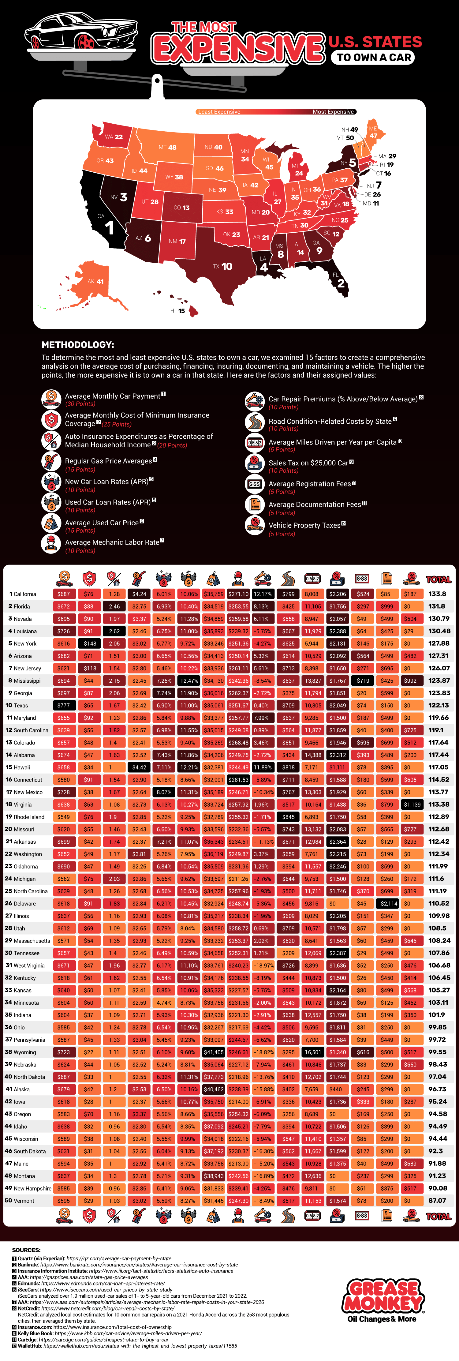
They found that California is the most expensive state for car ownership. The high costs in California are largely due to maintenance talks. There are higher car repair premiums, higher gas prices, higher registration fees, higher car insurance premiums, and above-average monthly car payments in California. All of these combine to make California a highly expensive state in which to own a car.
If you’re looking to save on vehicle expenses, look no further than Vermont. It scored nearly 50 points lower than California according to the team’s system. Vermont has the third-lowest car insurance rates, third-lowest repair premiums, and low registration fees and sales taxes. There are no vehicle property taxes in Vermont, another major source of savings.
To create such a comprehensive study, the team looked at 15 different data sets and awarded points based on these sets:
- Average monthly car payment
- Average monthly cost of minimum insurance coverage
- Auto insurance expenditures as a percentage of median household income
- Regular gas price averages
- New car loan rates
- Used car loan rates
- Average used car price
- Average Mechanic labor rate
- Care repair premiums
- Road condition-related costs by state
- Average miles driven per year per capita
- Sales tax on a $25,000 car
After California, the most expensive states to own a vehicle in were Florida, Nevada, Louisiana, New York, Arizona, New Jersey, Mississippi, Georgia, and Texas. If you’re looking for more affordable states other than Vermont, turn to New Hampshire, Montana, Maine, South Dakota, Wisconsin, Idaho, Oregon, Iowa, Alaska, and North Dakota. The team’s study is an exhaustive examination of all the costs that stack up to make driving prohibitive. Many of the more expensive states have a generally high cost of living, so this information could be useful to anyone looking to relocate to a more affordable state.
Although it might seem counterintuitive, thorough annual maintenance on your car can keep your costs down in the long term. Regular oil changes, brake service, and tire rotations can extend the life of your car, which has a big impact on your savings. For car insurance, investigate special programs you may qualify for, like being a safe driver or completing a defensive driving course. This map can help us reflect on the many expenses that come with car ownership and prompt us to think of ways we can save money and keep driving costs reasonable.
Tech is one of the world’s biggest industries, with many of the dominant Fortune 500 tech companies based in the United States. Four tech companies alone are worth trillions of dollars, and though the industry is full of rapid changes, it’s not going anywhere. The Pulse team examined locations around the country where key tech industries are booming and mapped their findings. The map shows that while Silicon Valley is the traditional home of the tech industry, there are growing tech centers around the country.
Click below to zoom.
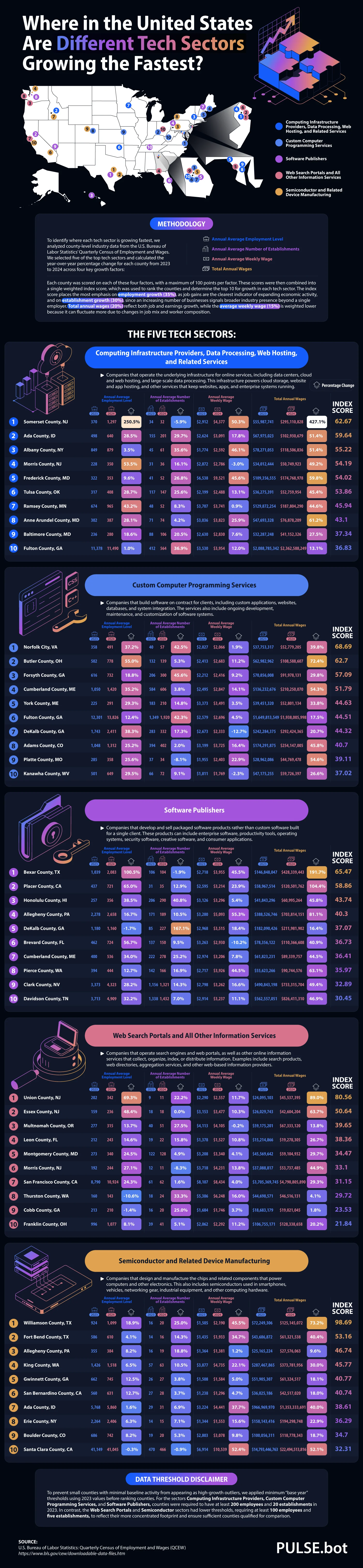
One of the sectors spreading geographically is computing infrastructure and data services. Somerset, New Jersey, is the hub of this sector, with a significant employment increase between 2023 and 2024. Dense fiber networks and proximity to financial clients in New York City make New Jersey an ideal location for this sector. However, Ada County, Idaho, and a few counties in Maryland also support this sector.
As for custom computer programming services, the biggest hub is in Norfolk City, Virginia. There are several major software firms there, supported by the Norfolk Innovation Corridor, a “technology zone” that includes businesses, public works, hospitals, and universities. Tech startups here earn major tax incentives and other benefits. Georgia and Maine have growing centers of custom programming services too.
Software publishing is booming in the state of Texas. In Bexar, Texas, employment in this sector had doubled. San Antonio and Austin are also full of software publishing companies. Pittsburgh emerges as a hub for software publishing too, thanks to the University of Pittsburgh.
Web search portals and information services have a home in the New York City metropolitan area, particularly in Union and Essex counties. Multnomah County, Oregon, home of Portland, also has a healthy number of companies in this sector, along with many other types of creative and digital media companies.
Semiconductors are commonly manufactured in Williamson County, Texas, north of Austin. Samsung made a $17 billion investment in a semiconductor facility in Taylor, Texas, making the area a leader in the industry. NVIDIA, located in Santa Clara County, California, is another leader in this industry.
From Ohio to Maine, it’s clear that California doesn’t have the tech industry on lock. Many other cities have responded to the booming economy supported by thriving tech companies. Many cities have been totally revolutionized thanks to a major tech company opening its headquarters there. Tech businesses bring skilled workers with money to spend on many other local industries, so many communities welcome these companies with open arms.
Students and entrepreneurs can use data and maps like this to pinpoint where they may want to relocate for their job search or startup. Overall, this map offers a fascinating way to look at the state of the American tech industry by shifting our focus away from Silicon Valley and considering how tech could impact other states and cities in the future.
-

 Business Visualizations2 years ago
Everything Owned by Apple
-

 Business Visualizations1 year ago
America’s Most Valuable Companies Ranked by Profit per Employee
-

 Business Visualizations1 year ago
The Biggest Fortune 500 Company in Every State
-

 Business Visualizations11 months ago
The Biggest Employers by Industry
-

 Timelines1 year ago
Timeline Charts the Development of Communications Technology
-
 Charts2 years ago
How Many Crayola Crayon Colors Are There? A Lot.
-

 Business Visualizations6 months ago
The Largest Companies in America That Are Still Run by the Person Who Founded Them
-

 Business Visualizations2 years ago
This Chart Shows the Colors That Appear in the Most Fortune 500 Logos