Timelines
Animation Shows Earth’s Temperature Trends from 0 to 2019 AD
Today’s animation comes to us from Reddit user /u/bgregory98 and visualizes global temperature trends from 0 to 2019 AD, the results are eye-opening:
Across the 2,000-year timeline, average global temperatures remain largely steady for the first 1,000 years and drop slightly for the next 500-750 years; what’s truly interesting about this animation is what happens in the final 200+ years. As the timeline approaches the industrial age, temperatures begin to rise and then skyrocket through to the modern day… the evidence is almost unsettling; human activity is undeniably affecting Earth’s temperatures.
Global warming and climate change have been hot topics for years. Even so, some people still don’t believe it’s real. However, scientists have studied climate models going back 50 years that have accurately predicted warming temperatures across the globe. These global temperatures have consistently risen around 0.9 degrees Celsius since 1970. What these models have also confirmed is that human activity is the cause. Climate change is caused from excess CO2 in the atmosphere. When people burn fossil fuel it creates carbon dioxide. This CO2 releases heat which then gets trapped in the earths upper atmosphere for 100 years, heating up the surface and leading to climate destruction. When scientists go to study climate change one thing they look at are Oxygen isotopes from ocean sediment. This is because they are tied to the earths ice caps. When water evaporates from the ocean’s surface, light isotopes of oxygen evaporate quicker because it takes less energy to break the chemical bonds. If these light isotopes then get carried to polar ice caps and trapped in the ice the ratio of these isotopes in the ocean goes down. What we are seeing now is the exact opposite. As the ice caps melt more oxygen isotopes are deposited into the ocean and the sea level rises. These ratios are recorded in shells of marine microorganisms and allow scientists to record how much the ice caps have grown or shrank around the globe.
Economists and scientists alike believe that taxing carbon is one way to strengthen the global response towards climate change. A carbon tax is a fee that would be imposed on the use of coal, oil and gas. The goal would be to motivate people to move to cleaner energy sources by saving them money and also making them more energy efficient. Judging by the information in this automated graphic, the worlds temperature is going to continue to grow at an exponential rate because of the human race. What we do today will determine if this leads to the destruction of earth in hundreds of years or if we can slowly begin to repair the damage done. If everyone did their part even just small changes can make a big difference!
Before we used banks, barcodes, or Bitcoin, humans still developed sophisticated point-of-sale systems to exchange something of value with a stranger. We’ve reinvented solutions time and again over human history, and the team at Qualtrics created a timeline that shows us the story of this history is a lot more dramatic than your tap-to-pay transaction suggests.
Trading between humans began with the exchange of goods rather than coins or paper. Livestock, pelts, and food were the stuff of life, the most valuable items we could possess. There was no central authority to set prices and values for these things, so trades were negotiated on a case-by-case basis. The first move toward abstraction came with the exchange of goods for cowry shells and tally sticks. An interesting fact: cowry shells have been found across continents, even among civilizations that never met each other.
A major currency turning point in the ancient world was Mesopotamia’s clay tokens, used to exchange for grain and to pay off debts. Ancient Egyptians expanded on this with labor tokens that existed in a tiered system as an early form of payroll. The Code of Hammurabi, from 1750 BC, established complex rules governing credit, debt, and contracts. Economic regulation is a lot older than many people may assume.
When the Silk Road opened in 138 BC, goods, currencies, and ideas traveled thousands of miles. Muslim merchants created sakk, a document that ordered banks to pay a third party, so they didn’t have to travel with heavy coins. The sakk is the direct ancestor of a check. The Song Dynasty of China created a system of paper receipts called jiaozi, which became the world’s first paper currency.
During the Industrial Revolution, James Ritty created the mechanical cash register to help secure coins and bills from untrustworthy cashiers pocketing spare change. He called the machine, “the Incorruptible Cashier.” The Diners Club card, introduced in 1950 by American Express, became the first plastic credit card. A pack of Wrigley’s Juicy Fruit gum became the first product with a barcode scanned at the checkout in 1974.
The digital age brought about the most dramatic and rapid development. In 2009, Square turned smartphones into point-of-sale registers. This dramatically lowered barriers to entry for small businesses everywhere that could process QR codes and contactless payment methods to sell goods and services. The newest advances are in the realm of biometrics. Michigan businesses started using payments triggered by eye recognition in 2023.
From clay tokens to retinal scans, we’ve come a long way in economic innovation. These advances and technologies tell the story of humans creating solutions to the problem of developing enough trust to trade with strangers. The timeline also shows us how commerce is so tightly woven into human history and development. Some may say it’s the keystone, the foundation of human civilization. This piece is an entertaining and informative visual tale of the development of money, sales, and trade.
Breakthroughs in technology can revolutionize industries and even give birth to new industries previously unimagined. The Qualtrics team explored the world’s most revolutionary products and services, arranged on a timeline that teaches us not only which tech has caused the biggest changes, but also how these developments interact with each other and advance technology and our lives as a whole. The timeline spans 1981 to 2022. It covers the realms of Computing and Internet, Entertainment and Media, and Mobile and Digital Services. Each item on the timeline has changed its industry and even changed the way humans live.
In the world of computing and Internet services, the timeline covers:
- IBM Personal Computer
- America Online
- Microsoft Windows 95
- Google Search Engine
- OpenAI ChatGPT
Click below to zoom.
The timeline covers the world of entertainment, featuring Sony PlayStation, Amazon, Craigslist, Netflix, Facebook, YouTube, and Nintendo Wii as the gamechangers. In the mobile and digital services realm, there’s a surprising diversity of products from smartphone models to apps like Uber to the Dyson DC01 Vacuum Cleaner, and even Red Bull energy.
It’s no secret that the personal computer revolutionized the business and computing industries. Before IBM’s PC, there was no market for personal computers; today, they’re a staple of modern life. Another 1980s brand, Red Bull, created a market where none previously existed. People traditionally get their caffeine fix from coffee, but energy drinks offer an easier-to-grab option on the go. Red Bull partnered with extreme-sports marketing to turn energy drinks into a lifestyle.
The timeline highlights AOL Instant Messenger as the Internet’s first big revolution. It’s a precursor to social media and helped make the World Wide Web a means of quick, easy communication. In 1998, Google Search Engines made the Internet an invaluable tool for knowledge. Google made it far easier to find websites of value on any topic under the sun (and even some beyond!)
From here on, the timeline is dominated by a range of innovative apps and Internet-based services. Amazon is the worldwide leader in e-commerce. It changed the way consumers shop forever, offering low prices, convenience, and fast delivery. Netflix changed the way people consume films and television by offering the first-ever streaming service. They offer an enormous library of new and old titles. No more waiting for a syndicated show to air. Netflix created a demand for “binge-worthy” content. The entertainment world touches every area of traditional arts and media. We see the Amazon Kindle changing how many book lovers read, offering a digital library that saves physical space and even money for some titles. Spotify became the leader of music streaming in 2008. Some think of it as the Netflix of music. Memberships offer unlimited streaming access to millions of songs and artists.
These are just a few of the industries that have been revolutionized by technology. We haven’t even touched on AI! Dive into the timeline to learn more about the most pivotal products and services of the modern era.
Ooma’s new article, “Advances in office technology and the upgrades that replaced them,” brings us on a sweeping journey through the history of the workplace, focusing on technological advances from the days of handwritten ledgers to the AI-infused systems used today. Their work goes beyond a retrospective and invites us to reflect on how today’s ordinary office tools were once revolutionary, replacing more labor-intensive methods. The team’s narrative tone and intuitive timeline design make the history of office technology feel relevant and dynamic. If you’re curious about how technology shapes the way we work, this timeline is for you.
Click below to zoom.
The article sets the scene by asking us to imagine an office without computers, phones, or instant messaging. The journey begins in a 15th-century scriptorium where monks copy texts by hand in a painstaking process. We move on to the first office building in London, which highlights the ways office spaces have transformed as technology advances.
The timeline traces a world of familiar office tech, including word processing, computing, communications, security, printing, and human resources. Each highlights a chapter in the pursuit of connectivity and efficiency. The timeline’s layout connects inventions such as the Gutenberg press, the first typewriter, and digital word processors like Microsoft Word. Fascinating facts add extra context to the information. For example, the IBM MT/ST was the first word processor that allowed edits without retyping pages, which surely seemed miraculous in an age of typewriters!
Office computing is perhaps the most important section. It traces our progress from the abacus, human calculations of rocket trajectories, ENIAC, and the first electronic computer. From there, it’s on to the Xerox Alto and IBM PC that revolutionized personal computing. Today’s laptops and AI assistants wouldn’t be possible without these predecessors.
Communication technologies are another fascinating subject featured here. Follow a path from pigeons and human messengers to the telegraph, the phone, the fax, email, VoIP, and on to modern platforms like Slack and Zoom. These technologies highlight how technology plays a huge role in the ways we communicate and collaborate.
The timeline doesn’t short us on details. It also addresses the development of office security and administration. We started with single human guards, then moved to private security firms, then to magnetic strip cards for building access, and finally to antivirus software. We can also take a look at how administrative jobs, like human resources, have evolved.
The timeline truly shines as a visual chart of technological evolution. Centuries of technological advances have been distilled into an easy-to-read map of progress. You can use this information as a quick reference or a detailed research document. It draws readers in, inviting us to learn more with clear visuals that break up text and make a complex history feel accessible and exciting. A well-crafted timeline transforms a historical overview into a story worth exploring, and that is exactly what this timeline accomplishes.
-

 Business Visualizations2 years ago
Everything Owned by Apple
-

 Business Visualizations1 year ago
America’s Most Valuable Companies Ranked by Profit per Employee
-

 Business Visualizations1 year ago
The Biggest Fortune 500 Company in Every State
-

 Business Visualizations11 months ago
The Biggest Employers by Industry
-
 Business Visualizations2 years ago
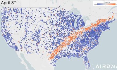
New Animated Map Shows Airbnb’s Fully Booked Cities Along the 2024 Eclipse Path of Totality
-

 Timelines1 year ago
Timeline Charts the Development of Communications Technology
-

 Charts2 years ago
How Many Crayola Crayon Colors Are There? A Lot.
-

 Business Visualizations6 months ago
The Largest Companies in America That Are Still Run by the Person Who Founded Them