Misc Visuals
How Prom Dress Styles Have Evolved Over Time
When you think of prom the first image that may pop into your head is a sea of colorful and extravagant dresses dancing the night away. The style of dresses you’re picturing, though, will depend entirely on the decade that you attended prom. Fashion trends are always evolving and that proves especially true when it comes to prom dress styles, as seen in this visual from popular fashion brand Lulus.
Click below to zoom
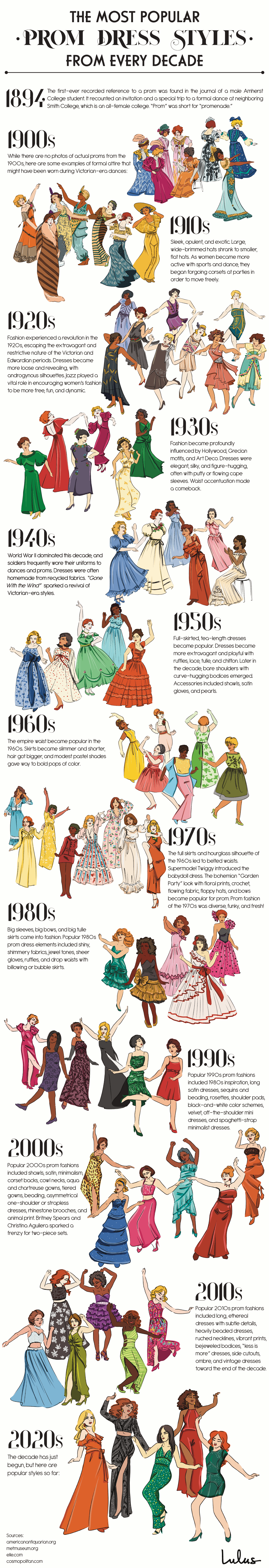
It starts with the early 1900s Victorian Era and travels through current day trends on a fashion blast through the past of the most popular prom dress styles from every decade. Here you’ll find the free and fun flapper dresses of the 1920s to the long and flowing bohemian dresses of the 1970s. As you go through the timeline of dresses it’s interesting to note how popular movies or celebrities had an impact on a decade’s fashion trends. The popularity of “Gone With the Wild” in the 1940s brought back the Victorian-Era style dresses that had been popular forty years prior. Pop stars like Britney Spears and Christina Aguilera influenced the prom dress styles that were popular in the 2000s. As the dress styles change from decade to decade, one thing about prom remains the same and that is the desire to get decked out in fancy attire and dance the night away with friends and classmates. And to see who is crowned Prom King and Prom Queen, of course! What type of prom dress do you think will emerge as one of the most popular styles of the 2020s?
Why do some people absorb new information like a sponge while others labor for hours over a textbook? According to a study by Preply, the answer lies in their learning style. The team set out to map which styles dominate across the United States. Preply emphasizes the importance of its study by citing research showing that more than half of Americans spend under two hours a day studying, with teenagers reporting feeling distracted. At the same time, the majority of Americans believe that different learning styles exist. To identify which styles are most common and where, Preply analyzed a year of Google Trends data across 50 states to map the dominant learning style in each.
Click below to zoom.
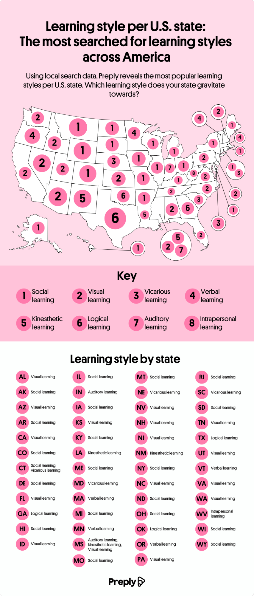
A Nation of Social Learners
The study’s standout finding is that 40% of Americans are social learners, making it the single most common learning style in the country. Social learners take in information through interaction and conversation. According to the map, 20 states favor the study-buddy approach, including Connecticut and New York.
Visual learning came in second place. These learners thrive on aids like flowcharts, maps, doodles, and color-coded notes. Preply found that visual learners are concentrated in California, Florida, and Washington. Together, social and visual learners account for more than 70% of Americans.
The Less Common Learning Styles
The remaining six styles in Preply’s study, verbal, vicarious, kinesthetic, logical, auditory, and intrapersonal, are much less prevalent, making up just 34% of preferences combined. Verbal and vicarious learning tie as the third most popular style, but together account for only about 8%. The map reveals some notable patterns. While the West skews heavily toward visual learners, the eastern half of the country shows more variance. Massachusetts and Vermont residents lean toward verbal learning, while Connecticut and New Yorkers favor social learning.
A few individual states stand out as outliers. Auditory learning, which is learning through hearing information, leads in only two states: Mississippi and Indiana. West Virginia is the only state in the country that favors intrapersonal, solitary learning. This is the least preferred learning style nationwide.
What We Can Learn from These Findings
Preply began their study with a seed list of widely recognized learning styles drawn from educational resources, then measured popularity using Google Trends data from 12 months across 50 states. Where multiple styles ranked equally in a state, the team treated them as equally popular. The point Preply drew from this data is the recognition that how you learn is a useful step toward more effective studying, particularly in a country where study time is short and distractions are plentiful.
What emerges from the team’s map is a portrait of a country that isn’t uniform. No single learning style dominates everywhere, and neighboring states can be quite different from one another. This study serves as a reminder that study habits are shaped by geography, culture, and personal preference. The Preply study is another in a long line of ideas about how people learn, drawing on theories from Aristotle to Howard Gardner, to Neil Fleming.
Compatibility is usually our biggest driver in the search for a romantic partner, but it turns out that age is still a major part of that compatibility. Tawkify’s matchmaking service surveyed about 98,798 Americans over two years, asking whether they’d date someone older and younger and how far outside their own age range they’d go. The data reveal both geographic and dating patterns, with a recurring pattern: smaller dating pools push singles to date across wider age ranges.
Click below to zoom.
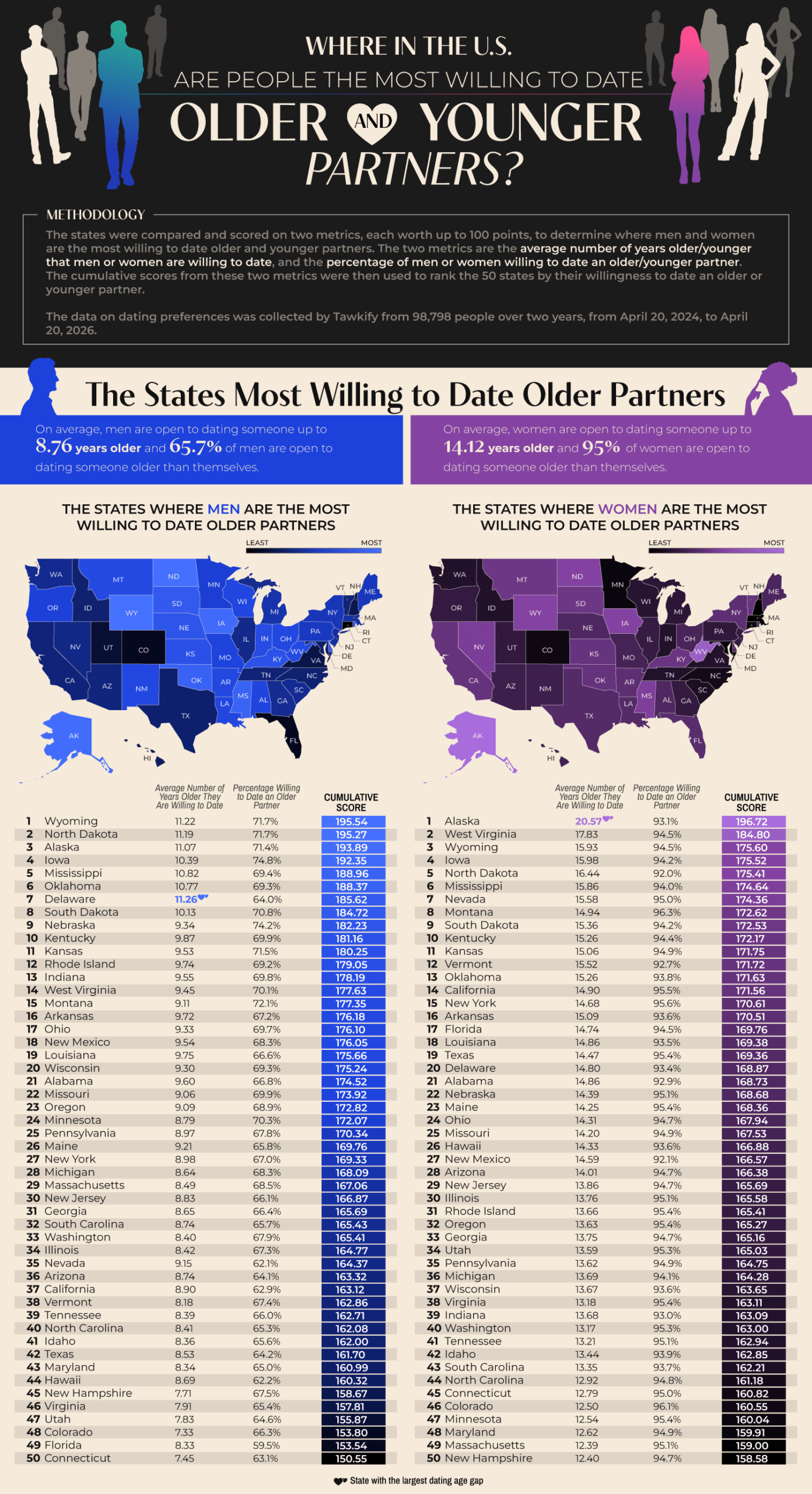
Wyoming tops the list of states with men willing to date outside their age range. 71.1% of Wyoming singles are willing to date an average of 11.22 years older than they are. North Dakota and Alaska also appeared in the top three. Delaware emerged as an interesting outlier. They have the largest average age gap in dating among men, at 11.26 years. 93.1% of Alaskan women are open to dating older partners, and they have the nation’s largest age gap by far at 20.57 years. West Virginia and Wyoming women follow in second and third. It seems that less-populated states show greater willingness to date outside their age range, which could be a very simple explanation. A smaller dating pool means singles widening their options.
As for willingness to date younger partners, Hawaii leads for both genders. 96.8% of Hawaiian men are willing to date someone younger, with 18.59 years as an acceptable age gap. This is the widest that appears in the study. 92% of Hawaiian women are open to dating younger, but their average age gap is only 9 years. Hawaii has an older-than-average population, with a median age of 41.5 years, so this limited island dating pool makes dating younger people more common. The runners-up for willingness to date younger were Nevada, Idaho, and Maine.
According to the data, women are dramatically more open to dating older than men are. 95% of women would date an older partner, compared with 65.7% of men. This pattern flips with dating younger. 96.5% of men would date someone much younger, with a national average age difference of 14.7 years. 88.1% of women would date younger men, but at a much smaller average age gap of 7.14 years. This shows that across the country, men tend to date younger partners, while women tend to date older partners. Women are consistently willing to tolerate a wider gap when dating up.
The team threw us a little fun fact from the Guinness Book of World Records, which lists Gertrude and John Janeway, married in 1927, as the largest spousal age gap of 63 years. Age-gap relationships can succeed but face challenges like judgment and assumptions about power dynamics and differing life stages. Strong communication, shared values, and aligned goals matter most in relationships, more than the number of years lived. Geography and gender seem to shape who Americans date, but the data also suggest that openness to age-gap romances often comes down to opportunity.
A study from the University of Texas at Austin found that during COVID-19 lockdowns, a simple phone call to 240 seniors over four weeks measurably reduced depression rates. Can something as simple as a phone call meaningfully ease senior loneliness? The data that Ooma collected shows that a phone call can mean the world to a senior. It’s a simple act with outsized mental and physical health benefits for older adults.
Click below to zoom.
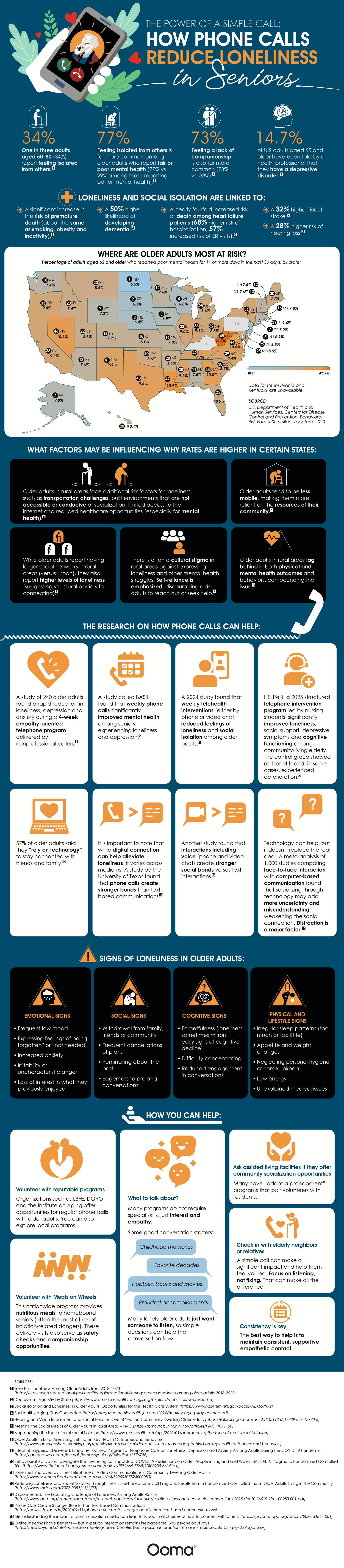
The team created a helpful map that also highlights key findings from their study. Here are a few of the most important figures:
- 1 in 3 adults aged 50 to 80 (34%) report feeling isolated.
- 77% of seniors with poor mental health report feeling isolated compared to only 29% of seniors with better mental health.
- 7% of American adults over 65 have been diagnosed with a depressive disorder.
- The map shows a wide variation in seniors reporting 14 or more poor mental health days, with a range of 5.5% among North Dakota seniors to 12.7% of West Virginia seniors.
Their data also shows that isolation is a health crisis, more dangerous than a simple mood problem. When people feel isolated, their mortality risk is comparable to that of people who are obese, inactive, or who smoke regularly. Isolated seniors have a 50% higher risk of dementia. There are nearly quadruple the death risk odds for heart failure patients who are isolated, and a 68% higher hospitalization risk. Isolated seniors are also at a 32% higher stroke risk and a 28% higher hearing loss risk. Rural seniors are the most vulnerable due to limited Internet access, transportation barriers, and a cultural stigma around expressing loneliness.
The dangers of loneliness are clear, and luckily, there are clear solutions. UT Austin’s empathetic phone call program created rapid drops in depression, anxiety, and loneliness. Weekly phone calls could improve mental health and even cognitive functioning. A 2024 telehealth study showed that both phone and video calls can have these effects.
The Ooma team also provided helpful tips that can help people spot signs of loneliness in their loved ones. If their social behavior changes, that’s a warning. This could look like withdrawal, dwelling on the past, canceled planes, and drawn-out conversations. Cognitive issues are another major red flag, like forgetfulness, trouble concentrating, and less engagement. If a senior’s sleep or appetite changes, they have persistently low energy, neglect their hygiene, or develop an unexplained ailment, this could also signal loneliness.
If you want to help fight the senior loneliness crisis, you could volunteer with the Institute on Aging’s Friendship Line, LBFE, or DOROT. Local assisted living communities might have an adopt-a-grandparent program. Volunteering for Meals on Wheels not only provides seniors with food but also offers a chance to socialize and conduct safety checks. If you are short on time, simply pick up the phone and call an elderly neighbor or relative. This study makes it clear that it’s a powerful act of kindness.
-

 Business Visualizations2 years ago
Everything Owned by Apple
-

 Business Visualizations2 years ago
America’s Most Valuable Companies Ranked by Profit per Employee
-

 Business Visualizations1 year ago
The Biggest Fortune 500 Company in Every State
-

 Business Visualizations1 year ago
The Biggest Employers by Industry
-

 Timelines2 years ago
Timeline Charts the Development of Communications Technology
-
 Charts2 years ago
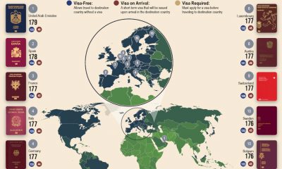
Map Uncovers Countries with Most Powerful Passports
-

 Business Visualizations9 months ago
The Largest Companies in America That Are Still Run by the Person Who Founded Them
-
 Maps2 years ago
A Map to Gold and Silver