Charts
New Study Reveals Details About American Intimacy
NapLab’s new study, “Most Popular Sex Positions,” is so much more than a cheeky peek at bedroom habits. It’s a fascinating examination of human intimacy, preference, and evolving sexual behaviors over time. The team employed bright visuals, clear rankings, and easy-to-read data that compile their survey responses into a graphic that shows us which sex positions are most popular and how that preference changes and shifts over time.
Click below to zoom.

The results are not surprising at first glance. The most popular positions are missionary, doggy style, and cowgirl. But a closer look at the data tells a more nuanced story. We can see that younger adults are more likely to favor adventurous or dominating positions, while older people prefer positions that emphasize comfort and emotional connection. People who have been in relationships longer seek positions based on comfort and ease of movement. This may be partially due to physical ease, but it also speaks to emotional and psychological needs.
This chart stands out for its ability to discuss a sensitive topic respectfully yet engagingly. The team skillfully avoids judgment and sensationalism in its presentation of the data. The visual format is approachable for readers who may shy away from the details and feel uncomfortable reading about sexual preferences. The graphic helps normalize conversations about sex, encourages healthy communications between partners, and promotes the idea of discussing desire to improve sex lives.
Gender differences are on display here, too. Men and women enjoy a variety of positions, but we see variations in the rankings that reflect different desires for control, stimulation, and connection. Rather than reinforce gender stereotypes, these differences highlight why communication is so important in a sexual relationship. It’s normal for one partner to enjoy something a little different from the other, and exploring those differences together will lead to a better experience for both partners.
This chart’s strength lies in the different ways it can serve the audience. For curious people, the graphic prompts a reflection on personal preferences. For couples, this could be a useful and judgment-free tool for trying something new and exploring what feels good. Educators and therapists could use the graphic as a visual aid while discussing intimacy in a data-driven way.
The most meaningful takeaway is the reminder that there’s no one “correct” way to have sex. Preferences and variations are common and natural. Some people seek novelty while others value comfort. Some want connection while others are seeking a thrill. The study reinforces the fact that open communication, consent, and a willingness to understand a partner’s needs are the path to a happy sex life.
This study is more than a chart of sex positions. It’s a cultural glimpse into intimate relations and the ways we connect physically and emotionally while opening the door to deeper conversation about pleasure, partnership, and trust, all while keeping the topic light, respectful, and fun.
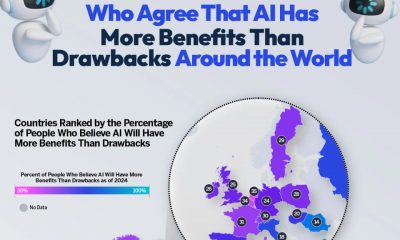


Artificial intelligence has infiltrated our everyday lives thanks to text generative applications. From huge corporations to individual users chatting on their smartphones, AI companies have developed ways to use AI in countless aspects of life. It has the potential to make huge, important leaps in technological progress, but it also comes with a host of concerns and dangers. The team at Qualtrics shows us the many different opinions on AI by mapping out opinions across the world. Their map shows us the percentage of people in each country who think AI has more benefits than drawbacks and vice versa.
Click below to zoom.
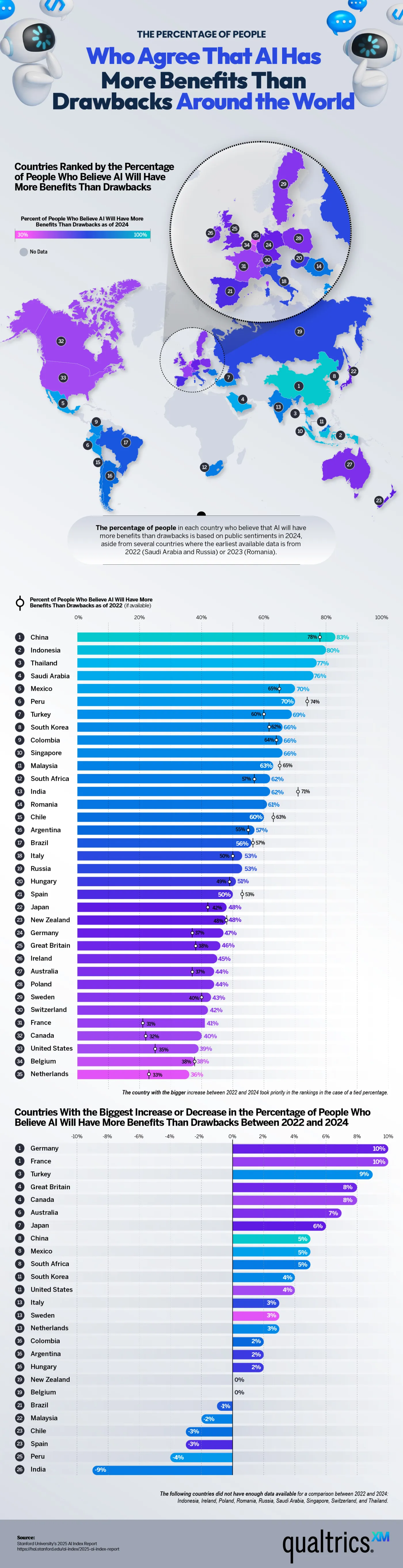
AI is gaining popularity around the world. People are using it at work to automate simple, repetitive tasks, speeding up their processes. It performs well as a data analyst and excels at the most mundane tasks, so many workers feel freed up to use their time and energy on more rewarding, nuanced work that requires creativity. AI can even identify the early stages of disease, allowing overloaded doctors to use it to assist them and process more patients. Many people in the healthcare field hope it will help with new discoveries and medical progress. AI has long been used in smart homes responding to requests to adjust the thermostat, start up a sound system, and monitor security.
Alongside the exciting possibilities AI offers, there are many concerns. AI has been used to create deep fakes, spread misinformation, and displace workers. People fear it could drastically disrupt the economy, and when some countries are considering using it as warfare, it’s natural for major fears to follow. Another major AI concern is resource constraints. Environmentalists have pointed to the heat AI data centers produce and the absolutely massive amount of water they consume to keep them cool.
How do these viewpoints vary around the world? According to the team’s data, China holds the most trust in AI, with 83% believing it brings more benefits than drawbacks. They’re closely followed by Indonesia at 80% and Thailand at 77%. Western European countries seem to be the most hesitant to embrace AI. 47% of German respondents believe AI will do more harm than good, followed by 41% in France and 36% in the Netherlands. This is a less-than-50 % approval rating. The United States has a 39% AI approval rating, but trust in AI there has risen by 4% in the past few years. This is a bit of a surprise, as American companies are leading AI development. This could be due to reports of data centers in the US disrupting neighborhood health and peace.
This map is a fascinating way to examine the rapidly changing world of AI through the lens of public opinion. Confidence in AI seems to be growing, but many unknowns remain regarding its effects on society and health. While some fear it may replace them at their job, others are hopeful that it will make work and life better.
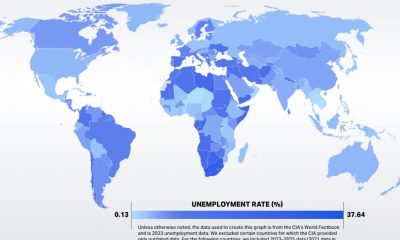
The unemployment rate is a percentage that reflects the number of people in the labor force who are without a job. This is calculated by dividing the number of unemployed people by the labor force and multiplying by 100. Because unemployment can have a drastic impact on a nation’s economy, the team at Qualtrics examined global patterns and mapped unemployment rates. To be considered unemployed for this study means a person doesn’t have a job but is available for work. That means people who are retired, disabled, or laid off don’t count in the figures.
Click below to zoom.
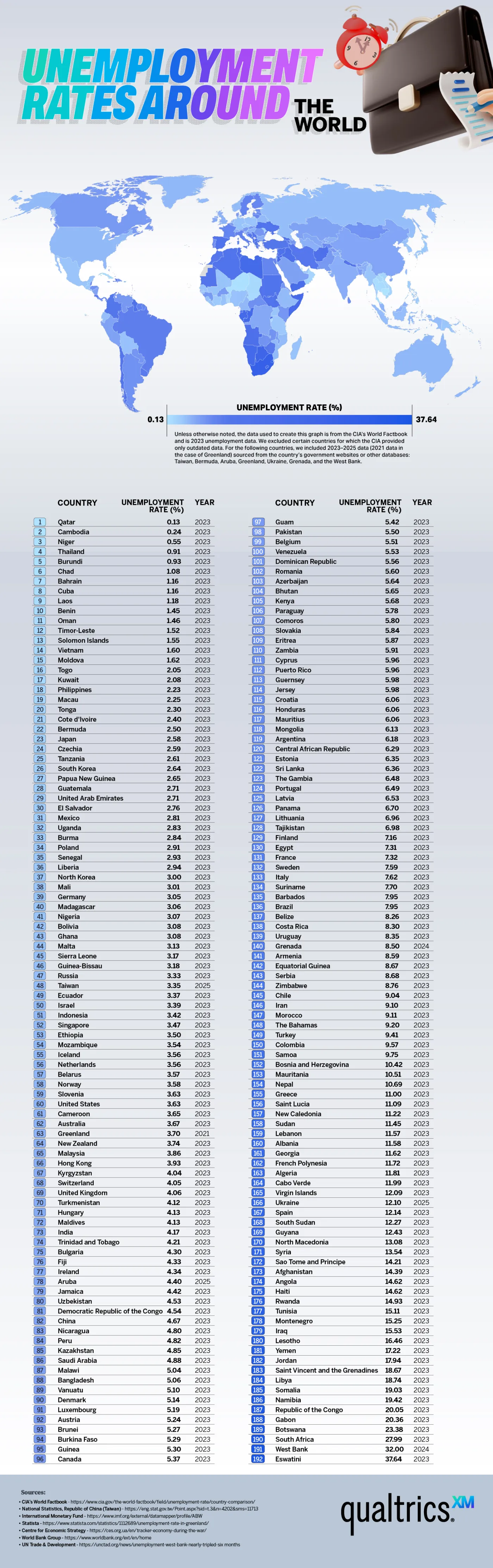
According to the team’s data, the country with the highest employment rate is Eswatini at 37.64%. This is a landlocked nation in Southern Africa, formerly known as Swaziland. This is one of the world’s last absolute monarchies, and it suffers economically like many of its neighbors, including South Africa, Botswana, and the Republic of the Congo. In particular, the youth of Eswatini are unemployed. The unemployment crisis is attributed to skill gaps in eligible workers.
It’s good to be at the low end of the unemployment spectrum. The nation Qatar has the lowest unemployment rate in the world at .13%. This comes as no surprise from a nation rich in petroleum and natural gas. Qatar has valuable real estate and has long been a haven for the wealthy, which lends itself to a booming economy with plenty of employment opportunities. Other nations that aren’t struggling with unemployment are Cambodia, Niger, and Thailand, due to high manufacturing production and/or a bustling tourism industry.
These countries have the lowest unemployment rates:
- Qatar
- Cambodia
- Niger
- Thailand
- Burundi
- Chad
- Bahrain
- Cuba
- Laos
- Benin
We see a very wide gap between the countries with the highest and lowest unemployment rates. Many factors can affect unemployment, but one of the biggest is changes in the size of the labor force. A struggling economy doesn’t necessarily indicate a high unemployment rate. If it’s difficult enough to find a job, people will give up, and they’ll no longer be counted in the unemployment numbers. That said, the unemployment rate does tend to increase in hard times. Global unemployment peaked in 2009 during the financial crisis.
In summary, unemployment rates reveal much about the economic health and social dynamics of countries worldwide. While nations like Eswatini face challenges due to skill gaps and limited job opportunities, others, such as Qatar, benefit from abundant resources and thriving industries. The disparity highlights how factors such as labor force size, economic stability, and industry growth affect employment levels. Understanding these global patterns is essential for policymakers and organizations aiming to address unemployment and foster sustainable growth. By analyzing the causes and consequences, we can better support individuals and communities striving for economic security and opportunity.
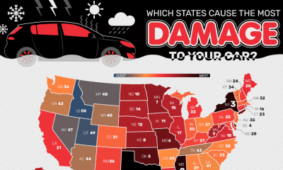
Car damage can occur for several reasons, and we’re all vulnerable to it at any time or place. Weather events are a huge factor in vehicle wear and tear. Hail can be a death sentence for your car, and intense UV radiation and heat can gradually destroy your car’s interior and paint job. Areas that must salt roads in winter do so to keep us safe on the road, but unfortunately, salt also damages cars and breaks down roads, leaving behind dangerous potholes. The Grease Monkey researchers took all these factors and considered them together to create a ranking system to show us the states that do the most damage to cars. Each state in the U.S. is ranked based on the severity of vehicle risk and deterioration.
Click below to zoom.
The team notes that hail was one of the most significant factors in their weather analysis. The size of hailstones will determine the damage, and areas with more frequent hailstorms will increase the likelihood of significant damage, such as cracked windows and broken headlights. Snowfall, ice, and sleet also greatly increase the risk of car damage. Frozen mechanical parts are more likely to break, and icy road conditions lead to dangerous crashes. Humid weather in general leads to more rust, so frequent rainfall and salty coastal air can take a slow toll as well. Natural disasters like floods and tornadoes can destroy a vehicle, so the team counted how many of these events each state has experienced since 1953.
Poor roads were another important factor in the team’s analysis. They counted the total percentage of a state’s roads considered to be in “acceptable” condition. Potholes, rough roads, and debris wreck tires, rims, and undercarriage components. Bad roads often have loose rocks that can kick up to shatter a windshield or dent a car’s body. The team found that the states with the worst roads are Rhode Island, Hawaii, New Mexico, Connecticut, and Mississippi. The states with the highest percentage of roads in good condition are Indiana, Kansas, South Dakota, Wyoming, and Vermont.
Combining all of these factors, the Grease Monkey analysis shows us that these ten states will cause the most damage to a car:
– Texas
– Mississippi
– New York
– Delaware
– Oklahoma
– Missouri
– Minnesota
– Kansas
– West Virginia
– North Dakota
This map can help drivers determine what factors are most likely to damage their car based on where they live. While we can’t do much to affect the quality of a state’s roads, it’s a good reminder to be vigilant and slow down for potholes. Heat damage to a car’s interior can be prevented with a sunscreen in the windshield. Building a garage can help protect your car from hail, snow, ice, and rain. Defensive driving will help you to be safe from accidents. People figuring out a car-buying budget can also consider these factors, which drive up insurance premiums.
-

 Business Visualizations2 years ago
Everything Owned by Apple
-

 Business Visualizations1 year ago
America’s Most Valuable Companies Ranked by Profit per Employee
-

 Business Visualizations1 year ago
The Biggest Fortune 500 Company in Every State
-

 Business Visualizations11 months ago
The Biggest Employers by Industry
-

 Timelines1 year ago
Timeline Charts the Development of Communications Technology
-
 Charts2 years ago
How Many Crayola Crayon Colors Are There? A Lot.
-

 Business Visualizations6 months ago
The Largest Companies in America That Are Still Run by the Person Who Founded Them
-
 Maps2 years ago
A Map to Gold and Silver