Misc Visuals
The Ultimate Visual Guide to Boy Scout Patches and What They Mean
The Boy Scouts of America was established in 1910 – ever since, invaluable qualities such as integrity, courage, teamwork, and survival skills have been cultivated and challenged in the youths who join. Boy Scouts can earn a myriad of patches that represent their achievements, ranging from simple colored shoulder loops to indicate the level of scouting the Scout has reached to individual merit badges in skills such as swimming, first aid, environmental science, archery, communication, citizenship in the community, wood carving, and even family life! One thing I love about patches of all kinds is how they translate a broader concept into a small design, much like logos! The team at WizardPins.com has created this fantastic visual guide to Boy Scout patches and what they mean:
Click below to zoom

There are so many cool designs on here! I am especially fond of the Wood Carving, Camping, and Arrow of Light patches. There are over 135 merit badges that Scouts can earn. How are Boy Scout patches earned? For merit badges, a scout must complete requirements with their badge counselor that help demonstrate a skillful understanding of the badge’s subject. For example, in order to earn a Hiking merit badge, the Scout must take four 10-mile hikes and one 20-mile hike with written plans and follow-up reports. I am actually shocked that a 20-mile hike is necessary – that is a colossal challenge even for a well-seasoned adult! It even says that Scouts are permitted to stop for just one meal. Goodness gracious! Way to go, Boy Scouts.
When a language disappears, a worldview, history, and culture fade with it. There are thousands of languages at risk of going extinct, as a report from Preply shows. Their Endangered Languages Report gathers data showing where the crises are most acute, while offering hope that extinction isn’t inevitable. They’ve shown areas where revival is working, too. The study highlighted problem areas in vanishing languages, the reasons they are in danger, and hopeful signs that languages can be revived.
Click below to zoom.
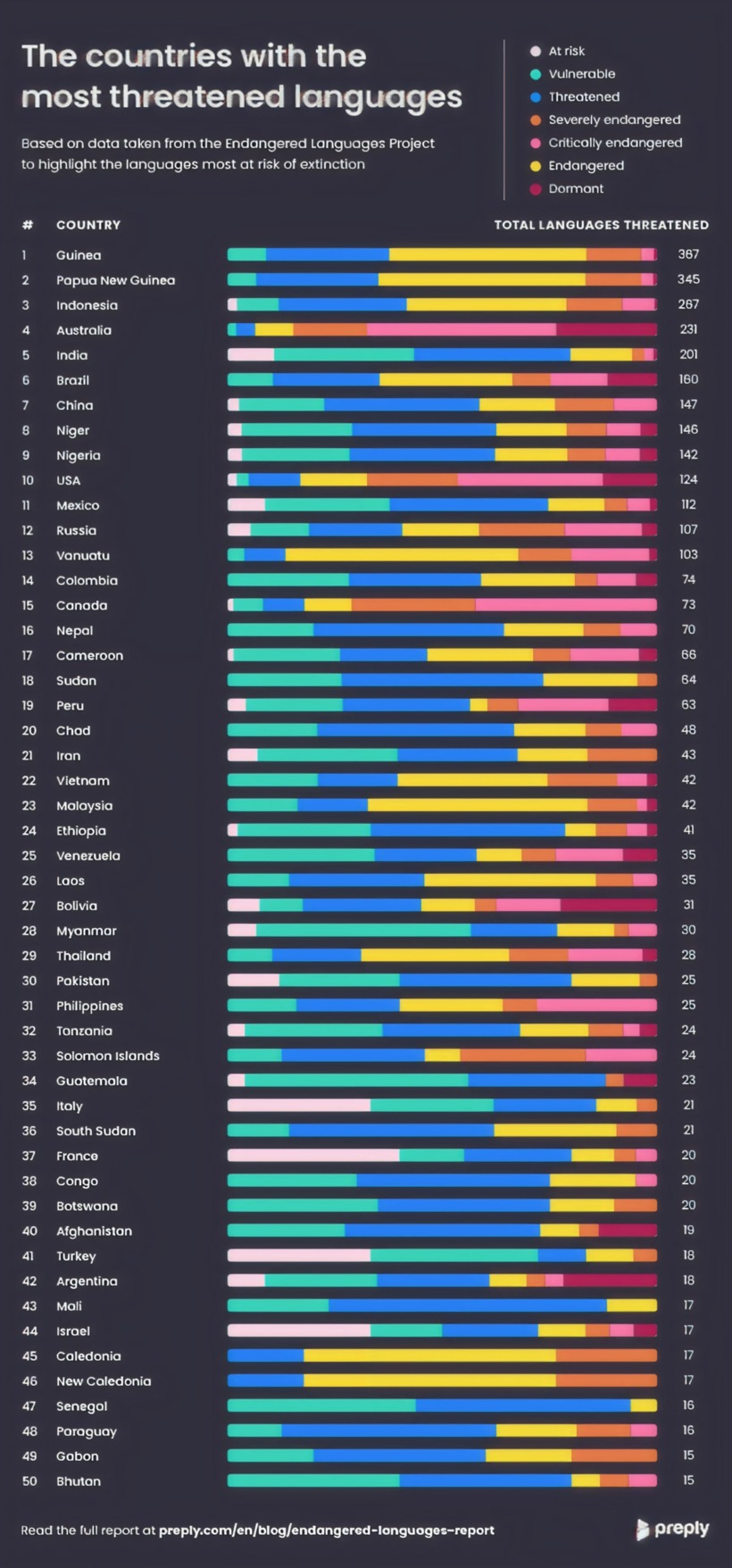
Australia leads the world in the number of critically endangered languages indigenous to its borders (133). In general, the Pacific region and islands have the most endangered languages overall, at 250. Africa has the highest number of threatened languages at 217. In many of these locations, globalization puts pressure on Indigenous and isolated communities. A globalized world pushes young working-age people toward learning a globally dominant language like English or Mandarin, so they have expanded opportunities. It’s worth paying attention to the scale the study creates with at-risk, vulnerable, threatened, endangered, severely endangered, and critically endangered languages. This shows that risk is a spectrum in the world of language, just as it is in plant and animal species.
In the data, a language stands out as a relative success story. Welsh is a vulnerable language, with 19%–20% of the population speaking it. After over 50 years of effort and education, it rose to 30% of children between 3 and 15 years old who spoke it. The nation of Wales set a goal of a million fluent speakers by 2050. If they can meet that goal, it will prove that policy and education can revive a language.
The Lakota language is a cautionary tale of historical oppression. There are only 2,000 speakers today and it’s an endangered language. The United States assimilation policies pushed Indigenous people into residential schools, where children were forced to drop their language and speak English. Today, only 1% of the Lakota population of 170,000 can speak their native language fluently.
Cornish is a rare and unique language brought back from extinction. It officially went extinct in the 1800s, and thanks to a standardized written form revived and adopted in 2008, there are now 557 speakers of a once-dead language.
“Awakening” languages are revivals of once-extinct languages, like Cornish. Kaurna, an Australian language, was nearly lost when the last speaker passed away in 1929. But a program worked to revive it among 50 speakers using dictionaries, songs, and formal education programs. These aren’t the only awakening languages. Wampanoag, Palawa Kani, and Natchez have also awakened back into existence. Revitalization is slow, meticulous work, but these languages show that it’s possible.
Non-native speakers can do their part to support efforts by studying an at-risk language or helping out a revival group. Native speakers carry the heaviest burden and will most effectively save a language by teaching it to their children early. Schools and governments also have a part to play by offering classes in endangered languages. Language survival is possible when ordinary people decide the language is worth speaking.
The team at Preply has completed its 2026 report on Language and Global Career Mobility. This study was performed across three English-speaking countries and examined why people are moving abroad and what languages they’re learning to prepare for the transition. It’s no secret that learning a second and even a third language can boost career prospects, but this study shows that this is key to helping people achieve their dreams of moving abroad. The survey included 1,800 respondents from the U.S., the UK, and Canada.
Many people aim to move abroad as job opportunities shrink at home. 40% of the survey respondents said their home country’s economy was in decline, and around the same number had either experienced job loss or were close to someone who had lost their job in the past two years. Those dreaming of an adventure outside their country are seeking a fresh start that can help them gain a more secure footing in a career, along with the ability to find new opportunities, grow, and thrive. 92% of people moving abroad said knowing the local language is critical to success.
The survey results are rich with detail. We learned that 63% of Gen Z have experienced job loss in the last 24 months. 81% of people open to relocating to a new country are more likely to do so now than they were two years ago. The biggest motivations for moving are the cost of living and the hope for a better quality of life. 75% say that learning the local language boosted their confidence and certainty about moving. 93% of respondents said they’d take advantage of language learning if their employers offered it. Clearly, there’s a strong willingness to learn new languages!
Click below to zoom.
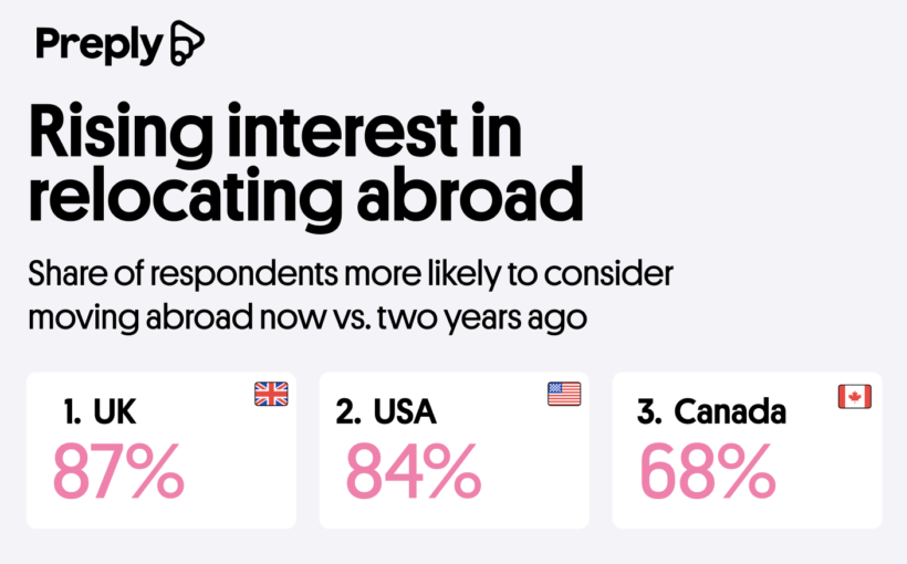
Since the year 2000, international travel has doubled. As traveling abroad becomes more common, life abroad begins to feel more accessible and possible. An enormous 82% of the survey respondents said they were open to moving abroad. Interest is highest in the UK at 87%, followed by the U.S. at 84%, with Canada trailing at 68%. As always, people are interested in moving abroad because they imagine they’ll have a better life there, but the team dug up a few more specific reasons as well. Some people are drawn to the culture, lifestyle, or language of the country they want to move to, while others are drawn to it for its healthcare, market access, and political and economic stability.
Today, many people in major cities around the world are fluent in English, and there are countless apps to aid translation. The benefits of learning a language are clear from this study. The confidence and personal transformations it inspires are priceless. Three in four learners say that learning a new language had a strong impact on their personal growth and even changed their lives. This study strongly underscores the personal empowerment that language learning provides.
Whoever said learning English is difficult and boring hasn’t seen this new study from Preply. It turns out that watching movies can help you improve your English learning, hooray! What better way to learn while having fun than sitting down with a bucket of popcorn and a good movie? Immersing yourself in popular media is a proven way to improve your real-world use of a language. Films can help you practice filling in comprehension gaps using context clues and studying facial expressions and body language for cues. Preply offers us a comprehensive watch guide of the best and worst films for learning English. They analyzed the 150 highest-grossing movies to present popular and enjoyable choices. Their score is based on the average number of words per minute, the difficulty of the vocabulary used, and the ease of watching with subtitles, which makes it easier to follow along.
Click below to zoom.
![Best movies for English language learning [Study]](https://thechartistry.com/wp-content/uploads/2026/04/movies-best-for-English-learning.png)
The team found that the best films for learning English are:
- Dawn of the Planet of the Apes
- Maleficent
- The Hobbit: Battle of the Five Armies
- Spider-Man 3
- The Hunger Games
Dawn of the Planet of the Apes has a low word count per minute and a simple vocabulary. This action-packed film should be easy to follow for those who don’t understand every word. The same is true of the Disney film, Maleficent, a retelling of Sleeping Beauty from the villain’s point of view.
Popular films that will give English language learners the most trouble are:
- The Wandering Earth
- Oppenheimer
- Barbie
- Shrek 2
- Finding Dory
This list has a few surprising results. While it’s no surprise to see the long, heavy, historical drama Oppenheimer on the list, it is funny to see it beside its famous marketing partner, Barbie, a much lighter film that released on the same day. But Barbie is chock-full of banter and musical numbers that add up to a high word count per minute and a frenetic movie for English learners to keep up with. This is the same reason animated films like Shrek 2 and Finding Dory made the list.
The team’s research points to fantasy and adventure films as the best genre for English learning, due to the large, dramatic, action-filled visuals that can help cue the meaning of dialogue. Epic quests and romantic films make for the best storylines. In keeping with these findings, they determined that the franchises best for learning English are The Hobbit films, the Spider-Man series, and the James Bond films. The team also separately emphasized films with high and low word-per-minute rates, which indicate how easy it will be to read the subtitles. Finding Dory is the most difficult to follow (thanks to the chatterbox of a fish in the starring role), and once again, Dawn of the Planet of the Apes comes up on top. This list is a great study tool for English students and one that ESL teachers should bookmark for lesson plans.
-

 Business Visualizations2 years ago
Everything Owned by Apple
-

 Business Visualizations2 years ago
America’s Most Valuable Companies Ranked by Profit per Employee
-

 Business Visualizations1 year ago
The Biggest Fortune 500 Company in Every State
-

 Business Visualizations1 year ago
The Biggest Employers by Industry
-

 Timelines2 years ago
Timeline Charts the Development of Communications Technology
-

 Business Visualizations8 months ago
The Largest Companies in America That Are Still Run by the Person Who Founded Them
-

 Maps2 years ago
A Map to Gold and Silver
-

 Timelines2 years ago
The Evolution of Baby Names: A Century of Trends