
The team at Stratus Building Solutions reveals which states have the cleanest and dirtiest workplaces in a new study. Cleanliness...


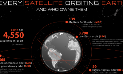

Did you know that more than half of the satellites that orbit the Earth are meant for communications, which includes things like the internet, telephones, television,...


The subject of climate change is one that continues to be heavily debated, and with good reason. From the NASA Goddard Institute for Space Studies, here...
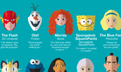

You don’t have to be a kid to appreciate the lessons and moral anecdotes from films, television shows, and books geared towards children. These stories often...
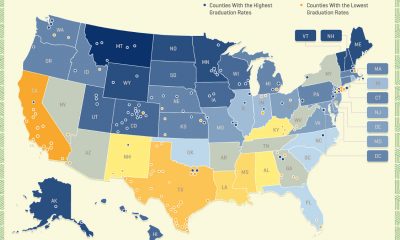

The United States is a colossal country with an incredible range of beliefs, livelihoods, and experiences. One thing that unifies the vast majority of America is...


When you were growing up, do you remember your parents having a big cardboard U.S. map with slots for the official state quarters to fit into?...
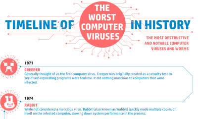

How does a computer virus infect a system? Much like a biological virus, computer viruses spread and replicate from one host to another, infecting a large...


When it comes to royal and aristocratic families throughout Europe, you might be surprised to learn that many of these families (even those that are ruling...
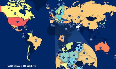

There is no denying that navigating parenthood is challenging, especially during a pandemic. If you are in the United States, you have to overcome the additional...
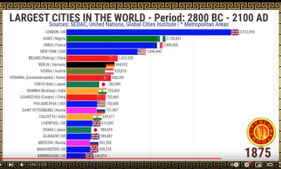

Let’s take a incredible journey through history to see the world’s largest cities over time with this animated visualization. This video, created by CityGlobeTour on YouTube,...
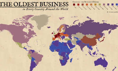

When you think of old businesses, do you think of your grandfather’s barber shop from the 1950’s or that amazing Italian restaurant in the city from...