
Many Americans are devoted to their pets and consider their furry friends a part of the family. That means they...


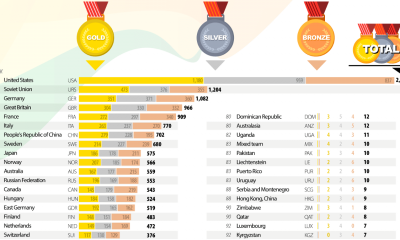

The road to the Olympic Games is a long grind that brings together only the top athletes of the world. To qualify, athletes are selected by...
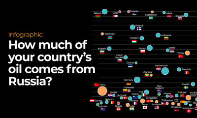

Oil prices have been surging to unprecedented heights across the United States since Russia invaded Ukraine on February 24th. Russia is the world’s largest exporter of...
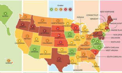

If you are in your twenties or older, you probably look back to your elementary school days and remember recess fondly. Sadly, over the years some...
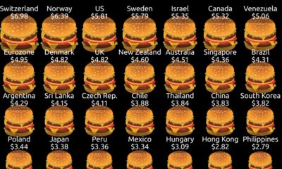

The iconic Big Mac is a two-beef patty, three bun delicacy topped with iceberg lettuce, American cheese, pickles, chopped onions and the super secret Mac Sauce....
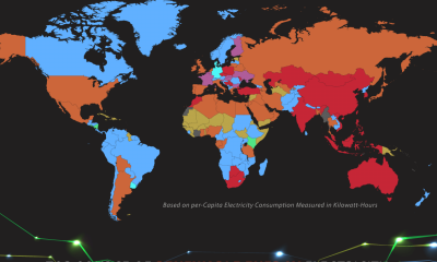

Around the world, which sources of electricity are the most popular? Some countries rely on traditional sources of energy like oil, gas or coal, while other...
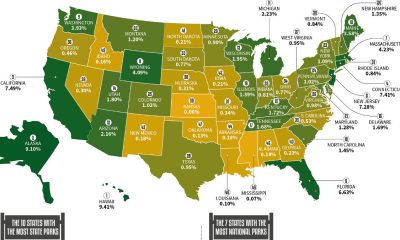

You might be surprised that the states with the most land don’t necessarily have the most national parks or state parks. This interactive map and visualization...
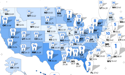

The original legend of the tooth fairy dates all the way back to the Middle Ages. Originally, it was thought that witches could cast spells onto...
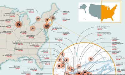

When a school district is well-funded, the students within those school districts are undoubtedly set up for more success in terms of their futures. From AAA...
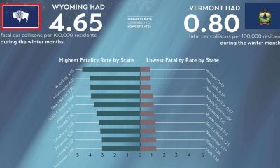

This may come as a big surprise, but winter is actually the season with fewest fatal car accidents. Winter driving can be scary, and this visualization...
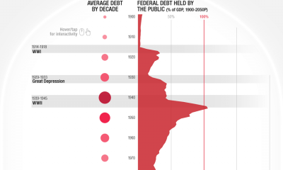

Today, the national debt of the United States of America stands at an eye-watering 28 trillion dollars and rising. The CARES Act of 2020 and other...